Preparing for the CMT Exam involves mastering the ability to synthesize charting techniques into actionable insights. Real-world chart analysis requires combining technical indicators, trendlines, and volume data to identify market opportunities and risks effectively. By integrating diverse charting methods, traders can discern patterns, anticipate shifts in momentum, and validate trading decisions with confidence. This comprehensive approach enhances market adaptability, aligns technical tools with strategic goals, and ensures well-informed decision-making in dynamic trading environments.
Learning Objectives
In studying Bringing It All Together: Real-World Charts for the CMT Exam, you should learn to apply theoretical concepts to real-world chart analysis. This topic focuses on combining technical tools and techniques, such as trendlines, moving averages, and chart patterns, to interpret live market data and make informed decisions. The process includes analyzing price action across multiple time frames, identifying trends and reversals, and validating observations using indicators like RSI, MACD, and Fibonacci retracements. Techniques such as overlaying indicators, comparing historical data, and refining strategies through backtesting are key to mastering this skill. Mastery of real-world chart applications is essential for enhancing analysis precision and achieving success in the CMT Exam.
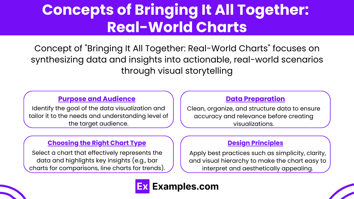
Concepts of Bringing It All Together: Real-World Charts

When creating charts for real-world applications, several concepts should be considered to effectively communicate data insights. Here’s an overview of the key concepts:
1. Purpose and Audience
Define the objective of the chart to clarify the story or insight being conveyed. Knowing your audience is crucial to tailoring the complexity and design of the chart to their knowledge level and interests.
2. Data Preparation
Ensure the data is accurate, complete, and free of errors by cleaning and validating it thoroughly. Aggregating data appropriately, such as summarizing it into monthly averages instead of daily data, enhances readability.
3. Choosing the Right Chart Type
Select the chart type based on the insight you aim to share. For comparisons, bar or column charts work well. Line charts or area charts are ideal for showing trends over time. Scatter plots or bubble charts are excellent for visualizing relationships, while pie charts or stacked bar charts are great for displaying proportions.
4. Design Principles
Focus on simplicity by avoiding unnecessary elements that can distract from the main message. Use a clear hierarchy with labels, titles, and legends for better understanding. Maintain consistency in color, font, and scale for a polished look.
Techniques of Bringing It All Together: Real-World Charts

Charts and visualizations are powerful tools for summarizing complex information in a digestible format. To create effective and insightful charts, it’s essential to apply strategies that combine data accuracy, design principles, and real-world relevance. Below are techniques to achieve this.
Define the Objective Clearly
Identify the key message or story the data should convey. Ensure the chart’s purpose aligns with its target audience, whether it’s executives, analysts, or the general public.Select the Right Chart Type
Choose the appropriate chart based on the data and its intended message. Line charts are ideal for showing trends over time, bar charts are great for comparing categories, pie charts work for displaying proportions (use sparingly), scatter plots highlight relationships between variables, and heatmaps are excellent for showcasing intensity variations.Simplify and Focus
Remove unnecessary elements such as excessive gridlines, redundant labels, or distracting colors. Focus on highlighting critical data points using annotations or contrasting colors. Ensure scales and intervals are consistent to avoid confusion.Emphasize Data Accuracy
Ensure all data used is accurate, relevant, and up-to-date. Clearly label axes, legends, and units of measurement. Misleading or ambiguous data representation can diminish the chart's credibility.Incorporate Real-World Context
Provide context to help the audience connect the data to real-world scenarios. Add references, benchmarks, or comparisons that ground the visualization in practical terms.Leverage Interactive Elements
For digital platforms, include interactive features like tooltips, zooming, or filtering. These allow users to explore the data in more depth, making the visualization more engaging.Iterate and Seek Feedback
Before finalizing, test the chart with a sample audience. Gather feedback to ensure clarity, accuracy, and impact. Make adjustments as needed to refine the presentation.
Purposes of Bringing It All Together: Real-World Charts

Real-world charts are essential tools for visualizing data and conveying information effectively. Here are their primary purposes:
Simplifying Complex Data: Charts transform large datasets into easy-to-understand visuals, enabling quick comprehension of complex information.
Identifying Trends and Patterns: They highlight trends, correlations, and patterns over time or across categories that might not be apparent in raw data.
Enhancing Decision-Making: Visual representations aid stakeholders in making informed decisions based on clear, data-driven insights.
Communicating Insights: Charts present data in a visually appealing and digestible format, improving communication and audience engagement.
Supporting Comparative Analysis: They enable comparisons between variables, categories, or timeframes to reveal differences or similarities.
Examples
Example 1. Analyzing Sales Trends Over Time
By using real-world charts, businesses can integrate various datasets, such as monthly revenue, customer acquisition rates, and product demand fluctuations, to identify patterns over time. For example, combining bar graphs for revenue and line charts for customer growth in a single dashboard helps managers visualize correlations and make data-driven decisions.
Example 2. Tracking Project Performance
Project managers can utilize Gantt charts along with pie charts displaying resource allocation to monitor the overall progress of projects. By bringing these elements together, teams can assess whether timelines are met, resources are optimally distributed, and milestones are achieved efficiently.
Example 3. Evaluating Marketing Campaigns
Real-world charts allow marketers to merge data like engagement metrics, conversion rates, and cost-per-click statistics into a unified visual. This combination of scatter plots for audience reach and stacked bar charts for ad spend breakdown provides a comprehensive overview of campaign effectiveness.
Example 4. Monitoring Financial Health
Financial analysts often use combined real-world charts to review profit and loss statements, balance sheets, and cash flow trends. For instance, pairing line graphs showing profit growth with area charts for expense categories can highlight areas needing budget adjustments or resource reallocation.
Example 5. Assessing Customer Feedback
Businesses can bring together customer survey results, sentiment analysis, and product ratings into dynamic dashboards. Using a mix of bubble charts for feedback distribution and heat maps for satisfaction scores enables stakeholders to pinpoint areas for improvement and track the impact of changes over time.
Practice Questions
Question 1
Which of the following is the most critical factor when selecting the type of chart to represent real-world data?
A. Aesthetic appeal of the chart
B. The message you want to convey
C. The software used to create the chart
D. The number of data points in the dataset
Answer:
B. The message you want to convey
Explanation:
When working with real-world charts, the primary goal is to effectively communicate the data's story or message. The type of chart chosen (e.g., bar chart, line chart, pie chart) depends on what you want to highlight, such as trends, proportions, or comparisons. While aesthetics and the number of data points are secondary considerations, they should support the clarity and purpose of the chart, not overshadow it.
Question 2
A company wants to show the percentage of its revenue generated by different product categories. Which chart type is the best choice?
A. Line chart
B. Pie chart
C. Histogram
D. Scatter plot
Answer:
B. Pie chart
Explanation:
A pie chart is best suited for displaying proportions or percentages of a whole. It visually represents how different categories contribute to the total, making it ideal for showing the revenue breakdown by product categories. Line charts are used for trends over time, histograms for frequency distributions, and scatter plots for relationships between variables, which are not appropriate for this scenario.
Question 3
You are analyzing customer satisfaction survey results collected over the past year to identify trends. Which chart type is the most appropriate for this analysis?
A. Bar chart
B. Line chart
C. Pie chart
D. Box-and-whisker plot
Answer:
B. Line chart
Explanation:
A line chart is ideal for showing trends over time. It helps visualize changes and patterns in customer satisfaction scores across a continuous timeline, such as months or quarters. Bar charts are better for comparing categories, pie charts for proportions, and box-and-whisker plots for displaying data distribution and variability, none of which emphasize trends as effectively as a line chart.


