Interpretation of Data is a crucial skill in the ACT Exam, particularly in the Science and Math sections. It involves analyzing, interpreting, and drawing conclusions from various types of data presented in graphs, tables, and charts. Understanding how to interpret data in one variable is foundational for making informed decisions and solving problems. This skill not only helps in exams but is also essential in real-life scenarios, where data-driven decision-making is becoming increasingly important.
Learning Objectives
By the end of this section, you should be able to understand and apply various techniques for interpreting data, including data presented in one variable. You will learn to analyze different types of graphs and charts, identify trends and patterns, and draw meaningful conclusions from the data. Additionally, you will be able to compare data sets, understand measures of central tendency and dispersion, and apply these concepts to solve problems efficiently.
Understanding Data Representation

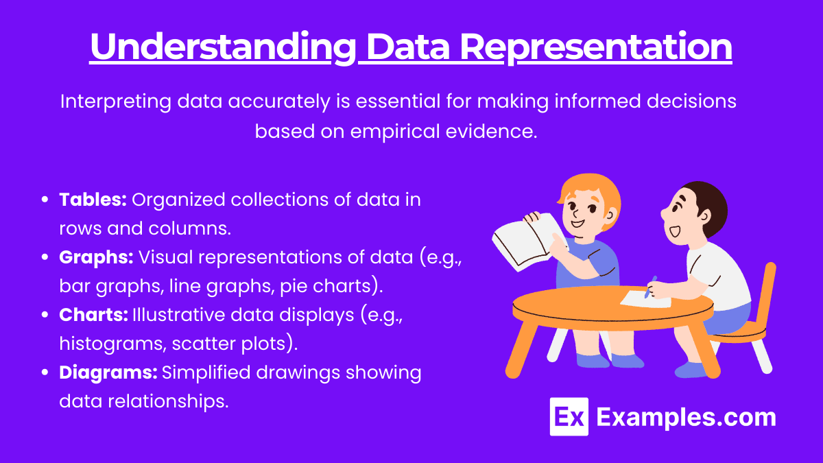
Interpreting data accurately is essential for making informed decisions based on empirical evidence. Data representation converts raw data into a visual or tabular format, making it easier to comprehend, compare, and analyze. Effective data representation highlights patterns, trends, and anomalies, enabling quick insights. Here, we delve into the various methods of data representation, emphasizing their importance and application.
Data can be represented in numerous ways, including:
Tables: Organized collections of data in rows and columns.
Graphs: Visual representations of data (e.g., bar graphs, line graphs, pie charts).
Charts: Illustrative data displays (e.g., histograms, scatter plots).
Diagrams: Simplified drawings showing data relationships.
Types of Graphs and Their Uses
Graphs are powerful tools for visualizing data, allowing for quick and intuitive understanding of complex datasets. Different types of graphs serve various purposes, from comparing quantities across categories to showing trends over time or illustrating relationships between variables. Understanding the appropriate use of each type of graph is crucial for effective data interpretation.
Bar Graphs
Bar graphs are used to compare quantities of different categories. Each bar represents a category, and its height (or length) represents the value of that category.
Example: Comparing the number of students enrolled in different college courses.
Line Graphs
Line graphs show trends over time. Points representing data values are connected by lines.
Example: Tracking the change in temperature over a week.
Pie Charts
Pie charts show proportions of a whole. Each "slice" represents a category's contribution to the total.
Example: Displaying the market share of different smartphone brands.
Histograms
Histograms show frequency distributions. Data is divided into intervals, and the frequency of data points within each interval is represented by bars.
Example: Distribution of test scores in a class.
Scatter Plots
Scatter plots show relationships between two variables. Each point represents an observation's values for the two variables.
Example: Relationship between hours studied and test scores.
Analyzing Data Trends

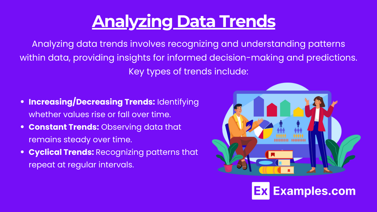
Analyzing data trends involves recognizing and understanding patterns within data, providing insights for informed decision-making and predictions. Key types of trends include:
Increasing/Decreasing Trends: Identifying whether values rise or fall over time.
Constant Trends: Observing data that remains steady over time.
Cyclical Trends: Recognizing patterns that repeat at regular intervals.
Making Inferences
Inferences are conclusions drawn from data analysis, providing insights beyond mere observation. Accurate inferences require evaluating relationships, assessing correlations, and examining outliers to ensure well-founded conclusions. To make accurate inferences:
Evaluate Relationships: Determine if a relationship between variables is direct or inverse.
Assess Correlation: Understand if a change in one variable corresponds with a change in another.
Examine Outliers: Identify and consider the impact of data points that deviate significantly from the rest.
Examples of Interpretation of Data
Example 1: Evaluating Relationships
Scenario: A study examines the relationship between hours of sleep and productivity levels.
Observation: Data shows that as hours of sleep increase, productivity levels also increase up to 8 hours, after which productivity levels plateau.
Inference: Optimal sleep for peak productivity is around 8 hours.
Example 2: Assessing Correlation
Scenario: A marketing team tracks advertising spend and website traffic.
Observation: Higher advertising spend is correlated with increased website traffic.
Inference: Increased advertising spend leads to higher website traffic, suggesting effective marketing efforts.
Example 3: Examining Outliers
Scenario: A school's test score data includes one unusually low score.
Observation: The low score is significantly different from other scores.
Inference: The outlier may be due to an error or an unusual circumstance affecting one student.
Example 4: Identifying Trends
Scenario: A retailer analyzes monthly sales data over three years.
Observation: Sales consistently increase during holiday seasons.
Inference: Holiday seasons drive higher sales, indicating a need for targeted marketing during these periods.
Example 5: Using Regression Analysis
Scenario: An economist examines the impact of interest rates on housing prices.
Observation: A regression analysis shows that lower interest rates are associated with higher housing prices.
Inference: Lower interest rates stimulate higher demand for housing, driving up prices.
Practice Questions
Question 1: Evaluating Relationships
Scenario: A researcher collects data on the amount of time students spend studying and their corresponding grades.
Data Summary:
Students who study 0-2 hours: Average grade of 70
Students who study 2-4 hours: Average grade of 75
Students who study 4-6 hours: Average grade of 85
Students who study 6-8 hours: Average grade of 90
Question: Based on the data, what is the relationship between study time and grades?
No relationship
Negative relationship
Direct relationship
Inverse relationship
Answer: 3. Direct relationship
Explanation: The data shows that as study time increases, grades also increase, indicating a direct relationship.
Question 2: Assessing Correlation
Scenario: A company tracks its monthly advertising spend and monthly sales revenue.
Data Summary:
January: 50,000 revenue
February: 60,000 revenue
March: 40,000 revenue
April: 70,000 revenue
Question: What type of correlation exists between advertising spend and sales revenue?
Positive correlation
Negative correlation
No correlation
Random correlation
Answer: 1. Positive correlation
Explanation: The data indicates that as advertising spend increases, sales revenue also increases, showing a positive correlation.
Question 3: Examining Outliers
Scenario: A nutritionist records daily calorie intake and weight changes for a group of individuals.
Data Summary: Most individuals have calorie intakes between 1800 and 2200 calories, with weight changes between -1 and +1 pounds. One individual has a calorie intake of 3000 calories and a weight change of +5 pounds.
Question: How should the nutritionist handle the data point for the individual with 3000 calories intake?
Ignore it as an error
Include it in the analysis without question
Investigate the reasons behind the outlier
Adjust other data points to match it
Answer: 3. Investigate the reasons behind the outlier
Explanation: The outlier should be investigated to understand if it is an error or a genuine case, which can provide valuable insights.


