
Different Types of Maps and What They Tell You

In AP Human Geography, understanding different types of maps is essential for interpreting geographic information. Maps serve as vital tools that visually represent spatial data, offering insights into various phenomena. Thematic maps reveal specific patterns like population density or climate, while reference maps focus on locations and boundaries. Topographic maps highlight physical terrain, and flow maps track movement such as migration or trade. Each map type offers unique perspectives, helping geographers analyze spatial relationships, processes, and patterns critical for understanding the human and physical world.
Learning Objectives
For the topic “Different Types of Maps and What They Tell You” in AP Human Geography, you should focus on understanding how different types of maps (thematic, reference, topographic, and others) represent spatial information. Learn to interpret these maps, identify what they reveal about population patterns, physical landscapes, and human activities. Recognize how maps communicate specific geographic data, analyze the purpose of different map projections, and evaluate how cartographic techniques shape our understanding of geographic spaces. This knowledge will enhance your ability to analyze geographic phenomena.
Thematic Maps
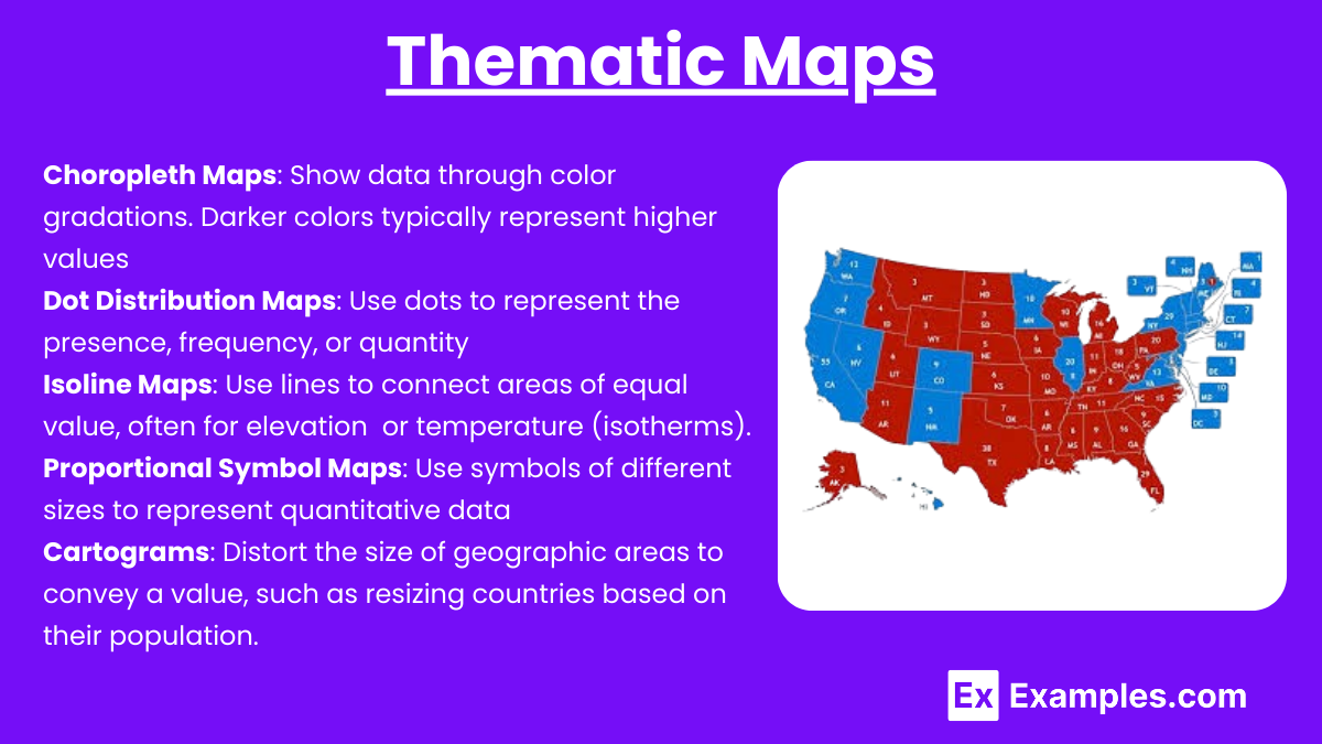
These maps focus on a specific theme or subject area, such as population density, climate, or economic activities. They emphasize spatial variation of one or a few geographic distributions. Examples include:
- Choropleth Maps: Show data through color gradations. Darker colors typically represent higher values, such as population density or income levels.
- Dot Distribution Maps: Use dots to represent the presence, frequency, or quantity of a phenomenon, such as the distribution of farms.
- Isoline Maps: Use lines to connect areas of equal value, often for elevation (topographic maps) or temperature (isotherms).
- Proportional Symbol Maps: Use symbols of different sizes to represent quantitative data, like city populations or economic output.
- Cartograms: Distort the size of geographic areas to convey a value, such as resizing countries based on their population.
Reference Maps
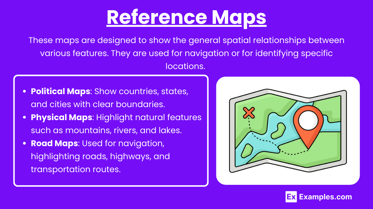
These maps are designed to show the general spatial relationships between various features. They are used for navigation or for identifying specific locations. Examples include:
- Political Maps: Show countries, states, and cities with clear boundaries.
- Physical Maps: Highlight natural features such as mountains, rivers, and lakes.
- Road Maps: Used for navigation, highlighting roads, highways, and transportation routes.
Topographic Maps
These maps use contour lines to depict elevation and terrain. They are used to study landforms and are crucial in fields like environmental science, urban planning, and geology. The spacing of contour lines indicates the steepness of terrain, where closer lines represent steep areas and wider gaps indicate flat areas.
Mental Maps
Mental maps are the representations individuals carry in their minds about geographic locations. They reflect how a person understands the world spatially and can vary between individuals based on experiences, knowledge, and perception.
Flow Maps
Flow maps show movement between locations, such as migration patterns, trade routes, or traffic flows. Arrows or lines of varying thickness are used to represent the volume or intensity of movement.
Cadastral Maps
These maps are detailed, large-scale representations showing land ownership and property boundaries. They are often used in legal contexts and urban planning.
Examples
Example 1: Choropleth Map
A choropleth map uses various shades of color to represent data across different regions. For example, a choropleth map of global population density might show darker colors where populations are more concentrated (like cities or urban areas) and lighter colors where populations are sparse (rural regions or deserts). This map type helps illustrate spatial patterns and make comparisons, such as the high population density in Asia versus the lower density in the Arctic.
Example 2. Dot Distribution Map
This map uses dots to represent the occurrence or concentration of a particular feature, such as the location of farms or urban populations. For instance, a dot distribution map of the United States might show clusters of dots in major cities, revealing urbanization patterns. This type of map provides insight into spatial distribution and helps identify population centers or areas of economic activity.
Example 3. Isoline Map
An isoline map connects areas with equal values using lines, such as elevation on topographic maps (contour lines) or temperature on climate maps (isotherms). An example would be an isoline map of global temperatures, which connects places of equal temperature. This helps geographers understand variations in weather patterns, such as the temperature gradient from the equator to the poles.
Example 4. Proportional Symbol Map
A proportional symbol map uses symbols of varying sizes to represent quantitative data. For instance, a map displaying global GDP might use larger circles to represent countries with higher GDP, such as the U.S. or China, and smaller circles for countries with lower GDP. This type of map highlights the relative economic power of different regions and is often used in economic geography.
Example 5. Cartogram
A cartogram distorts the shape of geographic regions to represent a specific variable, such as population size or energy consumption. For example, a cartogram showing global population might inflate the size of India and China while shrinking regions with smaller populations, like Greenland. This type of map emphasizes the significance of certain areas in relation to the data being mapped, making it easier to visualize global inequalities or distributions.
Multiple Choice Questions
Question 1
Which of the following is an example of using matrices to model population changes in different regions?
A) A diagram showing cultural diffusion over time.
B) A matrix representing population in various countries and how it changes over decades.
C) A map showing the distribution of natural resources across a continent.
D) A bar graph comparing economic growth rates in several cities.
Answer: B) A matrix representing population in various countries and how it changes over decades.
Explanation: Matrices can be used to represent multiple variables and their changes over time. In this case, a matrix showing population in various countries over decades is a classic example of using matrices to model change. Each row in the matrix can represent a different country, while each column represents a specific year, allowing you to easily observe how populations change across regions and time. This is an effective way to analyze population trends and shifts.
Question 2
How can matrices be used to model migration patterns between multiple regions?
A) By calculating the distance between regions on a map.
B) By organizing data in rows and columns to track the flow of people between regions.
C) By plotting a graph showing the relationship between GDP and population.
D) By mapping political boundaries and using layers to show migration data.
Answer: B) By organizing data in rows and columns to track the flow of people between regions.
Explanation: Matrices allow you to organize and model complex systems like migration patterns. In this case, rows and columns in a matrix can represent different regions, and the entries can show the number of people migrating from one region to another. This allows geographers to easily track and analyze migration trends, such as identifying which regions are gaining or losing population due to migration, and the magnitude of these movements.
Question 3
Which of the following best describes a scenario where matrices help model economic changes across multiple regions?
A) A matrix is used to track agricultural productivity across states over a 10-year period.
B) A matrix outlines political alliances between countries during a specific era.
C) A map shows topographical features that impact economic development.
D) A graph displays population density across different states in a country.
Answer: A) A matrix is used to track agricultural productivity across states over a 10-year period.
Explanation: Matrices are useful for tracking changes in multiple variables over time. In this scenario, a matrix can be set up where each row represents a state, and each column represents a specific year. The values in the matrix represent agricultural productivity in each state over time. This allows geographers and economists to assess trends, identify which regions are becoming more or less productive, and analyze the factors contributing to these changes.