
Comparing Representations of 2 Categorical Variables

In AP Statistics, comparing representations of two categorical variables is essential for analyzing relationships and dependencies between them. This topic covers the use of contingency tables, segmented bar charts, and mosaic plots to visually and numerically represent the data. By understanding these methods, students can effectively compare distributions, identify patterns, and draw meaningful conclusions about the association between categorical variables. Mastery of these skills is crucial for success in the AP Statistics exam.
Learning Objectives
By studying how to compare representations of two categorical variables, you will learn to use contingency tables, segmented bar charts, and mosaic plots. You will understand how to visually and numerically analyze relationships and dependencies between categorical variables. These skills will help you effectively compare distributions, identify patterns, and draw meaningful conclusions about associations. Mastering these techniques is essential for success in the AP Statistics exam and will enhance your ability to interpret and communicate statistical findings.
Contingency Tables
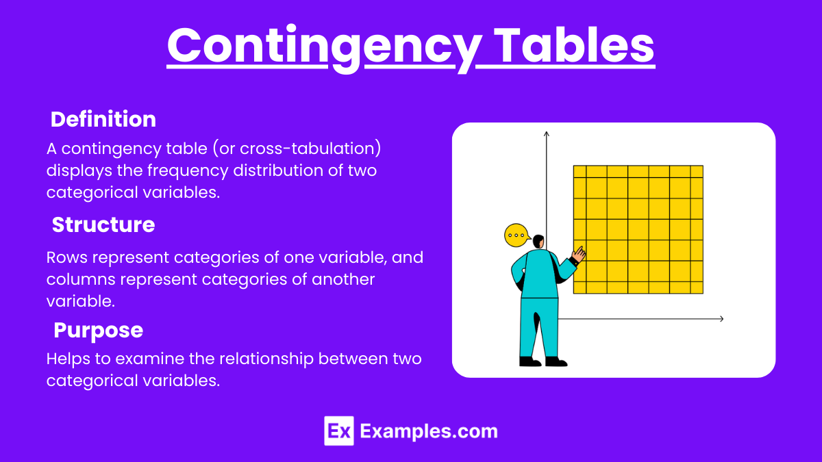
Definition: A contingency table (or cross-tabulation) displays the frequency distribution of two categorical variables.
Structure: Rows represent categories of one variable, and columns represent categories of another variable.
Purpose: Helps to examine the relationship between two categorical variables.
Segmented Bar Charts
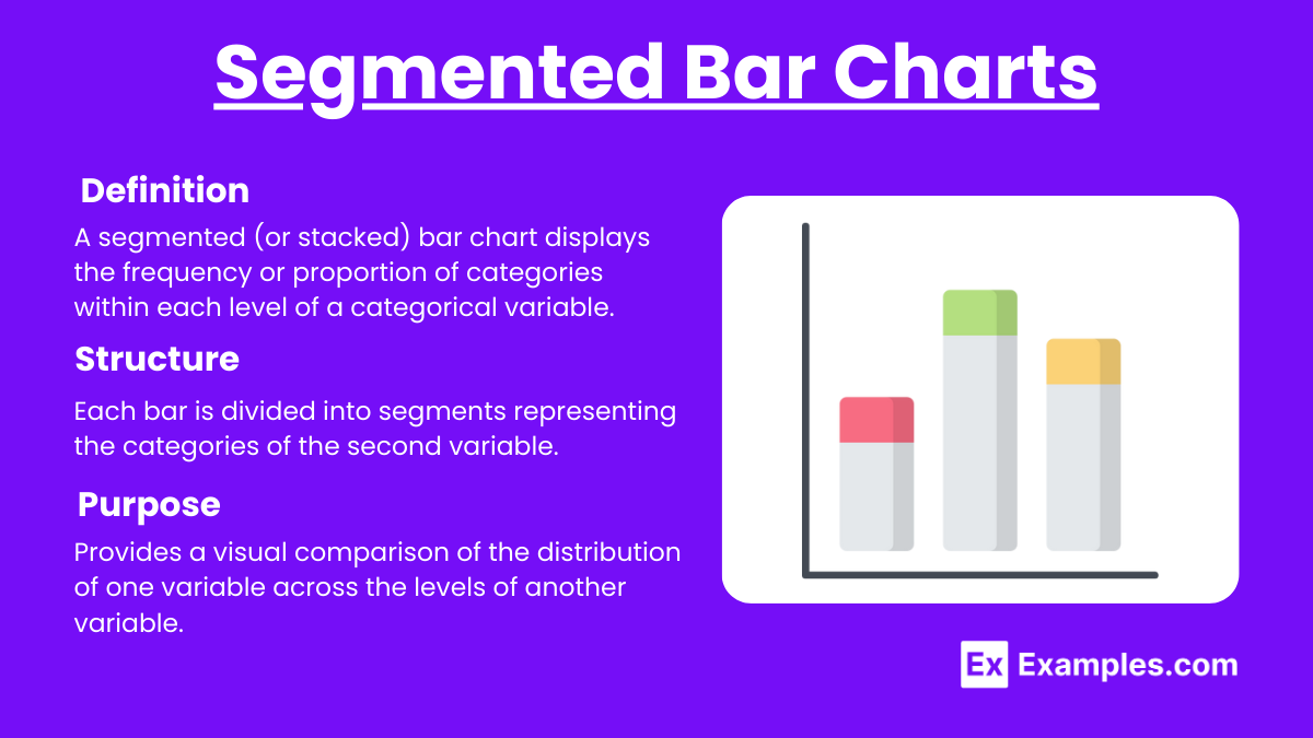
Definition: A segmented (or stacked) bar chart displays the frequency or proportion of categories within each level of a categorical variable.
Structure: Each bar is divided into segments representing the categories of the second variable.
Purpose: Provides a visual comparison of the distribution of one variable across the levels of another variable.
Mosaic Plots
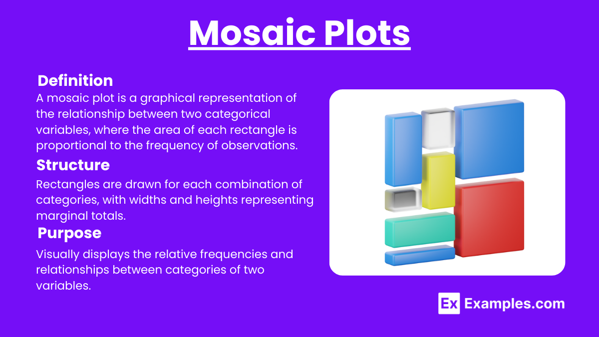
Definition: A mosaic plot is a graphical representation of the relationship between two categorical variables, where the area of each rectangle is proportional to the frequency of observations.
Structure: Rectangles are drawn for each combination of categories, with widths and heights representing marginal totals.
Purpose: Visually displays the relative frequencies and relationships between categories of two variables.
Examples
Example 1: Contingency Table
Data: Survey of 100 students on gender (Male, Female) and favorite subject (Math, Science, English).
Table:MathScienceEnglishTotalMale10201545Female20152055Total303535100
Analysis: The table shows the frequency distribution of favorite subjects by gender.
Example 2: Segmented Bar Chart
Data: Survey of 100 students on gender (Male, Female) and favorite subject (Math, Science, English).
Chart: Create a bar for each gender, divided into segments for each favorite subject.
Analysis: Visual comparison of the distribution of favorite subjects between males and females.
Example 3: Mosaic Plot
Data: Survey of 100 students on gender (Male, Female) and favorite subject (Math, Science, English).
Plot: Create a mosaic plot where the area of each rectangle represents the proportion of students in each category combination.
Analysis: Visual representation of the relationship between gender and favorite subject.
Example 4: Relative Frequencies in Contingency Table
Data: Survey of 100 students on gender (Male, Female) and favorite subject (Math, Science, English).
Table:MathScienceEnglishTotalMale0.100.200.150.45Female0.200.150.200.55Total0.300.350.351.00
Analysis: The table shows the relative frequencies of favorite subjects by gender, allowing for a proportionate comparison.
Example 5: Chi-Square Test of Independence
Data: Survey of 100 students on gender (Male, Female) and favorite subject (Math, Science, English).
Test: Perform a chi-square test to determine if there is a significant relationship between gender and favorite subject.
Analysis: Calculate the chi-square statistic and p-value to test the hypothesis of independence between the two categorical variables.
Multiple Choice Questions
Question 1: What does a contingency table display?
A. The frequency distribution of a single categorical variable
B. The relationship between two categorical variables
C. The distribution of a quantitative variable
D. The correlation between two quantitative variables
Answer: B. The relationship between two categorical variables
Explanation: A contingency table displays the frequency distribution of two categorical variables, showing their relationship.
Question 2: In a segmented bar chart, what do the segments represent?
A. The total frequency of a single variable
B. The mean values of a quantitative variable
C. The categories of the second variable
D. The range of a quantitative variable
Answer: C. The categories of the second variable
Explanation: In a segmented bar chart, each segment represents a category of the second variable within each level of the first variable.
Question 3: What is the purpose of a mosaic plot?
A. To show the spread of a quantitative variable
B. To compare the means of two groups
C. To display the relative frequencies and relationships between two categorical variables
D. To plot individual data points
Answer: C. To display the relative frequencies and relationships between two categorical variables
Explanation: A mosaic plot visually displays the relative frequencies and relationships between two categorical variables, with the area of each rectangle proportional to the frequency of observations.