
Describing and Comparing Distributions of Data

In AP Statistics, describing and comparing distributions of data is crucial for understanding how data is spread and identifying patterns. This involves analyzing the shape, center, spread, and unusual features of distributions using graphical representations like histograms, boxplots, and dot plots. By comparing these aspects across different datasets, students can make informed conclusions about similarities and differences. Mastering these skills helps in effectively interpreting and communicating statistical findings, which is essential for success in the AP Statistics exam.
Learning Objectives
By studying how to describe and compare distributions of data, you will learn to analyze the shape, center, spread, and unusual features of data distributions. You will master using histograms, boxplots, and dot plots to visualize data. These skills will enable you to compare different datasets effectively and make informed conclusions about their similarities and differences. This knowledge is essential for interpreting and communicating statistical findings, preparing you for success in the AP Statistics exam.
Describing Distributions
Shape
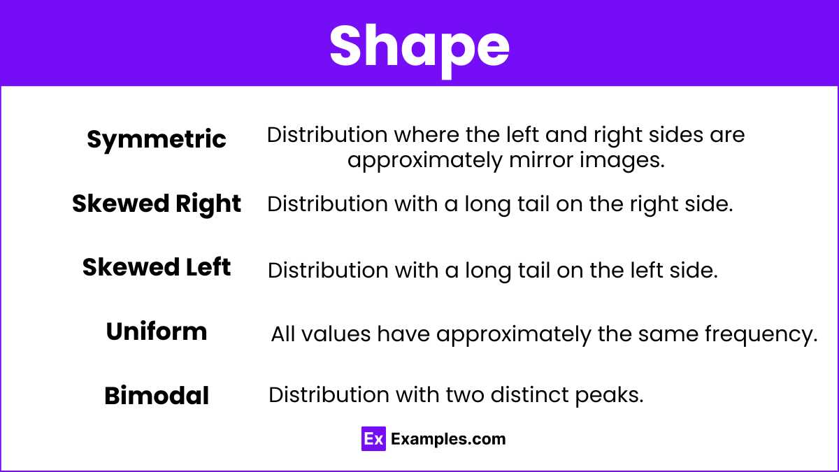
Symmetric: Distribution where the left and right sides are approximately mirror images.
Skewed Right: Distribution with a long tail on the right side.
Skewed Left: Distribution with a long tail on the left side.
Uniform: All values have approximately the same frequency.
Bimodal: Distribution with two distinct peaks.
Center
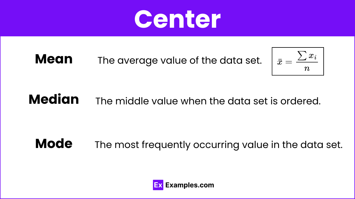
Mean: The average value of the data set.
Median: The middle value when the data set is ordered.
Mode: The most frequently occurring value in the data set.
Spread
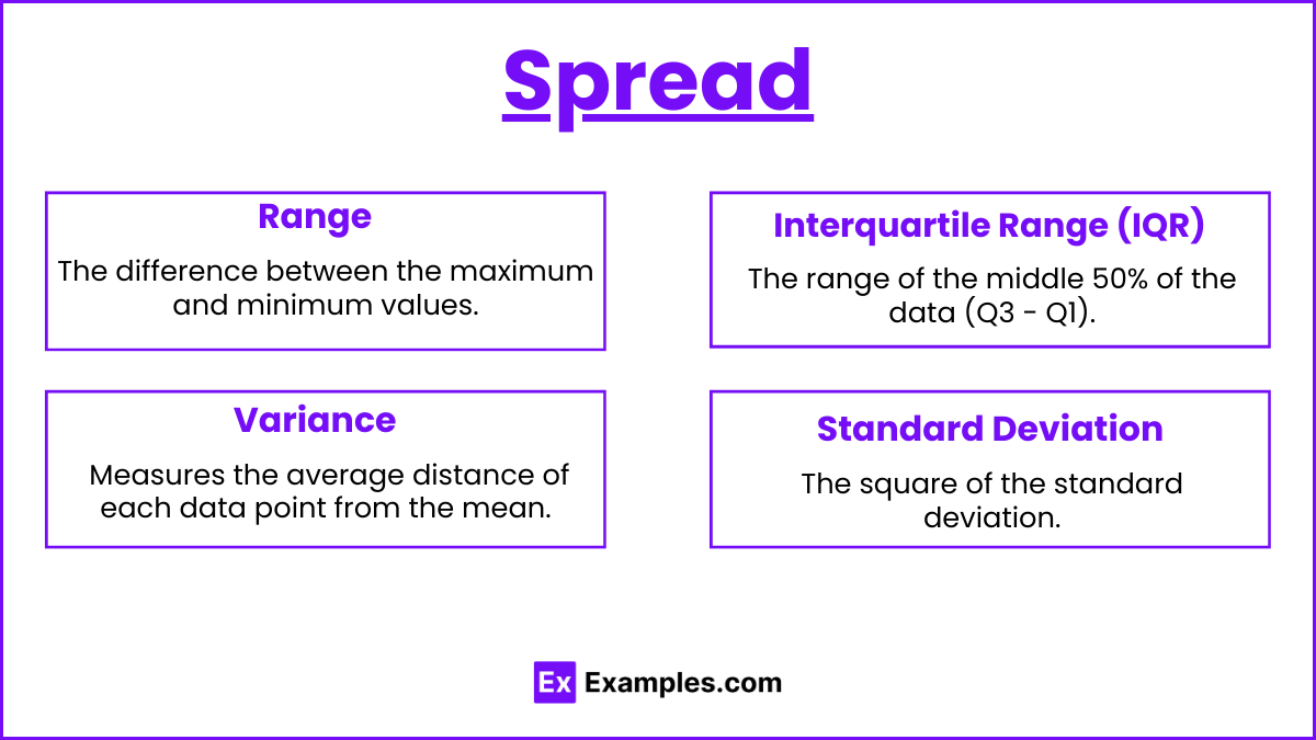
Range: The difference between the maximum and minimum values.
Interquartile Range (IQR): The range of the middle 50% of the data (Q3 - Q1).
Standard Deviation: Measures the average distance of each data point from the mean.
Variance: The square of the standard deviation.
Unusual Features
Outliers: Data points that are significantly different from the rest of the data.
Gaps: Intervals in the data distribution where there are no data points.
Clusters: Groups of data points that are close together.
Comparing Distributions
Comparative Analysis
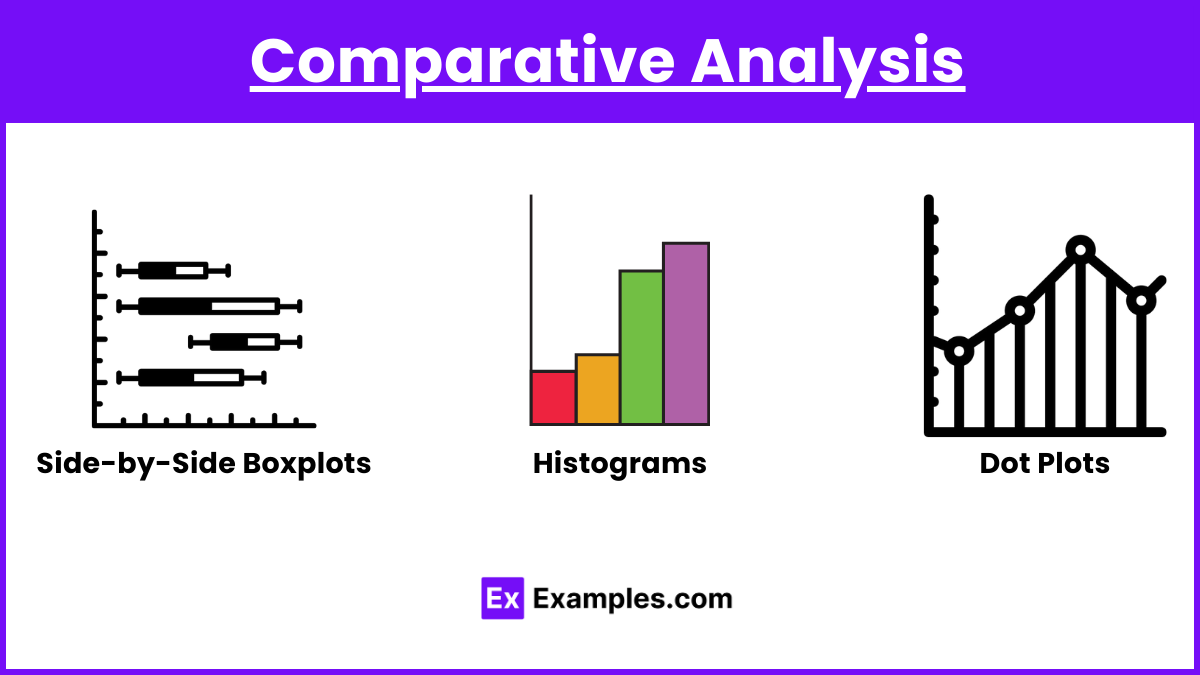
Side-by-Side Boxplots: Useful for comparing the distribution of a quantitative variable across different categories.
Histograms: Can be used to compare the frequency distributions of two or more datasets.
Dot Plots: Provide a simple way to compare individual data points across different groups.
Key Elements to Compare
Shape: Look for differences in symmetry, skewness, and modality.
Center: Compare the mean or median values.
Spread: Compare the range, IQR, and standard deviation.
Unusual Features: Identify and compare any outliers, gaps, or clusters.
Examples
Example 1: Describing a Distribution
Data: Test scores: 60, 65, 70, 75, 80, 85, 90, 95, 100
Description:
Shape: Symmetric
Center: Mean = Median = 80
Spread: Range = 100 - 60 = 40, IQR = 90 - 70 = 20, Standard Deviation ≈ 13.89
Unusual Features: None
Example 2: Comparing Two Distributions Using Boxplots
Data: Heights of male and female students
Males: 65, 67, 70, 72, 75
Females: 60, 62, 65, 67, 70
Comparison:
Shape: Both are approximately symmetric.
Center: Median height for males is higher than females.
Spread: Range and IQR are similar for both groups.
Unusual Features: No outliers in either group.
Example 3: Using Histograms to Compare Distributions
Data: Scores of two classes on a math test
Class A: 50, 55, 60, 65, 70, 75, 80, 85, 90, 95
Class B: 60, 62, 64, 66, 68, 70, 72, 74, 76, 78
Comparison:
Shape: Class A is more spread out with a wider range; Class B is more compact and symmetric.
Center: Mean score of Class B is higher than Class A.
Spread: Class A has a larger standard deviation.
Unusual Features: No significant outliers in either class.
Example 4: Comparing Distributions with Dot Plots
Data: Weights of two different species of birds
Species 1: 1.2, 1.3, 1.5, 1.7, 1.8
Species 2: 1.4, 1.6, 1.9, 2.0, 2.1
Comparison:
Shape: Both distributions are relatively symmetric.
Center: Species 2 has a higher median weight.
Spread: Species 2 has a slightly larger range.
Unusual Features: No outliers in either species.
Example 5: Identifying Outliers in a Distribution
Data: Monthly sales figures: 100, 110, 120, 130, 2000
Description:
Shape: Right-skewed due to the outlier.
Center: Median = 120, Mean = 492
Spread: Range = 2000 - 100 = 1900, IQR = 130 - 110 = 20, Standard Deviation ≈ 799.55
Unusual Features: Outlier at 2000
Multiple Choice Questions
Question 1: Which measure of center is least affected by outliers?
A. Mean
B. Median
C. Mode
D. Range
Answer: B. Median
Explanation: The median is the middle value of an ordered dataset and is not affected by extreme values or outliers, unlike the mean.
Question 2: What does a boxplot display?
A. The distribution of a categorical variable
B. The five-number summary of a dataset
C. The frequency of individual data points
D. The relationship between two quantitative variables
Answer: B. The five-number summary of a dataset
Explanation: A boxplot displays the minimum, first quartile (Q1), median, third quartile (Q3), and maximum values of a dataset, which make up the five-number summary.
Question 3: Which graph is most appropriate for comparing the distribution of a quantitative variable across different categories?
A. Scatter plot
B. Histogram
C. Side-by-side boxplots
D. Dot plot
Answer: C. Side-by-side boxplots
Explanation: Side-by-side boxplots are effective for comparing the distribution of a quantitative variable across different categories, showing the center, spread, and any outliers for each category.