
Interpreting the Results of an Experiment

In AP Statistics, interpreting the results of an experiment is essential for understanding data and making informed conclusions. This process involves summarizing data using descriptive statistics, visualizing data through graphical analysis, and applying inferential statistics to draw meaningful inferences about the population. Key concepts include calculating confidence intervals, performing hypothesis tests, and understanding p-values. By mastering these techniques, students can evaluate the significance and implications of their findings, leading to accurate and insightful interpretations of experimental results.
Learning Objectives
By studying interpreting the results of an experiment in AP Statistics, you will learn to summarize data with descriptive statistics, visualize data through various graphical methods, and apply inferential statistics to draw meaningful conclusions. You will understand key concepts such as confidence intervals, hypothesis testing, and p-values. This knowledge will enable you to evaluate the significance and implications of your findings accurately, enhancing your ability to make informed decisions based on experimental data.
Descriptive Statistics
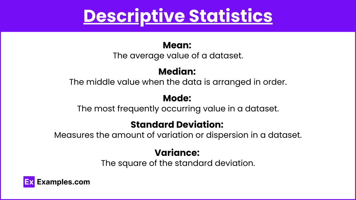
- Mean: The average value of a dataset.
- Median: The middle value when the data is arranged in order.
- Mode: The most frequently occurring value in a dataset.
- Standard Deviation: Measures the amount of variation or dispersion in a dataset.
- Variance: The square of the standard deviation.
Inferential Statistics
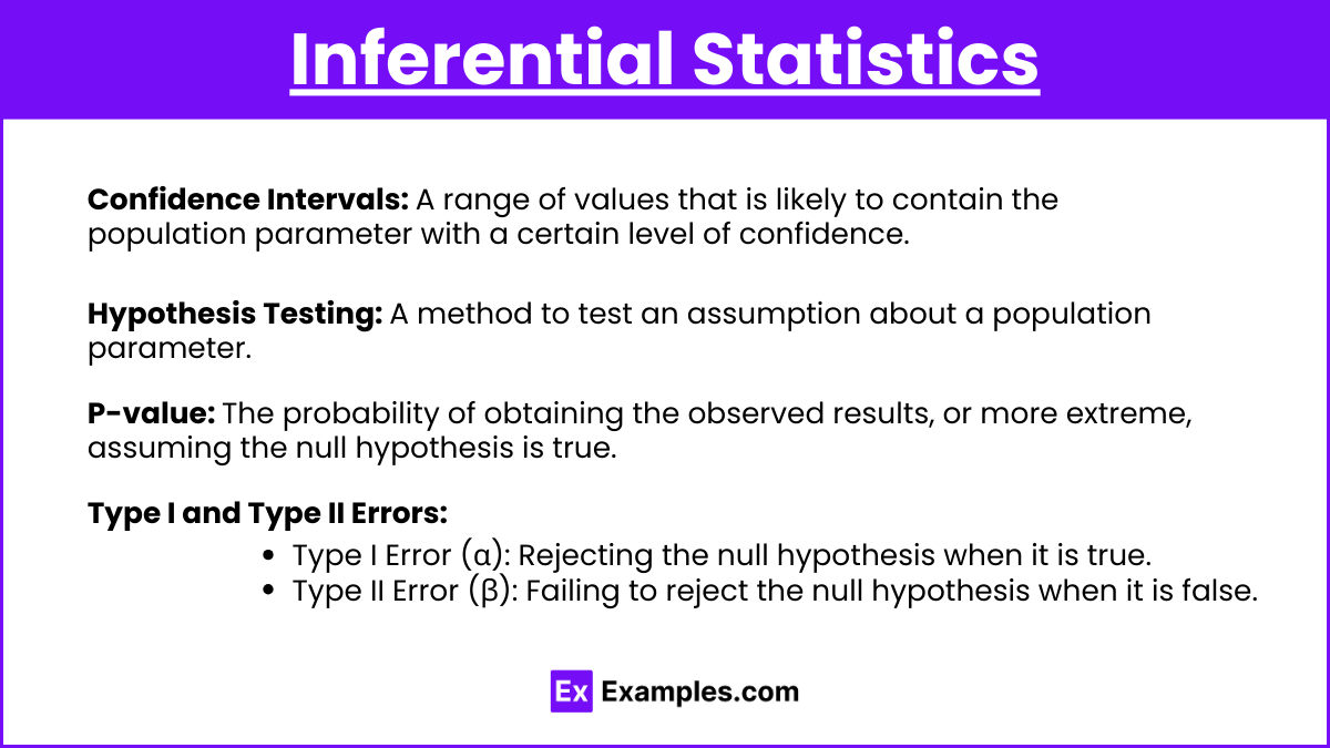
- Confidence Intervals: A range of values that is likely to contain the population parameter with a certain level of confidence.
- Hypothesis Testing: A method to test an assumption about a population parameter. This includes:
- Null Hypothesis (Hₒ): The hypothesis that there is no effect or no difference.
- Alternative Hypothesis (Hₐ): The hypothesis that there is an effect or a difference.
- P-value: The probability of obtaining the observed results, or more extreme, assuming the null hypothesis is true.
- Type I and Type II Errors:
- Type I Error (α): Rejecting the null hypothesis when it is true.
- Type II Error (β): Failing to reject the null hypothesis when it is false.
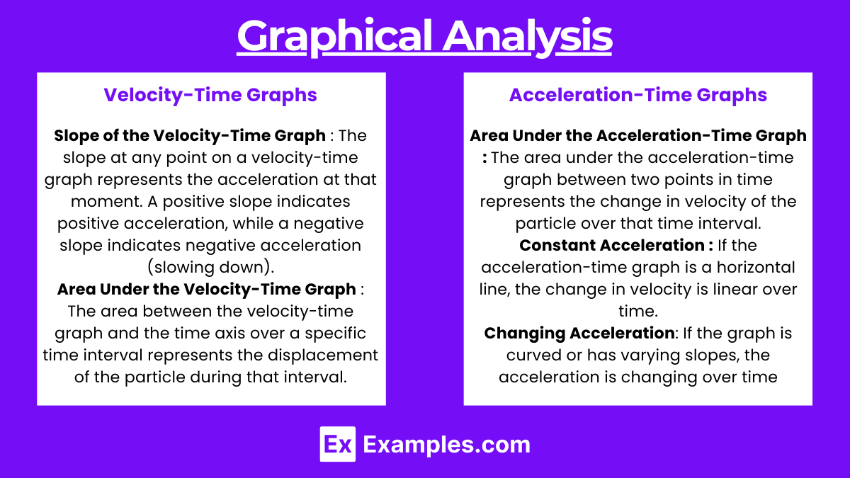
Graphical Analysis
- Histograms: Display the frequency distribution of a dataset.
- Box Plots: Show the distribution of data based on a five-number summary (minimum, first quartile, median, third quartile, and maximum).
- Scatter Plots: Show the relationship between two quantitative variables.
Correlation and Regression
- Correlation Coefficient (r): Measures the strength and direction of the linear relationship between two variables.
- Linear Regression: Models the relationship between a dependent variable and one or more independent variables.
Detailed Steps to Interpret Results
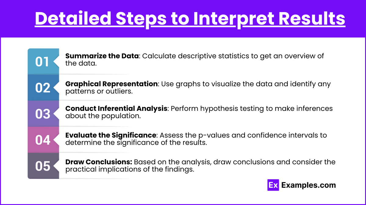
Step 1: Summarize the Data
- Calculate descriptive statistics to get an overview of the data.
Step 2: Graphical Representation
- Use graphs to visualize the data and identify any patterns or outliers.
Step 3: Conduct Inferential Analysis
- Perform hypothesis testing to make inferences about the population.
Step 4: Evaluate the Significance
- Assess the p-values and confidence intervals to determine the significance of the results.
Step 5: Draw Conclusions
- Based on the analysis, draw conclusions and consider the practical implications of the findings.
Examples
Example 1: Mean and Standard Deviation
- Scenario: A teacher wants to know the average test score of her class.
- Data: Test scores: 70, 75, 80, 85, 90.
- Mean: (70+75+80+85+90) / 5 = 80.
- Standard Deviation: Calculate the spread of the scores around the mean.
Example 2: Confidence Interval
- Scenario: A company wants to estimate the average weight of a product.
- Sample Mean: 150 grams, Standard Deviation: 10 grams, Sample Size: 30.
- Confidence Interval: Using a 95% confidence level, the interval might be 146 to 154 grams.
Example 3: Hypothesis Testing
- Scenario: Testing a new drug’s effectiveness.
- Null Hypothesis (Hₒ): The drug has no effect.
- Alternative Hypothesis (Hₐ): The drug has an effect.
- P-value: If p < 0.05, reject.
Example 4: Correlation Coefficient
- Scenario: Studying the relationship between hours studied and test scores.
- Data: Hours studied and corresponding test scores.
- Correlation Coefficient: Calculate r to determine the strength of the relationship.
Example 5: Linear Regression
- Scenario: Predicting sales based on advertising spend.
- Data: Advertising spend and sales data.
- Linear Regression: Model the relationship and make predictions.
Multiple Choice Questions (MCQs)
MCQ 1:
Which of the following is true about a p-value in hypothesis testing?
A) It measures the probability that the null hypothesis is true.
B) It is used to calculate the sample mean.
C) A p-value less than 0.05 typically leads to rejecting the null hypothesis.
D) It represents the correlation between two variables.
Answer: C) A p-value less than 0.05 typically leads to rejecting the null hypothesis.
Explanation: In hypothesis testing, a p-value is used to determine the significance of the results. If the p-value is less than 0.05, it suggests that the observed data is unlikely under the null hypothesis, leading to its rejection.
MCQ 2:
What does a confidence interval of 95% mean?
A) There is a 95% chance that the sample mean is within the interval.
B) There is a 95% chance that the population parameter is within the interval.
C) 95% of the data points lie within the interval.
D) The standard deviation is 95% of the sample mean.
Answer: B) There is a 95% chance that the population parameter is within the interval.
Explanation: A 95% confidence interval means that if we were to take many samples and calculate a confidence interval from each sample, approximately 95% of those intervals would contain the true population parameter.
MCQ 3:
Which graph is best used to display the distribution of a single quantitative variable?
A) Scatter plot
B) Histogram
C) Box plot
D) Bar chart
Answer: B) Histogram
Explanation: A histogram is ideal for displaying the distribution of a single quantitative variable, as it shows the frequency of data points within specified ranges, allowing for easy visualization of the distribution’s shape.