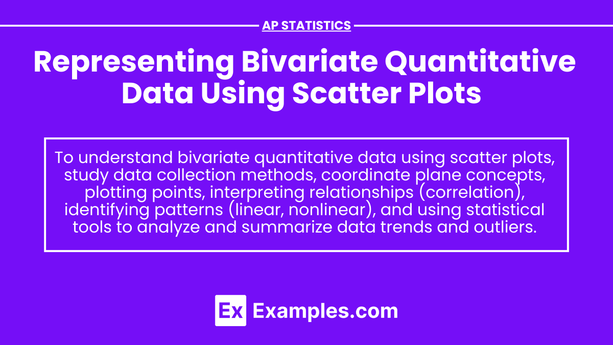

Representing Bivariate Quantitative data using scatter plots

In AP Statistics, scatter plots are a crucial tool for visualizing the relationship between two quantitative variables. Each point on the scatter plot represents an observation in the data set, with one variable on the x-axis and the other on the y-axis. Scatter plots help identify patterns, trends, and potential outliers, providing a clear visual representation of correlation and aiding in the analysis of linear or non-linear relationships. Understanding scatter plots is essential for interpreting bivariate quantitative data effectively.
Learning Objectives
By studying scatter plots in AP Statistics, I will learn to visualize the relationship between two quantitative variables effectively. I will plot data points to identify patterns, trends, and outliers, and understand the concepts of positive, negative, and no correlation. I will also gain skills in interpreting linear and non-linear relationships, which will enhance my ability to analyze bivariate data. Mastering scatter plots will be crucial for my overall understanding of statistical data representation.
Introduction to Scatter Plots
Scatter plots are a fundamental tool in statistics used to display the relationship between two quantitative variables. Each point on the scatter plot represents a pair of values from the data set.
Purpose of Scatter Plots
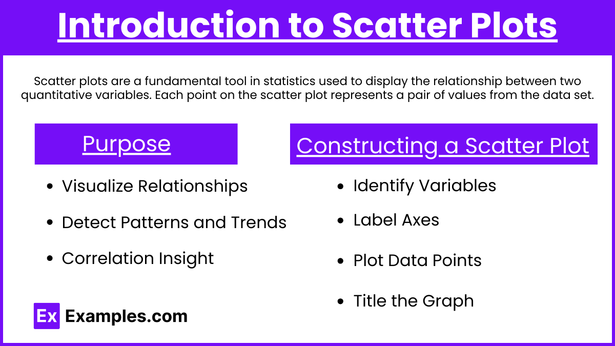
Visualize Relationships: Scatter plots help identify the type and strength of relationships between two variables.
Detect Patterns and Trends: They can reveal trends, clusters, and potential outliers.
Correlation Insight: Scatter plots provide a visual representation of correlation between variables.
Constructing a Scatter Plot
Steps to Construct a Scatter Plot
Identify Variables: Determine which variable is independent (x-axis) and which is dependent (y-axis).
Label Axes: Clearly label each axis with the variable name and units.
Plot Data Points: For each pair of values, plot a point where the x-value corresponds to the independent variable and the y-value corresponds to the dependent variable.
Title the Graph: Add a descriptive title to the scatter plot.
Interpreting Scatter Plots
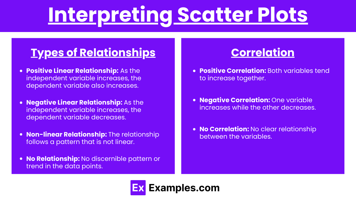
Types of Relationships
Positive Linear Relationship: As the independent variable increases, the dependent variable also increases.
Negative Linear Relationship: As the independent variable increases, the dependent variable decreases.
Non-linear Relationship: The relationship follows a pattern that is not linear.
No Relationship: No discernible pattern or trend in the data points.
Correlation
Positive Correlation: Both variables tend to increase together.
Negative Correlation: One variable increases while the other decreases.
No Correlation: No clear relationship between the variables.
Examples of Scatter Plots
Example 1: Height vs. Weight
Data: A sample of 10 individuals with their heights (in inches) and weights (in pounds).
Interpretation: There appears to be a positive linear relationship between height and weight.
Example 2: Hours Studied vs. Exam Score
Data: A sample of 10 students with the number of hours studied and their exam scores.
Interpretation: There appears to be a positive linear relationship between hours studied and exam scores.
Example 3: Temperature vs. Ice Cream Sales
Data: A sample of 10 days with the daily temperature (in °F) and ice cream sales (in dollars).
Interpretation: There appears to be a positive linear relationship between temperature and ice cream sales.
Example 4: Age vs. Reaction Time
Data: A sample of 10 individuals with their ages and reaction times (in seconds).
Interpretation: There appears to be a negative linear relationship between age and reaction time.
Example 5: Advertising Expenditure vs. Sales Revenue
Data: A sample of 10 companies with their advertising expenditure (in dollars) and sales revenue (in dollars).
Interpretation: There appears to be a positive linear relationship between advertising expenditure and sales revenue.
Multiple-Choice Questions
Question 1
Which of the following best describes a scatter plot? a) A graphical representation of the frequency distribution of a single variable. b) A table used to display the frequency distribution of two categorical variables. c) A graphical representation of the relationship between two quantitative variables. d) A bar graph used to compare different categories of a single variable.
Answer: c) A graphical representation of the relationship between two quantitative variables.
Explanation: Scatter plots specifically show how two quantitative variables relate to each other by plotting data points on a two-dimensional graph.
Question 2
In a scatter plot showing a positive linear relationship, as the values of the independent variable increase, the values of the dependent variable: a) Decrease. b) Remain constant. c) Increase. d) Show no pattern.
Answer: c) Increase.
Explanation: A positive linear relationship means that as one variable increases, the other variable also tends to increase.
Question 3
Which of the following indicates a strong negative correlation between two variables in a scatter plot? a) The points form a pattern that slopes upward from left to right. b) The points form a pattern that slopes downward from left to right. c) The points are scattered with no discernible pattern. d) The points form a perfect horizontal line.
Answer: b) The points form a pattern that slopes downward from left to right.
Explanation: A negative correlation is indicated when one variable increases while the other decreases, creating a downward slope.