
Representing Data Using Tables Or Graphs

In AP Statistics, representing data using tables or graphs is essential for data analysis and interpretation. This topic involves learning how to effectively organize and display data using frequency tables, bar charts, pie charts, histograms, boxplots, scatter plots, and line graphs. Mastering these techniques helps in visualizing trends, patterns, and relationships within datasets, making complex data more understandable. By understanding how to create and interpret these representations, students can better communicate statistical findings and draw meaningful conclusions from data.
Learning Objectives
By studying how to represent data using tables or graphs, you will learn to organize and display data effectively. You will master creating frequency tables, bar charts, pie charts, histograms, boxplots, scatter plots, and line graphs. You will understand how to interpret these visualizations to identify trends, patterns, and relationships within datasets. This knowledge will help you communicate statistical findings clearly and draw meaningful conclusions from data, enhancing your analytical skills for the AP Statistics exam.
Importance of Data Representation
Data representation helps in visualizing trends, patterns, and relationships within biological data.
Effective use of tables and graphs simplifies complex data, making it easier to interpret and analyze.
It aids in presenting research findings clearly and concisely.
Types of Data Representation
Tables
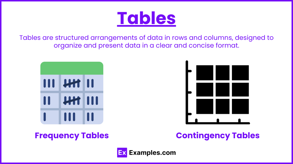
Frequency Tables: Display the number of occurrences of each category or value in a dataset.
Contingency Tables: Show the frequency distribution of variables and are used to examine the relationship between categorical variables.
Graphs for Categorical Data
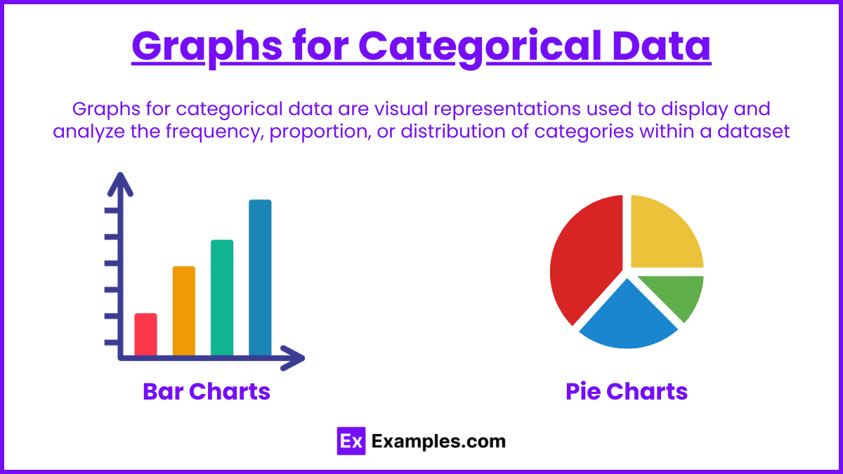
Bar Charts: Use bars to represent the frequency or proportion of categories. Bars can be displayed vertically or horizontally.
Pie Charts: Represent the relative frequencies of categories as slices of a pie, with each slice proportional to the category's frequency.
Graphs for Quantitative Data
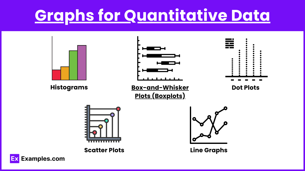
Histograms: Use bars to represent the frequency distribution of quantitative data. Each bar represents an interval (bin) of values.
Box-and-Whisker Plots (Boxplots): Display the five-number summary (minimum, first quartile, median, third quartile, and maximum) of a dataset, highlighting the spread and potential outliers.
Dot Plots: Use dots to represent individual data points along a number line, showing the distribution of a small dataset.
Scatter Plots: Display the relationship between two quantitative variables by plotting data points on a Cartesian plane.
Line Graphs: Connect data points with lines to show trends over time.
Other Graphical Representations
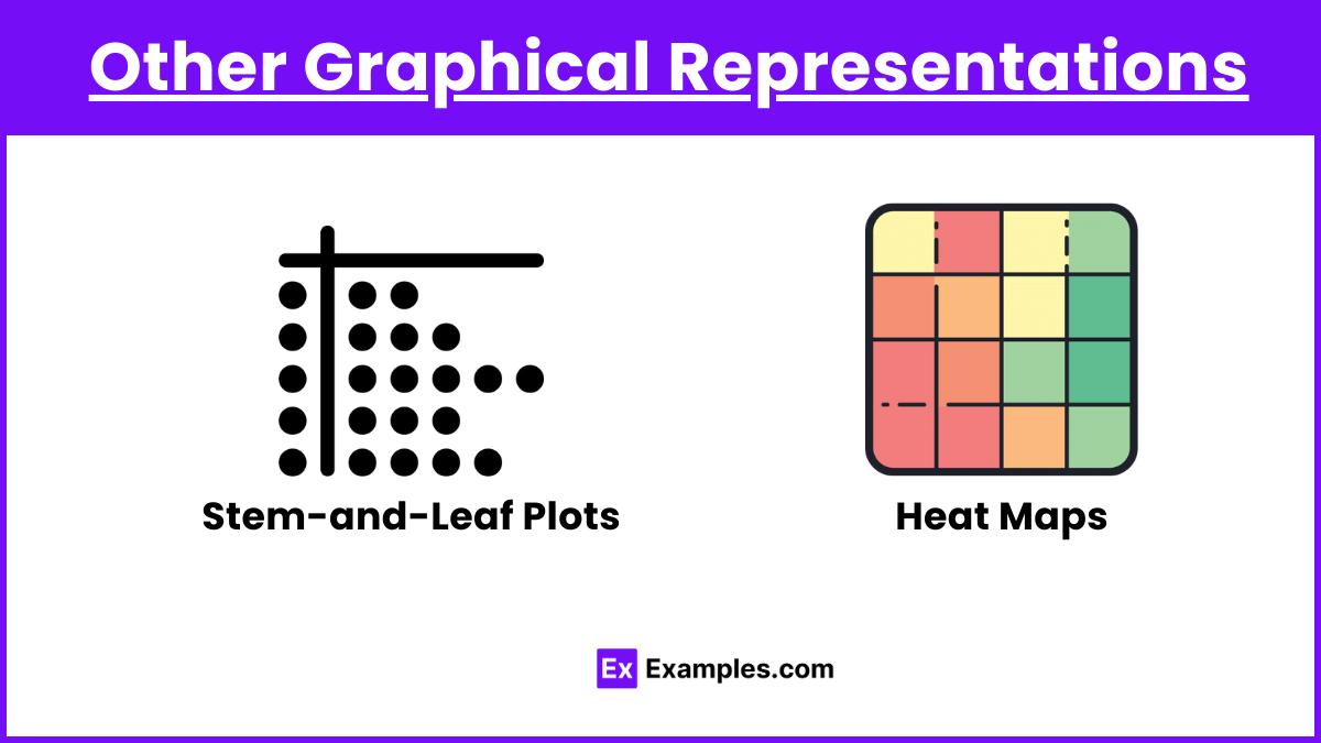
Stem-and-Leaf Plots: Split data values into a "stem" and "leaf" to display data distribution.
Heat Maps: Use color gradients to represent data values, often used to show gene expression levels.
Creating Effective Tables and Graphs
Components of a Good Graph
Title: Clearly describes what the graph represents.
Axis Labels: Indicate what each axis measures, including units.
Scale: Properly spaced intervals on the axes to accurately represent data.
Legend: Explains symbols, colors, or patterns used in the graph.
Data Points/Bars: Accurately plotted and clearly visible.
Grid Lines: Optional but can help in reading values from the graph.
Tips for Creating Effective Tables
Organize data in a clear and logical manner.
Include descriptive column and row headers.
Use appropriate units of measurement.
Highlight important data points or trends if necessary.
Examples
Example 1: Bar Chart
Data: Favorite fruit among students (Apple, Banana, Orange, Grapes).
Graph: A vertical bar chart with bars representing the count of students for each fruit.
Significance: Easy comparison of category frequencies.
Example 2: Pie Chart
Data: Market share of different smartphone brands.
Graph: A pie chart with slices representing the percentage of market share for each brand.
Significance: Visual representation of parts of a whole.
Example 3: Histogram
Data: Test scores of students.
Graph: A histogram with bars representing the frequency of scores in intervals (bins).
Significance: Shows the distribution of continuous data.
Example 4: Boxplot
Data: Heights of basketball players.
Graph: A boxplot displaying the five-number summary and potential outliers.
Significance: Highlights the spread and central tendency of the data.
Example 5: Scatter Plot
Data: Relationship between hours studied and test scores.
Graph: A scatter plot with points representing pairs of study hours and corresponding test scores.
Significance: Shows the correlation between two quantitative variables.
Multiple Choice Questions
Question 1: Which graph is best for displaying the frequency distribution of a quantitative variable?
A. Bar chart
B. Pie chart
C. Histogram
D. Segmented bar chart
Answer: C. Histogram
Explanation: A histogram is best for displaying the frequency distribution of a quantitative variable, as it groups data into intervals (bins) and represents the frequency of data within each interval.
Question 2: What does a boxplot display?
A. The relative frequencies of categories
B. The five-number summary of a dataset
C. The relationship between two quantitative variables
D. The frequency of individual data points
Answer: B. The five-number summary of a dataset
Explanation: A boxplot displays the five-number summary (minimum, first quartile, median, third quartile, and maximum) of a dataset, highlighting the spread and potential outliers.
Question 3: Which graph type is most appropriate for showing the relationship between two quantitative variables?
A. Pie chart
B. Bar chart
C. Scatter plot
D. Histogram
Answer: C. Scatter plot
Explanation: A scatter plot is most appropriate for showing the relationship between two quantitative variables, as it plots data points on a Cartesian plane to reveal any correlations or patterns.