8+ A4 Brochure Examples to Download
Brochures are often overlooked by some business entities because most of them focuses on other promotional materials such as elegant flyers and simple banners to allure people to buy their products and services. However, brochures are of equivalent value as those promotional materials as they serve as a guide to the customers for the specific products and services that a company is offering. Brochures are also a way to get people acquainted and have an overall glance to the offers of a certain business entity. Hence, companies who understood their importance put an equal effort to all their promotional tools because they know that each of the tools is like a part of a system of a body that will not function well without the other. Thus, if you are all set to start your business and you need to market your products and services, know well what are the promotional materials that you might need for your advertisement, with brochures as being one of those.
To help you in designing your brochures, the next sections provide you awesome brochure designs that will surely meet your preferences for your business brochure. You may also check over other brochure designs as well:
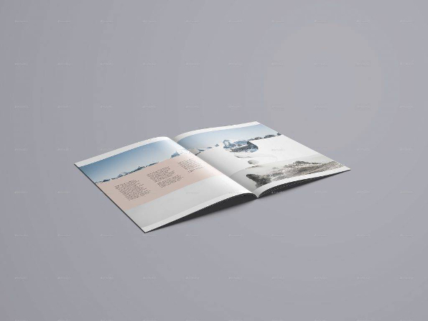
A4 Brochure Mockup
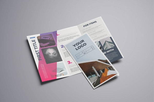
Gradient A4 Tri-Fold Brochure
Common Pitfalls When Creating Brochures (and How to Avoid Them)
While creating a best brochure especially in today’s digital generation, we are all utilizing our resources as much as possible to make a piece of paper in our hands containing the products and services offered by our companies become real and convey an emotion to the readers. Though you might think that this is quite simple, well, think again. There are two broad reasons that you must satisfy in order for you to have a successful brochure and those are introducing your products and services to the potential customers and turning prospects into actual buyers. Bridging the prospects to become a buyer might be a challenging one, and that is the reason why you must work hard on your brochures.
However, as you work full time in creating a striking brochure, there are common pitfalls that you may encounter along the way that, when overlooked, would lead to a failure in your brochure design making it ineffective and just a waste of time, effort, and money. Many companies would usually stumble on this pitfalls and regret that they have never been educated about these things.
Below are the common pitfalls that every company and brochure designer might encounter which must be prevented or avoided. You must always remember and familiarize them for they always come in a very subtle way.
1. No Definite Purpose
Your brochure must have a definite purpose or the thing that you are trying to achieve. You must identify what you want from the customers or how do you want the customers to respond. For example, you may want them to call you or send you a mail or you may want to visit your site personally. You must also determine if your brochure’s purpose is to educate the reader, promote a certain product or service, build customer trust and loyalty in your company, or establish branding for your business. You must have these goals set in mind as you make your brochure in order for you to have a determination to achieve that goal. You may also see advertising brochure examples
A4 3-Fold Brochure Mockup

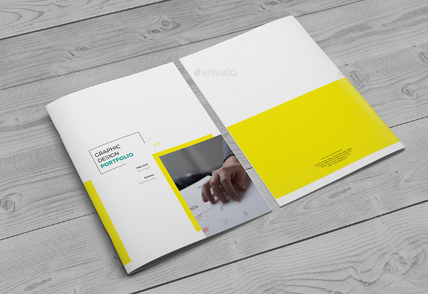
Simple A4 Brochure
2. No Insight on the Target Market
The next pitfall that a designer usually commits is having no insight on the target market. This is somewhat related to the previous pitfall. You must address to the following questions in order for you to avoid this pitfall:
- Who is your target market?
- Who are your end users?
- What are their problems that only your products and services can solve or satisfy?
- What might be the possible queries that potential customers might ask?
- What benefits can people get when they buy your products or services?
You may also like examples of bi-fold brochure design
3. Trying to be a Pro on Graphic Designing
Excluding graphic designers and graphic artists, if you are well aware that you are not a pro in the field of digital designing and are just trying to be one, never attempt to design for your brochures. You are just sacrificing the quality of your work and you are just gambling the presentation of your brochure design. Though sometimes it will work, most of the time, it will not. Your design will just end up being ineffective and would result in less sales and business opportunities for the company. Better consult an expert when it comes to graphic designing so you will have the peace of mind in the overall look of your brochure.
Filing Strip for A4 Brochures and Catalogues

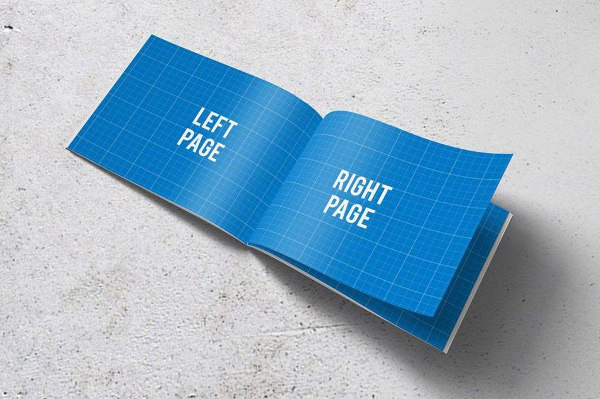
A4 Horizontal Brochure Mockups
4. Budget Cut for Photos
There are times when a company cut their costs for photos. Although using stock photos is a great idea to cut costs, there are photos that are pixelated and have poor quality. Also, using photos for the sake of having one is a big no. Your photos must be related to your brochures and what you are trying to convey as photos can tell a story even at just one glance. Using a photo perfect for your products and services will help you convey your message to the readers more effectively and more clearly. You need have to include as many photos as you can: only those that you think is needed and is a perfect fit for what you are offering to the market. You may also check out examples of service brochures
5. Trying to Include Everything
The products and services that you must place in your brochure must complement well with each other. You must not try to include everything in a single brochure, and never try to do it just to impress all of the readers. Always remember that you cannot impress everybody. One person might get interested with a certain product while other person might be interested in another. You cannot please everyone, as they say. So, just stick with your target market and the things that are primarily needed by them. Also, it is a common dictum for business entities that when you try to interest everyone, you will end up interesting no one. You may also like tri-fold brochure designs & examples
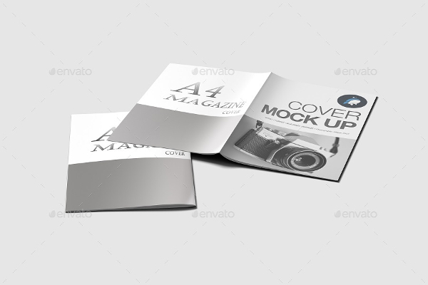
Editable A4 Brochure Mockup
6. Not Disseminating the Brochures
Never be too conservative with your brochures; once you have them, search and invent ways and means on how to disseminate them to the public, especially to your target market. Hoarding your own brochures can only cause a slack and delay to your potential sales. Hence, as a remedy you may include your brochures along with the delivery of the product, you may include them in emails, pass them out during an exhibitions or trade shows, or hand them out to people walking along the busy streets and public places. But always take note that while you are disseminating your brochure, ensure that you are handing them to your target market. You may also see examples of business brochure design
7. Too Concerned with the Looks and Forgetting the Sales Objectives
Sometimes, companies will be too overwhelmed in the creation and design of their brochures that they forget their sales objectives in the first place. This is very common especially to small business firms where the designer of the brochure is also part of the management team. With the many tasks assigned to him or her, the focus might be shifted to the looks of the brochure, including the design and layout, but they have forgotten that they still have many sales objectives to achieve. As a solution, one must not forget and take away the company’s focus on the sales objectives and other goals by constantly reviewing and checking what else is needed to achieve the objectives of a company. You may also like travel brochure designs & examples
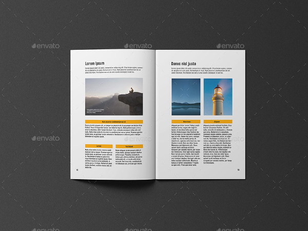
A4 Brochure and Catalogue Mockup
8. Taking Brochure as Your Entire Marketing Plan
No, your brochure is not your entire marketing plan, rather, it is just part of the many plans that a company must have. It is also just a part of the marketing strategies. Even though it is a very important one, other marketing tools have their own functions as well, and you must not underestimate their purpose for the overall achievement of a company’s objectives and goals. Other marketing tools that are commonly used but with equal importance with each other are flyers, creative posters, effective banners, simple billboards, and fashion catalogs.
9. Not Asking for Feedback
This is a most usual pitfall that many companies commit. After printing and disseminating the brochure, many would think that it is the end of the story. They have forgotten that they still need to reinforce those marketing materials for them to assess what are the things that they still need to enhance, improve, upgrade, change, or totally remove. By gathering customer feedback, they will know their strengths and weaknesses, as well as their lapses, and make ways on how to address them. Accepting feedback from customers is also a way of recognizing imperfections from your previous works and realizing that you have a lot of rooms for improvement. In this way, your company will achieve growth especially in marketing areas. You may also see event brochure designs & examples
Minimalist A4 Brochure or Catalog Mockup
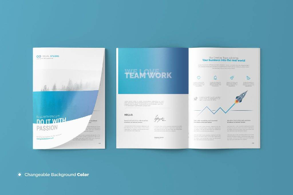
Minimalfolio Photography Portfolio A4 Brochure

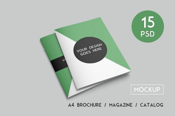
A4 Brochure and Magazine Mockups
In a Nutshell…
At this point, you might already have sufficient knowledge to get started with your modern brochures. Given the examples of A4 brochures given above, you are fully equipped and are ready to customize your own brochure.
But, you must not forget that there are still pitfalls that even those who are making brochures for a long time may fail to recognize and among the popular ones are as follows: no definite purpose for your brochure, no insight on the target market, trying to be a pro in graphic designing, cutting budget for the photos, trying to include everything in one brochure, not disseminating the brochures, too concerned with the looks of the brochures rather than the sales objectives, taking brochure as the entire marketing plan, and not asking for the feedback of customers. These are the pitfalls that you must avoid to achieve a presentable and striking brochure. You may also like InDesign brochure examples.


