Dashboard – Examples, Meaning, and Uses
A dashboard is a visual display tool that consolidates and organizes key performance indicators (KPIs), metrics, and data points on a single screen. It provides an at-a-glance view of an organization’s performance, enabling quick and informed decision-making through real-time data visualization and analysis.
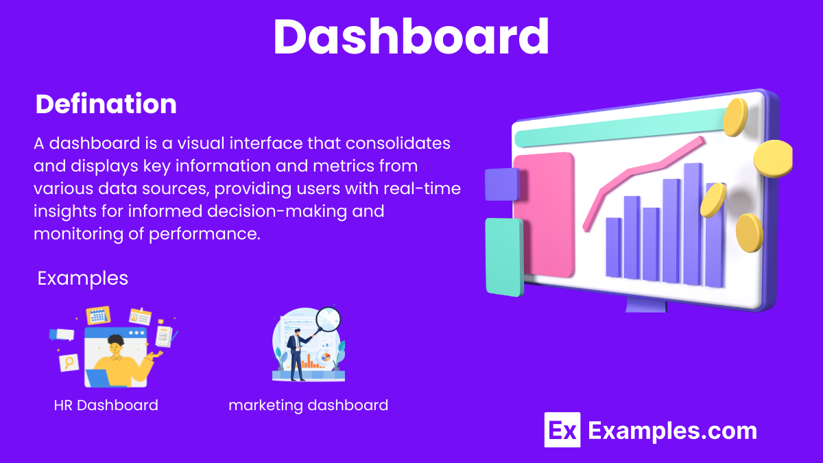
What is a Dashboard?
A dashboard is a visual tool that displays key performance indicators (KPIs) and metrics in an interactive, easy-to-understand format. It consolidates data from multiple sources, providing real-time insights to help businesses monitor performance, make informed decisions, and achieve strategic objectives efficiently.
Examples of Dashboards

What is the Use of a Dashboard?
A dashboard is an essential tool for businesses and organizations to monitor, analyze, and manage various aspects of their operations effectively. Here are key uses of a dashboard:
1. Real-Time Data Monitoring
- Provides up-to-date information on key performance indicators (KPIs).
- Allows for immediate response to changes and issues.
2. Informed Decision-Making
- Consolidates data from multiple sources into a single view.
- Facilitates data-driven decisions by presenting relevant metrics clearly.
3. Performance Tracking
- Tracks progress towards goals and objectives.
- Highlights areas of success and identifies areas needing improvement.
4. Efficiency and Productivity
- Streamlines reporting processes by automating data collection and visualization.
- Saves time by reducing the need for manual data analysis.
5. Enhanced Communication
- Improves transparency within the organization by sharing insights with relevant stakeholders.
- Promotes accountability by making performance data accessible.
6. Trend Analysis
- Helps identify trends and patterns over time.
- Enables proactive planning and forecasting based on historical data.
7. Customization and Flexibility
- Can be tailored to meet specific business needs and priorities.
- Offers interactive features to drill down into detailed data.
8. Competitive Advantage
- Provides insights that help stay ahead of the competition.
- Enables quick adaptation to market changes and business environments.
Differences between reports and dashboards
| Aspect | Reports | Dashboards |
|---|---|---|
| Purpose | Provide detailed analysis and comprehensive data | Offer a high-level overview of key metrics and trends |
| Data Presentation | Typically static, historical data | Interactive, real-time data visualization |
| Frequency | Generated periodically (e.g., daily, weekly, monthly) | Continuously updated |
| Interactivity | Limited interactivity, often read-only | Highly interactive with drill-down capabilities |
| Complexity | Detailed and comprehensive | Simplified and focused |
| Customization | Customizable but often time-consuming | Easily customizable with drag-and-drop features |
| Audience | Detailed analysis for specific departments or tasks | Broad audience, including executives and managers |
| Focus | In-depth analysis and specific insights | Quick monitoring and decision support |
| Usage | Used for in-depth reviews and audits | Used for ongoing performance tracking and management |
| Examples | Financial reports, audit reports, project reports | Sales dashboards, marketing dashboards, executive dashboards |
What makes a good dashboard?
- Key Metrics: Displays the most important and relevant metrics, focusing on critical data points essential for decision-making and performance monitoring.
- Clarity: Clear and concise visualization ensures that information is easily understood, avoiding clutter and complexity that can overwhelm users.
- Real-Time Data: Incorporating real-time data provides up-to-date insights, enabling timely responses to changes and making informed decisions quickly.
- Customizability: A good dashboard is customizable, allowing users to tailor the display to their specific needs and preferences, enhancing usability.
- Interactivity: Interactive elements, such as drill-downs and filters, enable users to explore data in-depth and gain more detailed insights.
- User-Friendly Design: An intuitive and user-friendly design ensures that the dashboard is accessible to all users, regardless of their technical expertise.
- Data Integration: Seamlessly integrating data from multiple sources provides a comprehensive view, ensuring all relevant information is consolidated in one place.
- Consistency: Consistent use of colors, fonts, and layout helps users quickly interpret and understand the data, maintaining a cohesive look and feel.
- Performance: Efficient performance, with fast loading times and responsive interactions, ensures that users can access and use the dashboard without delays.
- Security: Strong security measures protect sensitive data, ensuring that only authorized users can access and interact with the dashboard.
Adjust and data dashboards for app marketers
Data dashboards for app marketers provide a powerful tool for tracking and analyzing key performance metrics. These dashboards display essential metrics such as user acquisition, retention rates, and in-app engagement, helping marketers understand user behavior and app performance. Clear and concise visualizations ensure that information is easily understood, while real-time data offers up-to-date insights for timely decision-making. Customizable features allow marketers to tailor the dashboard to their specific needs, enhancing usability. Interactive elements like drill-downs and filters enable a deeper exploration of data, providing detailed insights. A user-friendly design ensures accessibility for all team members, regardless of technical expertise. Integrating data from multiple sources offers a comprehensive view, consolidating all relevant information in one place. Consistency in colors, fonts, and layout helps in quickly interpreting data, maintaining a cohesive look and feel. Efficient performance ensures fast loading times and responsive interactions, while strong security measures protect sensitive data, ensuring that only authorized users can access the dashboard.
The Overview dashboard
The overview dashboard provides a high-level snapshot of key performance indicators (KPIs) and metrics, offering real-time insights into overall business performance. It consolidates data from various sources, enabling quick monitoring, trend analysis, and informed decision-making, essential for strategic planning and operational efficiency.
The Assists dashboard
The assists dashboard tracks and visualizes assistance metrics, such as support ticket resolutions, customer interactions, and response times. It provides real-time insights into team performance, helping identify areas for improvement, streamline processes, and enhance customer satisfaction by ensuring efficient and effective assistance.
What software is commonly used to create dashboards?
Popular software includes Tableau, Power BI, and Google Data Studio.
How often should a dashboard be updated?
Ideally, dashboards should be updated in real-time or at regular intervals depending on the data frequency.
What is a KPI in the context of a dashboard?
A KPI (Key Performance Indicator) is a measurable value that indicates how effectively an organization is achieving its objectives.
Can dashboards be customized?
Yes, dashboards can be tailored to meet specific user needs and business requirements.
What is data visualization?
Data visualization is the graphical representation of information and data using visual elements like charts, graphs, and maps.
Why is data visualization important in dashboards?
It makes complex data more accessible, understandable, and usable for decision-making.
Can dashboards be accessed on mobile devices?
Yes, many dashboard tools offer mobile-friendly versions for on-the-go access.
What are the benefits of using a dashboard?
Benefits include improved data visibility, enhanced decision-making, and increased efficiency.
What challenges might arise when implementing a dashboard?
Challenges include data integration, ensuring data accuracy, and user adoption.
How do you measure the effectiveness of a dashboard?
Effectiveness can be measured by user satisfaction, the accuracy of insights provided, and the impact on decision-making processes.
Share :
