Data Visualization – Examples, Types, Tools, Techniques, Importance
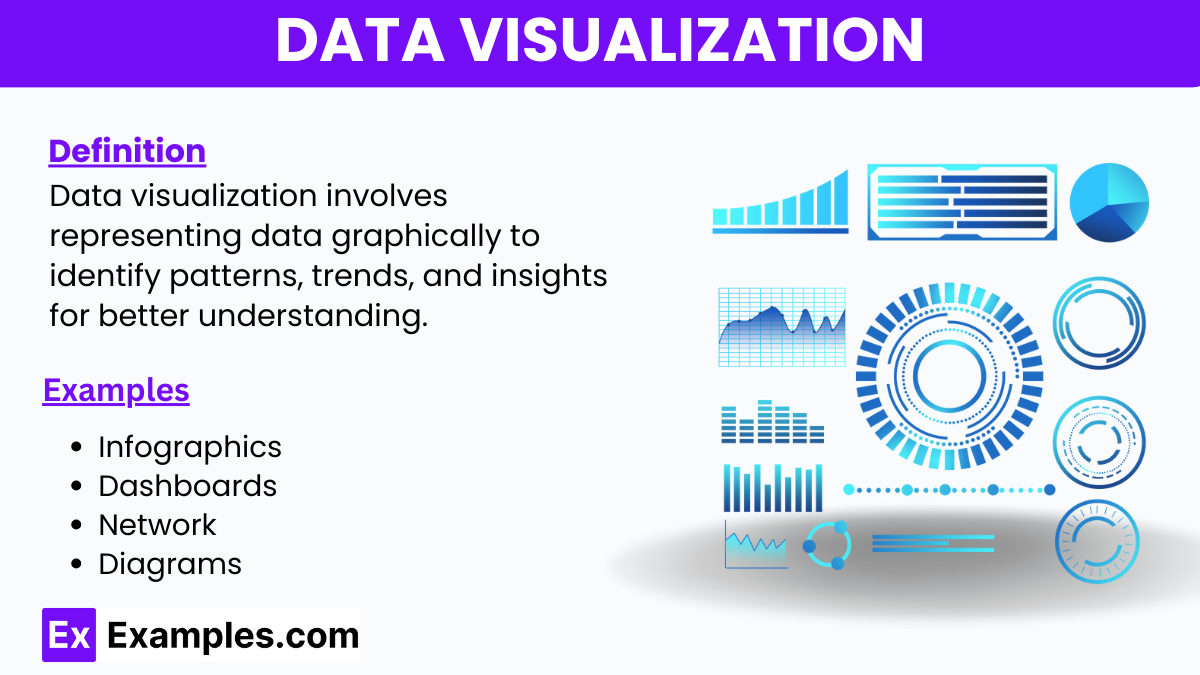
Data visualization is the graphical representation of quantitative data to help individuals easily understand complex datasets. By transforming numerical information into visual elements like charts, graphs, and maps, data visualization makes trends, patterns, and insights more accessible and comprehensible. This method is essential for making data-driven decisions in various fields, including business, science, and education. Effective data visualization enhances the ability to communicate findings clearly and intuitively.
What is Data Visualization?
Data visualization is the process of converting data into visual formats such as pie charts, bar graphs, and line graphs. This technique helps to illustrate complex information clearly and efficiently, making it easier to identify patterns, trends, and insights.
Data Visualization Examples
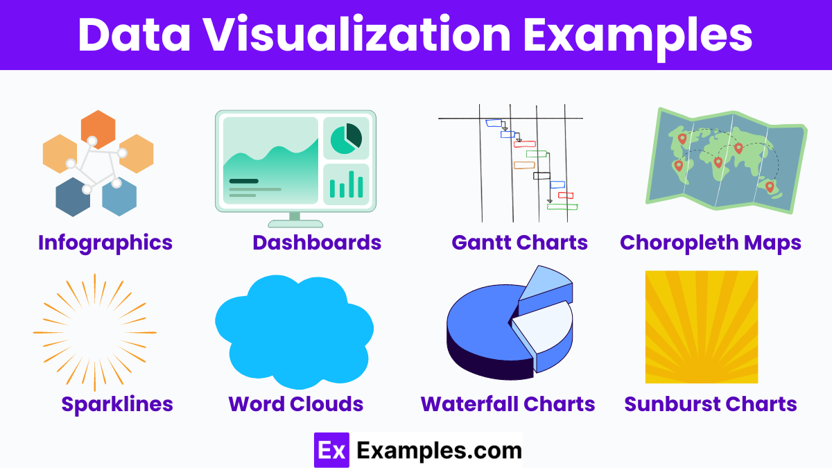
- Infographics: Combine images, charts, and minimal text to present complex data simply.
- Dashboards: Integrate various visualizations for real-time data monitoring.
- Gantt Charts: Manage project schedules and timelines.
- Choropleth Maps: Display data through varying shades of color on a map.
- Network Diagrams: Visualize relationships between entities in a network.
- Sparklines: Small, simple charts embedded in text to show trends.
- Word Clouds: Highlight the most frequent words in a text dataset.
- Waterfall Charts: Illustrate cumulative effects of sequentially introduced positive or negative values.
- Sunburst Charts: Represent hierarchical data in concentric circles.
- Bullet Graphs: Compare performance against a target.
Data Visualization Types
- Pie Charts: Pie Chart Represent parts of a whole.
- Bar Graphs: Bar Graphs Compare quantities across categories.
- Line Graphs: Line Graphs Show trends over time.
- Scatter Plots: Scatter Plots Display relationships between variables.
- Histograms: Histograms Illustrate data distribution.
- Heat Maps: Highlight data density.
- Area Charts: Area Charts Emphasize volume changes.
- Box Plots: Box Plots Summarize data spread.
- Bubble Charts: Bubble Charts Show relationships with bubble sizes.
- Tree Maps: Tree Maps Represent hierarchical data.
Data Visualization Tools
- Tableau: Popular for interactive, shareable dashboards.
- Microsoft Power BI: Integrates with Microsoft products, offering robust data analysis.
- Google Data Studio: Free tool for creating customizable reports.
- D3.js: JavaScript library for producing dynamic, interactive data visualizations.
- QlikView: Provides guided analytics and dashboards.
- Plotly: Enables creation of interactive graphs and charts.
- Chart.js: Simple yet flexible JavaScript charting for designers and developers.
- Infogram: Easy-to-use tool for creating infographics and reports.
- Looker: Data exploration platform for business intelligence.
- SAP Lumira: Combines visualizations with advanced analytics.
Data Visualization Software
- Tableau: Ideal for creating interactive dashboards and detailed visualizations.
- Microsoft Power BI: Integrates seamlessly with Microsoft products, perfect for business intelligence.
- Google Data Studio: Free tool for generating customized, shareable reports.
- D3.js: A JavaScript library for building dynamic, interactive visual representations.
- QlikView: Offers guided analytics and robust data exploration capabilities.
- Plotly: Enables the creation of highly interactive graphs and visual data insights.
- Chart.js: A simple yet powerful JavaScript tool for designing charts.
- Infogram: User-friendly software for developing infographics and visual reports.
- Looker: A comprehensive data exploration platform for business intelligence.
- SAP Lumira: Combines advanced analytics with versatile visualization options.
Data Visualization Techniques
- Color Coding: Uses different colors to represent various data points, making patterns and differences easily distinguishable.
- Interactive Dashboards: Allows users to interact with data, drill down into specifics, and view data from multiple perspectives.
- Annotations: Adds notes and explanations directly onto charts or graphs to provide additional context and insights.
- Small Multiples: Displays a series of similar graphs or charts side-by-side, allowing for easy comparison of multiple variables.
- Data Layering: Combines multiple types of data visualizations in one view to provide a comprehensive understanding of complex data sets.
Data Visualization Techniques in Data Mining
- Heat Maps: Highlight data density and patterns using color gradients, enhancing visual communication of complex datasets.
- Cluster Analysis: Groups similar data points together, making it easier to identify trends and relationships within large datasets.
- Decision Trees: Break down data into branches, simplifying the visual communication of decision-making processes.
- Parallel Coordinates: Represent multivariate data, allowing for the comparison of many variables simultaneously.
- Geographical Maps: Display data across different regions, providing a clear visual communication of spatial trends and patterns.
Data visualization in Data Science
Data visualization in data science transforms complex datasets into visual formats, facilitating easier understanding and analysis. It helps data scientists identify trends, patterns, and outliers quickly. Common techniques include scatter plots to show relationships, heat maps to highlight data density, and histograms to display frequency distributions. Effective data visualization enhances visual communication, enabling data-driven decision-making and clearer presentation of insights to stakeholders. Tools like Tableau, Power BI, and D3.js are frequently used for creating these visualizations.
What is Data Visualization in Python
Data visualization in Python involves using Python libraries to create visual representations of data. Popular libraries like Matplotlib, Seaborn, and Plotly help transform raw data into charts, graphs, and maps. These visual tools facilitate the understanding of complex datasets, making it easier to identify trends, patterns, and insights. Python’s versatility and the powerful features of these libraries make it a preferred choice for data scientists and analysts to enhance visual communication and data-driven decision-making.
Importance of Data Visualization
- Enhances Data Understanding: Data visualization simplifies complex data, making it easier to understand trends, patterns, and relationships at a glance.
- Facilitates Better Decision-Making: By providing clear insights, data visualization helps stakeholders make informed, data-driven decisions quickly and accurately.
- Improves Communication: Visual representations of data enhance communication and ensure that complex information is conveyed clearly and effectively to diverse audiences.
- Identifies Trends and Patterns: Visualization tools help in detecting hidden trends and patterns that may not be apparent in raw data, enabling deeper analysis and insights.
- Saves Time and Resources: By presenting data visually, it reduces the time needed to analyze information and allows for faster identification of key insights and actionable intelligence.
Benefits of Data Visualization
- Increases Engagement: Interactive visualizations capture attention and encourage users to explore data more deeply.
- Facilitates Storytelling: Helps narrate the story behind the data, making complex narratives more accessible and compelling.
- Enhances Data Accuracy: Visual tools can highlight data errors or anomalies that might be overlooked in raw datasets.
- Supports Predictive Analysis: Visualization aids in forecasting and predicting future trends by making historical data patterns more apparent.
- Promotes Data-Driven Culture: Encourages organizations to base strategies and decisions on data insights, fostering a culture of informed decision-making.
Why is data visualization important?
It simplifies complex data, helping to identify trends and insights quickly.
What tools are commonly used for data visualization?
Popular tools include Tableau, Power BI, and D3.js.
How does data visualization aid in decision-making?
It provides clear and immediate insights, facilitating informed decisions.
What are some common types of data visualizations?
Common types include bar graphs, line charts, pie charts, and heat maps.
Can data visualization be interactive?
Yes, interactive visualizations allow users to explore data in more depth.
How is data visualization used in business?
It helps in analyzing performance, identifying trends, and making strategic decisions.
What is the difference between data visualization and data analytics?
Data visualization is about presenting data visually, while data analytics involves analyzing and interpreting data.
How does color play a role in data visualization?
Color helps distinguish different data points and highlights important information.
What are infographics?
Infographics are visual representations that combine data with design to tell a story.
What is a dashboard in data visualization?
A dashboard is a collection of visualizations providing an overview of key metrics and data points.
Share :
