10+ Photography Sign Examples to Download
Click. Flash. Pose. That’s how it’s always been. The minute a camera points at someone, they never seem to shy away and hide their smile. That’s the magic of photography shoots; capturing the rawest emotions and seizing a single moment in one image. Pictures bring us back to our fondest memories, to the days when we weren’t so caught up in the madness of reality, and when color was swirling in the very air we breathe. Isn’t it funny? All the good times pass, so we take pictures to make them last a little longer. Photography lets people see the world in a different light and preserve longer-lasting moments. Just like photographs capture memories, signs capture messages that guide or inform people in different spaces. Today, creators often rely on sign templates to design visually appealing signs that communicate clearly and leave a lasting impression, much like a well-taken photograph.
Photography is an art form that combines creativity with science, capturing the bending and bouncing of light to produce pictures. It uses light-sensitive material to record images of people, moments, and events. The first permanent captured photo was taken in 1826 using big bulky cameras. Nowadays, almost everyone has a built-in camera in their phones to take pictures of everyday moments. People in astrological fields even use high-powered cameras to produce clear images of faraway celestial bodies in outer space. Many make photography business their career. If this is your forté, you should put up a sign for your photography business.
Look Back Through the Lenses
Professional photographers of the modern era use all kinds of cameras to get the perfect picture. You can also see them carrying all sorts of lenses to weddings and other events. But did you know that the first cameras didn’t even capture permanent photos? They just projected them upside down on a different surface. It wasn’t until the 1830s when the first long-lasting photo was created. This then led to numerous advancements in the mid to late 1800s. Film cameras were then introduced in the 1880s by George Eastman, the founder of Kodak. Decades later, we now enjoy the many advances in cameras and photography.
10+ Best Photography Sign Examples and Templates
Photography flyers, posters, and signages are a big help to your business. To invite people to get you to take their portraits, here are multiple best photography sign examples and templates you can use.
1. Roll Up Banner Signage Template

2. Free Business Sign Template

3. Photography Billboard Template

4. Photography Business Poster Template

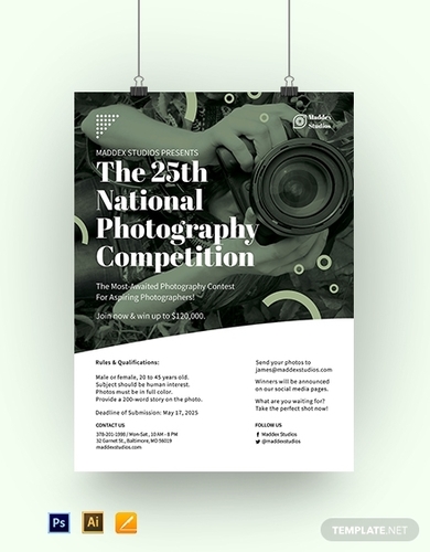
5. Photography Competition Poster Template

6. Professional Photography Roll Up Signage Template

7. Creative Photography Roll Up Banner Template

8. Collage Photography Roll Up Signage Template

9. Simple Photography Roll-Up Banner Template

10. Free Photography Roll Up Signage Template

11. Photography Notice Sign
Making it Picture Perfect
Capturing photos just takes a click of a button. But the best photographers know that there is more to the art than just shooting a scenic view. No matter how aesthetically pleasing your social media pics are, thousands of likes and comments don’t make you an expert. Professionals study and practice many tricks and techniques to hone their craft. Fancy cameras and high-tech lenses are good and all, but what makes a photographer is his style and skill. If you want to develop your skills in photography, these techniques can help you.
1. Rule of Thirds
In photography, make sure your images don’t look forced and boring. As a way to give the photo a more natural feel, don’t place your subject directly in the middle. This photography technique called the rule of thirds theorizes that an uncentered subject gives the photographer more opportunities to take advantage of the negative space. Imagine the object behind a grid composed of two horizontal and vertical lines. Align the image’s focal points with the intersections then press click. This rule can be your excuse to capture more compelling images from different angles.
2. Meet Me in the Middle
If the previous technique says to keep your subject away from the middle, this time, do the opposite. Some subjects are best photographed when they are front and center. If this is the case, you need to make sure that the focus point is centered, and there is symmetry to keep the visual balance of the picture. You’ll find in architecture magazines that this technique works best with landmarks and roads. The use of this technique lets the photographer capture various details that the viewer might have to focus on.
3. An Overlapping of Scenes
Giving your image layers helps viewers explore the details of the subject, its surroundings, and the distance of landscapes. By adding layers, you get to add depth to your image. If you add foreground interest to your photograph, you give the scene a three-dimensional feel to it. This technique works really well with wide-angle lenses. Layering also challenges the perspectives of the elements within the picture, making for an intriguing result. Photographers use this technique to lead viewers through the image. An image with more than once subject lets you bounce off one detail to the next.
4. This Way Please
When you see a trail, your eyes usually follow where it leads and then fixes your gaze to its focal point. That’s just basic human instinct. In wedding photography, photographers use this curiosity to their advantage by taking pictures of the aisle and the bride. Elements called leading lines are exploited to guide the viewer through the image to the main subject. Leading lines take the form of roads, patterns on floors and walls, and other various elements. They don’t have to be straight; they just have to take the viewer to the focus point. Grab the viewer’s attention and guide them through the trees.
5. Blasting Colors
Creative brochures use colors to catch your attention. Colors give so much more life to an image; nevertheless, a way too colorful image isn’t always creative. It gives your picture so much noise. Good photographers make sure that the colors in their photographs complement each other. Contrasting colors provide the subject a lot more focus. Some images rely on contrast to give detail to the subject. The world is more than just black and white. But if you are planning on going monochromatic, a difference in shades can do you wonders. Just be careful with the dark parts, too much can be too heavy for the viewers.
6. No Mess, No Fuss
Beauty doesn’t have to be complicated. A beautiful photo of nature could simply be a flower among the greens. You just have to put the focus on your subject. That’s it. A noisy background could make your image too tiring to look at. This is also a good tip for beginners who think that super artsy photos are the essence of photography. Distracting elements can ruin your picture. A simple image lets you have more freedom with the negative space and bring your viewers directly to your subject. It can even boost your photography portfolio.
The good times and the chill vibes all fade away. Soon your greatest adventures will all just be memories hanging on to the hope of never forgetting. Remnants and traces of who you were and how you lived will be all that remains of you. One day you’ll catch yourself staring at old photographs and realize they’re all you have left. Pictures are as beautiful as the scenes they encapsulate; that’s the power of photography. Capture your best memories, let your portraits bear your biggest smiles, and savor every moment. Relive your life one snapshot at a time.


