19+ Pop-up Marketing Examples to Download
You visit a website you thought was interesting, but as you were about to navigate around the page, a floating box appears onscreen and obscures your view of the entire website. It tells you about the good stuff you could enjoy if you surrender your email address at its request. This modern advertising craze that many e-commerce sites have began using is known as pop-up marketing.
Learn more about pop-up marketing with the information provided below. You may also find examples and templates for your reference.
Essential Elements of a Pop-up Ad
A web page that uses pop-ups often sees more conversions than those without it. It’s a digital marketing technique that can help drive traffic to your website and boost sales. But to generate this type of response from an online audience, a well-designed and thoughtfully implemented pop-up is necessary.
Some of the vital components of a good pop-up ad include the following:
- Headline Copy: This should be clear, relevant, and specific. Attention-grabbing headlines that can pique one’s curiosity usually perform best.
- Headline Design: Once you have determined a good headline, focus on creating a design that will stand out from the page while also maintaining the readability of your copy. Certain font styles, colors, and line breaks can greatly influence the look of your text.
- Box Design & Images: Adding a relevant and appealing image to your pop-up can make a huge difference to your conversion rate. Thus, choosing the right colors, dimensions, and imagery is a task you shouldn’t take lightly.
- Form Field Labels: Pop-up ads usually contain some sort of form to collect personal data from site visitors. The last thing you would want to do is to discourage users from signing up, so you need to make sure that your field labels that are readable and properly aligned.
- User Escape Routes: Not everyone would want to sign up for an email newsletter, nor will they be interested to become a premium account holder of your site. Users must be given the option to decline an offer with the help of an exit button or link. Find out the best way to incorporate these escape routes by putting each option to the test.
- Body Copy: This element is completely optional, as there have been several cases where removing the entire body copy functions more effectively in lifting conversions. But if you hope to use one to describe benefits and features, or provide social proof for a particular offer, remember to convey this clearly and concisely.
- Call to Action: Don’t settle with the plain old “Submit” button copy. A more specific approach with copy options like “Download Now” or “Sign Me Up” will likely gain a better reaction from visitors.
- Action Button Design: Like other elements on this list, the only way to find out what the best action button design would suit your page and increase conversions is to test out different shapes, sizes, colors, texture, and any other attribute that’s within your control.
10+ Pop-up Marketing Templates
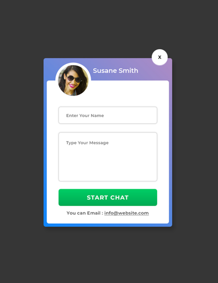
Website Chat Pop-up
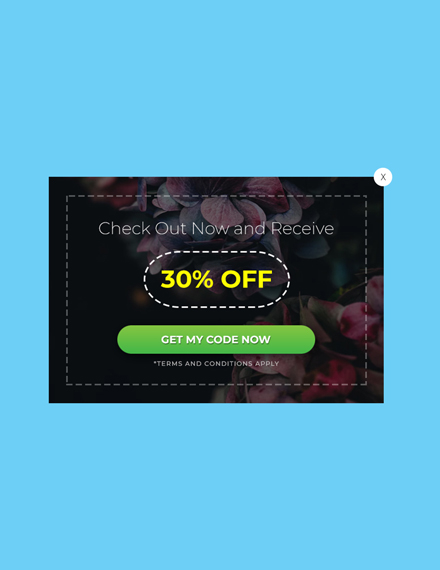
Website Coupon Pop-up
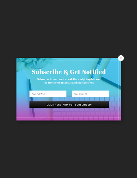
Website Email Subscription Pop-up
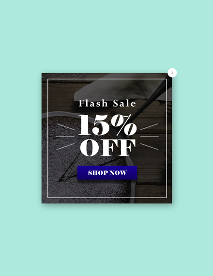
Website Flash Sale Pop-up
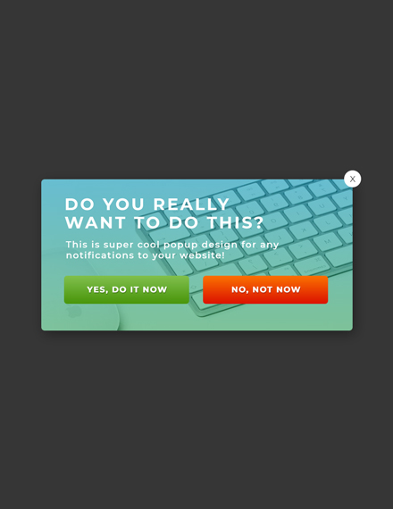
Website Modal Pop-up Notification
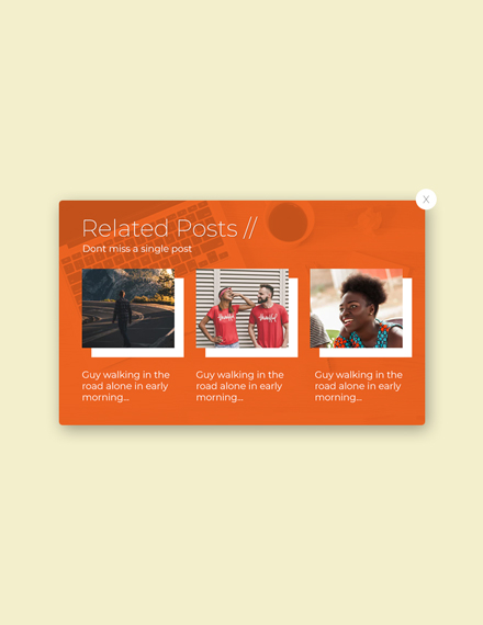
Website-Related Posts Pop-up
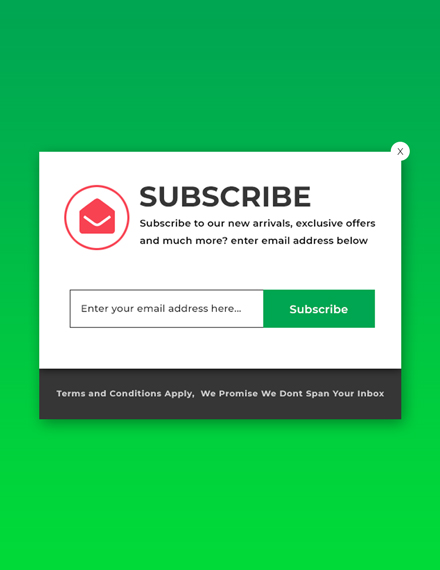
Website Subscribe Pop-up
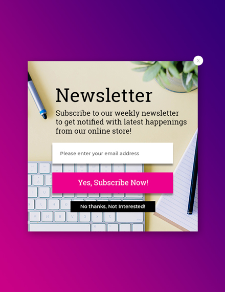
Website Subscription Pop-up
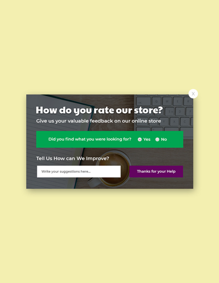
Website Survey Pop-up Template
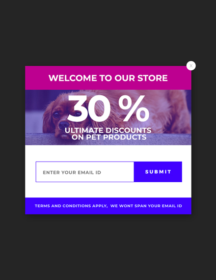
Website Welcome Pop-up
10+ Pop-up Marketing Examples
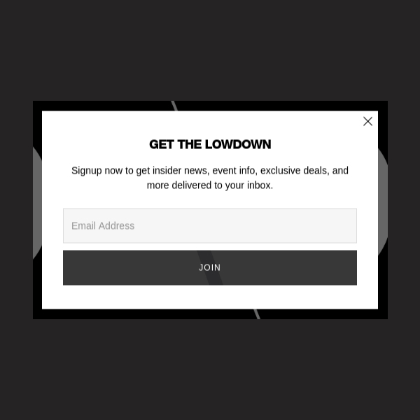
Skullcandy Pop-Up Marketing Ad
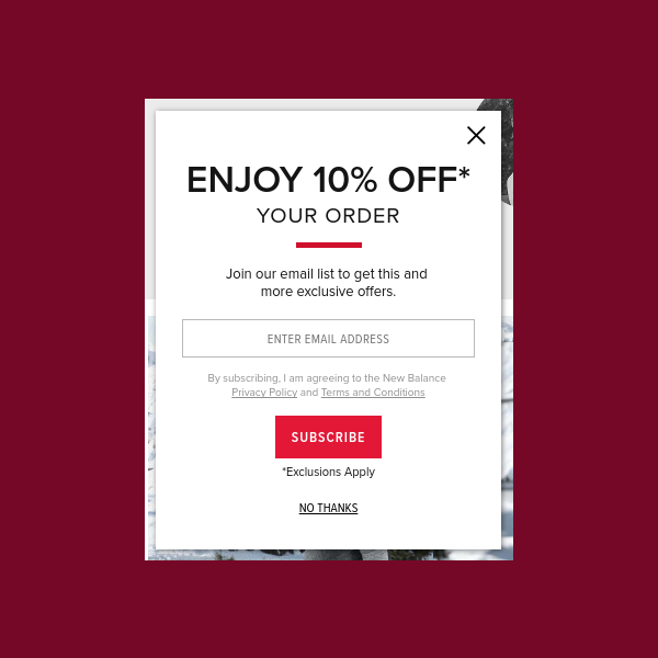
New Balance Pop-Up Marketing Ad
Merrell Pop-Up Marketing Ad
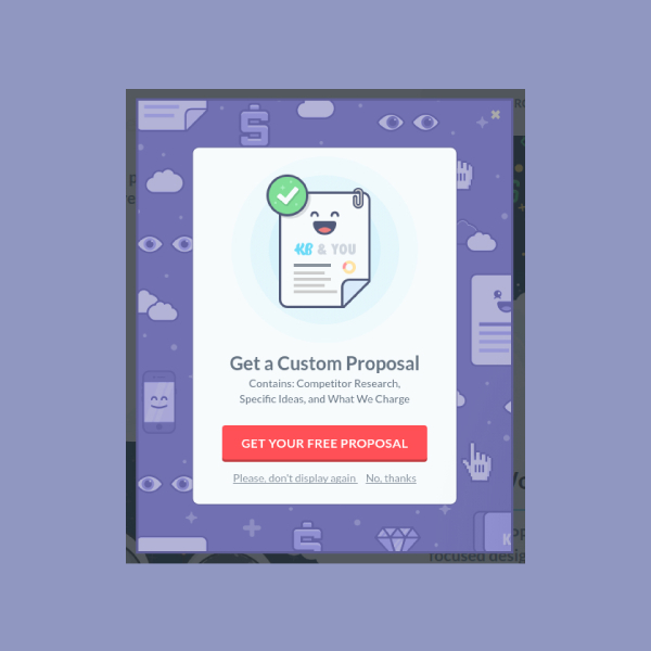
KlientBoost Pop-Up Marketing Ad
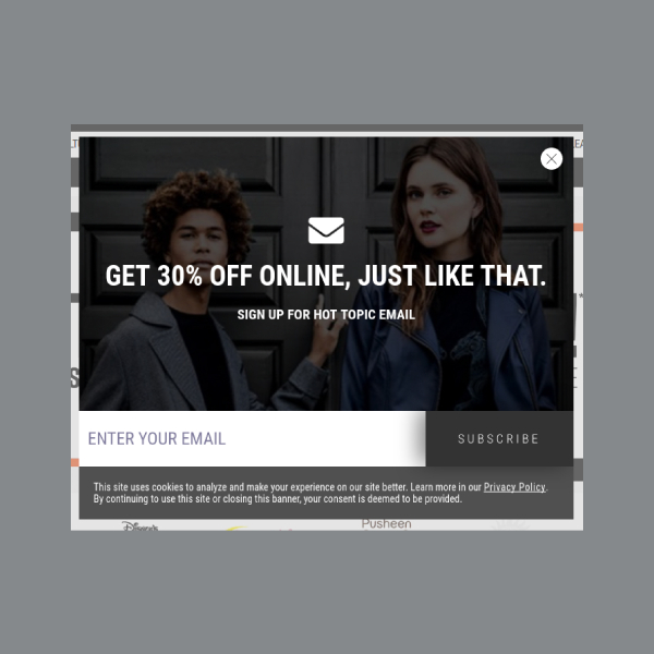
Hot Topic Pop-Up Marketing Ad
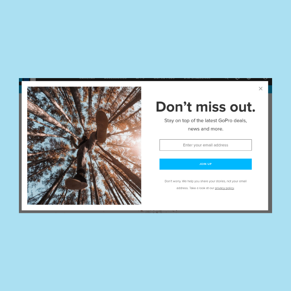
GoPro Pop-Up Marketing Ad
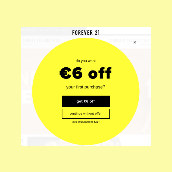
Forever 21 Pop-Up Marketing Ad
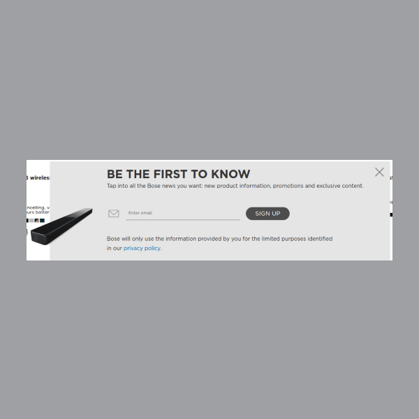
BOSE Pop-Up Marketing Ad
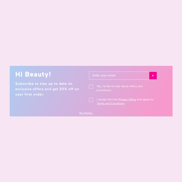
BH Cosmetics Pop-Up Marketing Ad
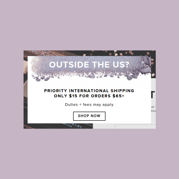
Anastasia Beverly Hills Pop-Up Marketing Ad
How to Create an Eye-Catching Pop-up Marketing Ad
Pop-up ads are a lot like advertising banners. Though they may not be a part of your main content, they can still attract attention and promote your product or service offers. But because they can be pretty annoying at times, creating an ad that’s worth a look should be every marketer’s priority.
- Create value: You have to give visitors a good reason to subscribe to your weekly newsletter or to create a personal account on your website. Not everyone will be too keen about receiving random product announcements every time they open their email, so the least you could do is to offer something valuable in return. This can be anything from a coupon code to a discount voucher.
- Select a format: Pop-up ads generally come in four different formats: the welcome mat, top banner, slide-in box, and overlay modal. This may also be utilized in a variety of ways—at the landing page, by scrolling to a certain point of the page, by hovering over a specific element, or even by staying for a particular amount of time on the web page. It’s best to choose a format that is likely to complement user activity.
- Master the science of technology: This goes beyond the visual element of your design. You see, the technical aspect of pop-up marketing can also be a money-making machine. Perhaps the modal closes a millisecond too slow, or maybe it closes too abruptly as opposed to how most users would prefer. A few glitches in the tool or plugin can also shape a visitor’s perception toward your website.
- Design your pop-up ad: Creating a beautiful design might seem like a great approach to pop-up marketing. But the truth is, the simplest designs often generate the best results. This covers the geometrical shape of the pop-up, the color, the wording, as well as the call to action. By sticking with the basics, you can limit a user’s choices to make it easier for them to decide.
- Conduct a test run: Finally, test out your design to see if it works. A trial and error operation might seem a bit time-consuming, but it’s one of the most efficient ways to assess which pop-up design will convert best.
Tips for Designing a Pop-up Marketing Layout
Pop-up ads usually vary in terms of purpose and design. No two pop-up ads are identical, as they may depend on factors like branding, marketing budget, target audience, and development resources. So to catch the eye of your visitors and encourage a desired response, here are a few design tips to consider:
- Make an irresistible offer: Most pop-up ads are only boring because they lack a gripping offer to entice consumers. The key is to leave a reputable impression and to make sure your visitors have a good user experience. The ad should include a promise and build a sense of urgency in order to appeal to customers.
- Use compelling imagery: It’s impossible to convert a potential customer into a buyer using a forced and unattractive pop-up. Ads like these often use a sales-like language that most people try to ignore. To stimulate a sense of excitement among users, try including high-quality images of your products, brand ambassador, and logo design.
- Leverage on a conversion-driven message: A visually pleasing pop-up design is worthless without a message that can elicit a response from viewers. Using a strategically written copy will help you connect with your audience on a more personal level. It should be enough to persuade visitors to respond in a certain way.
- Provide social proof: Many shoppers pay close attention to the reviews provided by other customers. It’s an asset that can help establish credibility and influence one’s buying decision in the marketplace. High-user ratings and user-generated feedback is sure to reinforce your company’s reputation.
- Consider proper timing and display: A pop-up shouldn’t be the first thing a user sees upon visiting your site. Instead, it is intended to capture a person’s attention just a few moments after. That way, visitors wouldn’t be too quick to leave the page.
Types of Pop-up Marketing
Let’s take a look at five common types of pop-up marketing ads:
- Click Pop-Ups: This usually activates when a visitor clicks on a particular link, image, or word on your website. Some marketers use a web banner as an invitation for such action, while others include a short sentence for a more subtle approach.
- Timed Pop-Ups: These pop-ups appear after a visitor has remained on the page or site for a designated amount of time. However, they’re also quite tricky to apply. Timing is a huge deal you wouldn’t want to mess up at any instance. It’s best to learn more about user activity to determine when your pop-up should be timed.
- Scroll Pop-Ups: This is a perfect alternative for timed pop-ups. These ads are set to appear once a visitor has scrolled down a certain percentage of your page. That way, you can ensure that users are actually invested in your content before you can enforce a lead-generating strategy.
- Entry Pop-Ups: Deemed as the most dangerous pop-up type, these ads appear as soon as the page or site has loaded. It makes the website seem a bit sketchy, but when applied correctly, they can be just as effective.
- Exit Pop-Ups: Thanks to mouse-tracking technology, this pop-up type can interrupt a user’s attempt to hit the “back” button on their browser. This may be your last chance to make a pitch with potential customers.
Pop-up Marketing FAQs
1. How can I make a pop-up ad?
The easiest way to make a pop-up ad is to use a browser plugin or third-party tool. You can design the layout of your advertisement, incorporate it into a code, and run it through your plugin. This allows you to test and retest your pop-up design to see which works best for your website. Proper placement and format must also be assessed to ensure the most beneficial results.
2. What is the purpose of a pop-up ad?
Pop-up ads are pop-up windows for advertising. While some users tend to disable them using ad blockers and the like, those who do get to encounter them are given the opportunity to score awesome discounted and limited deals offered by the advertiser. By clicking a link or filling a form, users are directed to a social media page, can subscribe to a newsletter, or register an account. This can help increase lead conversions and raise traffic to your website.
3. Why is pop-up marketing important?
Marketers are always looking for new ways to communicate with customers and keep them engaged. Fortunately with a pop-up marketing, you can encourage visitors to keep in touch with your business through various social media platforms, to gain valuable consumer feedback, and to grow a mailing list for your email marketing efforts.
When used the right way, pop-up marketing can be an effective tool for engaging website visitors and encouraging a response. Careful planning and proper implementation is sure to generate a successful pop-up ad for your business.


