Visualizing relative strength (RS) offers analysts a unique perspective on asset performance by comparing one asset’s movement to another, often using ratio-based charts or innovative tools like Relative Rotation Graphs (RRG). This approach reveals trends in outperformance or underperformance across markets and sectors, enabling more strategic investment decisions. By examining RS within various time frames and utilizing advanced visualizations, analysts can identify market leaders, sector rotation trends, and potential trade opportunities, making RS analysis an essential tool for informed and effective portfolio management.
Learning Objectives
In studying “A Unique Way to Visualize Relative Strength” for the CMT Exam, you should learn to analyze various methods for assessing asset performance, focusing on relative strength (RS) visualization techniques. Understand how RS ratios and charts, such as ratio-based charts and Relative Rotation Graphs (RRG), reveal asset relationships over time and across sectors. Evaluate how these tools assist in identifying outperforming and underperforming assets, sector rotation, and market timing. Explore applications in portfolio management, trend analysis, and pair trading. Apply these insights to interpret RS data and improve asset selection within diverse market conditions.
A Unique Way to Visualize Relative Strength

Relative strength (RS) is a powerful analytical tool that compares the performance of one asset against another, usually by plotting a ratio. It is particularly useful for traders and technical analysts who seek to identify which assets outperform or underperform their peers or benchmarks over a specific period. In CMT, relative strength can be visualized in innovative ways, such as through RS charts and specific indicators, helping analysts make well-informed decisions by identifying strong trends and potential reversals within asset relationships.
Key Concepts in Relative Strength
- Relative Strength Ratio:
- The relative strength ratio is calculated by dividing the price of one asset by the price of another (for instance, stock-to-stock or stock-to-benchmark). If the RS ratio is rising, it suggests the first asset is outperforming the second, while a declining ratio indicates underperformance.
- This ratio can be used to evaluate different types of assets, such as stocks, commodities, or currencies, enabling a broad comparison across sectors and markets.
- Visualizing Relative Strength with Charts:
- RS can be visualized on a chart by plotting the RS ratio over time, providing a clear view of an asset’s performance relative to another.
- In a line chart format, the RS line simplifies the interpretation: an upward-sloping line signifies outperformance, while a downward-sloping line signifies underperformance.
- Relative Strength Indicators:
- There are multiple technical indicators associated with RS, such as the RSI (Relative Strength Index), which, despite its name, is used to measure internal momentum within a single asset rather than cross-asset comparison.
- Some analysts modify traditional indicators to apply them within the RS framework, allowing them to gauge both overbought/oversold conditions and relative performance.
Advanced Visualization Techniques

- Ratio-Based Charts:
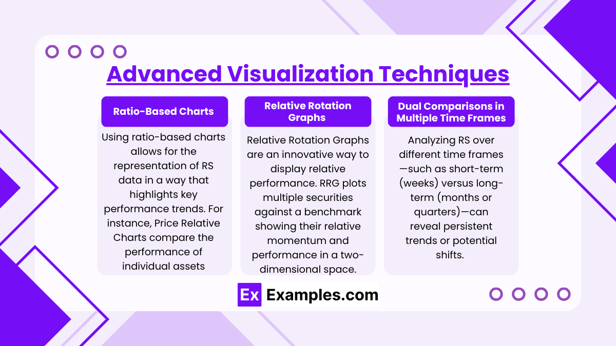
- Using ratio-based charts allows for the representation of RS data in a way that highlights key performance trends.
- For instance, Price Relative Charts compare the performance of individual assets against a benchmark, while Spread Charts measure the price difference between two assets to uncover pricing anomalies and potential reversals.
- Relative Rotation Graphs (RRG):
- Relative Rotation Graphs are an innovative way to display relative performance. RRG plots multiple securities against a benchmark over a rotational period, showing their relative momentum and performance in a two-dimensional space.
- The graph divides into quadrants—Leading, Weakening, Lagging, and Improving—helping analysts visualize how assets rotate between these phases relative to the benchmark.
- This visualization provides insight into market rotation, trends, and potential turning points across sectors or asset classes, making it valuable for portfolio management and sector rotation strategies.
- Dual Comparisons in Multiple Time Frames:
- Analyzing RS over different time frames—such as short-term (weeks) versus long-term (months or quarters)—can reveal persistent trends or potential shifts. Short-term RS momentum might show signals that align or contrast with longer-term trends, helping to identify both steady leaders and short-lived outperformers.
Applying Relative Strength in Analysis

- Sector and Asset Class Rotation:
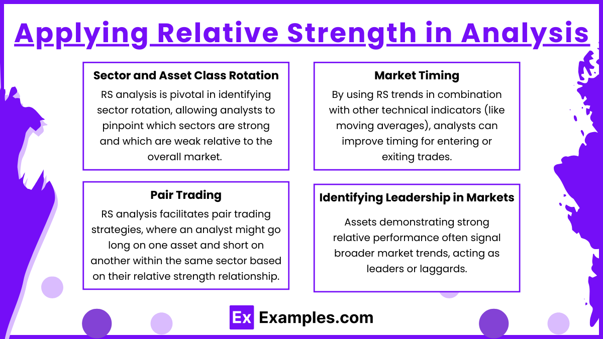
- RS analysis is pivotal in identifying sector rotation, allowing analysts to pinpoint which sectors are strong and which are weak relative to the overall market. This can be used to align portfolio positions with trending sectors.
- RS charts between sectors and asset classes (like equities vs. bonds) help analysts adjust allocations based on prevailing market conditions, improving portfolio robustness.
- Market Timing:
- By using RS trends in combination with other technical indicators (like moving averages), analysts can improve timing for entering or exiting trades. This approach is especially useful in momentum-based strategies where the focus is on aligning with strong assets while avoiding weaker ones.
- Pair Trading:
- RS analysis facilitates pair trading strategies, where an analyst might go long on one asset and short on another within the same sector based on their relative strength relationship. This approach allows for gains from relative outperformance, even in neutral or bearish market conditions.
- Identifying Leadership in Markets:
- Assets demonstrating strong relative performance often signal broader market trends, acting as leaders or laggards. Recognizing these leaders early through RS analysis can help in capitalizing on broader macro movements or sector trends.
Examples
Example 1: Relative Strength Line for Individual Stocks vs. Benchmark Index
A common way to visualize relative strength is by plotting a stock’s performance relative to a benchmark index, such as the S&P 500. This involves calculating the relative strength ratio by dividing the stock’s price by the index level and then plotting this value over time. An upward-sloping line on this RS chart indicates that the stock is outperforming the index, while a downward slope shows underperformance. Analysts often overlay moving averages on the RS line to identify trends and potential reversals, providing insights into whether a particular stock is leading or lagging within the broader market.
Example 2: Sector vs. Sector Relative Strength Analysis
Another method to visualize RS involves comparing different sectors against each other, such as technology vs. healthcare. Analysts can create RS charts between the technology sector ETF (e.g., XLK) and the healthcare sector ETF (e.g., XLV) by plotting the ratio of their prices. When the line trends upwards, it signals that technology is outperforming healthcare. This comparison helps in sector rotation strategies, allowing investors to shift capital toward sectors that exhibit relative strength. RS charts can also be used to spot early signs of rotation, which can be advantageous in aligning portfolios with prevailing trends.
Example 3: Currency Pair Relative Strength in Forex Markets
In Forex trading, RS charts can help traders visualize strength between two currency pairs, such as the EUR/USD vs. GBP/USD. By plotting the ratio of these pairs’ prices, analysts can determine which currency is stronger relative to another. For instance, if the EUR/USD to GBP/USD ratio rises, it implies that the euro is strengthening relative to the British pound. Forex traders use these RS charts to identify stronger currency pairs and adjust their positions accordingly, capitalizing on relative outperformance within a highly liquid market.
Example 4: Relative Rotation Graphs (RRG) for Multi-Asset Analysis
Relative Rotation Graphs (RRG) provide a multi-dimensional visualization of relative strength by plotting multiple assets or sectors against a benchmark over time. RRGs divide assets into quadrants—Leading, Weakening, Lagging, and Improving—showing the trajectory of each asset relative to the benchmark index. For example, plotting sectors such as technology, healthcare, and consumer staples against the S&P 500 reveals their relative positions and momentum, making it easy to see which sectors are strengthening or weakening. This tool is particularly valuable for identifying cyclical rotation and adjusting portfolios based on the relative strength trends of multiple assets.
Example 5: RS Comparison of Bonds vs. Equities for Asset Allocation
To manage risk and return in portfolio allocation, analysts may compare the relative strength of bonds to equities. An RS chart can be created by plotting the ratio of a bond ETF (e.g., TLT for Treasury bonds) to an equity index (e.g., SPY for the S&P 500). When the RS line is rising, bonds are outperforming equities, suggesting a flight to safety or risk-off environment. Conversely, a falling RS line indicates that equities are outperforming bonds, signaling a risk-on market sentiment. This comparison is essential for adjusting the mix of bonds and equities in a portfolio to align with market trends and investor risk preferences.
Practice Questions
Question 1
What does an upward-sloping relative strength (RS) line on a chart generally indicate?
A. The asset being compared is underperforming the benchmark.
B. The asset being compared is outperforming the benchmark.
C. There is no significant difference in performance between the two assets.
D. The asset’s price is declining.
Answer: B. The asset being compared is outperforming the benchmark.
Explanation: An upward-sloping RS line represents an increase in the relative strength ratio, meaning that the asset’s price (numerator) is increasing at a faster rate than the benchmark’s price (denominator), or the asset is declining at a slower rate than the benchmark. This indicates that the asset is outperforming the benchmark in terms of relative performance. Conversely, a downward-sloping RS line would indicate underperformance. Recognizing these patterns is essential for technical analysts, as it helps identify strong assets in the market.
Question 2
Which of the following tools allows analysts to visualize multiple securities’ relative performance against a benchmark in a two-dimensional space, often displayed in quadrants such as Leading, Weakening, Lagging, and Improving?
A. Price Relative Chart
B. Relative Strength Index (RSI)
C. Relative Rotation Graph (RRG)
D. Spread Chart
Answer: C. Relative Rotation Graph (RRG)
Explanation: Relative Rotation Graphs (RRGs) are a unique visualization tool that plots multiple securities against a benchmark, showing their relative strength and momentum in four quadrants: Leading, Weakening, Lagging, and Improving. This layout allows analysts to see how assets are rotating through these phases over time, making it easier to identify potential trends and reversals. RRGs provide a dynamic, time-based view of asset relationships, which is not possible with static tools like Price Relative Charts or the RSI. This method is highly valuable for tracking sector rotation and for portfolio management strategies focused on identifying strong and weak sectors.
Question 3
When utilizing a relative strength (RS) ratio, what is the primary benefit of analyzing assets across multiple time frames?
A. It simplifies the RS calculation process.
B. It helps identify persistent long-term trends and short-term reversals.
C. It makes RS charts more visually appealing.
D. It decreases the volatility of RS ratios.
Answer: B. It helps identify persistent long-term trends and short-term reversals.
Explanation: Analyzing relative strength (RS) across multiple time frames, such as weekly and monthly charts, allows technical analysts to observe both long-term trends and short-term movements within an asset relationship. This multi-timeframe approach can reveal insights that are not visible in a single timeframe, helping analysts detect potential reversals or confirm the strength of existing trends. For example, a strong long-term RS trend combined with a temporary short-term pullback may present an ideal entry point. This technique is particularly useful in identifying asset leaders over time and in making more informed trading decisions.


