Preparing for the CMT Exam requires a thorough understanding of “Additional Charting Methods,” a vital component of technical analysis. Mastery of alternative charting techniques, including Renko, Kagi, and Point-and-Figure charts, is essential. This knowledge enhances insights into market trends, price movements, and trading strategies, crucial for achieving a high CMT score.
Learning Objective
In studying “Additional Charting Methods” for the CMT Exam, you should learn to understand the principles and applications of alternative charting techniques such as Renko, Kagi, and Point-and-Figure charts. Examine how these methods provide unique insights into price trends, reversals, and volatility without the influence of time as a variable. Evaluate the advantages of these charts in identifying market strength, trading signals, and support/resistance levels. Additionally, explore the use of these techniques in diverse market conditions and apply your understanding to interpret trends and make data-driven decisions in CMT practice scenarios.
Overview of Alternative Charting Techniques

Alternative charting techniques, such as Renko, Kagi, and Point-and-Figure charts, are unique tools in technical analysis that offer a fresh perspective on price movements. Unlike traditional candlestick or bar charts, these methods filter out minor price fluctuations, focusing solely on significant price changes. This focus helps traders and analysts identify clear trends, key support and resistance levels, and potential reversals with reduced noise.
Renko charts, for instance, create “bricks” only when prices move a specific amount, thus emphasizing trend direction without regard to time. Kagi charts adjust line thickness based on price movement, indicating shifts in market sentiment. Point-and-Figure charts, on the other hand, plot price changes using columns of X’s and O’s, ignoring time entirely and thereby simplifying trend identification.
These alternative charting methods are particularly useful in volatile markets, as they reduce the distraction of minor price swings, allowing traders to make clearer, more data-driven decisions. Mastering these techniques provides a powerful edge in technical analysis, as they reveal critical insights that can be obscured by traditional chart types.
Understanding Renko Charts
Renko charts are a type of price chart that focus solely on significant price movements, filtering out smaller fluctuations to provide a clearer view of market trends and reversals. Unlike traditional charts that plot price changes over time, Renko charts are created by adding “bricks” when prices move a specified amount in one direction, disregarding time intervals. This makes them particularly useful for traders who want to focus on the strength and direction of a trend without the noise of small, inconsequential price changes.
Each Renko brick is added only when the price moves a fixed amount—set by the user—up or down from the last brick. If the price rises by the specified amount, a new brick of the same color is added above the previous one, suggesting a continuation of the trend. Conversely, if the price falls by the fixed amount, a brick of a different color appears in the opposite direction, potentially signaling a trend reversal.
Renko charts are highly effective for identifying strong trends and key support/resistance levels. They help traders stay in profitable trends longer by minimizing reaction to short-term price volatility, and they can provide clearer buy and sell signals compared to traditional charts. For instance, traders often look for trend reversals when the color of the Renko bricks changes direction, or they may use the chart’s structure to confirm entry and exit points alongside other indicators.
Setting the brick size is crucial in Renko charts, as it determines the sensitivity of the chart to price movements. A smaller brick size captures minor trends, which can be useful in volatile markets, while a larger brick size filters out small price changes, focusing on larger trends and reducing the frequency of false signals. Mastering Renko charts allows traders to gain a cleaner, trend-focused view of price action, enhancing their ability to make strategic trading decisions.
Kagi Charts and Market Sentiment
Kagi charts are a unique charting method that represents price movement based on direction and trend strength rather than time, making them effective for tracking shifts in market sentiment. Originally developed in Japan, Kagi charts are composed of vertical lines that change in thickness based on price action, with thicker (or “yang”) lines indicating upward momentum and thinner (or “yin”) lines signaling downward movement. This thickness adjustment is a key feature that reflects changes in buying and selling pressure, giving insight into market sentiment without the noise of minor fluctuations.
In a Kagi chart, a line continues in the same direction until there’s a reversal of a predefined percentage or amount, which the user sets. When a reversal meets this criterion, the line changes direction and, if necessary, switches from thick to thin (or vice versa) to indicate a shift in trend strength or sentiment. This change in thickness signals a potential shift from bullish to bearish sentiment, or vice versa, helping traders recognize emerging trends and possible turning points in the market.
The “yin” and “yang” transitions in Kagi charts are particularly valuable for identifying strong and weak price trends. For example, when a yang (thick) line changes to a yin (thin) line, it may signal that buyers are losing strength, suggesting a potential bearish trend. Conversely, a switch from yin to yang suggests renewed buying interest and possibly a bullish trend. These transitions are often used as signals for entry and exit points, especially when confirmed by other technical indicators or support and resistance levels.
Kagi charts are useful in volatile markets because they help reduce noise by ignoring time and small price reversals, focusing instead on significant movements. By tracking market sentiment and trend reversals with these charts, traders can make more informed, sentiment-driven trading decisions, capitalizing on shifts in buying and selling pressure. This method also complements other analysis tools, allowing traders to get a clearer view of market trends and sentiment dynamics.
Point-and-Figure Charts for Identifying Support and Resistance
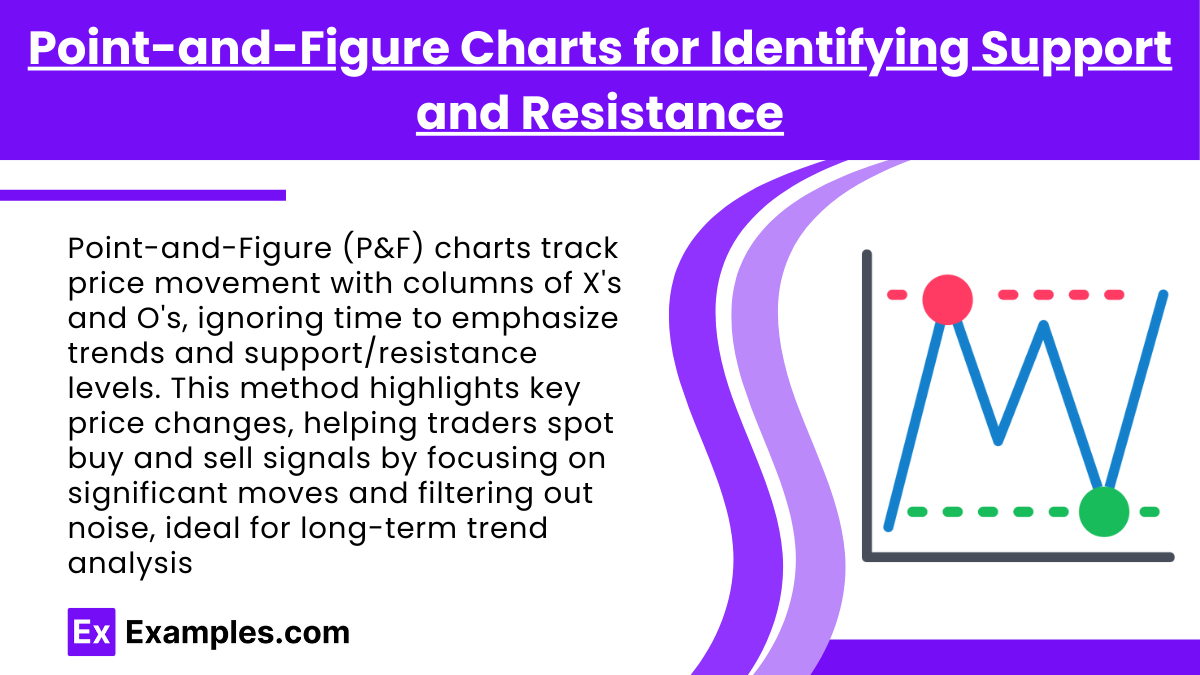
Point-and-Figure (P&F) charts are a distinct charting method that focuses exclusively on price movement, filtering out time and minor fluctuations to highlight significant trends and key levels of support and resistance. Unlike traditional price charts, which plot price changes over regular intervals, P&F charts use columns of X’s and O’s to represent price rises and falls, respectively, creating a straightforward visual representation of supply and demand dynamics.
Each column on a P&F chart consists of either X’s, indicating upward price movement, or O’s, indicating downward movement. A new column begins when the price reverses by a predetermined amount, known as the “reversal size,” which can be set by the user. This structure provides a clear, uncluttered view of trends, with long columns of X’s representing strong upward trends and long columns of O’s indicating prolonged downward trends. By focusing only on significant price changes, P&F charts reduce market noise, making it easier for traders to identify strong support and resistance levels.
Support and resistance levels are particularly visible on P&F charts because of their structured layout. For example, when multiple columns reverse at a similar price level, it suggests strong support or resistance. Traders can easily spot these areas, as they manifest as horizontal lines across the chart where price movement repeatedly stops or reverses. Breaking through these levels often indicates a strong shift in the supply-demand balance, making them important signals for potential trend continuation or reversal.
In addition to identifying support and resistance, P&F charts are helpful for pinpointing buy and sell signals. Common strategies include looking for breakouts above resistance for buy signals or breakdowns below support for sell signals. By reducing the influence of minor price fluctuations and ignoring time, P&F charts allow traders to focus on critical price action, making it a valuable tool for tracking large price movements and trend reversals. This method is especially useful for long-term trading decisions, as it highlights major market movements and key levels in a way that traditional charts often obscure.
Examples
Example 1
Using a Renko Chart to Spot a Trend: In a volatile market, a trader uses a Renko chart with a fixed brick size to identify the underlying trend direction. By filtering out smaller price fluctuations, the Renko chart highlights a clear upward trend. The trader then follows this trend until a reversal is confirmed by a brick in the opposite direction, signaling a potential exit point.
Example 2
Identifying Market Sentiment with Kagi Charts: An analyst uses a Kagi chart to evaluate market sentiment during a stock’s price rally. As the line thickens to a yang state, it indicates bullish sentiment. When the line reverses and thins to a yin state, the analyst recognizes a potential shift to bearish sentiment and adjusts their strategy accordingly.
Example 3
Spotting Support Levels with Point-and-Figure Charts: A trader studying a P&F chart of a commodity identifies a strong support level where multiple columns of O’s reverse to X’s at the same price. This suggests a price floor, as sellers lose momentum. The trader then decides to place a buy order at this support level, anticipating a price rebound.
Example 4
Using Heikin-Ashi Candles for Trend Analysis: In a currency trading strategy, an investor uses Heikin-Ashi candles to smooth out price action and gain a clearer view of trends. The investor sees a series of bullish Heikin-Ashi candles with no lower shadows, signaling a strong uptrend, and holds the position until a bearish candle with a long lower shadow appears, indicating a possible trend reversal.
Example 5
Trading Breakouts with Line Break Charts: An equity trader uses a line break chart to capture breakout opportunities. The chart only adds a new line when prices move in a specific direction by a set amount. The trader notices a bullish breakout when a new line forms above a previous high and decides to enter a long position, using the line break chart to confirm trend continuation.
Practice Questions
Question 1
Which of the following statements best describes the purpose of Renko charts in technical analysis?
A. They track price changes over time, including all minor fluctuations.
B. They filter out small price movements and only focus on significant changes.
C. They use time intervals to add new candles, highlighting daily trends.
D. They plot price changes using columns of X’s and O’s to track market sentiment.
Answer: B
Explanation: Renko charts are designed to filter out minor price fluctuations and focus on significant price changes. They achieve this by plotting “bricks” only when the price moves a predetermined amount in one direction, ignoring time intervals. This feature helps traders see clear trends without the noise of minor fluctuations.
Question 2
In a Kagi chart, what does a switch from a “yin” (thin) line to a “yang” (thick) line most likely indicate?
A. An increase in market volatility
B. A shift from bearish to bullish sentiment
C. A continuation of the current trend
D. A reversal of a support level
Answer: B
Explanation: A switch from a “yin” (thin) line to a “yang” (thick) line on a Kagi chart indicates a shift from bearish to bullish sentiment. This line change reflects an increase in buying pressure, suggesting a potential upward trend. Kagi charts are effective for tracking shifts in market sentiment without the influence of minor fluctuations.
Question 3
Point-and-Figure charts are particularly useful for identifying which of the following?
A. Time-based trends and price movements
B. Minor price fluctuations within an hour
C. Key support and resistance levels
D. Volume levels over a period
Answer: C
Explanation: Point-and-Figure charts are especially effective for identifying key support and resistance levels. By plotting only significant price movements and ignoring time, P&F charts create a clear visual representation of where price levels hold or reverse. This allows traders to easily spot horizontal areas that act as strong support or resistance, aiding in long-term trading decisions

