Introduction to Charts Part 1 serves as a foundational exploration of the essential tools used in technical analysis. Charts are vital for visualizing price movements, helping traders and analysts identify trends, patterns, and market sentiment. This section focuses on various chart types, including line, bar, and candlestick charts, each offering unique insights into price action. By understanding how to read and interpret these charts, traders can make informed decisions, enhancing their ability to analyze market behavior and develop effective trading strategies.
Learning Objectives
In studying “Section I: Theory and History of Technical Analysis: Introduction to Charts Part 1” for the CMT Exam, you should learn to identify and differentiate between various chart types, including line charts, bar charts, and candlestick charts. Analyze how these charts represent price movements and trends over time. Evaluate the significance of chart patterns and their implications for market behavior. Additionally, explore the use of multiple time frames in technical analysis to enhance trading strategies, and apply this knowledge to interpret chart data effectively in practice scenarios for improved trading decision-making.
Overview of Charts in Technical Analysis
Charts are fundamental tools in technical analysis, providing a visual representation of price movements over time. They enable traders to identify trends, patterns, and potential support and resistance levels, facilitating informed trading decisions. Understanding how to read and interpret different chart types is essential for successful market analysis.
Types of Charts

- Line Charts:
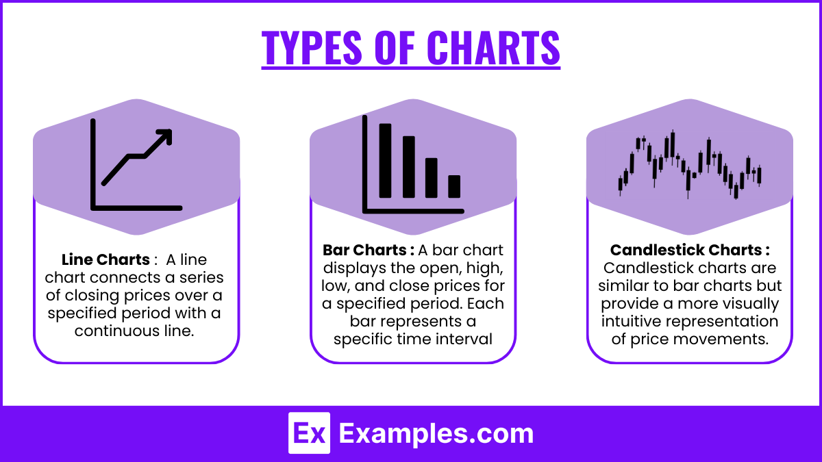
- Definition: A line chart connects a series of closing prices over a specified period with a continuous line.
- Advantages: Simple and easy to read, line charts provide a clear view of price trends without excessive detail. They are particularly useful for identifying the overall direction of the market.
- Limitations: Line charts do not show intra-period price movements, which may overlook significant price fluctuations during the trading session.
- Bar Charts:
- Definition: A bar chart displays the open, high, low, and close (OHLC) prices for a specified period. Each bar represents a specific time interval (e.g., daily, weekly).
- Components:
- The vertical line indicates the price range (high and low).
- A small horizontal line on the left indicates the opening price, and a horizontal line on the right indicates the closing price.
- Advantages: Bar charts provide more detailed information than line charts, allowing traders to analyze price movements within each time period. They are effective for identifying market volatility and potential reversal points.
- Candlestick Charts:
- Definition: Candlestick charts are similar to bar charts but provide a more visually intuitive representation of price movements. Each candlestick shows the open, high, low, and close prices for a specific time period.
- Components:
- The body of the candlestick represents the range between the open and close prices.
- The wicks (or shadows) indicate the high and low prices during that period.
- Advantages: Candlestick charts offer more information at a glance, allowing traders to quickly assess market sentiment. Patterns formed by multiple candlesticks can signal potential reversals or continuations in trends, making them popular among traders.
Chart Patterns

Understanding chart patterns is crucial for predicting future price movements in technical analysis. These patterns represent the collective psychology of market participants and can signal potential trend reversals or continuations.
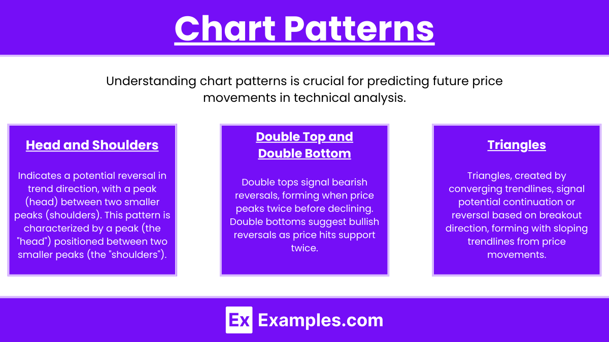
- Head and Shoulders: Indicates a potential reversal in trend direction, with a peak (head) between two smaller peaks (shoulders). This pattern is characterized by a peak (the “head”) positioned between two smaller peaks (the “shoulders”). It typically indicates a potential reversal from a bullish trend to a bearish trend, signaling traders to prepare for a downward price movement.
- Double Top and Double Bottom: These patterns signal potential trend reversals, with double tops indicating a bearish reversal and double bottoms indicating a bullish reversal. The double top pattern appears when the price reaches a peak twice before reversing downward, indicating a bearish reversal. Conversely, the double bottom pattern occurs when the price hits a low twice before reversing upward, signaling a bullish reversal. Both patterns emphasize the market’s struggle to break through significant support or resistance levels.
- Triangles: Formed by converging trendlines, triangles can indicate continuation or reversal, depending on the breakout direction. Triangles form when price movements converge, creating upward or downward sloping trendlines. These patterns can indicate either continuation or reversal, depending on the breakout direction. An ascending triangle typically suggests bullish sentiment, while a descending triangle indicates bearish sentiment. The breakout direction can provide valuable trading signals, making triangle patterns essential for traders to monitor.
Time Frames in Technical Analysis

Different time frames can yield different perspectives on price action, significantly impacting trading strategies and decision-making processes. Understanding how to analyze these time frames allows traders to tailor their approaches based on their investment goals and risk tolerance. Here are additional insights into commonly used time frames:
- Intraday (1-minute, 5-minute, 15-minute): Useful for short-term trading and scalping strategies. These ultra-short time frames are particularly popular among day traders and scalpers. They allow for quick trades based on minor price fluctuations and are suitable for high-frequency trading strategies. Traders use these charts to capitalize on small price movements throughout the trading day, often relying on technical indicators and patterns for entry and exit points.
- Daily: Offers a broader view of market trends, suitable for swing traders. Daily charts present a comprehensive view of market trends and price movements over a 24-hour period. This time frame is favored by swing traders, who hold positions for several days to weeks. Daily charts help identify significant support and resistance levels, trend lines, and chart patterns that may indicate future price movements.
- Weekly and Monthly: Ideal for long-term investors, providing insights into major trends and potential reversal points. Weekly charts provide a broader perspective on market trends and are particularly useful for identifying long-term price movements. Traders often use weekly charts to assess the general direction of a security over weeks or months. Patterns that develop on weekly charts can indicate significant shifts in market sentiment and help traders make strategic decisions about entry and exit points.
Examples
Example 1: Analyzing Price Trends with Line Charts
A trader examines a line chart of a technology stock over a six-month period. The line chart clearly illustrates the stock’s upward trend, with consistent higher highs and higher lows. By analyzing the chart, the trader identifies key support levels where the price has previously bounced back, helping them to decide on potential entry points for a long position.
Example 2: Understanding Bar Charts and Price Movements
A technical analyst reviews a bar chart for a commodity like gold. Each bar represents daily price movements, displaying the open, high, low, and close (OHLC) for each day. The analyst observes that the bars indicate increasing volatility, as the range between the high and low prices widens. This insight helps the analyst anticipate potential price breakouts, prompting them to adjust their trading strategy accordingly.
Example 3: Interpreting Candlestick Patterns
An investor studies a candlestick chart for a major currency pair, such as EUR/USD. They notice a series of candlesticks forming a bullish engulfing pattern, which suggests a potential reversal from a downtrend to an uptrend. Understanding this candlestick pattern allows the investor to anticipate a possible price increase and consider entering a long position based on the pattern’s implications.
Example 4: Identifying Chart Patterns for Trading Decisions
A trader analyzes a daily chart for a stock and identifies a head and shoulders pattern forming after a prolonged uptrend. Recognizing this bearish reversal pattern alerts the trader to potential downside risk. They prepare to implement a short-selling strategy, setting stop-loss orders above the pattern’s neckline to manage risk while capitalizing on the anticipated price decline.
Example 5: Utilizing Multi-Timeframe Analysis
A swing trader employs multi-timeframe analysis by examining both daily and weekly charts of a major index, like the S&P 500. The daily chart shows a recent uptrend, while the weekly chart reveals an established resistance level that has previously hindered upward movement. By integrating insights from both time frames, the trader decides to wait for a confirmed breakout above the resistance on the weekly chart before committing to a longer-term position, ensuring a higher probability of success.
Practice Questions
Question 1
Which type of chart provides a continuous line connecting closing prices over a specific period?
A) Bar chart
B) Line chart
C) Candlestick chart
D) Point and figure chart
Correct Answer: B) Line chart
Explanation : A line chart connects a series of closing prices over a specified time frame, creating a continuous line that illustrates overall price trends. It is simple to read and provides a clear visual representation of price movements. In contrast, bar charts display the open, high, low, and close (OHLC) prices, while candlestick charts provide similar information but with a more visually intuitive format. Point and figure charts focus on price movement without regard to time, making option B the correct choice.
Question 2
What key information does a bar chart display for each time period?
A) Only the closing price
B) Open, high, low, and close prices
C) Moving averages and volume
D) Price momentum indicators
Correct Answer: B) Open, high, low, and close prices
Explanation : A bar chart shows four key data points for each time period: the open price (where the price started at the beginning of the period), the high price (the highest point reached during the period), the low price (the lowest point during the period), and the close price (where the price ended at the close of the period). This comprehensive information allows traders to analyze price action and volatility effectively. Options A, C, and D do not accurately reflect the information presented in a bar chart.
Question 3
Which candlestick pattern is typically considered a bullish reversal signal?
A) Doji
B) Shooting Star
C) Hammer
D) Evening Star
Correct Answer : C) Hammer
Explanation : The hammer is a candlestick pattern that typically appears at the bottom of a downtrend and signals a potential bullish reversal. It has a small body near the top of the trading range and a long lower shadow, indicating that sellers pushed the price down during the session, but buyers managed to push it back up near the opening price. The presence of a hammer suggests that buying pressure is increasing, making it a bullish signal. In contrast, a doji indicates indecision, a shooting star signals a potential bearish reversal, and an evening star indicates a bearish reversal, thus making option C the correct answer.


