Preparing for the CMT Exam requires a comprehensive understanding of “Introduction to Charts Part 2,” a crucial component of technical analysis. Mastery of advanced charting techniques and patterns is essential. This knowledge provides insights into market trends, trading signals, and price movements, critical for achieving a high CMT score.
Learning Objective
In studying “Introduction to Charts Part 2” for the CMT Exam, you should learn to understand the application and interpretation of advanced charting techniques used in technical analysis. Analyze how different chart types, such as point and figure, Renko, and Kagi charts, help determine market trends and reversal points. Evaluate the principles behind these charting methods and their specific uses in identifying trading opportunities. Additionally, explore how these tools are integrated into market analysis to visualize price actions and investor sentiment effectively. Apply this knowledge to real-world data to enhance your ability to forecast market movements and refine your trading strategies.
Advanced Charting Techniques Overview

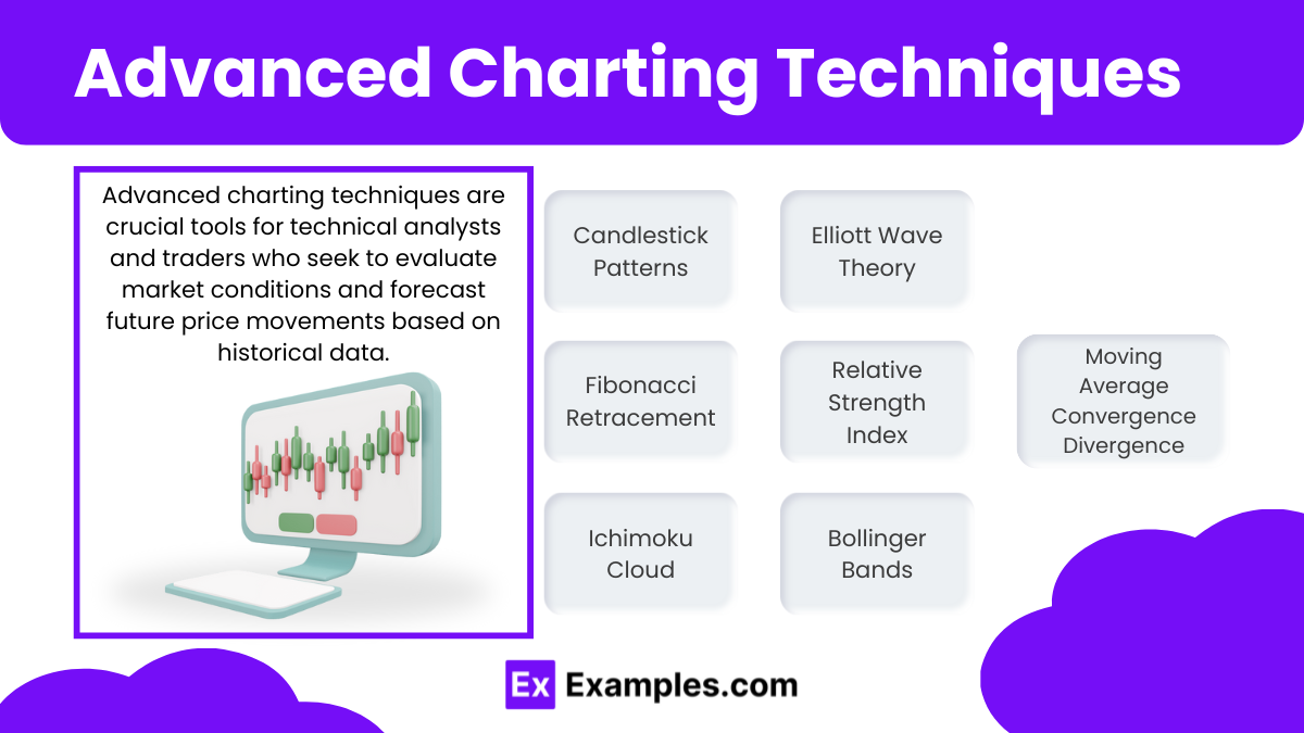
Advanced charting techniques are crucial tools for technical analysts and traders who seek to evaluate market conditions and forecast future price movements based on historical data. These techniques allow traders to visualize complex market patterns, identify trends, and spot potential trading opportunities. Here’s an overview of several advanced charting techniques widely used in financial analysis:
- Candlestick Patterns
- Provide detailed price information (open, high, low, close) and can indicate potential market reversals or trend continuations through specific formations.
- Fibonacci Retracement and Extensions
- Based on mathematical relationships found in the Fibonacci sequence, these tools help identify potential support and resistance levels, guiding traders on strategic positions for transactions.
- Ichimoku Cloud
- Offers a comprehensive view by indicating support/resistance levels, trend direction, momentum, and providing trading signals, all within one chart.
- Elliott Wave Theory
- Suggests that markets follow predictable patterns (waves) based on investor psychology. Useful in forecasting market trends by identifying potential highs and lows.
- Relative Strength Index (RSI)
- A momentum oscillator that helps identify overbought or oversold conditions, suggesting potential reversal points in the market.
- Moving Average Convergence Divergence (MACD)
- A trend-following momentum indicator that shows the relationship between two moving averages of price. Useful for spotting changes in trend strength, direction, and duration.
- Bollinger Bands
- Measure market volatility and provide visual indications of when prices are relatively high or low, which can be helpful in setting entry and exit points.
Point and Figure Charts

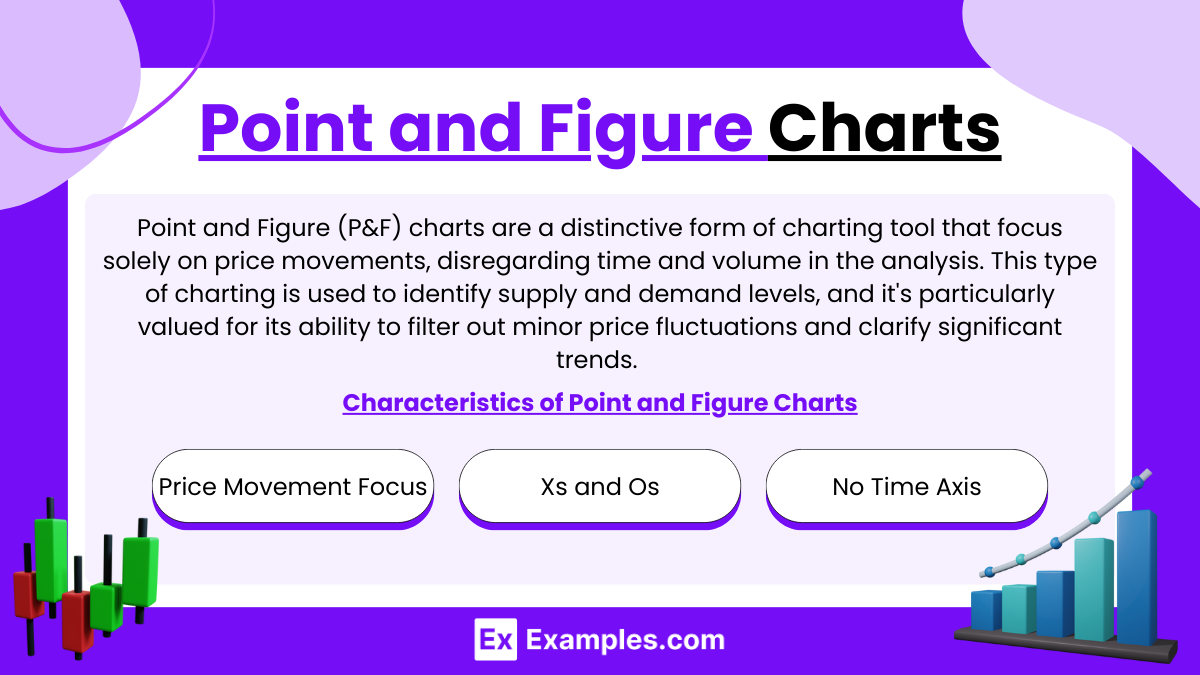
Point and Figure (P&F) charts are a distinctive form of charting tool that focus solely on price movements, disregarding time and volume in the analysis. This type of charting is used to identify supply and demand levels, and it’s particularly valued for its ability to filter out minor price fluctuations and clarify significant trends. Here’s an overview of Point and Figure charting, its methodology, and its application in trading:
Characteristics of Point and Figure Charts:
- Price Movement Focus: Unlike typical bar or line charts, P&F charts only record price movements that meet a specified minimum amount, ignoring minor changes. This helps in focusing on more significant trends.
- Xs and Os: P&F charts use a series of Xs and Os to represent price movements. X columns typically denote rising prices, while O columns indicate falling prices.
- No Time Axis: These charts do not have a time axis. Columns change only when there is a significant price movement in the opposite direction of the current column by a predetermined amount, known as the box size.
Renko Charts

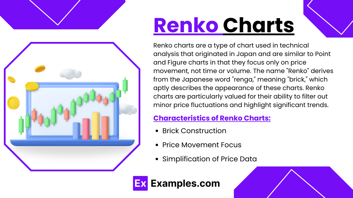
Renko charts are a type of chart used in technical analysis that originated in Japan and are similar to Point and Figure charts in that they focus only on price movement, not time or volume. The name “Renko” derives from the Japanese word “renga,” meaning “brick,” which aptly describes the appearance of these charts. Renko charts are particularly valued for their ability to filter out minor price fluctuations and highlight significant trends.
Characteristics of Renko Charts:
- Brick Construction: Renko charts use “bricks” to represent price movements. Each brick has a uniform size and is placed at a 45-degree angle to the previous brick. A new brick is added only when the price moves by a predefined amount, known as the brick size.
- Price Movement Focus: Like Point and Figure charts, Renko charts ignore the time element and focus solely on price changes. This helps traders identify important trends more clearly.
- Simplification of Price Data: By filtering out minor price movements and focusing only on significant changes, Renko charts help traders avoid the noise of intraday price fluctuations and provide a clearer view of the market trend
Examples
Example 1: Point and Figure Chart Breakouts
An investor uses point and figure charts to identify breakout patterns in the S&P 500 index. The chart displays a series of X columns that exceed previous resistance levels, signaling a strong buy opportunity as the price moves consistently upward, breaking past prior resistance points.
Example 2: Renko Chart for Trend Confirmation
A trader applies Renko charts to confirm a trend in the price of gold. By setting the brick size to a fixed price movement, the Renko chart filters out minor fluctuations and clearly shows a sustained upward movement, indicating a robust bullish trend free from the noise of typical daily price changes.
Example 3: Kagi Chart for Reversal Detection
Using Kagi charts, a technical analyst detects a significant reversal in a tech stock. The Kagi line moves from thin to thick, indicating a shift from a downtrend to an uptrend as the price rises above the previous reversal point, providing a clear signal to consider buying.
Example 4: Combining Chart Types for Comprehensive Analysis
An analyst combines point and figure, Renko, and Kagi charts to analyze a cryptocurrency’s price action. The point and figure chart shows breakouts, Renko confirms the trend direction, and Kagi indicates reversals. This multi-chart strategy provides a robust analysis, helping to mitigate risks associated with volatile markets.
Example 5: Using Advanced Charts for Sector Rotation Strategy
A portfolio manager utilizes advanced charting techniques to implement a sector rotation strategy. By analyzing point and figure charts for various sectors, the manager identifies which sectors are showing strength (new X columns) and which are weakening (new O columns), reallocating investments to capitalize on these trends.
Practice Questions
Question 1
What unique feature does a Renko chart have compared to traditional bar charts?
A. Time-based plotting
B. Price movement-based plotting
C. Volume-based plotting
D. Interest rate-based plotting
Answer:
B. Price movement-based plotting
Explanation:
Renko charts are distinct because they plot price movements and ignore time and volume. Each block (brick) on a Renko chart represents a predefined price movement, providing a cleaner view of the price trend and helping to filter out minor fluctuations that may not be indicative of a true market reversal.
Question 2
Which of the following best describes the utility of Kagi charts in technical analysis?
A. They provide a clear indication of the trend direction based on line thickness.
B. They help in identifying the volume of trades for a given price level.
C. They are primarily used for determining the long-term interest rate trends.
D. They predict future prices based on historical earnings data.
Answer:
A. They provide a clear indication of the trend direction based on line thickness.
Explanation:
Kagi charts use line thickness to indicate the strength of a trend. A shift from a thin to a thick line suggests a change from a downtrend to an uptrend, making Kagi charts useful for visualizing trend strength and potential reversals based on price movements rather than time intervals.
Question 3
How can combining different chart types, such as point and figure, Renko, and Kagi, benefit technical analysis?
A. It allows for the assessment of interest rates alongside stock prices.
B. It increases the complexity of analysis without adding insight.
C. It enhances the analysis by providing multiple perspectives on market dynamics.
D. It simplifies the data to a level that is too basic to be useful.
Answer:
C. It enhances the analysis by providing multiple perspectives on market dynamics.
Explanation:
Combining different chart types like point and figure, Renko, and Kagi charts can provide a more comprehensive analysis by offering multiple perspectives on price movements and market trends. Each chart type has unique features that can highlight different aspects of the market, such as trend direction, volatility, and key reversal points, leading to a deeper and more robust understanding of market behavior.


