10+ Photography Logo Examples to Download
The need for photography and videography services highly depends on the seasons and events; thus, to ensure that this business generates a good profit, you need to use effective and clear marketing tools. Just like any business, you will need a logo that will communicate necessary information about what you offer. It is also the most effective tool to use when you want to establish your brand and make it more recognizable to the market. Hence, your photography logo should flawlessly embody your brand’s mission, vision, and overall identity.
Photography Logo Examples
1. Simple Photography Logo
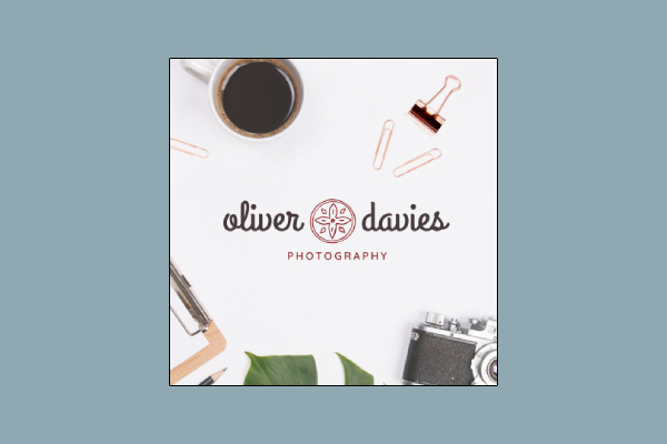
As much as you want to use a complicated and over-the-top logo for your photography business, sometimes toning it down and letting your art do the talking for you is more effective. Basically, it is still quite impressive to use a simple logo to help clients and potential clients remember your brand. Similar to this example, a simple font style used for the name and a basic symbol can honestly do the job of establishing a brand.
2. Elegant Photography Logo
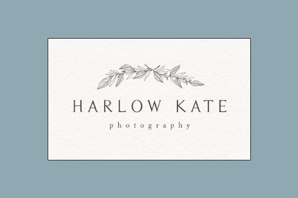
Contrary to the first logo, it is also easy to capture the attention of potential clients through an elegant logo. You can balance the intricacy of your logo design by using a simple and basic font style. Looking at this example, you can clearly sense elegance and stylishness exude from this logo. Its simple yet glamorous logo design balanced out with a simple font style makes it look sophisticated and classy.
3. Photography Logo and Watermark
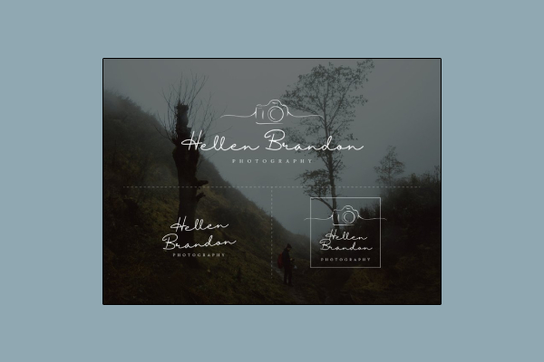
Although it is important to create a logo that matches the overall aesthetics that you are going for, it is also important to do the same when it comes to creating your watermark. Looking at this example, you can clearly see how the photography logo and watermark complement each other which helps create a consistent branding image for the business. Take inspiration with how dainty and beautiful this example is as you create your own for your business.
4. Modern Minimalist Photography Logo
As they say, there is beauty in simplicity, and that is truly evident in this logo example. This modern minimalist logo just uses lines to create a beautiful structure which enhances its overall appearance. This logo also does not use an icon but only showcases the name of the photographer. Incorporating this type of design in your own logo will make it look more sophisticated and sleek.
5. Wooden Camera Photography Logo
If you are the type to go over-the-top with your logo, then this is the perfect example for you. This logo uses a wooden camera adorned with colorful flowers as its icon. A dainty and unique font style is also used to balance out its chic and stylish vibe. This logo is perfect to use in your photography portfolio or photography blog since it is quite big enough and takes more space.
6. Whimsical Photography Logo
If you want to stand out and immediately capture potential clients’ interest, why not go for a whimsical and flashy business logo? Looking at this example, you will immediately see how quirky and fun this logo is, which is perfect for a photography business that exudes lively vibes with how photos are taken, how the studio is set, and its overall concept. If you are someone who wants to go for this type of design, you can take inspiration from this logo example.
7. Modern Photography Logo
A modern-designed logo is perfect for a modern photographer. Thus, this is the best photography example you should take inspiration from. This logo only uses a simple cursive type of font style that gives off a rustic and chill vibe. This is perfect for a photographer who chooses to use his or her full name as the brand logo rather than using icons or the abbreviation of his or her name. This example also includes a smaller version of the logo, should you prefer it, which is also perfect to use as a watermark for your photos.
8. Typography Photography Logo
You can use sleek and chic typography as the main feature of your logo design. If you look at this example, you can clearly see how sleek and classy the logo looks like. It has used complementing font styles that made a cool wavelike illusion in the front, and a shadowy figure at the back. A typography logo is perfect to use for a professional photography business because of its clean and sleek look.
9. Geometric Photography Logo
Making sure that your logo has a good structure will add more appeal to it; thus, it is a good option to use lines and symmetry when creating a photography logo. Nowadays, it is quite common to see geometric-shaped logos in businesses. Similar to this example, you can create a geometric logo by using lines and structuring them to create a certain shape. It is then up to you if you want to write your name in the middle of the shape, insert an icon, and so on.
10. Watercolor Photography Logo
If you want to achieve a dainty and chic look for a logo you can always make use of illustrations. Similar to this logo example, you can always incorporate a watercolor drawing of your icon or something that you prefer to amp up a plain and simple logo design. Sometimes, it is not necessary to use a drawing related or closely relevant to the business, e.g. photography; it is completely up to your preference.
11. Circular Photography Logo
As much as a free-flowing or abstract logo is attractive to others, some prefer to look at logos that have a strong structure. A round logo is a perfect logo to use if you want to achieve that result; ensuring that there is an outline makes it more easy to maintain a compact and tight-looking logo. If you are looking for inspiration in order to achieve a structured and sleek look for your photography logo, you can use this example as your guide.


