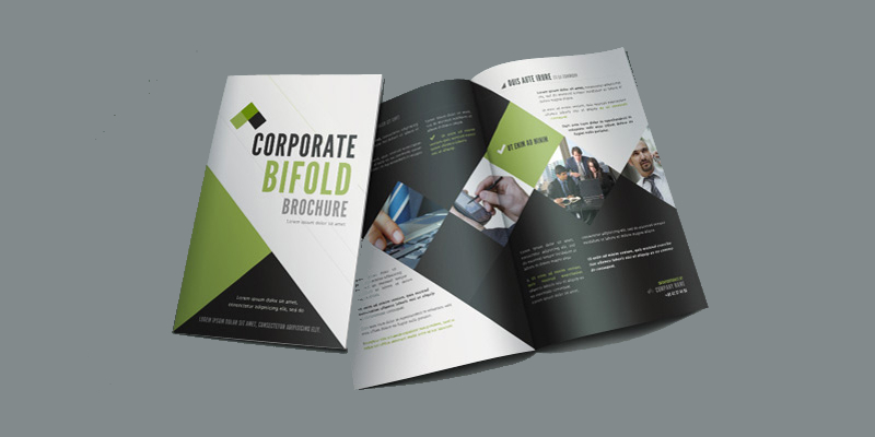
26+ Bi-Fold Brochure Examples to Download
If you think digital media have overtaken the marketing field completely, think again. Even with the onslaught of modern promotional techniques and the many options provided by social media platforms, blogs, and websites, they were unable to do what a brochure can. The brochure’s years in the industry as among the trusted promotional material remains. Hotel desks, shopping mall racks, and restaurants still use brochures. It’s cheap, multi-purpose, and it fits any purpose for any business needs. Learn more about this valuable material by perusing through our bi-fold brochure options and knowing how you can make it work best for you.
26+ Bi-Fold Brochure Examples
1. A3 Landscape Interior Design Bi-Fold Brochure
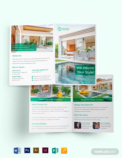
2. Design Studio Bi-Fold Brochure
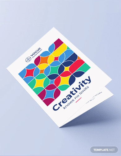
3. Interior Design Consultancy Bi-Fold Brochure
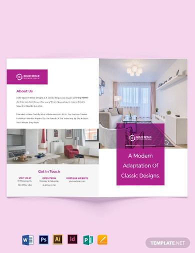
4. Interior Design Company Bi-Fold Brochure
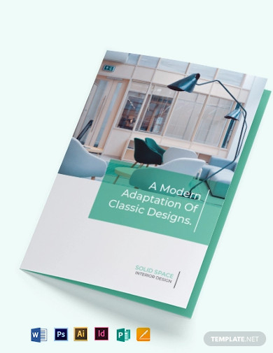
5. Event Company Bi-Fold Brochure
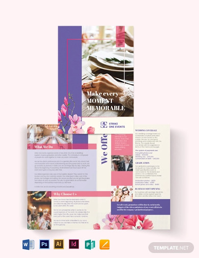
6. Interior Designer Bi Fold Brochure
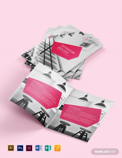
7. Professional Business Bi-fold Brochure
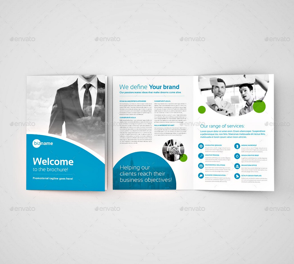
8. Business Bi-fold Brochure
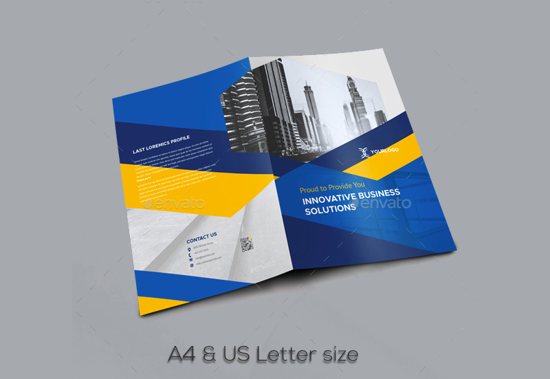
9. Creative Business Bi-fold Brochure

10. Multipurpose Business Bi-fold Brochure
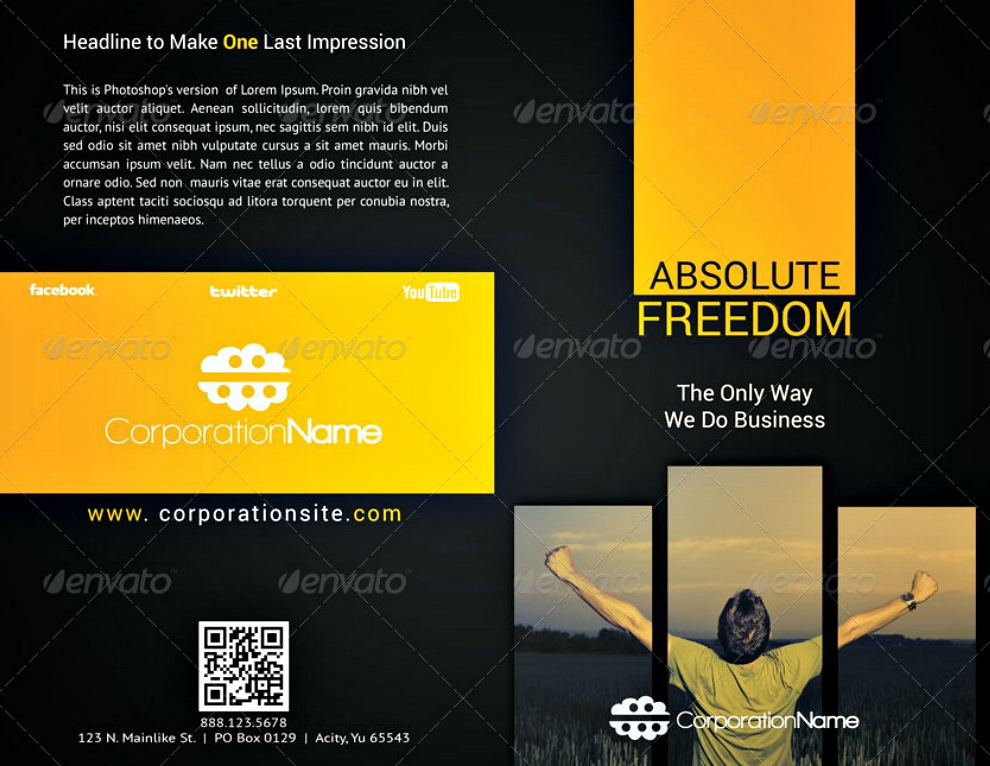
11. Simple Corporate Bifold Brochure
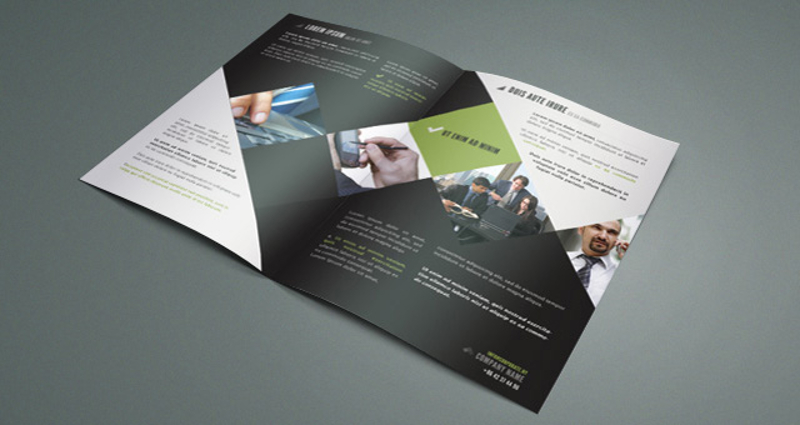
12. Business Bi-fold Brochure Template
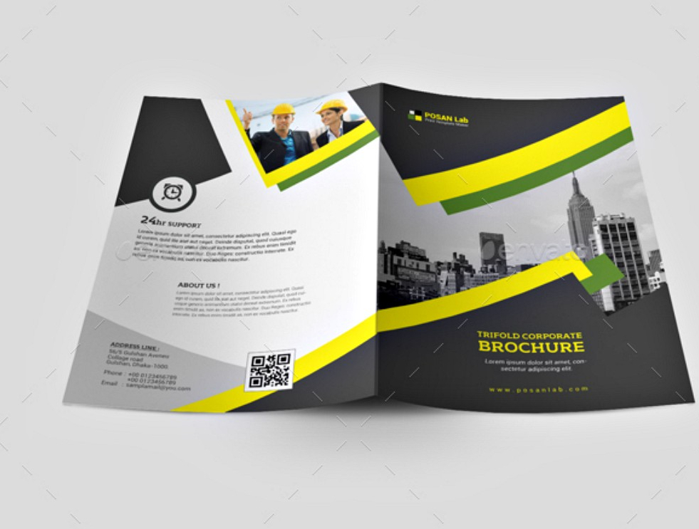
13. Black and White Bi-fold Brochure Template
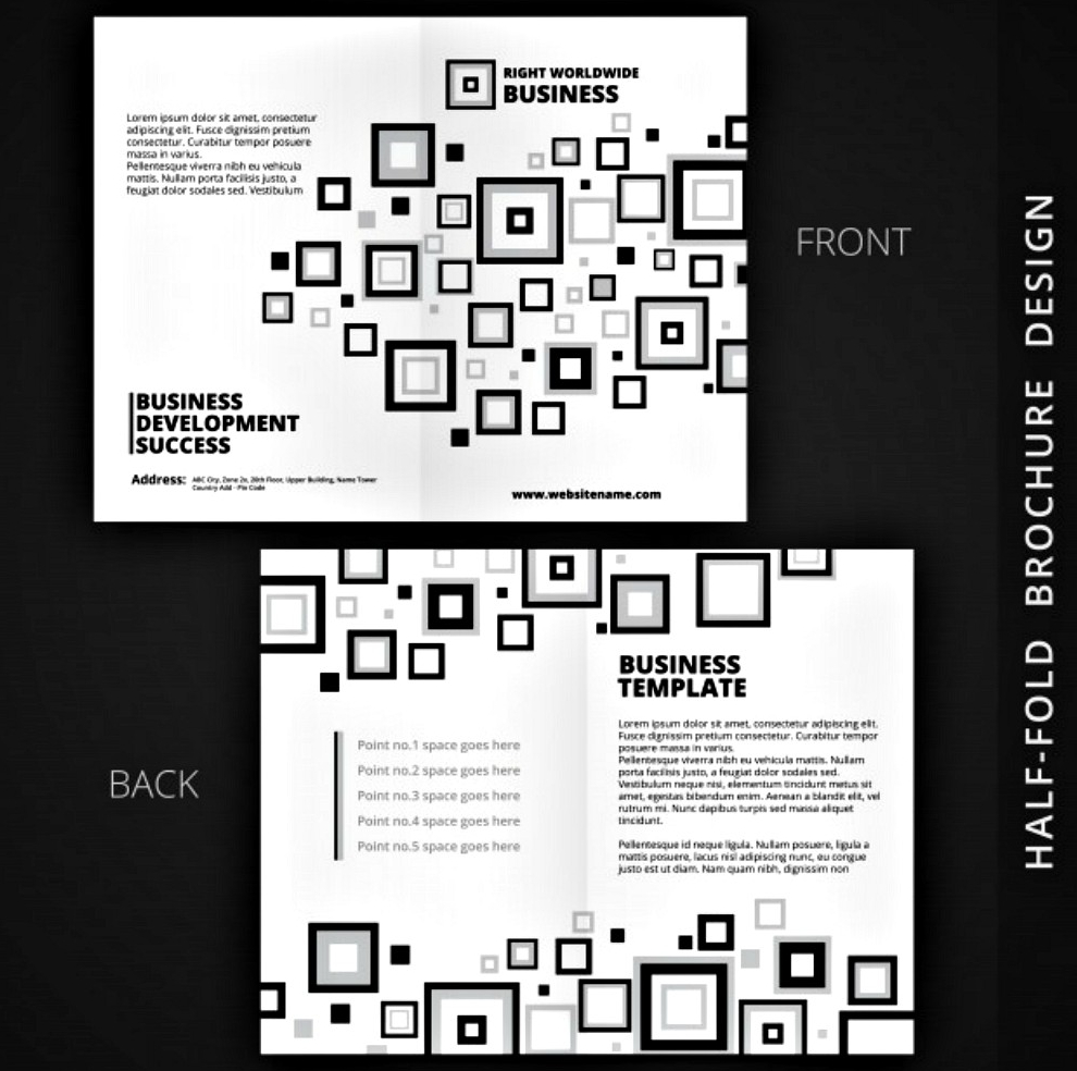
14. Modern Bi-fold Business Brochure Design

15. Open Geometric Brochure
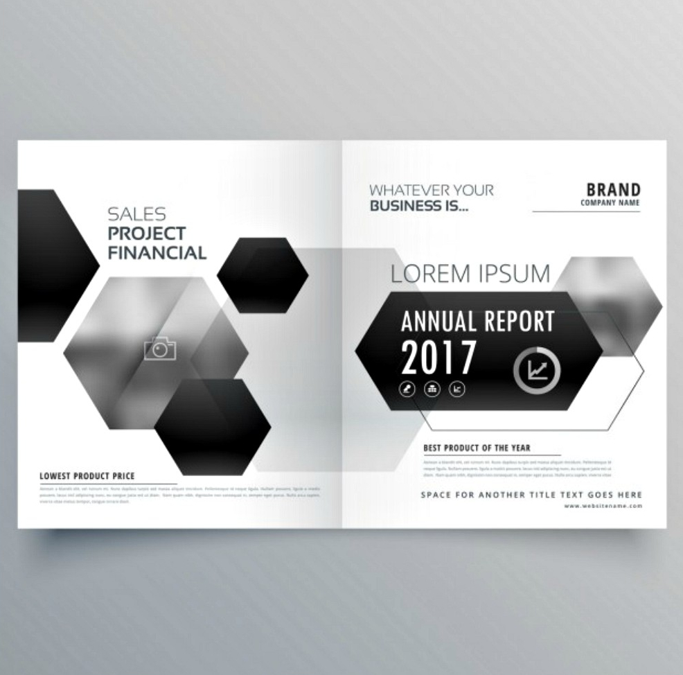
16. Blue Business Bi-fold Brochure Design Template

17. Two Color Bi-fold Template
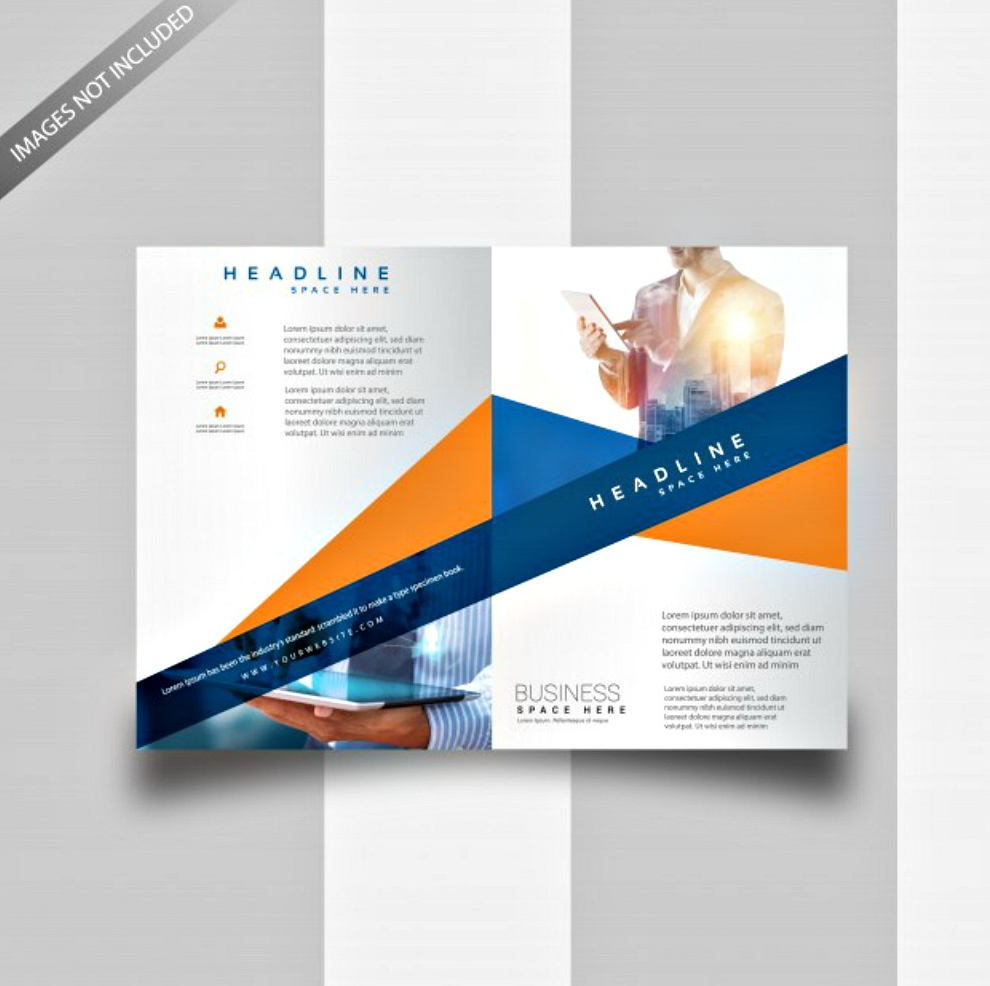
18. Modern Bifold Company Brochure

19. Technology Company Bi-fold Brochure
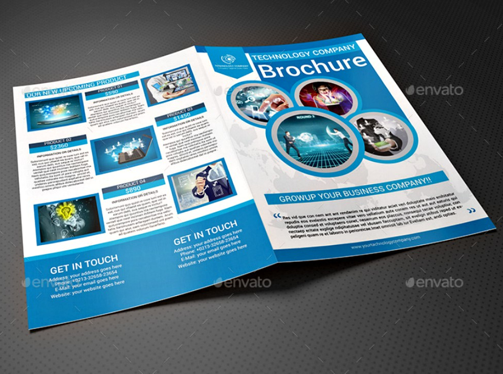
20. Software Company Bi-fold Brochure
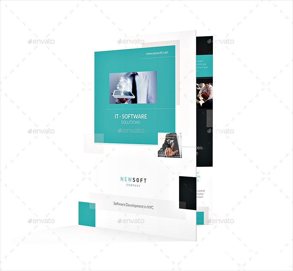
21. Company Profile Bi-fold Brochure
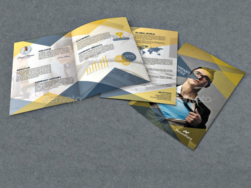
22. Insurance Company Bi-fold Brochure

23. Bi-fold Corporate Brochure
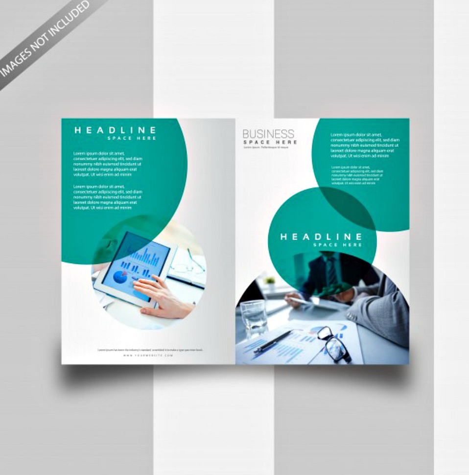
24. Bi-fold Editable Brochure
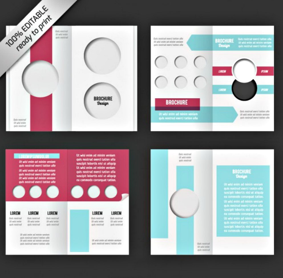
25. Transportation Company Bi-fold Brochure

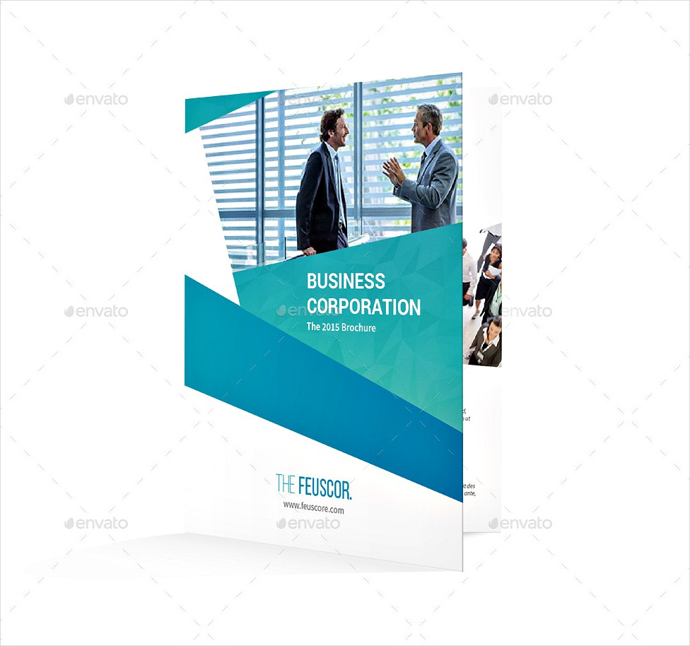
26. Business Corporation Bi-fold Brochure
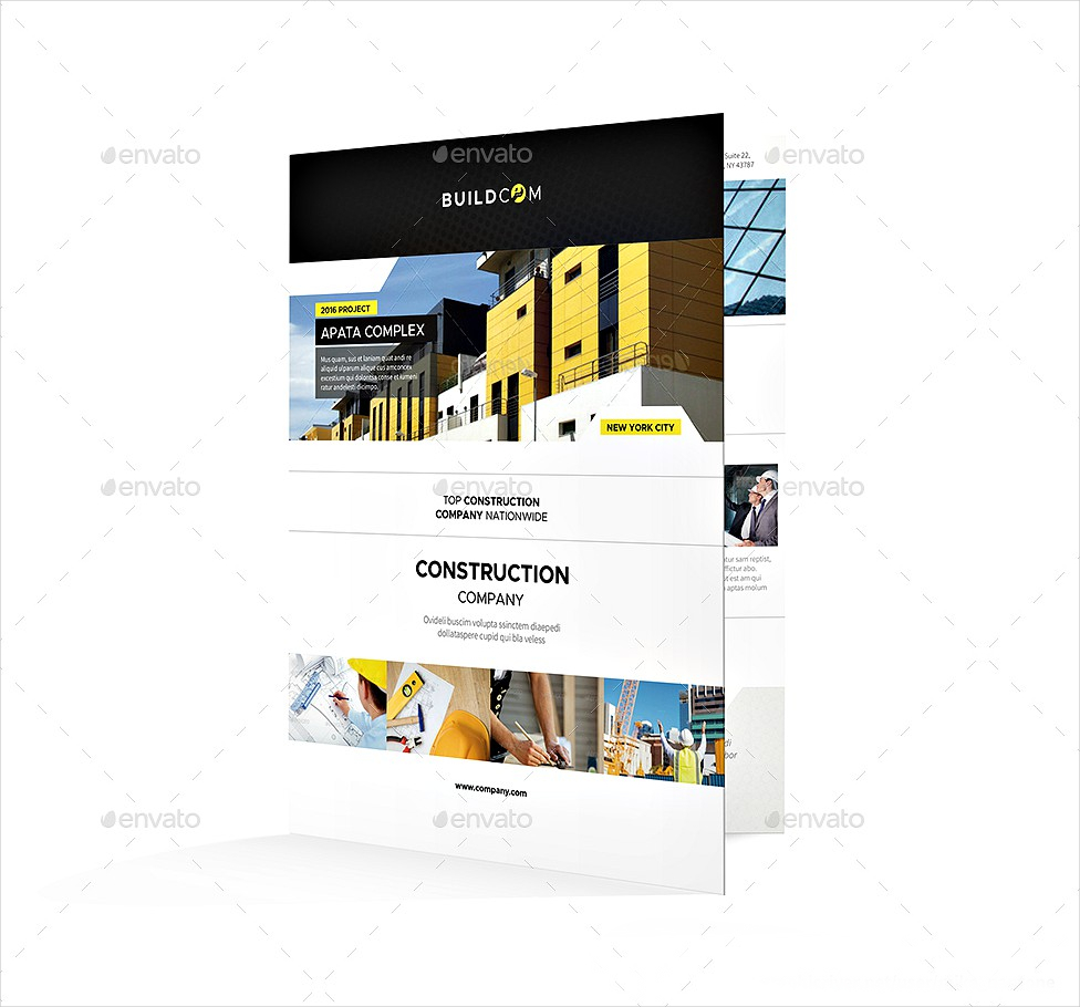
27. Construction Company Bi-fold Brochure
What Is a Bi-Fold Brochure?
A bi-fold brochure or a single fold brochure is a print promotional material used for commercial purposes. It is also used as an introduction to a company, an institution, or an event. Businesses favor brochure because it’s more compact than posters, and allows more space than flyers.
Best Practices When to Make Your Bi-Fold Brochure Stand Out
How did brochures remain to be relevant? According to Medium, brochures are important because it is characterized by many advantages, such as being cost-effective and having the ability to raise a business’ credibility. It’s everything good in one, all there’s left to do is to amplify them. Make your brochure stand out with the following tips:
1. Understand Your Brand’s Personality
You must understand that any material you put out for your business is a representation of your brand’s image and characteristics. Your company brochure should tell your brand’s story by employing a visual that presents what your business is all about. This gives your audience a glimpse of what you are through your brochure, even before they can read it. If you’re releasing a medical brochure promoting medical services, you wouldn’t want to use bright and perky colors as if you’re advertising a preschool.
2. Excite Your Audience
How will a piece of paper create excitement? This is the role of call-to-actions in your brochure. Your marketing brochure shouldn’t only fulfill its part of giving information to your audience, but it should also get them up and running on their feet. Aside from putting enticing call-to-actions, you can also make a promo voucher out of your brochure. For example, if you’re opening a new coffee shop and you want to reward your customers with a little treat, they can come to your shop with your brochure and exchange it for a free drink.
3. Maintain a Well-Balanced Layout
In any visual material, the key is always to find the right balance between your content and your graphic designs. This is a basic fact, so how will this capture your audience’s attention? Well, an inconsistent and imbalanced layout won’t look attractive. You should have a well-made and creative brochure. This is why you should be wary on how you can find the right balance on your layout. If you want to put emphasis on your texts, keep it concise and tone down on the design. Allow ample space to draw your audience’s attention to the text. If you want to keep your text minimal and focus on visuals, cut down your word count and include a well-arranged array of graphic artworks and photos.
4. Make Use of Relevant Images
Photos are powerful visual components. Even with the lack of words of descriptive statements, a single photograph would compensate for it. For brochures, it’s not only intended to be an effective visual design, but it also signifies credibility. If you want to showcase your products or services, how will they believe you if you don’t have a photo for proof? If you’re making an education brochure for a college or university, a handful of the campus’ photos should be enough to make them interested.
FAQ’s
What is the size of a bi-fold brochure?
A bi-fold brochure’s size varies according to individual preference, but its usual dimensions are 8 1/2 “x 16 1/2 “when laid flat and 8 1/2″ x 8 1/4” when folded.
What is the difference between a brochure and a booklet?
A brochure is typically a folded paper to create a 4-page space for the content. You can also add several pages to this and still call it a brochure. On the other hand, a booklet can work similarly with sample brochures, but the two vary on a single thing: a booklet has a hard cover while a brochure doesn’t.
What are the basic parts of a brochure?
When making a brochure, here are some parts that you must remember: 1. Cover 2. Title and logo 3. Contact details 4. Main points and details 5. Slogan
Brochures never cease to be among the most useful advertising tools. They are an essential marketing strategy to successfully win over your target consumers over to your side and boost not only your business’ reach but your profit as well. But such results are only possible if you create a brochure that will pique their interest. Choose yours among our high-quality and well-made brochure collection. Download now!


