17+ Billboard Examples to Download
Cruising through heavy traffic can be a drag for most drivers and commuters. It’s always the same view of vehicles tailing from bumper to bumper, not to mention the sight of red lights and smoke coming from the cars heating up. There’s nothing fun about being stuck in traffic from hours on end, that is, until you see a funny billboard ad just a couple meters ahead. You may also see digital billboard examples.
The tactile nature of billboard advertisements is what makes this marketing medium unique. While we’re used to seeing high rise billboard ads along congested streets and other outdoor environments, indoor billboards ads can also be found lying around train stations, shopping malls, and casinos. These advertisements tend to be striking and creative in form due to how it aims to attract and engage viewers to a given brand. However, simple billboard advertising is a craft that needs to be mastered. You can’t have a billboard put up under your name that fails to communicate accordingly with your targeted audience. This is why creating a billboard ad that is commutative just as it is creative is of utmost importance.
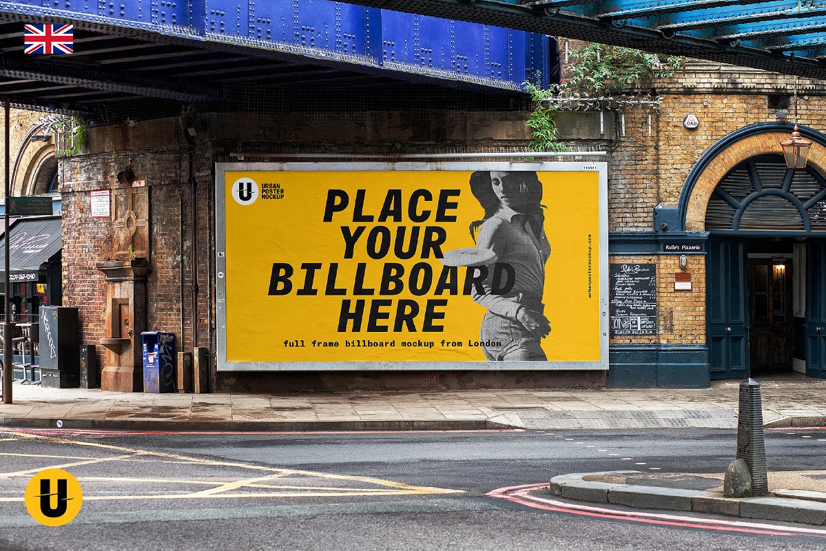
Urban Billboard Design Example

Street Billboard Design Example
9 Reasons Why You Should Choose Billboard Advertising
Billboards are a potent tool in advertising, but why?
Apart from being a direct marketing channel for business-consumer communication, billboards have become a part of our cultural landscapes. In fact, it’s hard to imagine an urbanized city without billboards sticking out from every corner. They come in a variety of shapes and sizes but manage to serve a common purpose. But with the introduction of social media marketing and online marketing to the world of business, why should advertisers opt for this customary approach?
To understand the wonders of a billboard marketing campaign, here are nine good reasons why billboard advertising is still as relevant as ever:
1. It’s everywhere!
More and more people these days spend time on the road than in their own houses. Apart from travelling to and from the office or school on a daily basis, people often go to the mall, the grocery store, the gym, or even the park during their free time. And if you’re one of these people, then you know how billboards are literally everywhere you go. You may also like billboard mock-up designs and examples.
Quite frankly, billboards are the only advertising media that drivers cannot escape from. They’re everywhere you go and it’s nearly impossible to avoid them. People can throw away a business brochure, or turn off the radio before an ad comes on, but a billboard is difficult to ignore when it’s placed right there in front of you.
2. Cost-effective medium.
While the production and manufacturing process of billboard advertising doesn’t come cheap, we can’t deny the significant return in investment brought by such approach.
Among the many marketing campaigns to choose from, the cost of a billboard ad is less than one penny per the thousand people that may potentially see your message. If you compare that to the traditional forms of marketing, billboards, once situated at the right locations, can bring you more than your money’s worth.
3. Infinite design possibilities.
Most billboard layouts are tailored according to a similar formula: a huge picture with a compelling headline. This is an opportunity for a business to utilize such medium in such a way that competitors are not. There are unlimited design possibilities that an advertiser may incorporate into the ad in order to stand out from others. Given how there may be a dozen other billboard ads placed within a close range from one another, you need to make sure your ad leaves the best impression. You may also see vector billboard designs and examples.
Keep in mind that an effective ad is the fruit of a thorough process of conceptualization and design, so you must learn to use your resources wisely before launching a costly campaign.
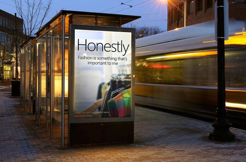
Station Billboard Design Example
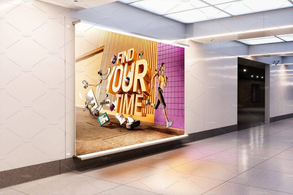
School Billboard Design Example

4. Constant exposure.
Purchasing a billboard space that’s good for twelve weeks would mean that people would get to see your ad everyday, at any time, for the next three months. This type of exposure guarantees your advertisement reaches as many people as possible within the said time period. If you take the same route on a regular basis, the billboard ad is bound to leave an impact on you one way or another. You may also see vertical banner designs and examples.
5. Encourages impulse buying.
How many times have you come across a food billboard ad while running an errand, and contemplated on the same ad multiple times throughout the day, only to end up at the nearest food stop to purchase the product because it’s all you’ve been thinking about?
Though buying the product was never a part of your agenda, you purchase it nonetheless because the ad persuaded you to. We can’t deny how good marketing has the ability to influence our buying decisions during certain times. Effective marketing comes when you are able to entice consumers and prompt an immediate response with your ad. You may also like retro billboard designs and examples.
6. Flexible.
Thanks to technological innovation, conventional billboard ads have taken a step back from the marketing scene to make way for a more modern media tool — the digital billboard.
Among the many billboard and signage types, digital billboards offer a series of benefits thanks to its versatility. From assigning time slots for the ad to an easy set up process, this type of billboard design makes it easier for advertisers to create animated advertisements that can attract prospects at a single glance. This even allows advertisers to send multiple messages in their ad, with no extra production charges to worry about. Digital billboards are extremely visible from far distances as well, which is perfect when you want to get noticed right away.
Metal Billboard Design Example
Outdoor Advertising Billboard Design Example
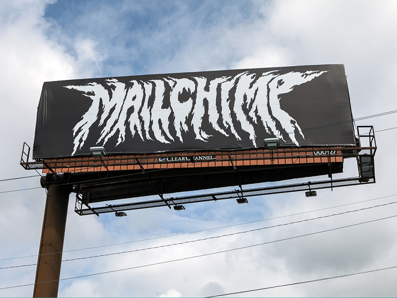
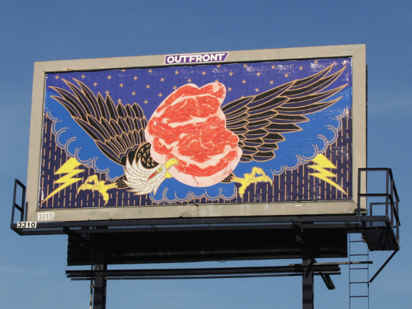
Meat Monkey Billboard Design Example
7. Targeted Locations.
Have you ever gotten hungry while driving along a wide, boring highway? Then to push your appetite even more, you suddenly come across a restaurant billboard ad that says the outlet is only 3 km away?
Most people would respond by making a stop over before they continue on with their journey. This is one major benefit that a billboard has compared to other promotional mediums. In some cases, the billboard may display a product or service right next to the establishment that offers it. Using a massive medium for marketing will help the brand garner attention effortlessly. It targets a broad demographic of people to ensure better marketing reach. You may also see digital marketing strategies.
8. Customizable.
The great thing about billboard ads is that they’re all different and unique in their own way. Many advertisers like to experiment with various colors, graphics, and even shapes and sizes when they create their ad. It’s all about being creative enough to send a message that reflects the identity of your brand. Remember, the marketing goal to this approach is to ingrain a given message in one’s mind. This will help increase customer engagement and generate better sales for the business.
9. Impactful.
A big, colorful billboard is bound to make an impact somehow. Hence, it’s sure to be memorable.
Crafting a billboard that highlights a simple yet powerful message is key in billboard advertising. This can easily make a person ponder upon a thought for the rest of the day. Not only can this change an individual’s perception towards a brand, but it can also shape their feelings towards it. You may also like examples of advertisement design.
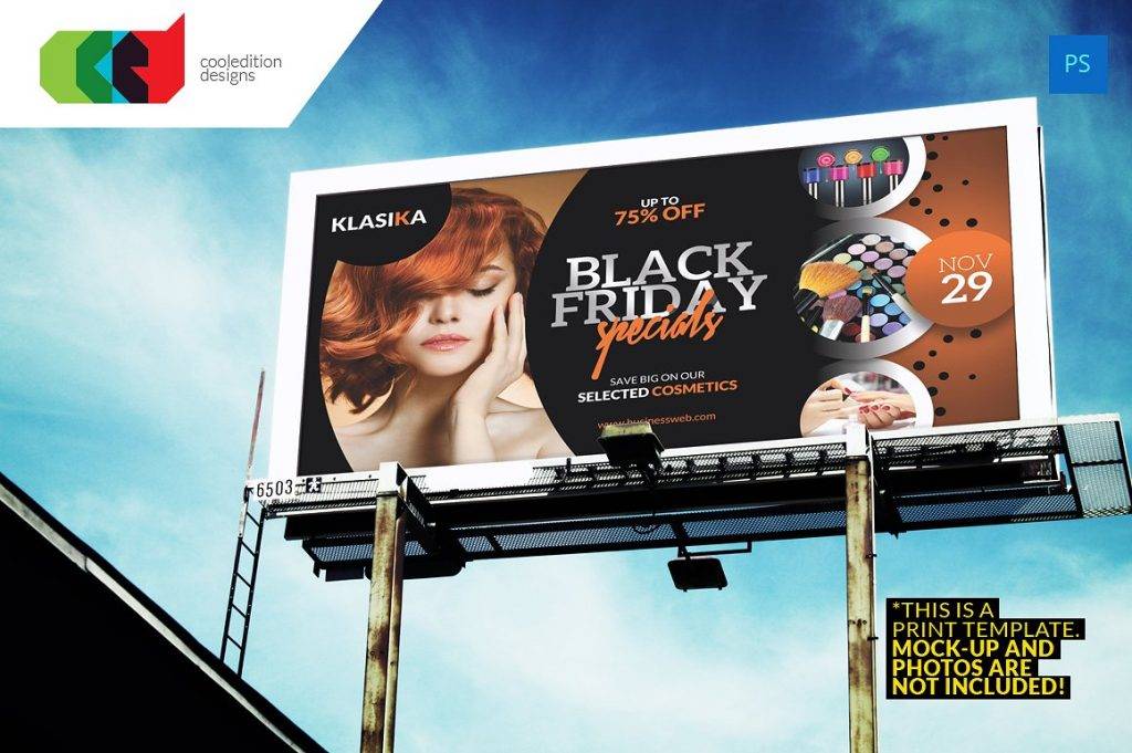
Black Friday Billboard Design Example
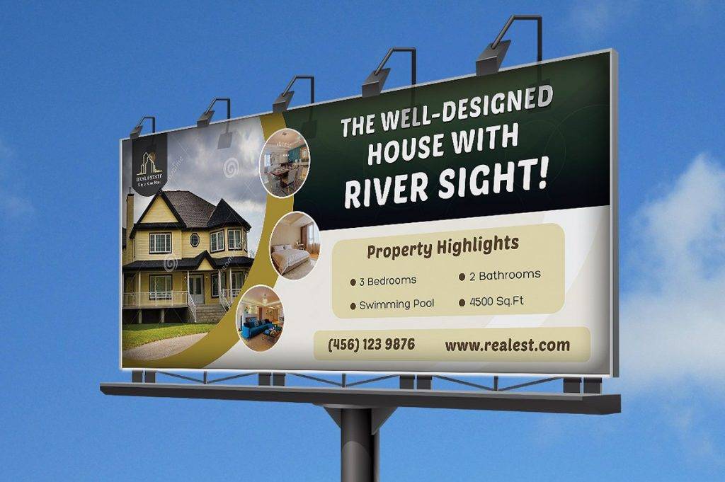
Real Estate Billboard Design Example
Building Construction Billboard Design Example
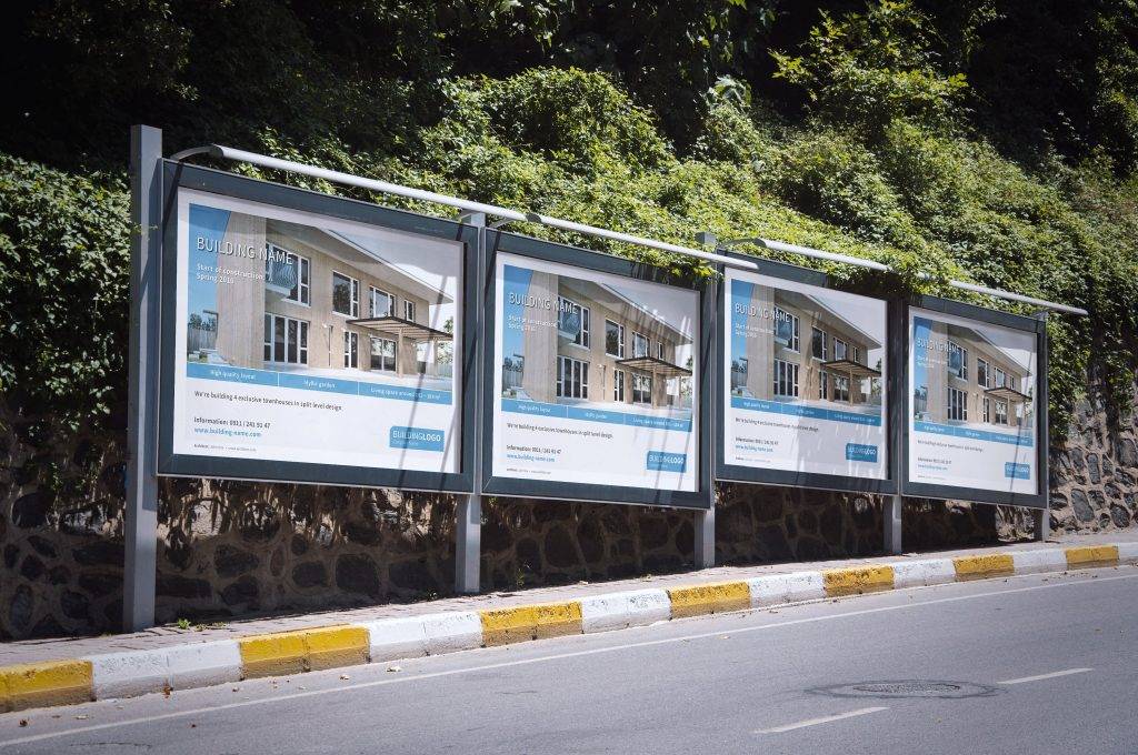
Restaurant Billboard Design Example

Corporate Billboard Design Example
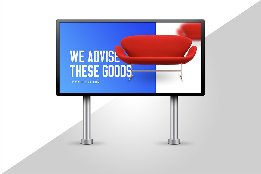
Fast Food Billboard Design Example
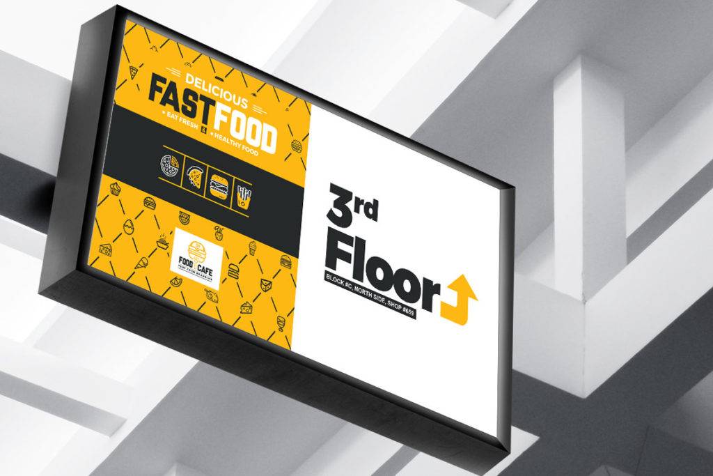
Billboard Template Design Example
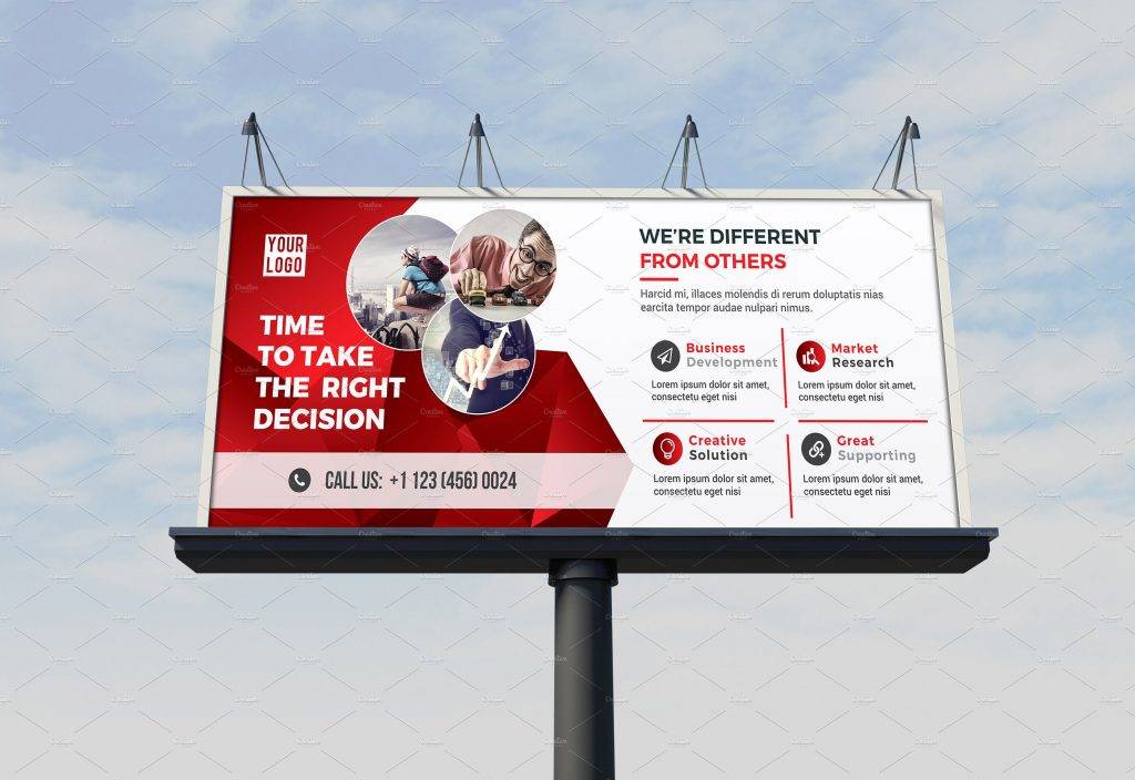
5 Creative Billboard Ideas for Your Business
In the past, billboards were typically composed of pieces of paper being stuck together in order to form one big image. But thanks to the likes of digital printing, advertisers can now print ads on a single sheet, or even use digital media to create computerized billboards ads for their convenience. You may also see examples of banner ads.
But with so many of these billboards scattered around our landscape, from busy highways to suburban roadsides, developing unique billboard marketing strategies is vital to corporate success. The last thing you would ever want is for consumers to mistaken your ad from that of a competing brand due to close similarities. This is why it’s important to quit doing what others are doing and start going beyond what is expected. Launching a rather different marketing strategy seems like a red flag to some advertisers, but with proper planning and execution, you’re sure to come out on top.
Listed below are some clever billboard marketing ideas to inspire you:
1. Bike Billboards
Have you ever heard of bike billboards before or let alone, seen one? If you haven’t, then try picturing out a bike with a life-sized cardboard attached to its rear end.
Besides being more mobile than the standard type of billboard, bike billboards are incredibly efficient and inexpensive to make. This is an excellent choice for small business marketing, where you can create, maintain, and deploy such billboards at a reasonable price. This also enables the company to reach consumers from different locations. This simple form of advertising is sure to attract a lot of attention from prospective customers.
2. Outrageous (but Witty) Billboards
One of the aims of billboard advertising is to entertain its audience. Using humorous and outrageous concepts help make an advertisement stand out. However, humor and advertising can either be a smart or a deadly mix as well.
The secret to creating a witty billboard ad is to keep up with the times. Incorporating relevant subjects such as famous catchphrases, popular movie titles, and other trending topics into the ad’s message will help pique the interest of passers-by. Besides being relatable, be sure that viewers can quickly recognize the purpose of the ad without much thought. You may also like tips for designing effective banner ads.
3. Local-Based Billboards
Since most billboard ads are personalized according to a targeted location, then it would only seem right to keep your focus on the locals. You can poke fun or play with some local icons to grab a person’s attention. It can be of a local figure or landmark, as long as it is recognizable by the people of a particular area. You do have an option to carry out a positive or a negative play with your ad, just make sure you don’t end up offending anyone too much. Otherwise, this could generate a negative response from its audience. You may also check out roll-up banner designs & examples.
Again, using humor for this type of ad will also help it stick to the minds of viewers.
4. Digital Billboards
The streets of New York’s Times Square is filled with all sorts of digital billboard ads. Not only does it suit the contemporary age of technology, but it also adapts to the vibrant and colorful environment of one of the most popular locations in the world. Some companies even choose to timeshare their ads with other businesses to save resources, with the billboard swapping from one ad to another every few minutes. You might be interested in printable banner examples.
But if there’s one thing that advertiser’s must keep in mind when using such, it’s that digital billboards must be maintained well. Dead pixels or the blue screen of death can greatly affect the overall appearance of the advertisement. It can either mess up the design or cause issues that will fail to display the ad. When this happens, maintenance work must spring into action as soon as possible. You may also see company banner examples.
5. Quirky Billboards
A quirky billboard ad may be classified as unprofessional and ridiculous, but if we’re talking about making headlines using any form of publicity alone, then this is definitely worth the risk.
No images. No colors. No designs. Just plain text (plus your business logo and company tagline, of course).
Using a sales pitch that’s as direct as it is absurd may seem like a bad marketing move, but you’d be surprised how many businesses have attained success by simply doing something out of the norm. For instance, you could say “please buy our products,” which can sound pretty desperate, but at least you’re being honest and direct with your message. And whether or not people love it or hate it, you still managed to grab their attention and build brand awareness. You may also like pop-up banner designs & examples.
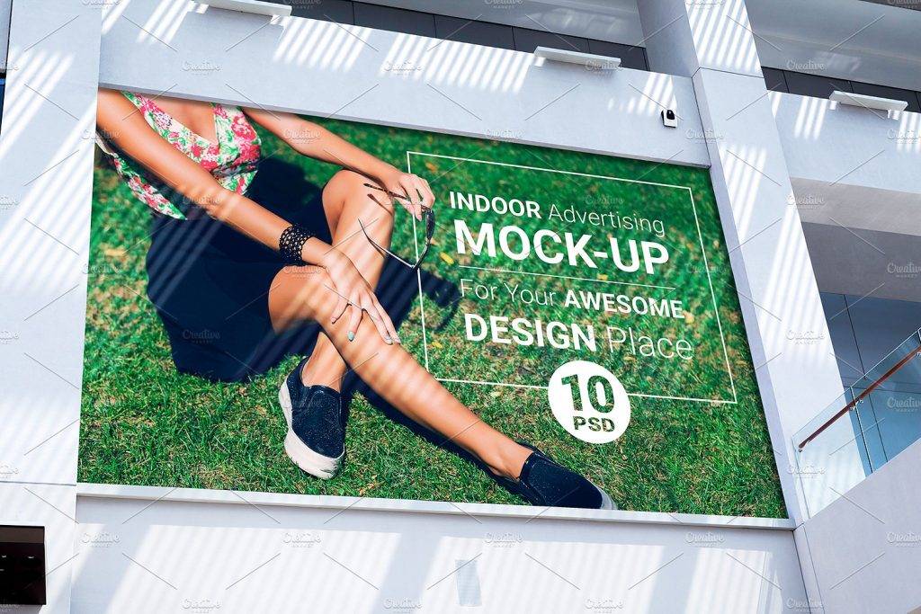
Indoor Advertising Billboard Design Example
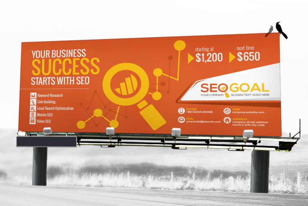
SEO Billboard Design Example
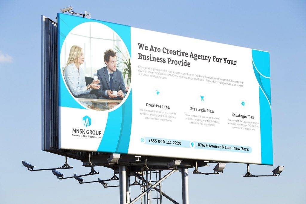
Bus Stop Billboard Design Example

Business Billboard Design Example
Tips for Designing an Effective Billboard Ad
Try recalling every billboard ad you’ve encountered in the last three days. Surely, you can’t remember every single one of them, but your mind can point out a significant few that are hard to forget. The average person can probably remember only seven out of a hundred ads they have seen in a day. So, who are these lucky few? You may also see roll up banner examples.
There’s no point in creating an ad that’s forgettable. The purpose of advertising is to give customers something to remember a brand for, which is why visual storytelling is a major factor to consider in both print and digital marketing. An effective ad can successfully keep a business under a person’s radar, leaving the viewer to think about the billboard ad even after driving by it.
When developing a billboard design, keep the following guidelines in mind:
1. Less is more.
Effective ads begin with a simple delivery. While it might be tempting to use up all the ad space with some kind of text or design, refrain from doing anything over the top. Complex designs tend to be irritating to look at even during short time periods. The billboard must consist of a brief expression of a single idea to ensure clarity in communication. You might be interested in real estate billboard designs and examples.
2. Consider viewing time.
Truth is, you’re likely to have less than ten seconds to make an impression with your audience. Most outdoor billboard ads are encountered by people inside a moving vehicle, and between keeping their eyes on the billboard and the road, viewing time is critical. So before launching the campaign, make sure your message is communicated effectively by the billboard ad. You may also like event banner examples.
3. Keep it short.
Setting a character limit for your ad must be strictly observed. Begin by composing a compelling statement, then edit it down to form a short slogan. Try limiting or eliminating punctuation and words to the bare minimum. Having about seven words or less worth of text will be enough to complete your ad. You may also check out fitness billboard examples.
4. Font size and style.
Since your goal is to create a billboard ad that can be seen from a fair distance, you need to choose the right font size and style for your layout. Make sure the size is large enough to be seen from far away, and that the type is clear and easy to read despite the distance between the ad and the reader. Setting an adequate distance between formal letters and words will also help improve visibility and readability.
5. Simple background.
In order to draw a person’s attention towards the focal point of your ad, be sure to design elements that help emphasize rather than serve as a distraction from the central idea of the billboard ad. But instead of having too much blank space, utilize such space wisely by making your text, image, or logo design bigger, yet complementary to the overall message.
6. Have a call to action.
What’s an advertisement without a call to action? If the CTA isn’t made clear in the ad, then people will fail to see the point you’re trying to make. Take note that how people respond to the ad will determine its success. Determine what you want people This includes phrases like ‘buy now!’, ‘call us at …’, or ‘visit our website.’
7. Ensure balance.
A crucial thing to remember in design is the value of balance. It shouldn’t seem like two objects are fighting for dominance, or this could affect the look and feel of the ad. For example, the logo usually isn’t the same size as the image being displayed. This is to avoid a messy layout that may be difficult to comprehend at first look. Finding the right balance between colors, text, and images is essential as well. You might be interested in examples of banner design.
From street corners to express highways, farm roads to city centers, billboards have visibly changed the look of our urban landscape in ways no one could have imagined. Billboards serve as a creative way to reach out to a mass audience that other forms of advertising materials can never do. For businesses that seek for campaigns that center on awareness and branding, then billboard advertising is the most suitable choice. They provide businesses and advertisers the opportunity to craft eye-catching ads at a cost-effective price, in order to reach maximum consumer impact. You may also see food billboard designs & examples.


