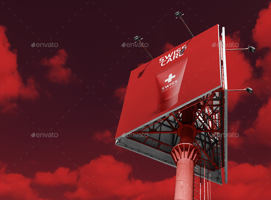
14+ Billboard Mock-Up Examples to Download
As we can see especially in busy cities, simple billboards are often present everywhere. As we place our gaze above our heads, we see billboards hanging up on the sides of the buildings and on areas specially designated for billboard ads. We might have come to a point where we ask if a billboard is really a great idea in advertising your products and services considering the number of competitors hanging their own billboards and the cost of such billboard.
Undoubtedly, billboards are naturally costly. But why do many company still pursue posting their ads in billboards? That is because they have figured out that the cost they will incur can be multiplied a couple of times in their profit as a result of the billboard ad. Also, they make sure that in making billboards, they can first glance the most close and realistic representation of their billboard design before putting them into actual billboard. This permits them to check if something is not right in the design or if there are changes needed to make to the billboard. You may also see vertical billboard designs and examples.
Types of Mock-Ups
Firstly, before knowing the types of mock-ups, we must know what is a mock-up and its basic uses to the developers and the clients. A mock-up is a scale of or the full-size model of a design that usually reflect the design choices for color scheme, layouts, typography, iconography, navigation, and the overall atmosphere of the product. It is usually used for teaching, demonstration, design evaluation, and promotion or advertisement. They are mainly used for the clients to provide feedback to the designers if some parts are still needed to modify. If it provides at least part of the functionality of a system and enables testing of a design, then it is called a prototype. You may also see food billboard designs & examples.
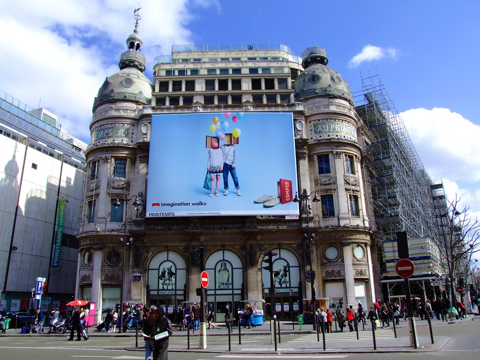
Mock-ups are designed to prevent major reconstruction on the actual project if ever there will be changes in designs. It is based on the popular engineering one-line which states that “It is better to fix it now on the drafting board with an eraser than fixing it later on the construction site with a sledge hammer.” Truly, it is more costly if changes were only made on the actual construction than just on the mock-up. Hence, mock-ups are very important so that changes needed to be implemented can easily be erased or added than changing them in the actual thing. You may also like examples of advertisement design.
To further discuss about mock-ups, below is a discussion on the types of mock-ups that you must know if you want to create your own mock-up for your project or construction.
1. Coded Mock-Ups
In coding your mock-ups, it is usually complex since it is designed for visual manipulation rather than just creating mock-ups. Hence, many designers build their mock-ups using graphic design softwares such as Photoshop and Sketch, which provides pixel-perfect images and allows you to add interactions to your mockups because for starters, they are really not comfortable with coding. They start with the appearance of the mock-up before creating the codes. This will focus only on visuals during the mock-up phase which saves times in decision-making as coding can be postponed until prototyping or in the later part. You may also check out what is direct marketing?
However, despite its complexity, there are a lot of skilled designers work with coding. They build a structure in HTML and then move to CSS for the basic layout. But there are others who prefer early coding because changes especially in terms of mathematical adjustments, like sizing, can be implemented more easily when the code is already written in the early stage. You might be interested in vertical banner designs and examples.
Nevertheless, there are advantages when using the the HTML/CSS route, and these are as follows:
- Feasible. Mock-ups that are designed only for visual purposes can be difficult to translate to code which will lead to wasted time and effort and even impossible in other instances. But when you start working on codes, it will give a hint right away of the things that you can and cannot do. You may also see examples of banner ads.
- Simplifying the iteration. As opposed to the former that it saves times in decision-making, the truth is, you can actually save time in coding by simplifying the iteration process.
- Less waste. Making a mockup creates a waste when made in anything other than the final technology in which the product is delivered. But you can eliminate or lessen the wastes through proper mock-up technologies. You may also like examples of banner design.
2. Graphic Design Software
As stated above, many designers utilize the use of mock-up apps as they provide them with easy manipulation of the software to make a visually presentable output. They use softwares like Photoshop, Sketch, and/or Illustrator to have a better control of the pixel in terms of colors and color schemes because those softwares provide them an endless selection highly defined colors and lesser restrictions to the color schemes and you can easily animate all layers in just few clicks. You may also check out pop-up banner designs & examples.
However, just like as stated above, if you are working first on visual presentation before coding, it might be difficult for you to code them in the later part as some colors, shades, hues, and values may not be feasible in coding.
3. Mock-Up Apps
If you are not comfortable with using codes as well as graphic design softwares, you might need the other type of mock-up creation which is the mock-up apps. They are tools that are created specifically for digital product designs and are built upon the existing experience with other design softwares such as Photoshop. Some of the most commonly used mock-up app is the UXPin, Sketch, Moqups, and Balsamiq which provides everything you need from the start of your preparation of your mock-up to the end process. They make the creation as easy as possible so that designers can focus on the visual and stylistic decisions and not anymore on the manipulating the program or the app.
Beginners prefer mock-up apps because of their ease of use, and experts appreciate the designs that are offered by the app because they are designed in a way that can meet their advanced needs. Overall, many people, whether a beginner or an expert, prefer the use of mock-up tools as they are very user-friendly because it is just a matter of drag and drop in customizing your own design of your mock-up. You might be interested in roll-up banner designs & examples.
Editable Billboard Mock-Up Example
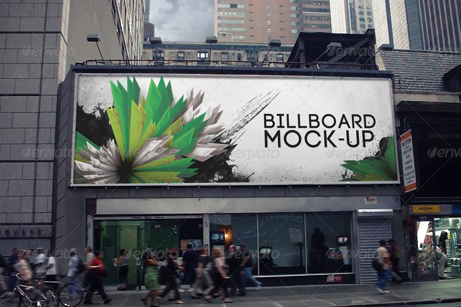
High-Resolution Billboard Mock-Up Example
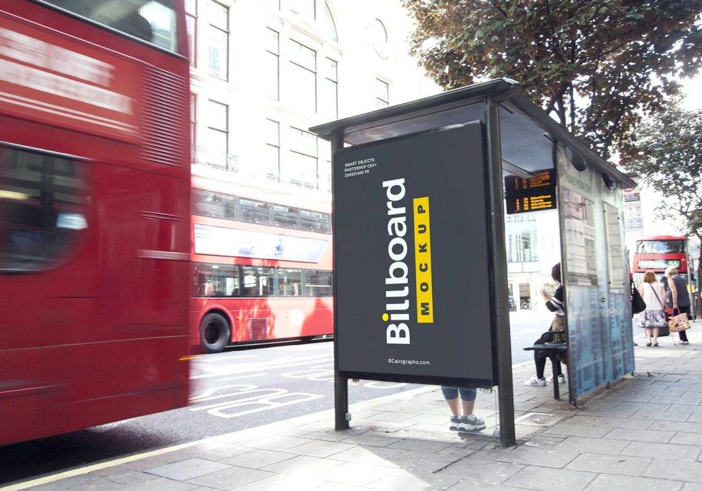
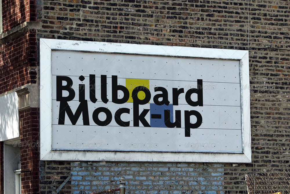
Photo-Realistic Billboard Mock-Up Example
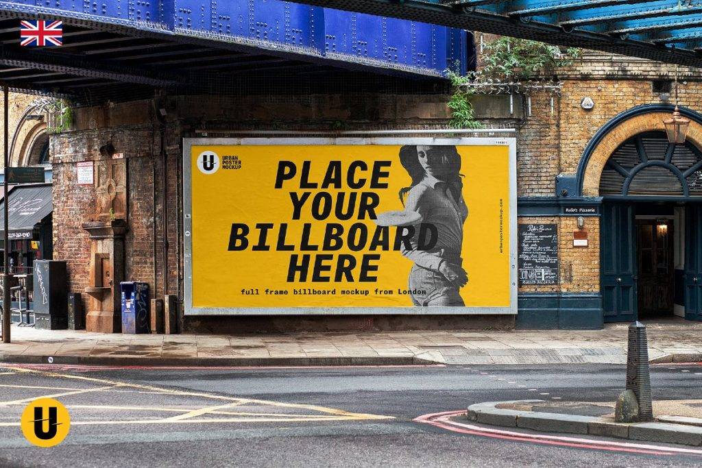
Full-Frame Billboard Mockup Example
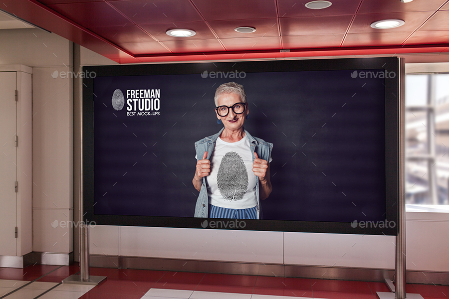
Organized Billboard Mock-Up Example
Billboard Mock-Up from London Example
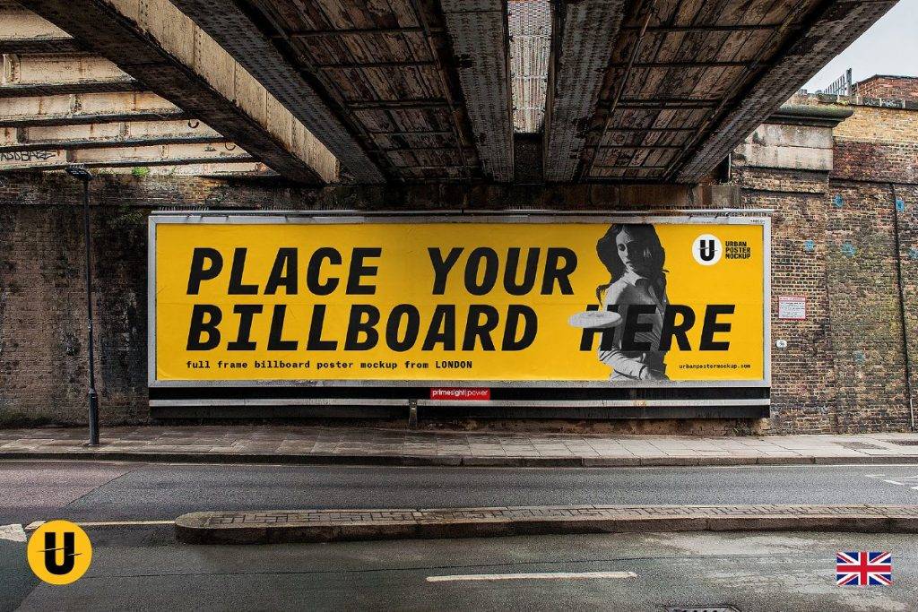
Well Organized Billboard Mock-Up Example

Realistic Billboard Mockup Example
Anatomy of a Mock-Up
In creating a mock-up, you must be aware that your design must be very closely similar to the actual object you will be creating. You must copy every detail specified by the upper management or your client and make sure that it represented the final output of the construction. There are certain things that are vital in the creation of your mock-up, the anatomy of a mock-up. The anatomy of the mock-up is the list of the things that are vital when you make and draft your own mock-up. You may also see examples of anniversary banner designs.
You must consider the things that comprises a mock-up to have a good-quality design and output, and these are as follows:
1. Layout
The first thing that you must consider in creating your own mock-up is the layout of your content. This means how the content, cards, text, and graphics is displayed. You are also going to consider the pattern of those content such as the F-pattern or the Z-pattern. Moreover, you also have to decide on the size of each content and how many you want to fit on the screen at a time. This decision-making is left in your hands at the start of your layout, but you must also consider the specifications by your client if they have clearly specified a definite or particular layout for the project. If so, you must apply them in your mock-up because that will become their basis for the actual construction of the project. You may also like printable banner examples.
2. Contrast and Color
For the contrast and color of your text, graphics, and background, you might check them with some apps as our mere eyes can be sometimes be fooled by the colors. You may check out these contrast apps which are available online:
- Colour Contrast Check: One of the commonly used online tool for checking colors which gives you feedback on the colors that you entered by showing the appearance of the color combination you have chosen as well as the result if it passes the test. You may also check out tips for designing effective banner ads.
- Colour Contrast Analyser: This is very similar to the above tool, only that it has no live feedback on the color combination that you entered. You still need to submit the combination and wait for the result which will only take for a while.
- Colour Contrast Visualiser: This is another tool that can visualize the color for you and provide sufficient contrast on the color palette. In this way, you can find acceptable color combinations for your project. You might be interested in examples of superb birthday banners.
- Colour Contrast Analyser Firefox Extension: This tool does not anymore require you to enter the color combination manually, but instead, it examines the difference between foreground and background colors and displaying the results in another tab.
- CSS Analyser: This tool checks the relevant text sizes that are specified in a a relative unit of measurement and also does a color contrast test of your CSS. You may also see company banner examples.
- Luminosity Contrast Ratio Analyser: With the help of an algorithm developed by the Trace R&D Center, this tool tests foreground and background color combinations.
- Vischeck: This is a color blindness simulator that simulates color bindness on an image that you are working on or the image that you upload on the web. You may also like valentine’s day banner examples & designs.
- Contrast Analyser, Version 2.0: This tool analyze a web page for its users. It is also user-friendly since you can pull the sliders when you want to specify the foreground or the background or work with the color or brightness. It will give a preview on the colors on have selected and provide feedback.
- Graybit: This tool lets you submit a URL to a certain web page that you are working on and converts it to grayscale and displayed in your browser. You may also check out event banner examples.
- Sim Daltonism: This tool simulates the color blindness for an easy check if a design is likely to cause problems.
3. Typography and Spacing
Typography refers to the style and appearance of the thing you are working on. You must work on the typography size, font, style, and spacing of your text and your graphics. It is like working on the overall structure and consistency of your design. You might be interested in examples of illustration design.
For spacing, there must be enough spacing and margin to enhance comprehension and legibility to the viewers. The notion is that the more negative space provided around a certain element, the more the viewer’s eyes will be drawn to it. Hence, also work on the spacing, and give an enough amount of space for the viewer’s eye to be caught into it.
4. Visuals
Visuals, specifically navigation visuals, should also be considered to know how will your output look like in its finished form. This is working on specific and minute details of your project and you can dive in the color schemes and hues as well as the order of the text and typography. You may also see examples of advertising banner design.
Mupi Billboard Mock-Up Example
Billboard Underground Metro Mock-Up Example
Mock-Up Billboards in the Subway Example
Professional Billboard Mock-up Set Example
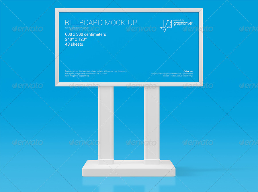
Mupi Billboard Mock-Up Design Example
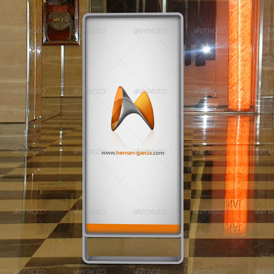
Billboard Mockup—Ad Station Series Example
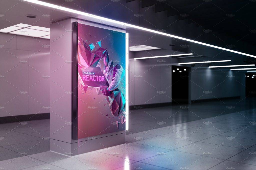
High-Quality Billboard Mock-Up Example
Final Note
Creating a mock-up requires that you must have an almost-actual copy of the final output of your project. It is as if that you are working on the real thing but the advantage is that it can be easily changed whenever you want some modifications to the designs. This can help you achieve a lesser cost as compared to a when a reconstruction is need if the final project has already been built. Hence, a mock up is very important in working special projects. There are three types of mock-ups that you must know an understand before creating your own mock-up, and they are as follows: coded mock-ups, mock-up apps, and graphic design software. You may also like advertising plan examples & samples.
Also, you must know first the anatomy of a mock-up so you have the gage on what are the things needed to consider in your mock-up. They are as follows: layout, contrast, color, typography, spacing, and visuals. You must consider these things when having a mock-up for a very detailed and presentable copy to the final output of your project.
Now that you already know very well the preparations for the creation of a billboard, it is expected that you are ready enough to make your own billboard mock-up design. If not, no need to worry! Just scroll back and check out the different examples and designs of billboard mock-ups above. You may also check out marketing strategies for small businesses.


