34+ Company Brochure Examples to Download
Brochures have been around for quite some time now. Brochures started to be printed out and distributed in the early 1900s, but they weren’t used as marketing tools. Rather, they were mostly used as campaign materials to address social issues such as racism and poverty.
These days, brochures are most by used companies, whether they are small and medium enterprises or large corporations. This article will be discussing the elements of a good company brochure, as well as steps in designing a company brochure. We have provided some examples that you can also download for free.
Elements of a Good Company Brochure
Attention-grabbing headline: Brochures need to immediately grab the attention of readers, similar to a poster or flyer. The headline should be the first thing that the individual sees in the brochure. If a headline is absent in the brochure, then the brochure is practically useless.
Points of differences: Points of differences are basically benefits that set you apart from your competitors. Points of differences are also considered as your competitive advantage or personal branding statement. The points of differences should answer these questions: What makes your company different? Why should a client opt to choose your company instead of another?
An educational brochure: Make your brochure educational. Once you have the potential customer interested, they will want to know on the products or services you are selling. Try to be clear without overloading the brochure with industry-jargon that your company and competitors only understand.
A brochure with hard evidence: You will be making bold claims in your brochure. Make sure to back up those claims with hard evidence (i.e. testimonials and quotes from customers, celebrities, and other public figures).
A call to action: A brochure is not just printed and to be completely ignored after. The reader should take action after reading your brochure. The brochure should let the reader pick up his phone and inquire about your products and services.
34+ Company Brochure Templates
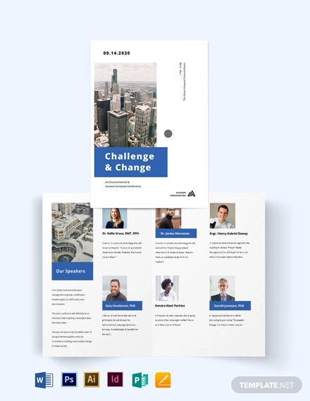
Corporate Event Company Bi-Fold Brochure Example
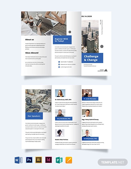
Corporate Event Company Tri-Fold Brochure Example
Creative Company Profile Bi-Fold Brochure Example
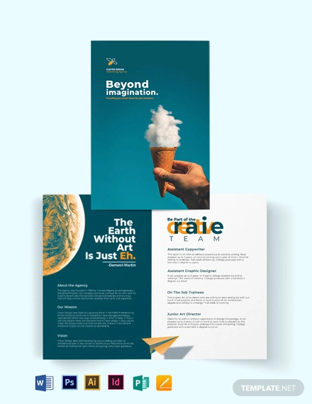
Creative Company Profile Tri-Fold Brochure Example
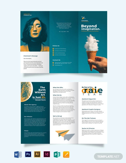
Business Company Profile Bi-Fold Brochure Example
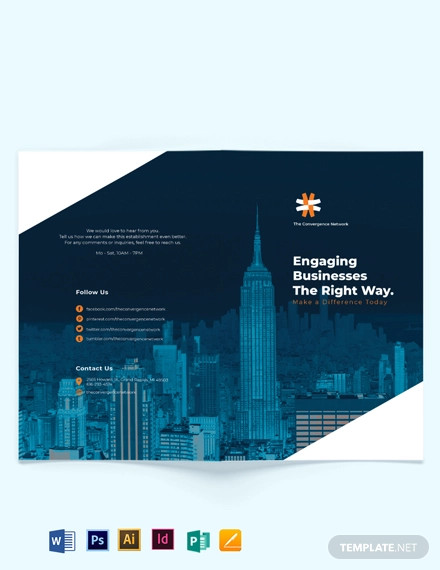
Business Company Profile Tri-fold Brochure Example
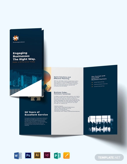
Interior Design Company Bi-Fold Brochure Example
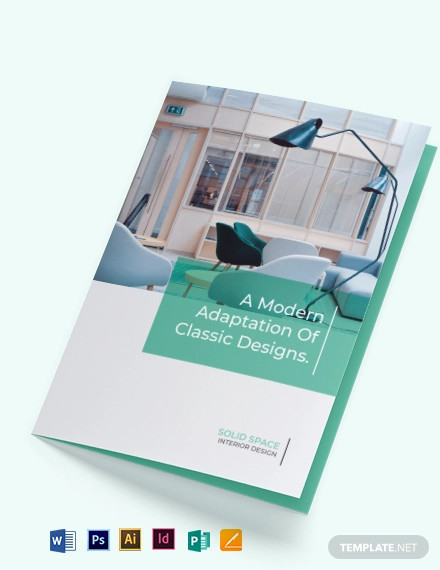
Interior Design Company Tri-Fold Brochure Example
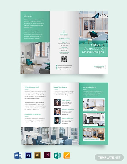
Modern Company Profile Bi-Fold Brochure Template
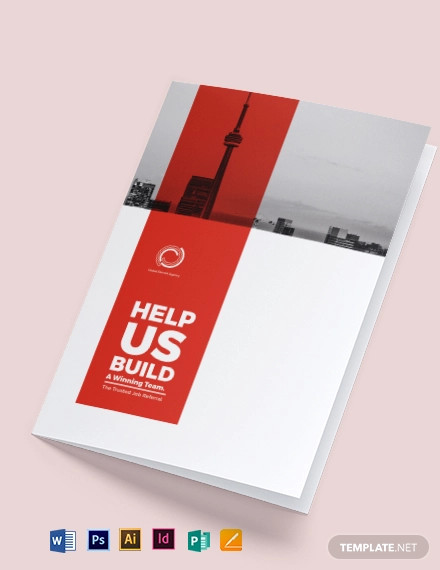
Modern Company Profile Tri-Fold Brochure Template
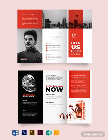
One Page Company Profile Brochure Example
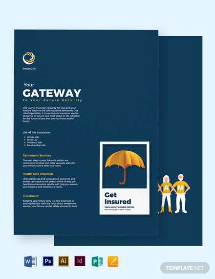
Landscape Company Tri-Fold Brochure Example
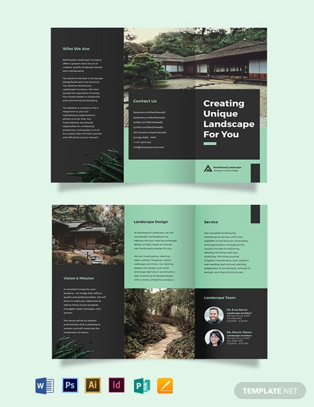
Landscape Company Bi-Fold Brochure Example
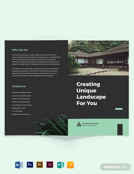
Professional Company Profile Tri-Fold Brochure Template
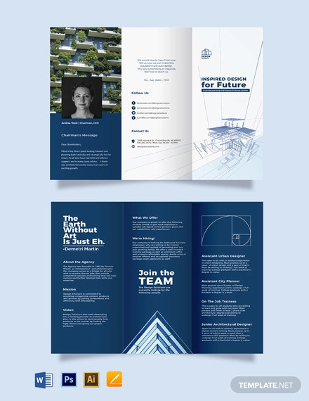
Professional Company Profile Bi-Fold Brochure Template
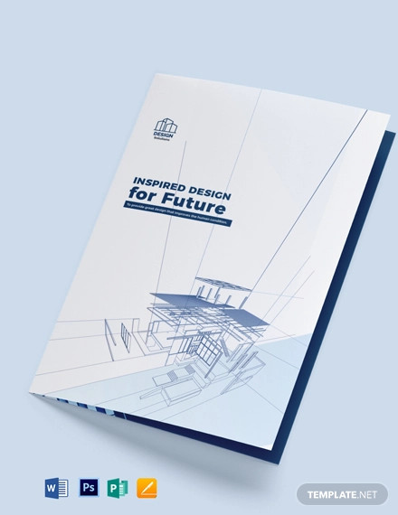
Simple Company Profile Tri-Fold Brochure Example
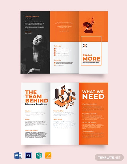
Simple Company Profile Bi-Fold Brochure Example
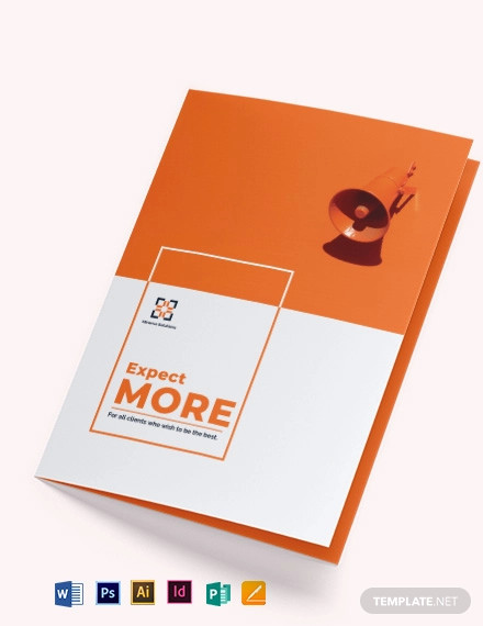
Interior Decor Brochure
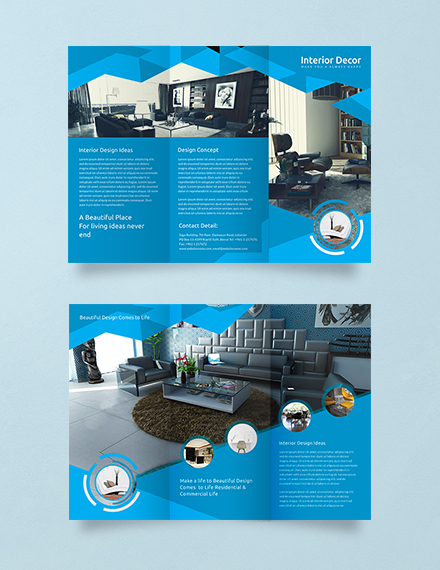
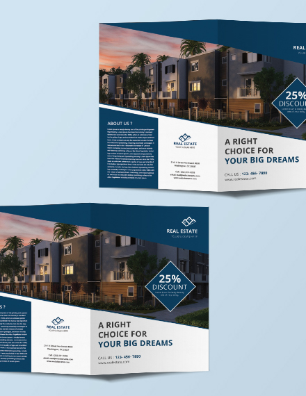
Real Estate Bi-fold Brochure Design
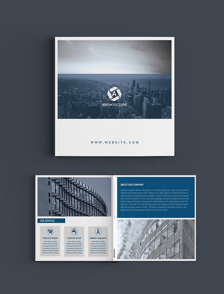
Square Architect Brochure Template
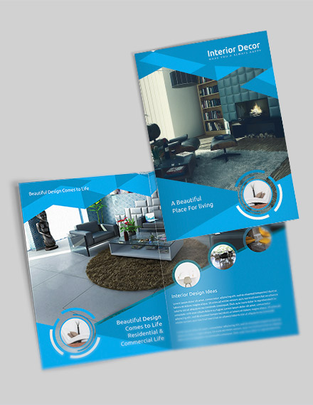
Creative Interior Decor Bi-Fold Brochure
Retro Multipurpose Bi-Fold Brochure
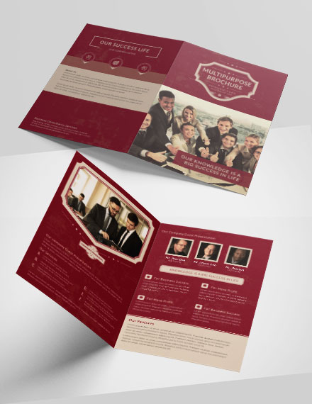
Multipurpose Retro Bi-fold Brochure
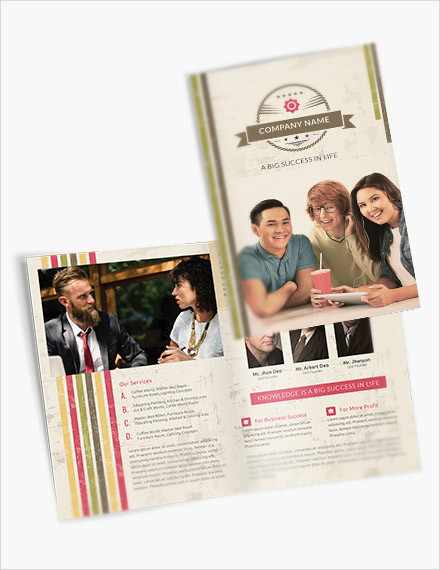
Construction Bi-Fold Brochure
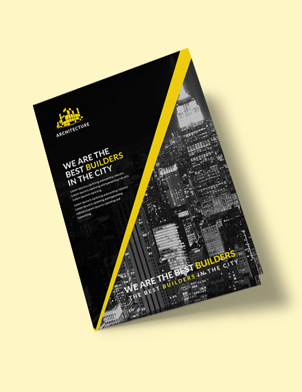
Building Construction Brochure Design
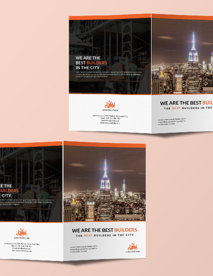
Construction Brochure Template
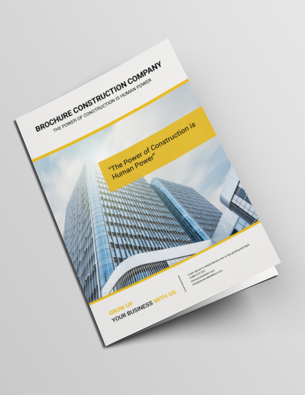
Construction Company Brochure
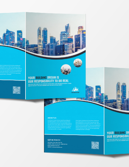
Company Profile Brochure Design
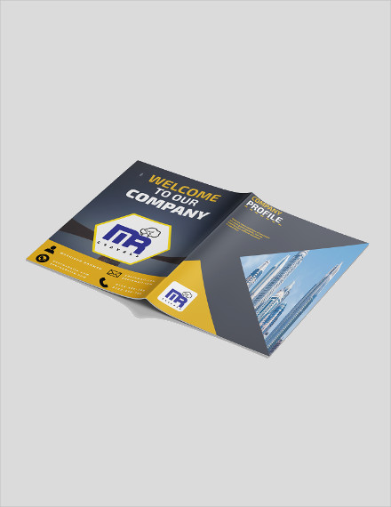
Company Brochure for Services Company
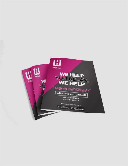
Training Company Brochure Example
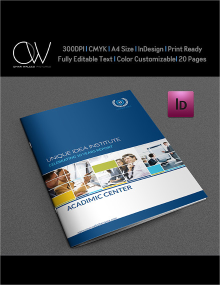
7 Company Brochure Examples
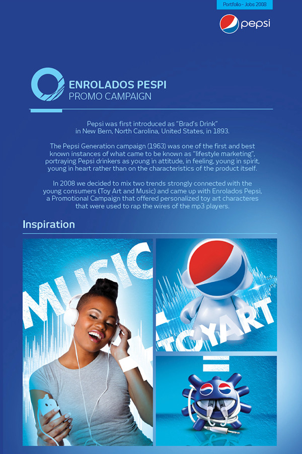
Pepsi Company Brochure
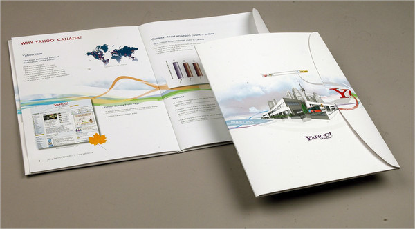
Yahoo Search Marketing Brochure
]
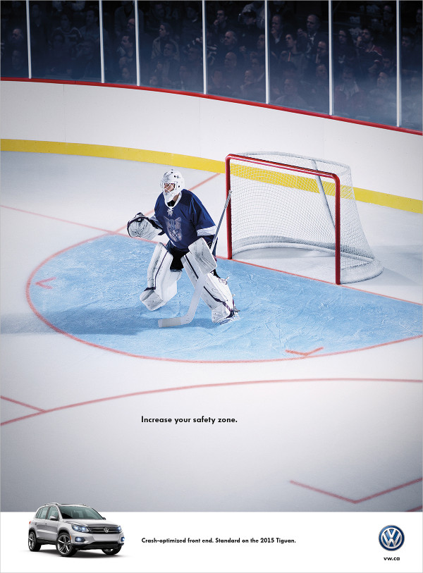
Volkswagen Company Brochure
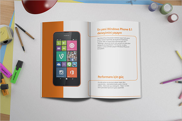
Nokia Company Brochure Example
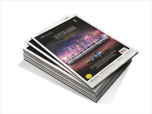
Hyundai Company Brochure Design
Steps to Designing a Good Company Brochure
Command attention with the cover
You should create a cover that catches the eye of your potential customer or client.
Attraction attention with compelling text
The cover design causes people to pause, but the text (specifically a phrase) on the cover is the invitation to pick up the brochure and read it.
Set the tone with color
One of the best methods to set the mood of your message is to use the right color. For example, if your business or service is fun and whimsical, bright colors are more preferred.
Choose the right font and font size
Selecting the right font is another way to set the mood of your message. Comic Sans, for example, is not an appropriate font for a brochure about a funeral home.
Use white space strategically
White space is an empty space that is as important as images and text. White space keeps your brochure from looking cluttered.
Organize with boxes
Boxes also draw attention to key images and/or information. Use boxes only sparingly.
Choose an appropriate fold
There are two common types of brochure folds: Z-fold and trifold. A Z-fold is used when a lot of information is presented.
Use photographs
Pictures and images are another way to communicate your company’s message without using text. Use about 2–4 pictures so the reader isn’t overwhelmed.
Steps to Designing a Good Company Brochure
1. Add compelling photos and graphics
Effective brochures should always include visual elements. Take note that the images you select should complement your text.
2. Use full bleed
Unfortunately, printers are not able to print right up to the edge of the paper. This can result in a white border around your content. In order to achieve a design that extends all the way to the edge of the paper, use a printing technique called “full bleed.”
3. Add your text
Text is an important part of a brochure. Make sure to create a draft before you to write the actual text in the brochure.
4. Incorporate color
Using color will greatly enhance your company brochure. Various colors also enhances your message visually and emphasizes specific points.
5. Choose the right size
Usually, brochures use the standard letter size which is 8 ½” × 11″. This size is a good starting point for print-at-home flyers.
Types of Brochures
Gate fold brochure
Gate fold brochures are quite uncommon, but they create a big impact when used correctly. The reason they are used rarely is their cost, that is why they are mostly used in high-end marketing.
Trifold brochure
Basically, a trifold brochure has three folds and is the the three-fold version of the bifold brochure. Trifold brochures provide you with enough space to present your information as it creates six panels.
Bifold brochure
The bifold brochure is the most common type of brochure. It is used by most companies as it is fairly cheap and affordable to print.
Leaflet or flyer
A leaflet brochure or a flyer is one of the most common types of brochures and are also very affordable to print. Leaflets or flyers are also used for targeting a large number of people and market segments.
Folders and insert brochure
These brochures have an additional feature of folders within the brochure. These brochures are used to store a feedback form or an enrollment form.
Z-fold brochure
This brochure goes by its name and folds into a Z. The Z fold gives an attractive look to the brochure and will leave the reader quite impressed.


