10+ Caution Signage Examples to Download
Signs are ubiquitous tools in our society that convey specific messages and instructions. They serve various purposes, from guiding traffic with stop signs and red lights—which demand drivers to halt, ensuring road safety—to displaying information and advertisements on billboards. Safety signs are particularly vital, clearly marking hazards to prevent accidents and ensure public well-being. Each sign, whether for direction, information, or safety, plays a crucial role in organizing and safeguarding our daily lives
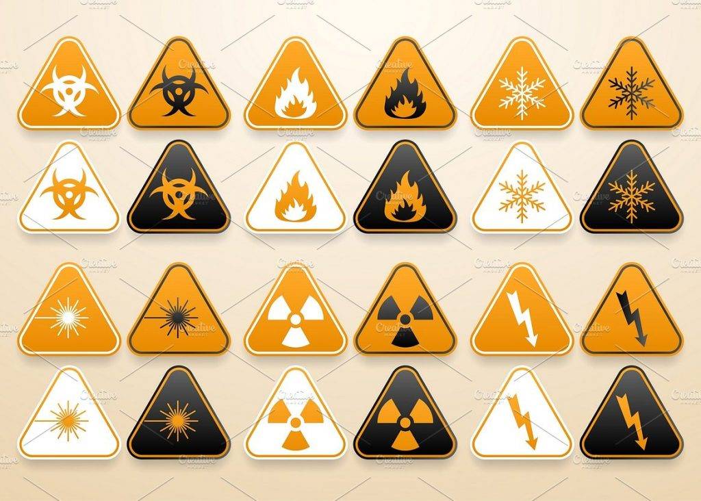
Set of Warning Signs Example
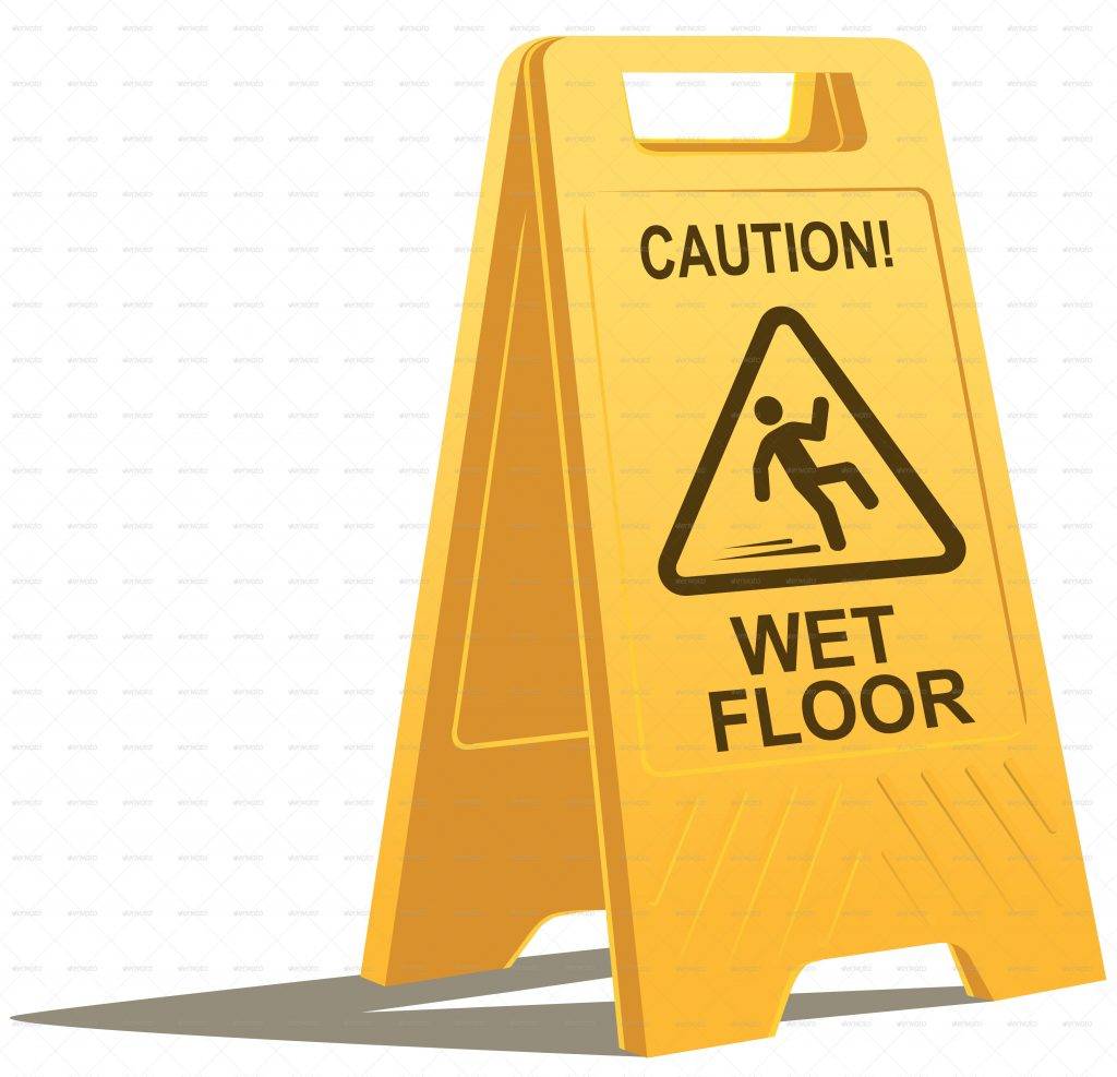
Wet Floor Caution Sign Example
Categories of Safety Signs
There are government sectors monitoring and encouraging the use of caution and safety signs and symbols to warn people of the possible hazards that might happen. There are regulations that are implemented for the standardization of safety signs and symbols for them to be easily recognizable and understandable by the public. You may also see examples of billboard designs & examples.
1. Prohibition Signs
These are the signs that prohibit an action to achieve safety. It should be used to convey the “do not” types of commands. Examples of prohibition signs are as follows:
- No smoking
- No blowing of horns
- Do not touch
- Do not use incomplete scaffolding
- Do not distract the machine operator
- Do not extinguish with water
- Cameras prohibited
- No entry
- No parking
- No pets allowed
You might be interested in food billboard designs & examples.
2. Warning Signs
These are signs that give warnings of potential risks or a nearby danger. The required color for this type of safety sign is yellow background and black text or a pictogram indicating the type of hazard on the center of the sign. Examples of warning signs are as follows:
- Highly flammable material
- Existential threat
- Macroscale quantum system
- Nanoparticle hazard
- Radio frequency energy
- Overhead electriv power lines
- Biological Hazard
- Antimatter
- Non-potable water
- Danger of infection
You may also like simple billboard designs and examples.
3. Mandatory Signs
These signs require actions or activities that will contribute towards safety. These must be carried out in order to comply with statutory requirements. Examples of mandatory signs are as follows:
- Keep this area litter free
- Wear face shield
- Protective footwear must be worn
- Respirators must be worn
- Eye protection must be worn
- Protective gloves must be worn
- Hard hats must be worn
- Safety vest must be worn
- Lift heavy objects correctly
- Aisle must be kept clear
You may also check out examples of billboard advertising.
4. Safe Condition Signs
These signs usually suggest routes in case of emergency such as fire and earthquake. Moreover these signs also indicate emergency exits, first aid equipment, emergency showers, and other similar safety routes. Examples of these signs are the following:
- Fire exit
- Fire assembly point
- First aid
- Emergency shower
- Emergency eye wash
- Refuge point
- Emergency stop
- First aiders
- Emergency exit
- Emergency telephone
You might be interested in retro billboard designs and examples.
5. Exit Signs
To comply with statutory requirements, an exit sign must be placed every doorway or other exit providing access to a means of escape, other than exits in ordinary use. Exit signs are easily recognizable because there are usually no other terms that are in replacement for the word exit. Thus, these signs can be easily seen and understood.
You may also see billboard mock-up designs.
6. Fire Fighting Equipment Signs
These are the signs that indicate the location of fire equipment to be used in case of fire and emergency and fire alarm activation points. The sign must be placed on areas that is clearly visible in case of emergency. Examples of fire fighting equipment signs are as follows:
- Fire alarm call point
- For use on live electrical equipment
- Fire hose reel
- Fire extinguisher
- Fire blanket
- Dry riser
- Fire emergency telephone
- Fire hydrant and hose reel
- Fire alarm control panel
- Fire axe
You may also like vertical billboard designs and examples.
Yellow Caution Signs Example
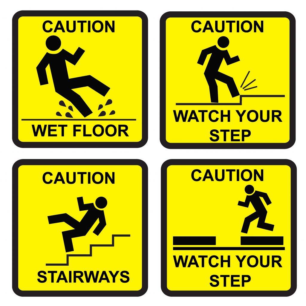
New Wet Floor Caution Sign Example
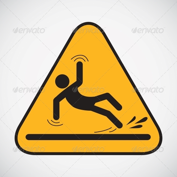
Common Signage Shapes
You must also note that the shape of a signage can also help to convey a message to the audience. Although the usage of particular shapes may vary by country and culture, there are common signage shape conventions which are as follows:
- Rectangular signs – These are often used to convey general information to the public.
- Circular signs – Most often, circular signs portray instructions that is either mandatory or prohibitive.
- Triangular signs – Triangular signs are often used in a warning sign for danger or caution.
You may also see business billboard designs and examples.
Pictogram Requirements
Pictograms, also known as pictographs, convey information through the use of graphics with resemblance to a physical object. It is required that any caution sign must contain a pictogram for an easy recognition. It must be recognizable across cultures and languages for it to be successful in conveying a message. It must contains features which are as follows:
1. Appropriate Colors
There are different colors to be used for different types of safety signs which can be summarized as follows:
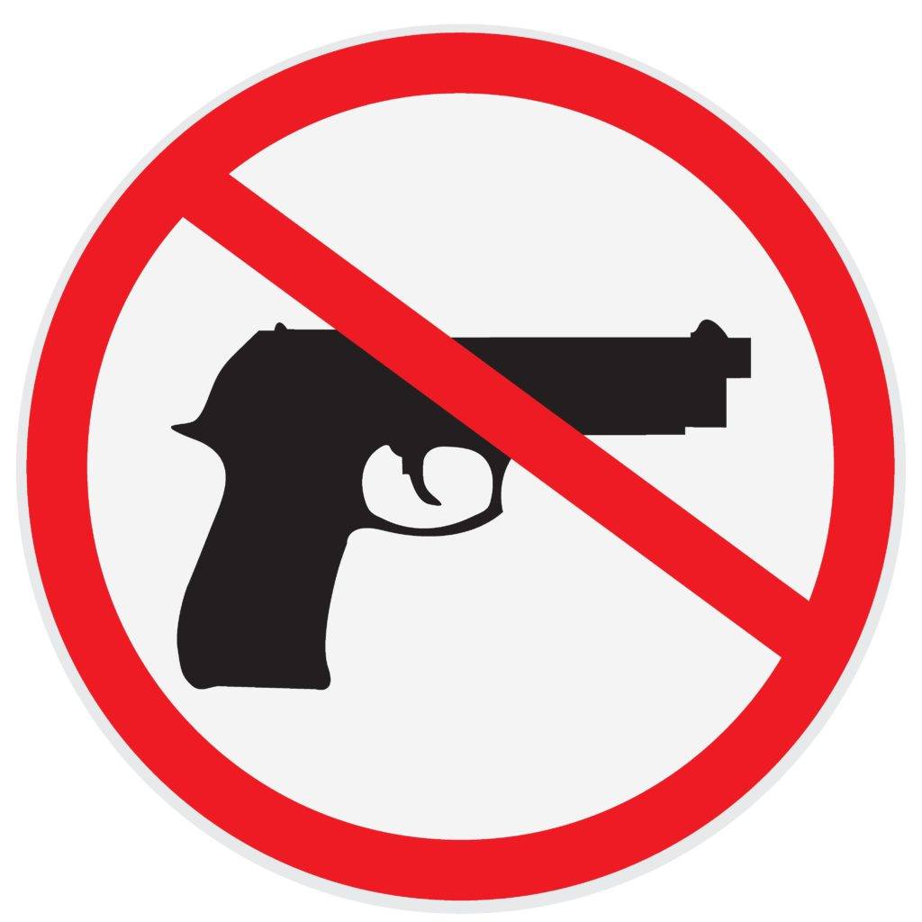
- Prohibition signs – The signs are usually circular in shape with a red lining, white background, and red crossbar.
- Warning signs – These signs are usually triangular with black borders, yellow background, and black symbols or text. You may also like corporate billboard designs.
- Mandatory signs – They are usually circular with blue background and white symbols or text.
- Safe condition signs – Usually in a rectangular form, these signs have green background with white symbols or text.
- Fire equipment signs – These come in either rectangular or circular shape with red background and white symbols or text. You may also check out vector billboard designs and examples.
- Supplementary information signs – These are usually in rectangular shape that may be in green, yellow, or red background with white or black symbols or texts.
2. Simplicity
It is also encouraged that the pictogram must be simple and should only contain essential details. It does not need words to explain the meaning of the symbol; hence, it should be simple enough for it to be easily recognized. The message should be direct enough that even those who are in panic and in a rush can immediately understand what the picture is all about. You may also see real estate billboard designs and examples.
3. Similar Graphics
There are really no standard graphics when it comes to safety signs. You can use similar graphics, either with more details or less details, as long as it conveys the same information and it is not misleading to the public.
4. Understandable
It is recommended that the dimensions and colorimetric and photometric features of the safety signs must be understandable enough in whatever culture and language. Although text can also be helpful, but a pictogram is preferred since there are language and cultural differences when a word is incorporated in the sign and there are also those who do not know how to read. You may also like digital billboard examples.
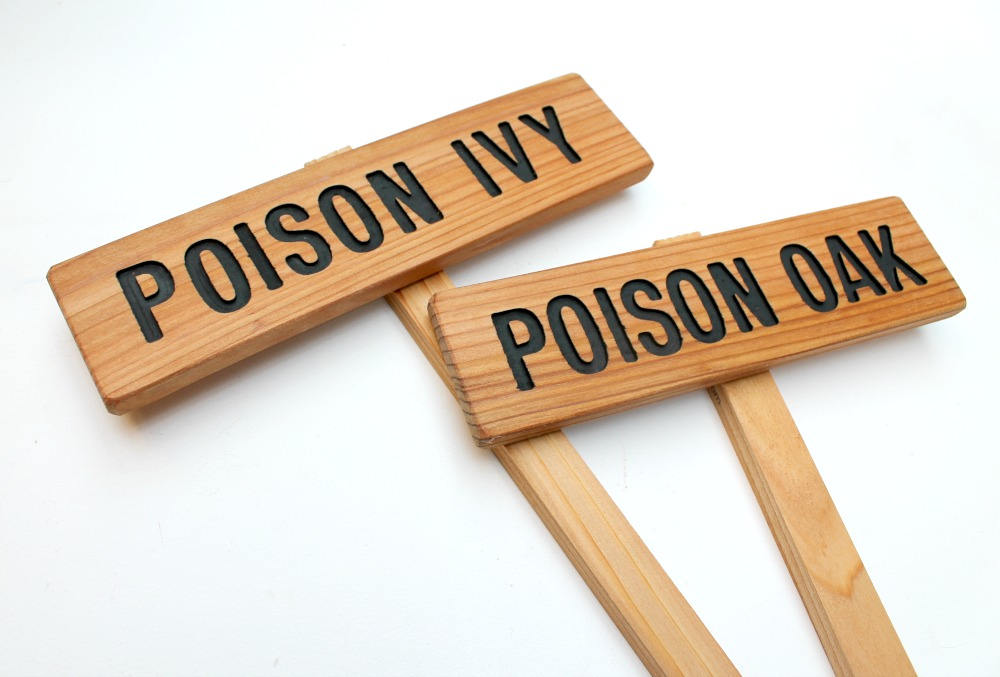
Poison Ivy Caution Sign Example
No Guns Allowed Sign Example
General Advice for Fire Safety
The most common safety and precautionary measures that almost every establishment is for the prevention of fire. Wih this, we will be discussing a short general advice for fire safety. Following fire risk assessment, if it is deemed necessary to provide any fire safety signs for a certain building, then they must comply with the appropriate colors as mandated by the law. You may also see restaurant billboard designs and examples.
Every country has its own law with regard to the color coding of safety signs so it is necessary that you must be aware of each of them. The above discussion for the colors of the different safety signs is the commonly used color by most of the countries. Signs that are only in text are not acceptable and therefore should no longer be used.
ANSI Z535 Definitions for Danger, Warning, Caution, and Notice
As per ANSI Z535.5, here are the definition of the terms danger, warning, caution, and notice.
1. Danger
Indicate[s] a hazardous situation which, if not avoided, will result in death or serious injury. The signal word “DANGER” is to be limited to the most extreme situations. DANGER [signs] should not be used for property damage hazards unless personal injury risk appropriate to these levels is also involved. You may also like poster billboard designs & examples.
2. Warning
Indicate[s] a hazardous situation which, if not avoided, could result in death or serious injury. WARNING [signs] should not be used for property damage hazards unless personal injury risk appropriate to this level is also involved.
3. Caution
Indicate[s] a hazardous situation which, if not avoided, could result in minor or moderate injury. CAUTION [signs] without a safety alert symbol may be used to alert against unsafe practices that can result in property damage only. You may also check out movie billboard designs and examples.
4. Notice
[this header is] preferred to address practices not related to personal injury. The safety alert symbol shall not be used with this signal word. As an alternative to “NOTICE” the word “CAUTION” without the safety alert symbol may be used to indicate a message not related to personal injury.
Don’t Spray Organic Garden Sign Example

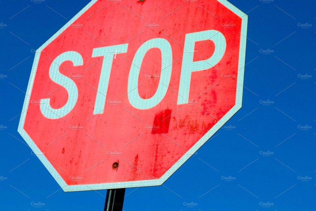
Simple Stop Sign Example
Sum Up
Caution signs are important for safety purposes of the people. They warn people of possible hazards and serve as a reminder that extra care should be taken. The caution signs can be segregated into different categories which are as folows: prohibition signs, warning signs, mandatory signs, safe condition signs, exit signs, fire fighting equipment signs, and supplementary information signs. You may also see fitness billboard designs and examples.
Caution signage also come in difference shapes: rectangular, circular, and triangular. Each shape entails different meaning and purpose. It is important that you are familiar with the shape and purpose of a caution for you to be aware of the message of the signage.
Lastly, you have to note that all signs should use graphic symbols or pictographs; a supplementary text is not a must. There are certain requirements for the features of pictograms which are as follows: appropriate colors, simplicity, the use of similar graphics, and understandable. You may also like billboard artwork designs and examples.
Scroll back to take another look of the examples of caution signs provided above.


