20+ Children’s Book Cover Examples to Download
New books expand a child’s mind to new worlds while subtly teaching lessons about the real one where we all live. It encourages them to dream, fantasize, and imagine, important things that they can bring with them when they grow older. A children’s book’s cover needs to be playful and eye-catching since the pictures are basically what the kids look for in what they read. At the same time, it needs to be well illustrated to impress the parents and catch their attention.
The market for children’s books is massive. Adults spend an estimated $3 billion on kids’ books each year. If you’re a children’s book author, this means that you will be competing in a crowded, colorful, and busy marketplace. To get your book noticed, you need to stand out in this diverse crowd. This article will teach you how.
Elements of a Good Children’s Book Cover
After the long excruciating process of writing a book, your job is not yet done. Before you can even start thinking about marketing it, you’ll need to first have a cover designed. While the process can be overwhelming—think about the dozens of ideas, colors, fonts, and photos you can incorporate into the design—we’ve come up with six elements that every future bestselling book cover must have.
- A title that stands out: It should effortlessly inform people of what kind of book you’ve written, what its main purpose is, and what they will be able to learn from it just by looking at its title. Your title should be placed on the dead-center of your cover. Nobody wants to have to search for the title, so make sure that yours is easily visible and legible. Consider using a font and color for your title that contrasts against the rest of the book’s background for maximum visibility, and make sure that your title’s typography is in bold to make it stand out.
- An explanatory subtitle: Display yours in a smaller size than your main title, and play around with different fonts to see what looks best. Your subtitle should never overtake your main title. Think of it as an accompaniment to highlight it, and not as the main star under the spotlight. You’ve only got at least one or two lines to sell the contents of your book, so make sure the copy you choose is concise, clear, and to the point.
- Engages the reader’s curiosity: Books sell because they cater to a reader’s curiosity. Your book cover is the single most valuable asset because it will be the main factor that will help readers decide if they are interested in it or not. You’ve already established who your target reader is, so your cover is where you’ll put the marketing into place to sell to them. Research keywords that your audience is most interested in, and use them on your cover. Find colors or graphics that suit your subject matter and leverage them to their full potential.
- An eye-catching photo that can draw people in: If you’re going to use a photo on your cover, make sure it jumps right off the page and attracts passersby. Make sure, though, that the photo is well-lit, brightly colored, and eye-catching.
10+ Children’s Book Cover Templates
Children’s Book Cover Template
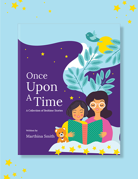
Children’s Non-Fiction Book Cover Template
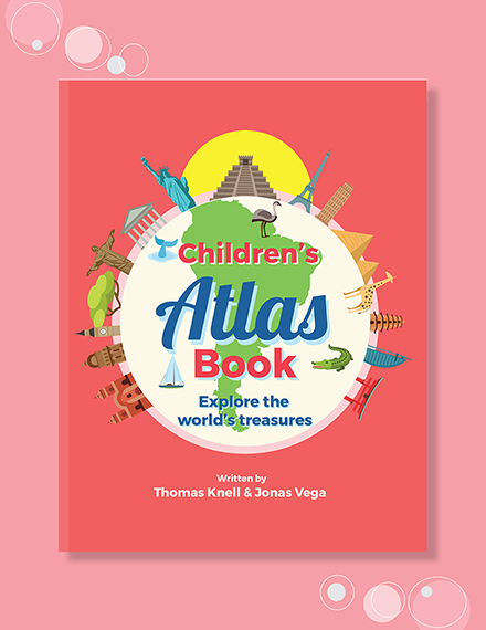
Kid’s Fiction Book Cover Template
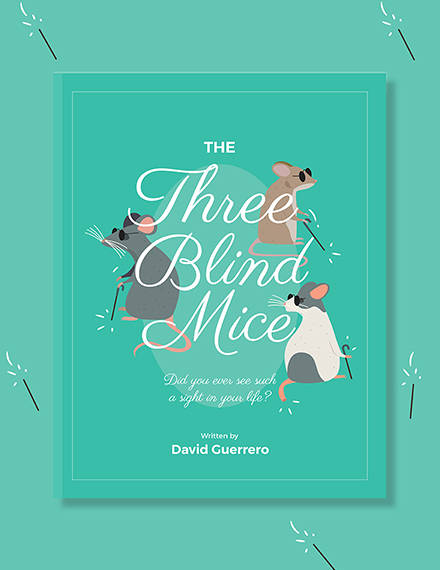
Fiction Book Cover Template
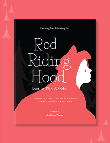
Simple Children’s Story Book Cover Template
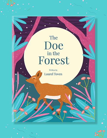
Children’s Story Book Cover Template
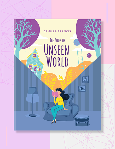
Children’s Education Book Cover Template
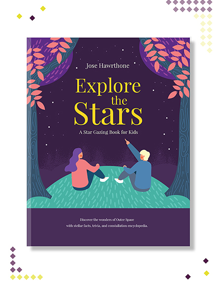
Children’s Funny Book Cover Template

Toddler’s Story Book Cover Template
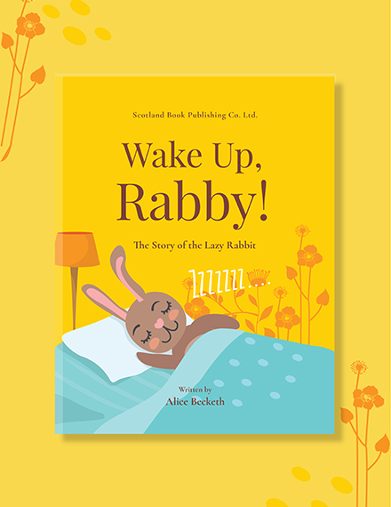
Story Book Cover Template
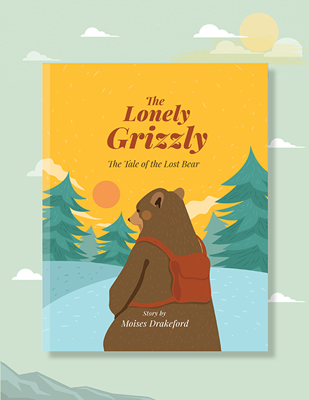
10+ Children’s Book Examples
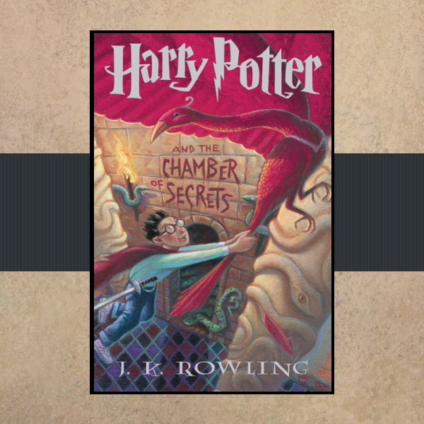
Harry Potter Children’s Book Cover
The Cat in the Hat Children’s Book Cover

Matilda Children’s Book Cover Design

Dear Dumb Diary Children’s Book Cover

Clifford for President Children’s Book Cover
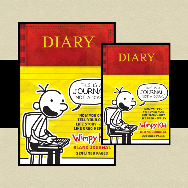
Diary of a Wimpy Kid Children’s Book Cover
Goosebumps Slappy World Children’s Book Cover
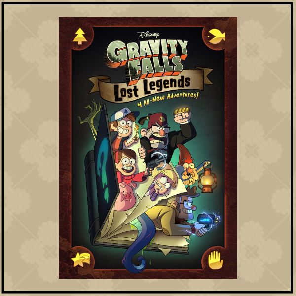
Gravity Falls Children’s Book Cover Design
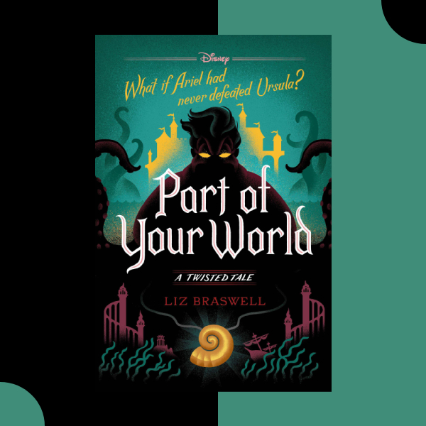
Part of Your World Children’s Book Cover
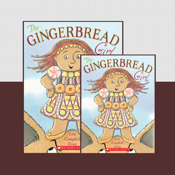
The Gingerbread Girl Children’s Book Cover
Simple Tips for an Excellent Book Cover Layout
Cover creation is the very last creative step when publishing a book because almost everything about the anatomy of a book cover is controlled by the final edited version of the book. Book cover design is comprised of text and images. In order to get the layout right, you need to think about the single message you want your cover design to communicate. Aside from that, here are other tips to remember when designing your book’s cover.
Front Cover
The front cover is the first of the physical parts of a book. It has one purpose: to sell the book by intriguing the right readers. The following are the essential elements of a good front cover.
- Imagery. Of all the different parts of a book cover, this is arguably the most important. Choose a photo, graphic, or illustration, or simply make a statement with a plain color, that will attract your target audience. It needs to communicate what the book is about while drawing in your reader. Use the visual element to create anticipation, mood, and expectations. The visual component of your cover is the first thing your potential readers will see and remember. Make sure the image is enough to make an impression.
- Typography. The fonts you select communicate more than the words they spell out, so choose based on the content and the tone you are aiming for. Don’t get so creative with fonts that your title and other information becomes tricky to read. Set the right mood with your font: choose a more flowing font to suggest romance, a whimsical font for humor, and a bold and strong font to create a sense of drama or adventure.
Back Cover
You’ll know that your front cover did its job if your readers flip the book to look at the back cover since it would mean that they got interested enough to give the book a second look. Now it is the job of the back cover to draw them in so much that they will feel compelled to buy the book.
The most important part of the back cover is a description of the book that offers up enough detail to ensure that the shopper can’t say “no” to buying it. The back cover of a paperback should also include a headshot, your bio, and your credentials if the works are academic or professional. Readers love to know more about the author, and details about who wrote the book can help the description seal the deal.
The back cover should also leave room for the International Standard Book Number (or ISBN code) and the barcode that goes with it. Since 2007, all books have a 13-digit ISBN code. The back cover should also include any book reviews, and it’s related to the book, your company logo.
Spine
Finished books that are more than 130 pages long also need spine text that shows the main title and the author’s last name as a part of the cover design. Make it easy to read, and be sure it can be reviewed sideways.
Steps to Designing a Good Children’s Book Cover
It’s a common knowledge by now that readers shop with their eyes, which means that they look for familiarity while also yearning for a surprise, for something that is new and refreshing. A good book cover design must communicate that the pages within are worth a reader’s time and attention.
Let us take a look at what we can do to get your book cover to tell readers a story even before they crack open the first page.
1. Understand the elements of a cover.
A book cover has three mandatory parts: the front cover and the back cover connected by the spine. A paperback book’s pages are glued together with a paper cover and then cut to size. A hardback book’s pages are sewn or glued into a case made of cardboard which is then covered with cloth or paper. The paper cover wraps around the book and includes flaps on either side. When you open a hardcover book and see colored or printed pages glued to the boards, you’re looking at endpapers, a lovely extra set of pages designers can use to tie a book project together.
2. Choose a design direction.
Next, it’s important to consider what your design direction will be and how it will fit the author’s vision of her book. There are lots of beautiful books out there but not all design will work for every book. So consider input from other people, look at comparable titles with successful covers and book pages, go to your local bookstore and handle books to get a feeling for the different paper thickness and materials. Make notes about what you like and don’t like. This information can prove itself useful way later in the design process if ever you hit a wall.
3. Choose graphics and fonts.
One of the great things about book covers is that there is almost no graphic style that can’t work. Writers have wild imaginations, and it’s the designer’s job to create a cover that represents all of the wondrous worlds that the author’s great mind created.
The downside of this is that narrowing down a style can be a challenge. Book covers can feature a photograph, illustration, or abstract design. They can feature everything from cartoonish doodles to stark modern typography.
Consider what message graphic style sends to a book buyer’s brain. A photograph of New York City should not be used for a book that is not set in New York. Soft typefaces and natural settings are often used in women’s fiction, while vintage photographs imply a historical setting.
Types of Book Covers
One of the great pleasures of browsing bookstores involves admiring the artwork on the cover design displays. However, if you are in the position of the person who produces said artwork, you probably already know that achieving that won’t be easy. So if you are an author who is in the market for a dust jacket, whether you or your publisher is paying for it, it’s worth understanding what goes into designing one.
Type #1. Stock Image Manipulation
The truth above a vast majority of book designs is that they often feature elements taken from stock image libraries. A lot of sites offer a license to millions of images that designers can work with. They even offer illustrations as well. The term stock photo is often thrown around like a bad four-letter word, and in the mouth of non-designers, they’re seen as a hallmark of creative laziness. Not only is this unkind, but it is also terribly untrue.
Type #2. Illustration
The main advantage of illustrated covers is the distinct visual style that the artist can bring. The styles of drawing can vary from the deceptively simple to the overly intricate. Readers of certain genres have even come to expect illustrated jackets, especially for fantasy and science fiction books where the book covers are often drawn to elaborate illustrations that encourage readers to explore the fictional world.
Type #3. Original Photography
Book covers with real photography are rare because time and money are such expensive resources. If you think that paying illustrators is extravagant, wait until you see how much it costs to organize a photo shoot. This route is only taken when there is no longer any other way to capture what the publisher wants using an illustration or stock imagery. The two genres that immediately jump to mind are celebrity memoirs and romance fiction.
Children’s Book Cover Sizes
Let us look at the standard sizes of book covers in publishing to help you decide on the right dimensions for your design.
- Kindle Direct Publishing recommended size – 2,560 × 1,600 (1:6:2 aspect ratio)
- Novels and Non-Fiction recommended size – 2,560 px × 1,600 px (1:5:1 aspect ratio)
- Illustrated Books recommended size – 2,800 px × 3,920 px (1:4:1 aspect ratio) or 3,000 px × 3,600 px (1:2:1 aspect ratio)
- Audiobooks – 3,200 px × 3,200 px (1:1 aspect ratio)
Brochure FAQs
How do I make an attractive book cover?
- Use white space to create focus.
- Use photography for a professional touch.
- Set the tone before you start designing.
- Stand out from the crowd with a 3D book cover.
- Weave your narrative into your cover design.
What is the best color for a book cover?
- Red – Energy, enthusiasm, emotion, power.
- Pink – Youth, playfulness, emotion, innocence.
- White – Clean, straightforward, self-sufficient, simple.
- Black – Authority, power, control, mystery, suspense.
- Brown – Natural, of the earth, comfortable, organic.
When it comes to creating a strong impact upon an audience, the cover is just as important as the content, so make sure that you pay equal attention to both.


