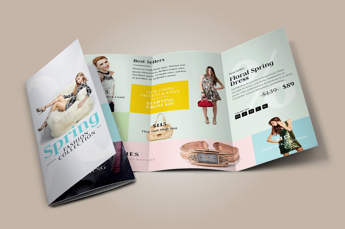
14+ Creative Brochure For Designers Examples to Download
There are different ways a company could market its goods, this could be done through digital media or even print media, such as with the old-fashioned company brochures. But creating a brochure can be a crucial task for most designers, considering there’s more to a brochure than a simple sales pitch to persuade customers. For starters, you need to be familiar with what your brochure is for. And there will always be an opinion coming from your audience about your brochure, especially if you’re supposed to be a designer with an eye for art.
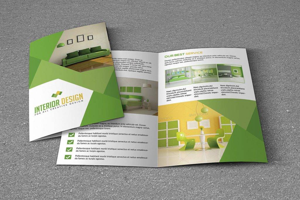
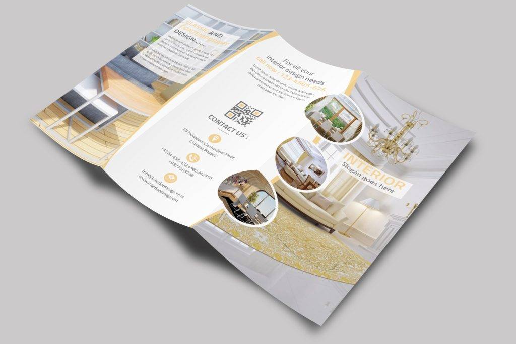
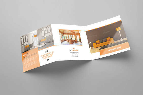
Bi-Fold Interior Brochure
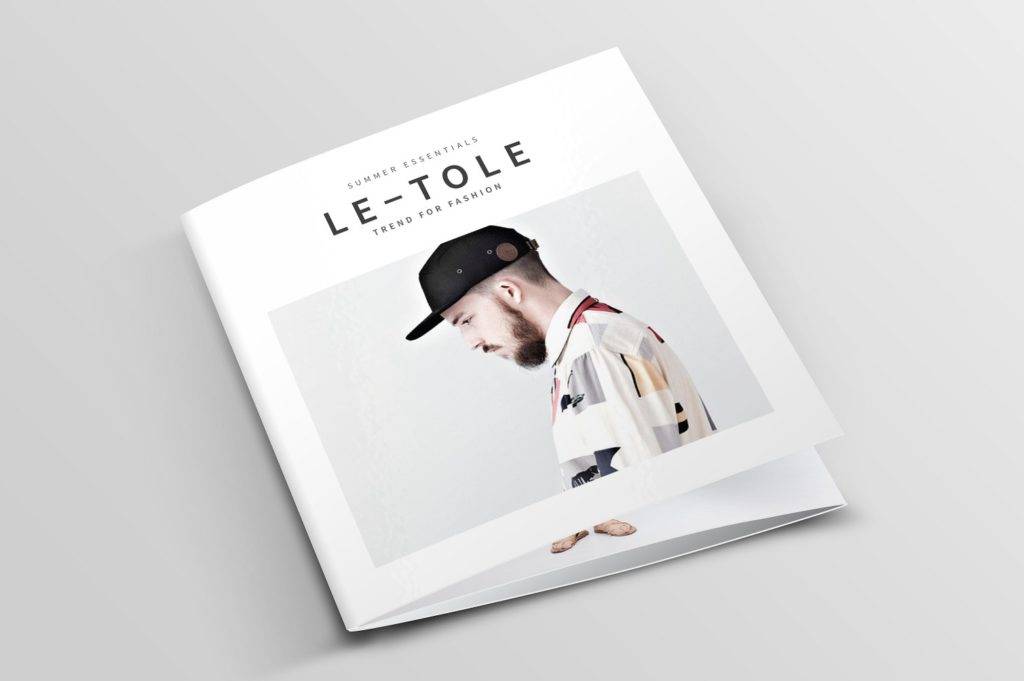
Minimalist Fashion Brochure
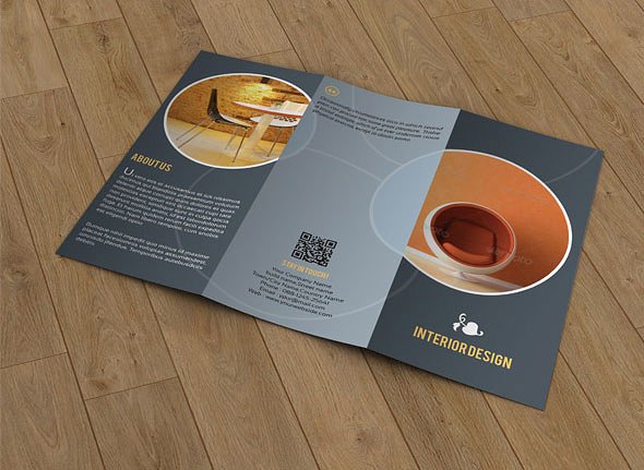
Simple Interior Design Brochure
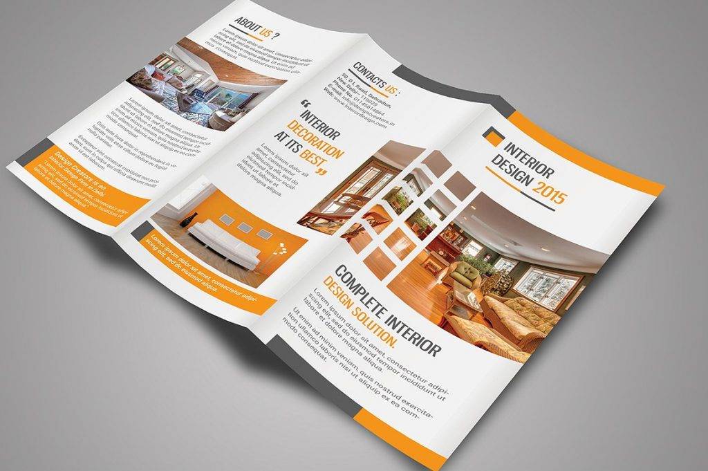
Classic Interior Brochure
Essential Attributes of a Good Brochure
When making an InDesign brochure, there are certain elements that need to be present in your creation to ensure positive feedback. To guide you, we rounded up six essential attributes of a brochure that you should know about:
1. Eye-Catching Cover Design
If there’s one thing that could instantly grab anyone’s attention, it has to be the cover. Think about it. It’s the first thing you see that could easily spark curiosity. It invites the reader to pick up the brochure and learn more about the subject without a second thought. This usually consists of an image, a catchphrase, and the organization or company logo. It’s made short to provide a clear gist of the topic at hand, yet captivating enough to interest potential readers as well.
2. Compelling Text
Not every best brochure requires an image to stand out on the cover, especially if you already have a compelling phrase to do the trick. This could be anything from a question to a tagline, just enough to turn heads. This will keep your readers engaged and prompt them to ask questions. This technique is a great way to interest readers at any given circumstance.
3. Right Type and Color
We’re all familiar with the role color plays in art. Not only does it give meaning to a subject, but it also sets the mood right. Knowing this, choosing the right color to go along with your message can greatly affect its overall impact to a viewer. It has the ability to create a certain look and feels that a reader will take note of. It would be best to choose a color palette that reflects the nature of your brand, as well as the purpose of the modern brochure.
As for the typeface, the size and style of your font can also affect a viewer’s perception. The font you choose must be suitable to your purpose and readable for your audience to understand. It’s important to take note of font size in highlighting headings and sub-headings as well. This will direct the reader’s eyes to the topics you want to bring into focus.
4. Organization
Not everyone is a huge fan of books, and if you ask them why, you’ll often hear about how they despise reading something composed of mere words page after page. So when making a brochure, this is one thing you’d want to avoid. Apart from keeping it to-the-point, you also have to organize bits and pieces of information accordingly. This will allow readers to find what they’re looking for immediately, without much effort. This also leaves your brochure looking clean and crisp enough to keep your readers interested. After all, a proper flow of details is always better than something messy and distracting.
5. Photographs
While it may not seem completely necessary in some cases, photography brochures are still great elements to add to your brochure. To some, images and pictures can effectively communicate a message more than words ever could. But even then, you shouldn’t rely heavily on them, as there’s always an issue of misinterpretation. Using a handful of images would be enough to keep your brochure on top of a viewer’s mind.
6. Call to Action
As a simple marketing brochures come in handy when you want to give your audience a brief run through of what you have to offer. Every brochure is made with a purpose in mind, a purpose that invites readers to act upon. This could be to avail of a particular product or service, donate to a certain charity, or to do your part for a given cause. Whatever it is, it must be made clear enough for the reader to grasp. Otherwise, your brochure would fail to deliver its intended purpose.
Vintage Design Brochure
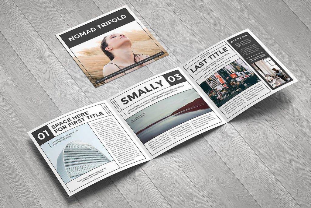
Elegant Interior Brochure
Fashion Tri-Fold Brochure

Stylish Square Brochure
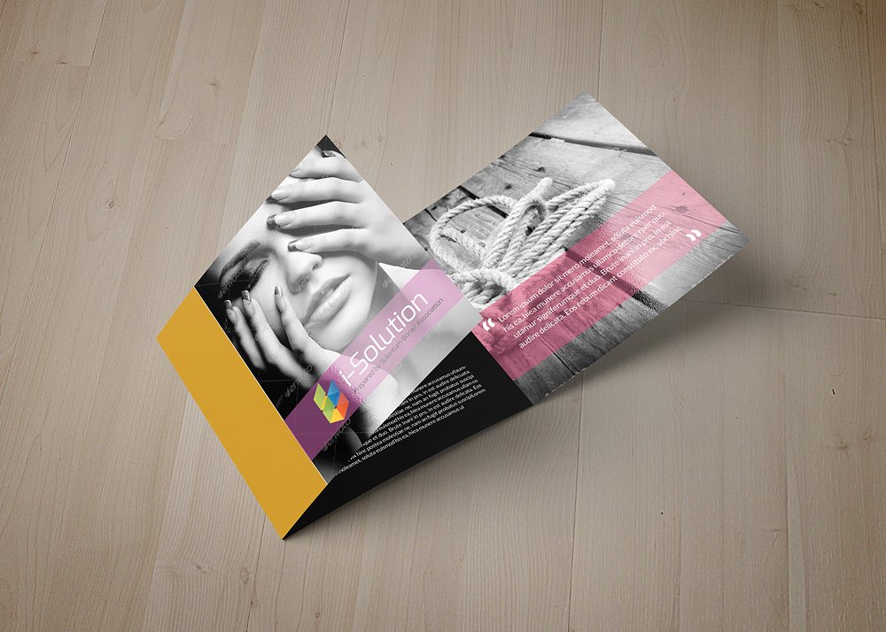
Tri-Fold Interior Brochure
Why Use a Brochure?
Living in an age of digital marketing, where TV commercials and social media advertisements are a thing, are brochures still as relevant as they were before?
To be quite honest about it, they still are, to an extent at least. It’s still common to come across companies and organizations handing out advertising brochures to their customers. While they aren’t as popular as they used to be considering that there are other cost-effective alternatives for it, don’t expect brochures to phase out anytime soon.
There are a lot of people that still appreciate the old-fashioned craft of skimming through brochures, as they still provide us with significant information that we might find useful. Brochures are extremely versatile as well, considering that they could be mailed, used on location, and handed out anytime without much trouble. This effortless means of distribution makes it easier to spread the word about a subject at the quickest time possible.
If that’s not enough to convince you, just think about how brochures don’t have to compete for a person’s undivided attention. You don’t have to worry about slowing down just to read what’s written on a billboard ad, nor do you have to wait for a commercial to play again just to see what’s being offered. With a brochure, you could always go back to it when you have the time to spare. You may even pass it on from person-to-person to spread the word about something you’re interested in. It may be a simple tool, but it can deliver its purpose just as effectively.
Modern Interior Brochure
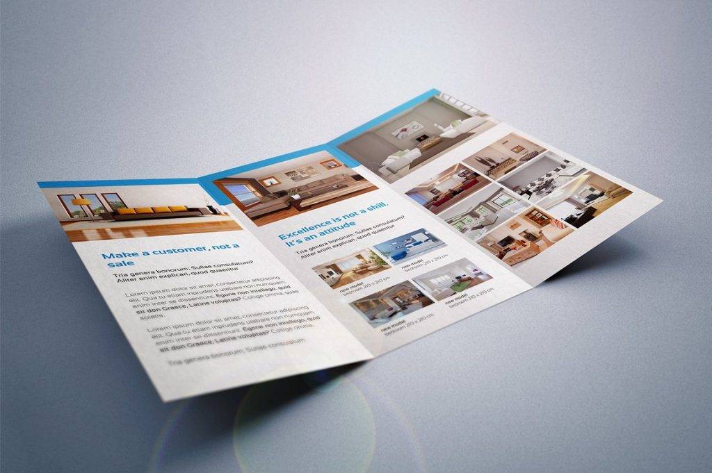
Creative Tri-Fold Brochure
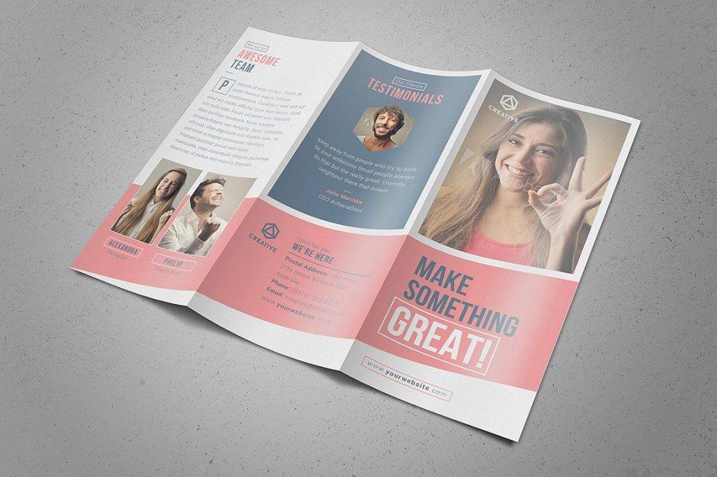
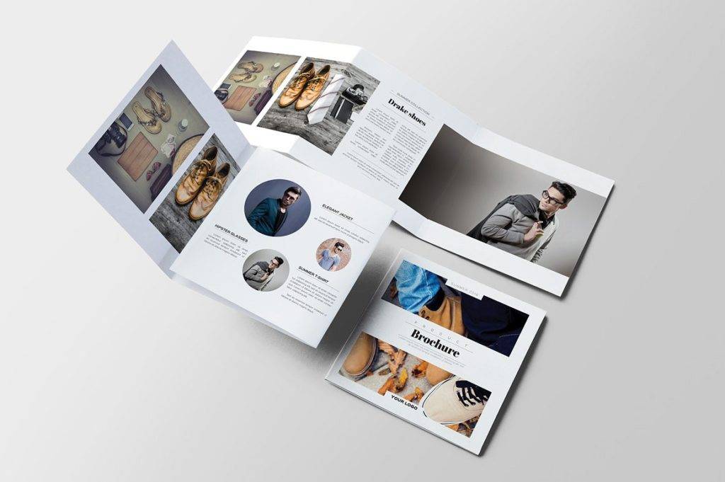
Tri-Fold Product Brochure
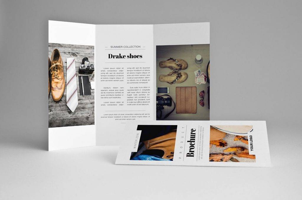
Product Square Brochure
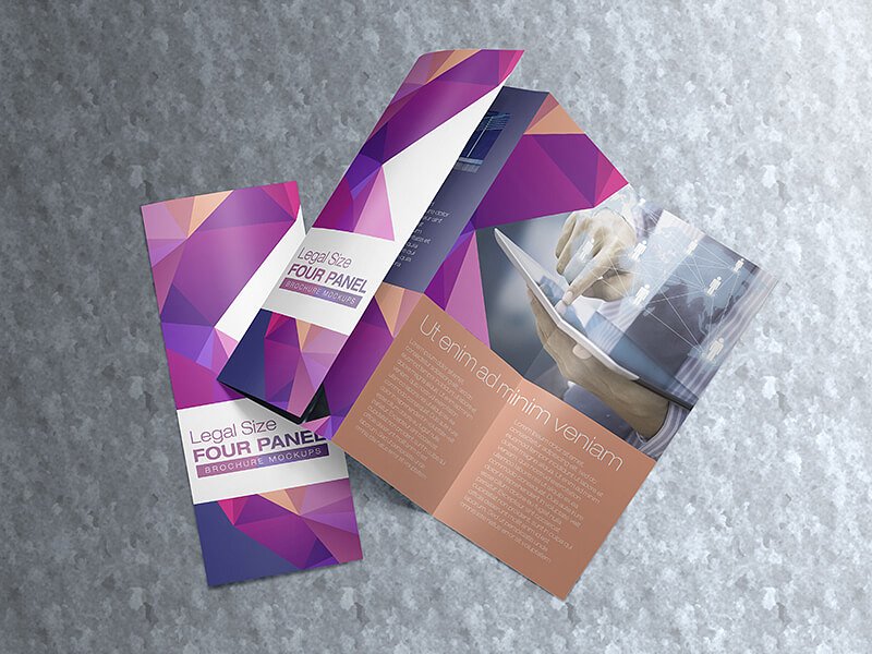
Colorful Four-Panel Brochure
Quick Tips for Designing a Brochure
Have a Purpose
To be fair about it, everything has a purpose. But when you design a brochure, you have to focus on this purpose as your primary goal. Do you want to talk about a new product? Promote a certain event? The brochure serves as a medium for communication, allowing you to connect with your audience by providing them with significant information. You can’t expect to be successful if you aren’t completely sure about what you’re meant to achieve, so it would be best to define the exact purpose of your brochure before you even begin adding other elements.
Keep Your Audience in Mind
It’s all about coming up with free brochures that can benefit your readers. You might have all these crazy ideas of how you want your brochure to be like, but if it doesn’t appeal to your target market, then it all becomes a complete waste. This will help you determine how the brochure should be made, anything from the colors you choose to the information you include. You have to view things from the perspective of your potential readers, as what may seem simple to you may be perceived differently by the average reader. Not only should your brochure be relatable to your audience, but it should also be simple enough to comprehend.
Sketch It Out
The creative aspect of designing can be the most fun part, but it could also be the most crucial. For one thing, developing a good brochure isn’t a quick process of adding text and images at a random order. You’ll come to find out that brainstorming and conceptualizing on every detail will bring you better results in the end. This is why it’s essential to start out with a rough design on paper. This way, you could properly analyze every element of your brochure and point out any mistakes you may have overlooked in the beginning.
Create a Flow
Have you noticed how movies, books, and even magazines are arranged in a certain way? In such a manner that tells a story through a smooth flow of events? With a brochure examples, it’s the same concept. The cover of a brochure is always the introduction, one where readers are given a short excerpt of what to expect if they continued reading. Having a clear flow guides the reader through the brochure, drawing attention to specific areas you want to emphasize. This ensures that the reader would be able to grasp every significant detail of your brochure.
Select a Color Palette
It’s always good to stick to one color palette throughout the whole design process of a brochure. This develops consistency, allowing various ideas to come together to deliver one message. The colors you choose should be pleasing enough for one to look at, so as to not distract the reader from the central meaning you want to convey. You also have to make sure that it reflects the brand you represent to constantly remind readers of the bigger picture in focus.
Designing a brochure doesn’t have to be boring, you could always turn it into a fun experience of innovation and creativity. It’s about delivering a clear message to readers through a medium filled with images and text that one meticulously crafts from scratch. The brochure you create speaks a lot about character, while still being professional enough to get your message across effectively.


