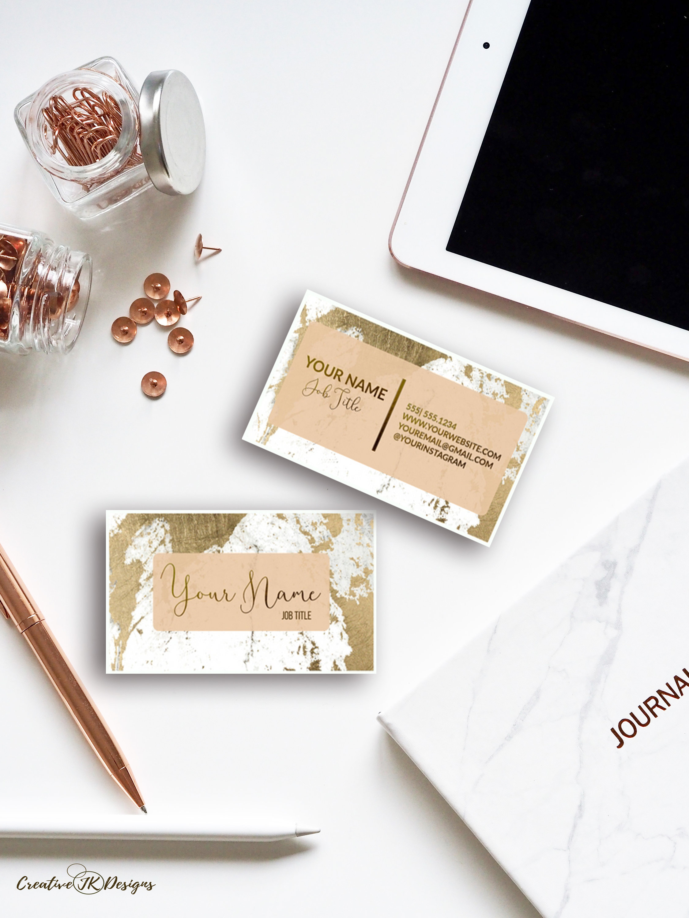
18+ Creative Business Card Examples to Download
One of the most common pitfalls in business is the lack of communication, follow-up, or catering of feedback from people may it be the clients, suppliers, business partners, or any prospects. Although it is easy to plan how to improve the system in your business entity in catering the people’s needs, the hardest part is the implementation of those plans. People will find it hard to connect with your staff and personnel to discuss matters related to your business.
Business Card Template for Designers
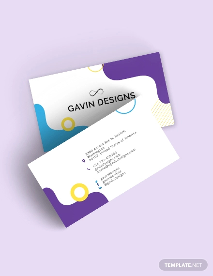
Transparent Business Card Template
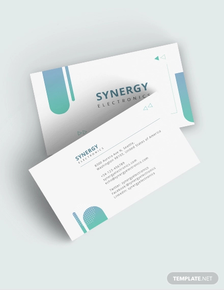
Creative Square Business Card Template
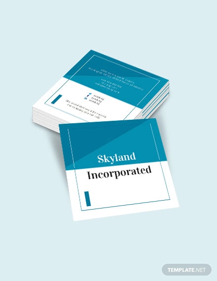
Creative Blue DJ Business Card Template
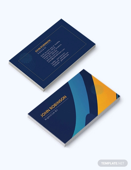
Customizable Creative Business Card Example

To have this remedied, each of the key management must have communication lines that are open for inquiries, comments, and suggestions. They must let the people know that their lines are always available for any feedback and questions, and this can be done through the use of a tool which is commonly used by businessmen, the business card, which contains all the necessary information regarding the contact details of the owner of the business card. Creating a business card is sure a challenging one, and it requires that you pour out your creativity in the work of art that you are doing.
Common Pitfalls of Business Cards (and How to Avoid Them)
Having a business card is necessary especially if you are dealing with business. This is a way so that people will remember you and will have a way to communicate with you. However, not business cards are created equal: there are those business cards that will stand out from the rest, and sadly, there are those that blend in with the rest without giving an impact to the people. So what makes these business cards negligible? What makes them too boring to read? Why are they not interesting to read? What makes them something not worth to keep. You may also see marketing business cards.
In this section, we will scrutinize the pitfalls of business cards for these are the reasons that business cards are not effective. Below are the most common business card blunders that you must avoid.
1. Bland Designs
First, you have to note that almost everyone in business each have their business cards. Hence, you have to come up with a creative way for your business card to stand out from the rest. This is a very common mistake that we have observed: people will create a business card that blends in with the other business cards making it not noticeable at all. It is not unique from the rest, and people would simply let it go or throw it away because the card seems not interesting at all. These are those cards that are too plain and boring, without someone new to the eyes of the reader. You may also like luxury business card examples.
2. Poor Quality
The next pitfall that we have observed is that there is a poor quality of the paper that they are using to create business. It is acceptable that all business would like to avoid expenses as much as possible, but they must invest a little sum of money in order for them to come up with a presentable business card. The material to be used for business card is not limited to paper only as they can also use transparent plastics, slate, metal, and even wood to have a different surface of the card. You may also check out real estate business card designs & examples.
3. The “Mystery” Business Card
The third pitfall of business card is the so called mystery business card. This is a type of business card that, at first glance, you cannot immediately determine what type of business that holder is dealing. It is not certain on what the business card presents, and it is as if it is for general purpose. To avoid this to happen, you might as well include the company name that you are working for as well as the logo and any other important things that points to the identity of your business. You might be interested in business card logo design examples.
Soft Creative Business Card Example
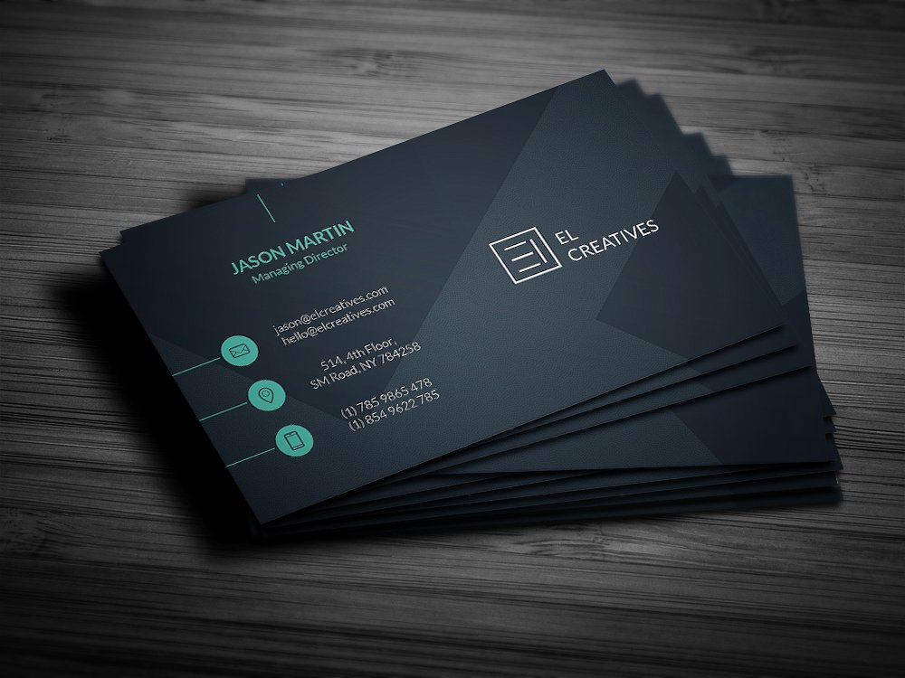
Custom Rounded Creative Business Card Example
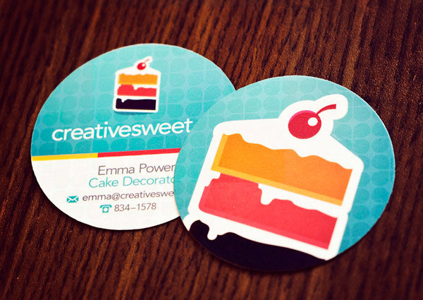
Simple and Creative Business Card Example
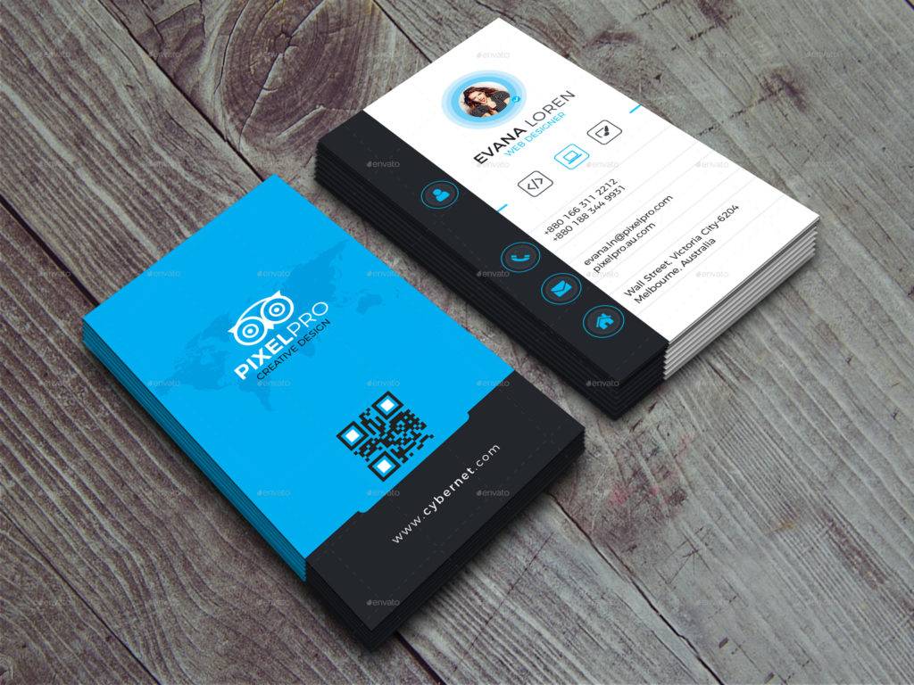
4. Not Providing a Proposition
The next pitfalls of greeting cards is that they are not providing a unique selling proposition. A lot of business entities miss this rare opportunity to use their business cards to its full marketing potential. The remedy to this pitfall is to have at least one powerful and strong reason why they should do business with you or your company. For example, you may include the company’s tagline such as “for complete automotive repairs,” “all work fully guaranteed,” or any other phrases that can catch their attention or can give them interest.
5. Tiny Text
Another pitfall that you must be aware of is the text is too small. This may be because they wanted to fit in all the information that they wanted to included. They fail to segregate those that are necessary and those that are unnecessary for the business card. As a result, the card may become too overcrowded, then they will adjust the text making it too small, for it to fit the card. Small texts are unreadable for some people, making them uninterested to your business card. Hence, avoid this to happen and include only those that are vital for your business card such as the name, contact information, and address. You may also see fashion business cards.
6. Poor Use of Color
The next blunder that you avoid is the poor use of color. There are colors that makes your business card too dull, and there are also those that can exaggerate the appearance of your card. The common mistake for most of the cards is that they will use a grey print on a white background, making the print hardly noticeable and difficult to read. Better use contrasting colors for your background and text, for example, black and yellow, blue and black, or red and black. You see, black complements well with other bright colors. On the flip side of your business card, do not make it too colorful for this will only distract the reader’s focus on the main part of your business card which is on the front page. You may also like business card samples.
7. Cluttered Design
You must also avoid your card to be cluttered. Do not try to fit it everything that you wanted to include in your card; instead, only include the most important information just as discussed in the previous subsection. Too much print would make your card look crowded and terribly unprofessional. The reader cannot focus on one thing if your card is full of clutter. Hence, settle for what is simple. This can make your card more elegant and professional.
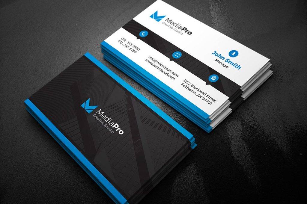
Modern Creative Business Card Example
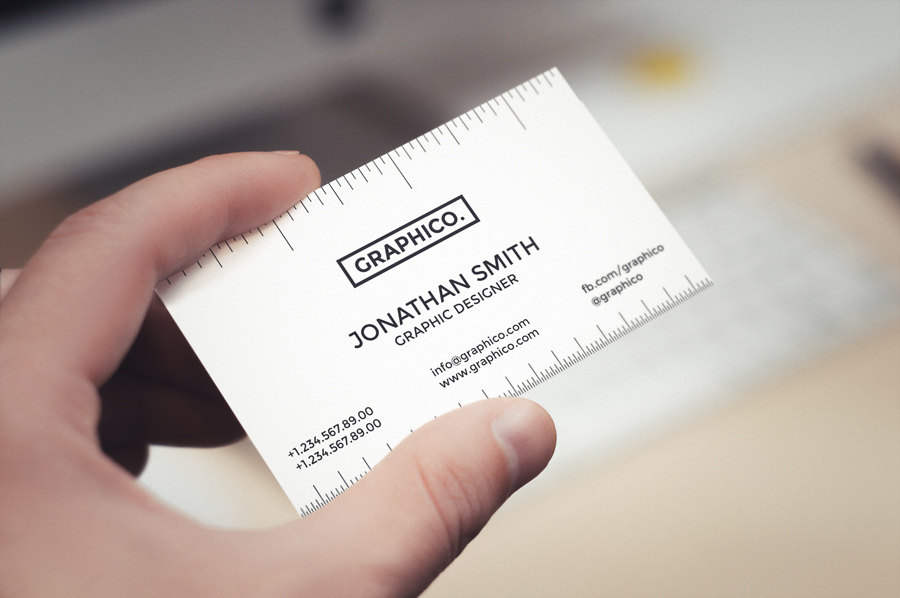
Simple Creative Business Card Example
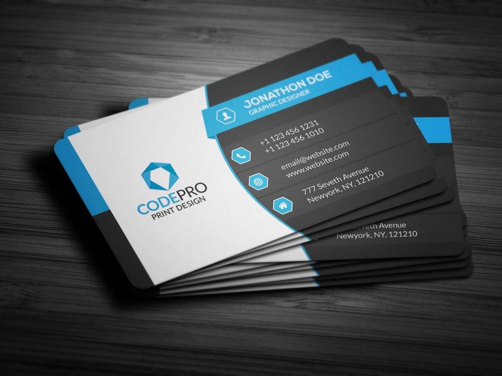
Creative Corporate Business Card Example
8. Card is Oversized
The standard size of a business card is 3.5″ × 2″. Any sizes different than the standard is considered as an oversize card. So what is the implication of an oversize card? Why is this considered as a pitfall? Well, you have to note that anything bigger than the standard size will not fit in the wallet or business card holders. As a result, people may place them anywhere and they might lose your business card or worse, they will easily throw your card in the trash bin. You may also check out creative ways to advertise your business using business card.
9. Lack of Vital Information
Among the important contact information that you must include is your email address and website. Why is this so? This is because, nowadays, commonly prefer to send an email rather than making phone calls. Moreover, when they wanted to know more about your company, they will go to your website and read the information about your company that you are posting there as well as the reviews from other people. If these important information are not included in your business card, you might miss out some business opportunities. You might be interested in examples of bakery business cards.
10. Lack of Distribution
The last thing that you must avoid is the undistributed simple business cards. There is no good to let your business cards to stay on your box and just collecting dusts in the corner. They are meant for marketing purposes and to communicate with a lot of people that may be interested on your business. If you will not disseminate your business card, this would equate to losing a lot of business opportunities. Hence, avoid this pitfall and look for ways on how you can distribute your business card for this will surely help in expanding your business.
Editable Creative Business Card Example
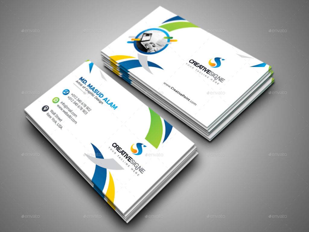
Yellow Business Card Example
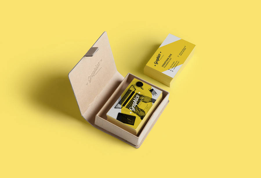
Effort Creative Business Card Example
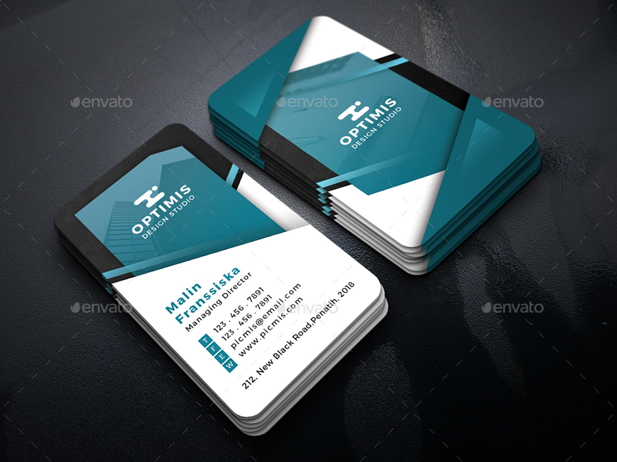
Creative Vertical Business Card Example

Elegant Creative Business Card Example
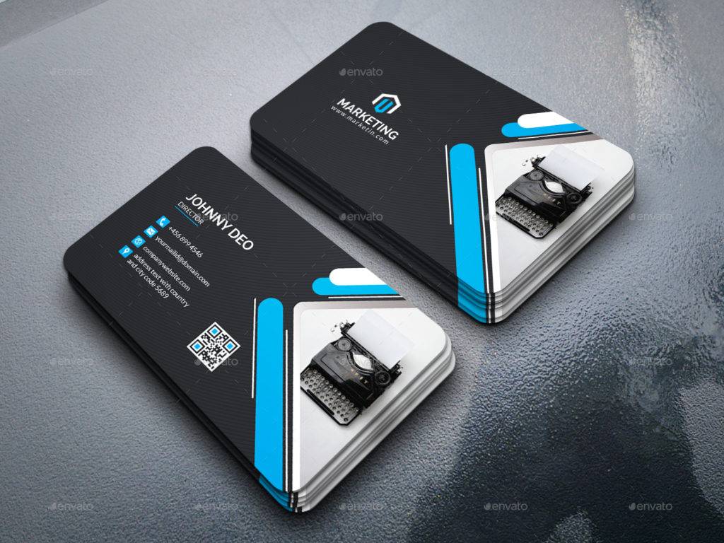
Pink Marble Creative Business Card Example
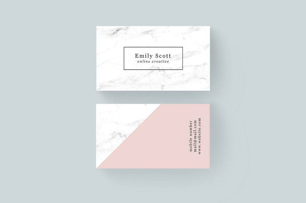
Concluding Remarks
Business cards are important for they bear with them contact details and other necessary information so that people will reach you and communicate with your their feedback and inquiries for the improvement of the communication lines of the company. These also serve as a marketing tool to help you in your branding and a way to advertise your products and services as well as you company. You may also see how to design a personal business card.
If you are still having a hard time creating your own business card or a business card for the company, feel free to browse through the examples of creative business cards presented above, and you might find one that would suit your preferences.


