8+ Creative Email Signature Examples to Download
Creativity is how we roll these days and this can very well apply to how we make our email signatures. Most professionals have one, as a way of communicating with colleagues, clients, employees from certain companies in a businesslike way. Obviously, your email signature must look totally professional and formal.
You can express your own individuality when customizing your own signature but you should make it look like it was done by a reputable professional, not just by any random person, so sloppiness and wild designs are out of the choices for you to make your very own email signature.
Creative Email Signature Example
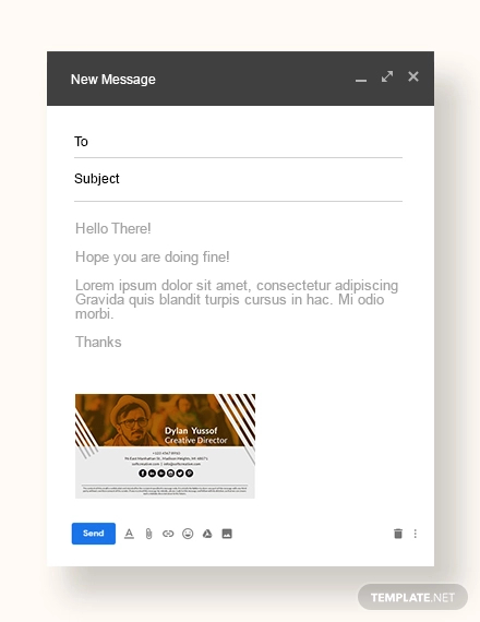
Creative Agency Email Signature
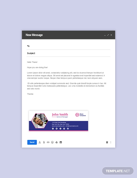
Creative Corporate Email Signature Template
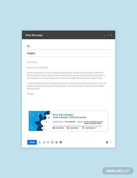
Clean Creative Email Signature Example
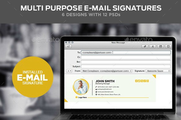
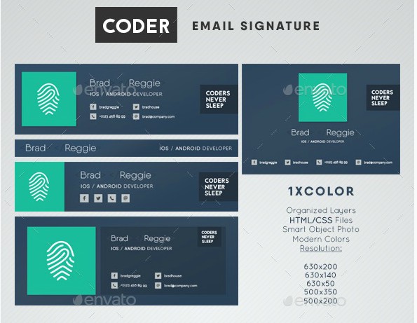
Coder Creative Email Signature Example
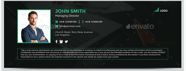
Dark Creative Email Signature Example
Email Signatures: A Reflection of One’s Self
How do you want your email signature to look like? Is it going to be simple, informative, and professional?
Maybe you haven’t thought deeply into it, but your email signature influences each contact’s perception of you.
Whether you’re sending formal emails, corresponding with potential clients, or offering support to customers, sending memorandums to your colleagues, sending file attachments to your subordinates, or even just asking a favor from your co-employee that is work related, your email signature is attached to every email you send. It only makes sense to put effort into designing the perfect signature.
If it’s your first time to generate your own email signature, there are important points you should do. You should include in your email signature design tips, how to generate your own signature, and provide the resources you need to get your signature set up and properly formatted in your email client.
What to Include in Your Professional Email Signature
Basic Contact Information
Firstly, your email signature should provide information about your contact details, such as your name, your business name, business address, and your position title. Include also your contact number and your professional social media profiles.
Example:
John Tecson
?JT Transport Services
912 Memory Lane, IL
Contact Number: 413-5467
Facebook: John Tecson (@jttransportservices)
Another useful tip: If you don’t want your address to look cluttered, rather than just linking to different social profiles, use social media icons to save space and drive traffic. Choose a set of icons that matches the rest of your email signature. You can look for cute and customized icons online.
An Image or Logo
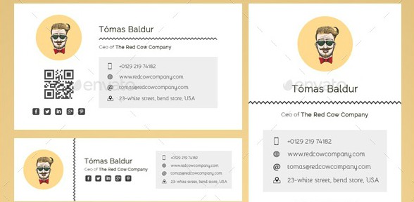
If you’re fond of using logos for your email signature, you can make one. This will give you a more customized and creative email. One tip for making a logo email signature, keep the image file small. Your logo can be a head shot of your professional photo or your creative shot (if your work involves a creative pursuit) are a great way to personalize your signature. Just make sure it fits in with the rest of your signature’s aesthetic and limit yourself to two images or graphics max. Don’t go overboard with your head shots or advanced graphics that eats up the memory limit for your logo.
Promote Fresh Blog Content or Your New E-Book
This is most especially helpful if you’re a writer or your work involves lots of making your own original content. If you’ve got a new blog post, book, e-book, music, or video you want the world to see or you want to advertise it, you can update your email signature to include a link to it. Not only does this demonstrate your expertise and build credibility in the eyes of the recipient, it helps drive traffic to your original content. Who knows your content will be sponsored by potential organizations who are willing to boost your content and give you the opportunity to share your talents and skills.
Example:
Leo Tan
Freelance Writer
Maple Tree St., IL
“Confessions of a Law Student” Out Now (check the it out here)
Promote a More Straightforward Simple Call-to-Action
An alternative to promoting a specific piece of your own content (if you’re getting desperate) is to include a call-to-action. This simply means letting people do your small favor. This could be anything from inviting recipients to visit your blog, sign a petition, share a piece of article you wrote, schedule a demo they might want to enter, register for an upcoming event, seminar, or training, enter a contest, take a poll, or download a piece of content.
A “Sent from my iPhone” Disclaimer
This is strictly for Apple brand phone users. (Sorry, Android users). You can also take advantage of the “Sent from my iPhone” disclaimer. By using this method, you can send an email that is quite casual and if you’re in a rush or you don’t have your laptop with you and you need to send an email, pronto. Unsurprisingly, correct spelling and grammar increase your credibility. So, if you tend to type out quick responses on the go, including some variation of this line can make your recipients more forgiving of errors, especially if those lot really value perfect grammar.
The Things You Should Not Include in Your Email Signature
Unfortunately, you can’t put everything in your email signature. For you to know what not to include, here are some things you should chuck out of your email signature:
- Your personal social media profiles (the social media sites you put should be strictly business social media sites)
- Your home phone number or address (only your business address and phone number you should put)
- Your personal website
- Your email address (this might seem obvious, but some people tend to forget)
- Your credit card or any card that has some sensitive information in it
- Your multiple titles/positions (you don’t need to put your positions in every organization you are in. This will look like you’re bragging and nobody really cares about it. This will only make your email signature look bulky)
- Inspirational quotes, jokes, memes
- GIFs
Some Design Tips for a Great Email Signature
Now that you know what to include in your signature, you can follow these design tips to make sure your signature makes the best impression to your recipients.
Less Is More
Simplicity can be elegant. A good and nice email signature conveys your contact information in a simple, clean, visually appealing format. You can also take a look at simple email signatures as reference.
Rather than listing every possible way someone can reach you, select a few specific methods of contact to include. Make sure these contact details are active. This keeps it concise and tells people how you prefer to be contacted.
Two or three lines is ideal—four max if you want to include your business address or phone number.
Don’t Make Your Entire Signature an Image
Feel free to include an image in your signature—like a brand logo or a photo of yourself—but don’t even think about making your entire signature an image. It might not always display properly and your recipient can’t copy your contact details if they’re part of an image.
Be Specific in Your Use of Color
This is not the time to include all the colors of rainbow for your email signature. If you use too many different colors, you risk creating a messy sign-off. Instead, choose a few specific color palettes from your logo to highlight elements of your signature. This ties your whole signature together in connection with your brand.
Stick to a Single Font or Two
The same principle mentioned above applies to fonts as well; using too many fonts are distracting, difficult to read, and makes your email look unprofessional. Use fonts that are readable; avoid the cursive type as this is annoying and takes time to read.
However, if you want to draw attention to a specific aspect of your signature, such as your name or phone number, play around with font size and color. This adds emphasis without the use of multiple font styles.
Make the Best Use of Space Possible
Create a design hierarchy to draw attention to the most important information first. You can achieve this by adjusting the font size and color, alignment, and positioning of all elements including images. Left alignment is the safest bet for easy reading, since people’s eyes are used to scanning from left to right.
You can also use dividers to help organize data and define your information hierarchy. For example, a vertical barhelps divide up different pieces of information while keeping your signature organized.
Example:
Catherine Earnshaw | Content Marketing | Wuthering Heights Inc.
Design with Mobile in Mind
That means over half of all email recipients are unable to read email signatures that aren’t designed to scale on mobile.
Since mobile screens are much smaller than computers, choose type and graphics that remain legible when scaled down significantly. Make sure any buttons you include (like social media icons) are easy to tap—which means leaving some white space in between them.
Minimal Creative Email Signature Example
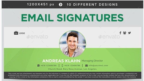
New Creative Email Signature Example
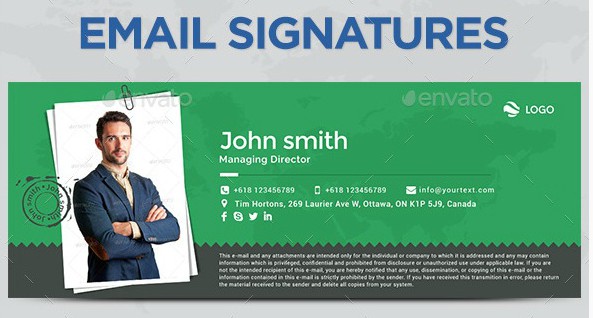
Simple Creative Email Signature Example
Sounds easy, right? Now that you already have an idea on how to make an effective email signature, it’s time to open your email site and experiment on how you want your email signature to look like. Remember to make sure your email reflects your own personality.


