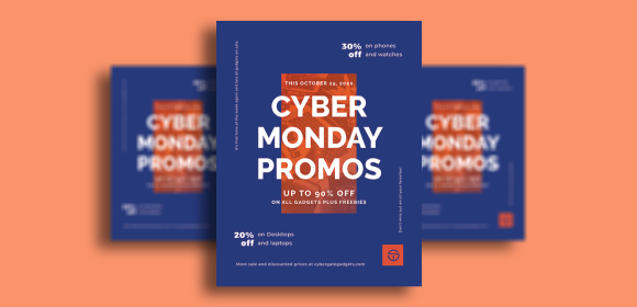
25+ Cyber Monday Examples to Download
Have a couple of stocks left from your Black Friday sale? Not to worry. With Cyber Monday just around the corner, it’s time to clear out those shelves by taking the online community by storm.
Holiday deals and promos are always very competitive. Thus, you need to make your product or service offers known with the help of an effective digital marketing strategy.
Elements of a Cyber Monday Design
Cyber Monday is a marketing term used for the Monday after Thanksgiving Day when companies go all out to persuade consumers to do their holiday shopping activities online. Cyber Monday ads can come in the form of posters, flyers, web banners, and email newsletters, among others. But for it to serve its intended purpose, you must consider the following elements:
1. Goal: “What am I trying to achieve?” This is the first thing you need to ask yourself before moving forward to the design stage. Your overall goal will help determine the outcome of the media you are creating. Promoting a sale? Make a sales flyer. Want to increase your online subscriptions? Design a pop-up marketing ad. All these must be tailored according to the holiday being celebrated.
2. Audience: It’s imperative that you understand your audience, no matter what the case. Focus on the WHO aspect of your marketing goal. Since it’s apparent that your audience will most likely consist of online users, try narrowing it down to a specific demographic. Knowing who your audience is will greatly affect the decisions you make with your design.
3. Color: This is arguably one of the most vital elements of a visual design. It’s the first thing people will notice from your Cyber Monday ad from a glance, not to mention its ability to set the tone and evoke an emotion from viewers. Colors can also be important in terms of branding, similar to that of a logo design.
4. Text: This refers to both the headline and copy of your Cyber Monday ad. Words like Huge Savings, Free Shipping, Buy 1 Get 1, Limited Stocks, and Exclusive Deals are just some examples of eye-catching headlines that are sure to draw in much-wanted attention. Your call to action should be enough to prompt a desired response as well.
5. Format and Structure: We put so much emphasis on making everything look pretty that we sometimes forget how crucial the positioning of key elements can be. A visually pleasing online advertisement must have a clean-cut layout, an easy-to-read content, and the proper placement of supporting elements. This allows you to see and absorb relevant pieces of information with ease.
17+ Cyber Monday Templates
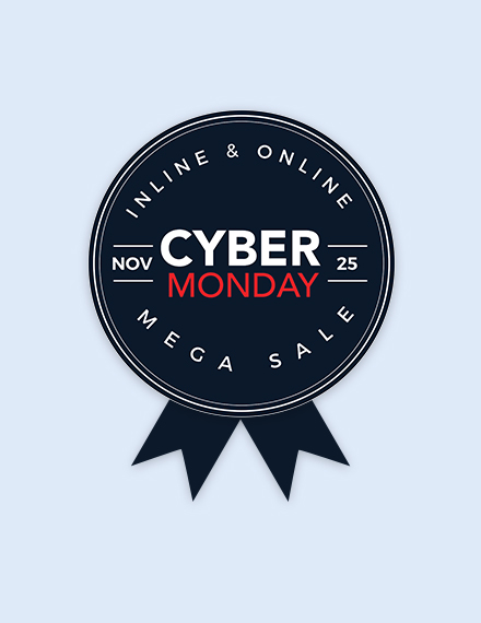
Cyber Monday Badge Design
Cyber Monday Discount Flyer

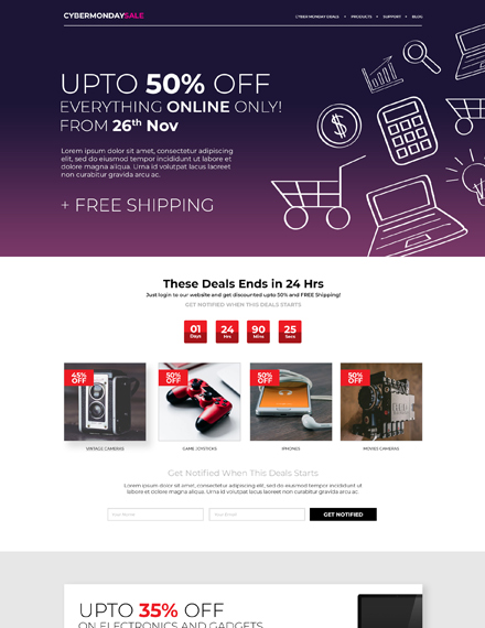
Cyber Monday HTML5 or CSS3 Landing Page
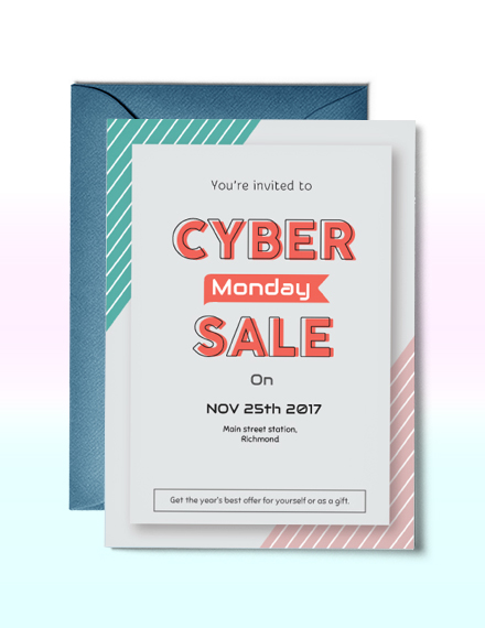
Cyber Monday Invitation Design
Cyber Monday Promotional Flyer
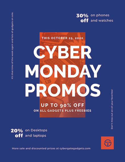
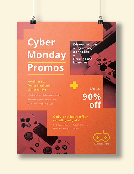
Cyber Monday Promotional Poster
Cyber Monday T-shirt Design Template
Cyber Monday Special Sale Email Template
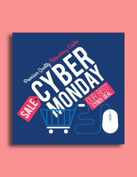
Free Cyber Monday Deal Poster
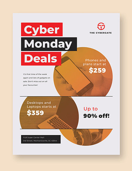
Free Cyber Monday Deal Flyer

Cyber Monday Email Newsletter Template
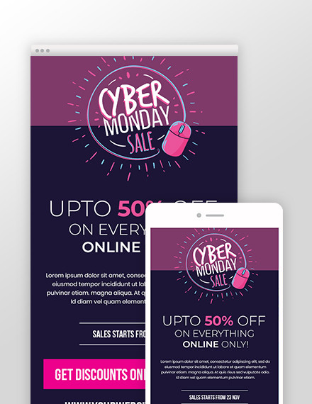
Cyber Monday Facebook Post Template

Free Cyber Monday Flyer Template
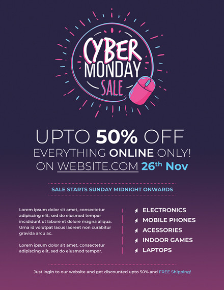
Free Cyber Monday Gift Card Template
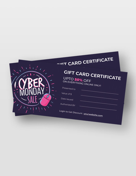
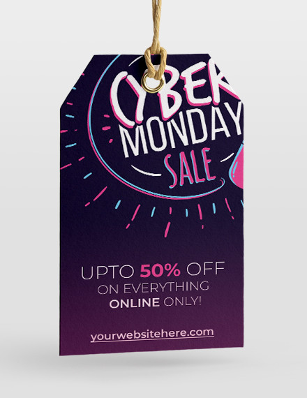
Free Cyber Monday Sale Tag Template
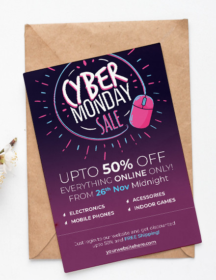
Free Cyber Monday Shopping Invitation Template
9+ Cyber Monday Examples
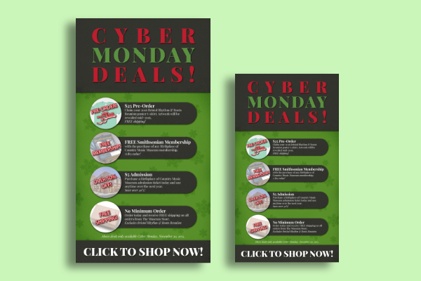
BCM Cyber Monday Deal
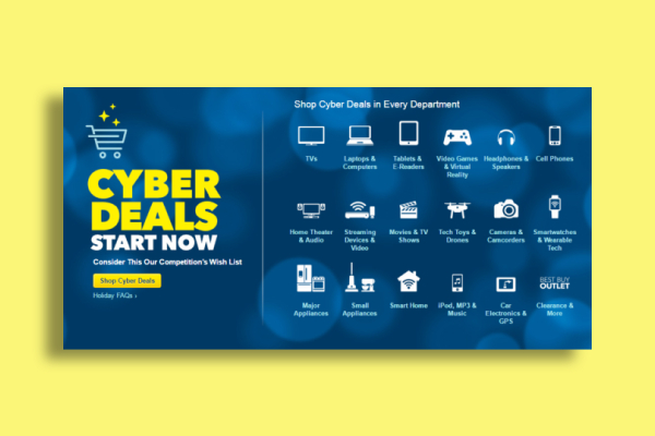
Best Buy Cyber Monday Deal
Craftsy’s Cyber Monday Sale Banner

Exclusive Cyber Monday Sale Ad
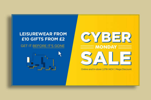
GNC Cyber Monday Deal
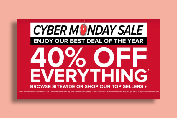
Sun Diego Cyber Monday Discount
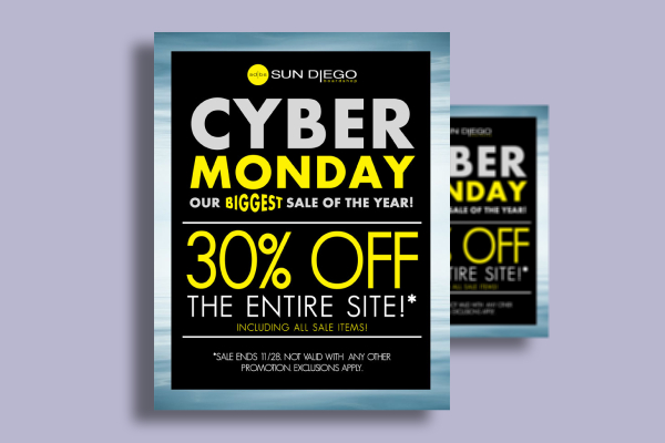
Target Cyber Monday Deal
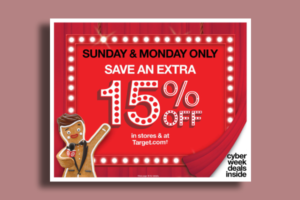
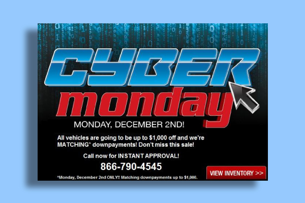
U Drive Today Cyber Monday Ad
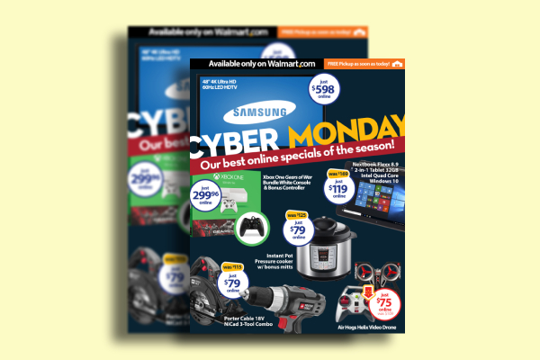
Walmart Cyber Monday Special
How to Create a Cyber Monday Design
A Cyber Monday ad that’s hard to resist can be a deadly weapon to a shopper’s bank account. This is also a time when business is booming for many companies. That being said, here’s how you can make a good Cyber Monday ad in four easy steps.
1. Brainstorm ideas: The great thing about Cyber Monday is that there isn’t an exact theme to stick with. Unlike other holiday ads like Christmas flyers and Valentine’s Day banners, your Cyber Monday advertisement can have its own distinct look. You can also gain inspiration from other design ideas in the market to see what works and what doesn’t for your digital ad.
2. Lay down your concept: Let’s face it, you might have a promising list of design ideas for your ad, but using everything all at once is a recipe for disaster. Instead, consider breaking them down into relative parts. You can incorporate various ideas into your layout as long as they remain relevant to your brand and can easily get your message across. Text and graphic elements must be applied strategically as well.
3. Edit: Once you have put all the essentials together, leave it be. Take a step away for a couple of hours and come back to it when you’re ready. This allows you to analyze the design from a fresh pair of eyes. That way, you can remove anything unnecessary and do some tweaking here and there until you’re finally satisfied with what you have. You can also enhance your Cyber Monday ad by adding images, changing colors, and switching font styles.
4. Add the finishing touches: As for the final stage of the process, be sure that your design meets the specified requirements. Let’s say you’re making a Facebook cover page banner for Cyber Monday. Considering how the social network has a standard dimension to abide to, ensure that the social media banner you’re making follows the 1640 × 664 size. Negative space should also be applied to avoid a cluttered outcome.
Tips to Achieve a Successful Cyber Monday Sale
With so many Cyber Monday deals circulating the marketplace, having a marketing strategy that’s enough to boost traffic and generate sales should be your main goal. So to make the most out of this holiday sale, here are five clever Cyber Monday marketing tips to consider:
- Learn from the previous year: Success and failure is the key ingredient to growth. Perhaps there are a few things you could do better this time to make up for last year’s mistakes, or maybe you did something surprisingly good last year that can be improved to garner better results. Take the time to review your sales report to assess what items will likely get sold out, customer behavior, and many more.
- Use a countdown widget: Uploading a countdown widget along with your regular ad is a great way to build urgency. This raises excitement among shoppers, giving them the motivation to check your site as frequently as possible to check the latest updates and announcements on the upcoming sale.
- Take advantage of social media: Never underestimate the power of social media. Networks such as Facebook, Instagram, Twitter, and Snapchat are some of the leading tools in online marketing. In addition to your banner ads and digital flyers, it’s best to start uploading hints and details about the holiday even a month before the actual date. Spreading awareness will help you strengthen your brand engagement with new and recurring customers.
- Offer unique and specific promos: Every single business will be using Cyber Monday as an excuse to offer some of their deals of the year. If you want to stand out from your competitors, it’s important to create specific promotions that your target audience would actually like. While a click bait might seem like a good idea, people would appreciate it more if you specify the exact percentage you will be discounting along with the particular items that will be on sale.
- Keep it responsive: This is especially important when using web banners and business newsletters to spread the word about your Cyber Monday sale. Given how we spend most of our time browsing the Internet on our mobile phones, you need to make sure that your site and other promotional tools work well on mobile. Users should be able to read and navigate through these mediums without much effort.
Types of Cyber Monday Designs
Listed below are common ways to advertise your Cyber Monday sale.
1. Banners: Web banners and social media banners are especially popular during the holiday season. Some banners are posted in an advertiser’s own website, while others may appear in other sites and social pages depending on the user’s activity. This can help raise awareness about your promotions and lead prospects to your website.
2. Email Newsletters: Newsletters are a lot similar to banners, except that they can be a bit more personal and direct compared to other advertising mediums. If you want to pique a person’s interest, you need to give them a reason to respond to your ad. Show customers how they may benefit from your product or service offers by using enticing graphics and engaging texts.
3. Flyers: Whether uploaded to a website or printed and handed out in the streets, a flyer is a detailed reading material that customers refer to in order to learn more about a deal or event. Some promotional flyers also contain special discount codes that customers can use to avail bigger deals while shopping. That way, you can motivate people to spend more than they intended to in your online store.
4. Landing Page: Though this may be a little complicated as opposed to an average flyer or poster design, using a Cyber-Monday-themed landing page is one of the best ways to take your marketing efforts to the next level. This requires you to change a few parts of your front-end code to give your interface a new makeover. By doing so, anyone who visits your page prior to the sale can look forward to the upcoming deals and promos.
Cyber Monday FAQs
What is Cyber Monday?
The term “Cyber Monday” was coined by marketing companies in an attempt to encourage online shopping. This paved the way for online retailers to boost website traffic, increase consumer engagement, and generate better sales. As an online equivalent to Black Friday, it’s safe to say that Cyber Monday is one of the biggest online shopping days of the year.
What time does Cyber Monday start and end?
As soon as Black Friday ends, the preparation for Cyber Monday begins. This is usually launched during the Monday after Thanksgiving holiday, particularly at or around midnight. However, some companies start their sales even earlier than the intended date as a week-long celebration. This provides shoppers with enough time to purchase from a retailer’s website and come back for more just before the sale period ends.
What is the purpose of a Cyber Monday ad?
People are always searching for different ways to save a few bucks. Some customers make it a habit to do their holiday shopping during Black Friday and Cyber Monday, and as a business, the best you can do is to take advantage of everyone’s enthusiasm and willingness to spend. Informing prospects of the promo using an eye-catching ad is sure to draw in traffic on the actual day.
So what are you waiting for? Advertise your Cyber Monday sale with the help of these templates and design ideas today!


