11+ Drive-Through Menu Examples to Download
These days, finding the time to even cook a decent meal can be a huge challenge for the average busy bee. Given how it’s nearly impossible to carry out your daily activities with an empty stomach, having a to-go meal ready is definitely an option that many people seek for. One common marketing tactic that has catered to such problem are the drive-through counters utilized by multiple fast food chains. But apart from the speedy service offered by the quick-serve industry, drive-through outlets also possess one primary marketing tool that every restaurant requires to showcase their goods — a menu. You may also see examples of a food menu.
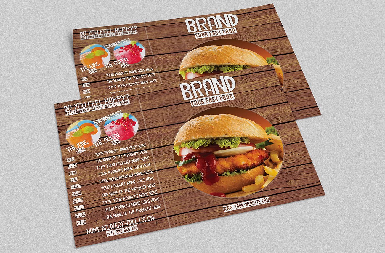
Fast Food Burger Drive-Through Menu Example
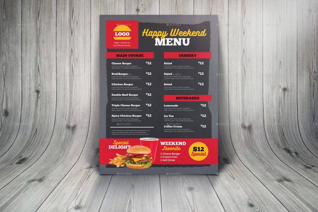
American Diner Drive-Through Menu Example
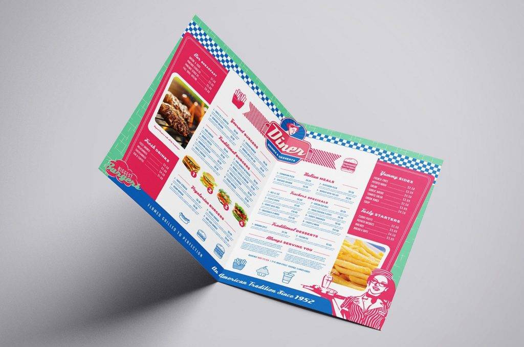
Drive-Through Fast Food Menu Example

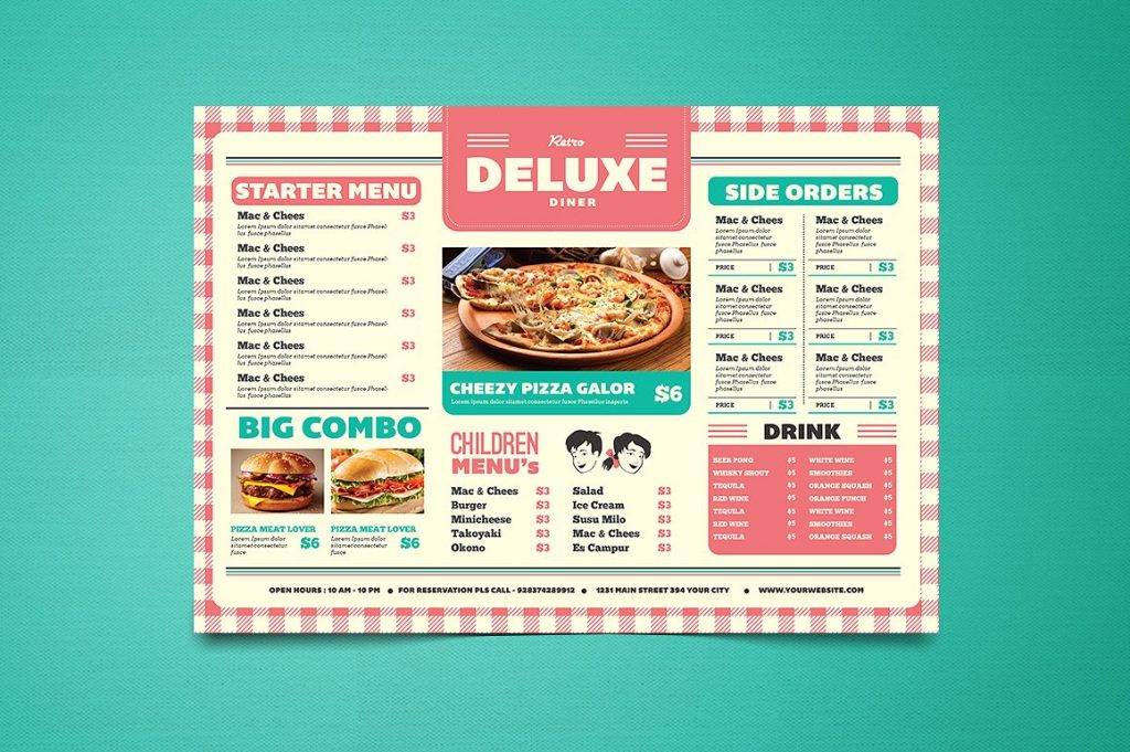
Retro Picnic Cardboard Drive-Through Menu Example
Why Create a Drive-Through Menu?
A drive-through, or drive-thru, is a type of service offered by businesses, such as fast food restaurants, that allows customers to purchase goods without leaving the comfort of their vehicles. Drive-through counters are popular among individuals with hectic schedules, and just want to grab a bite while on the road. It is set to target hungry drivers and their passengers whenever they need to refuel their bodies.
In business, dine-in, take-out, and drive-through customers are all of equal importance. But when it comes to the drive-through market, you want to make sure your customers are attended to accordingly. This means giving them the convenience of ordering and receiving their meals at a quicker time rate. You may also like sumptuous seafood menu examples.
To ensure a smooth and systematic ordering process, the drive-through menu must be created strategically. Considering how a menu plays a huge role in the first step of this process, designing a menu that motivates and informs customers on what to order is essential to successful marketing. Not only can this maximize the opportunity to make a sale, but it also eases the customer’s decision-making process. You may also see cafe menu designs.
It’s a long-known fact that the menu design of a drive-through, or any restaurant at that, can greatly influence what we order. The primary aim of such design is to make the ordering process simpler (and quicker) so employees may attend to queuing customers properly. Fortunately, technological innovation has introduced touchscreen ordering systems into the quick-serve industry, which has helped speed up the ordering process for the benefit of the business and its customers.
Though the menu board in this setting may be digitized compared to the standard print media, it still spares enough time for employees to focus on other tasks.
Burger Factory Drive-Through Menu Example
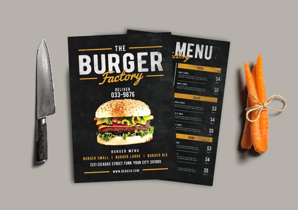
Drive-Through Food Menu Example
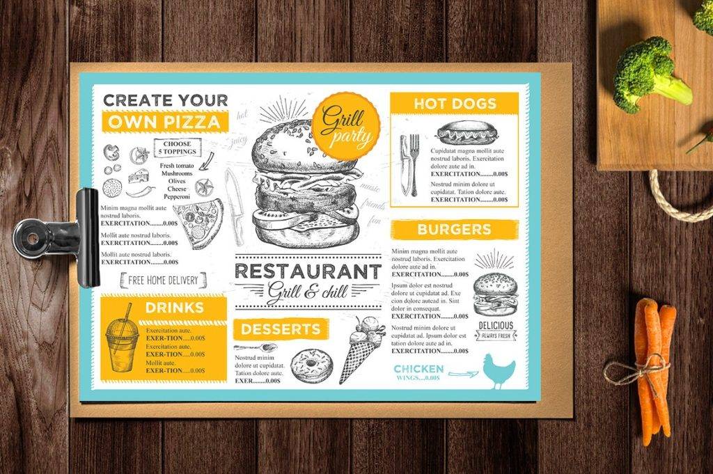
Food Flyer Drive-Through Menu Example
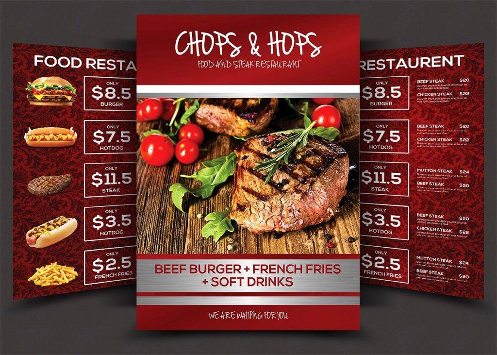
Food Drive-Through Menu Example
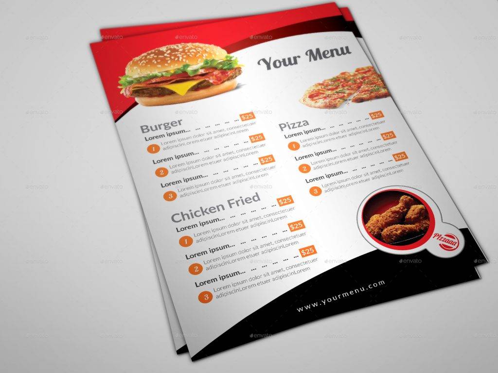
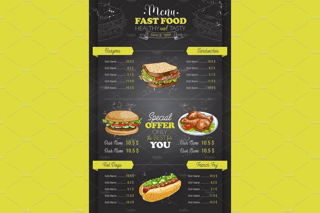
Vertical Fast Food Drive-Through Menu Example
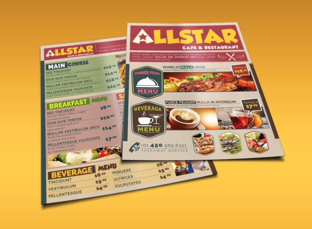
Cafe & Restaurant Drive-Through Menu Example
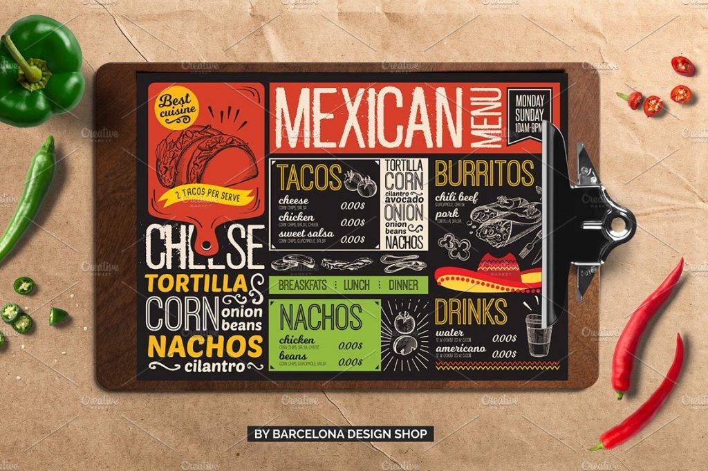
Mexican Food Drive-Through Menu Example
Menu Design Hacks You Probably Didn’t Know About
Contrary to popular belief, a menu is more than just a communication channel used to drive profit, but it’s also a significant medium that influences a customer’s dining experience by stimulating one’s appetite and prompting satisfying decisions. You may also see spa menu designs and examples.
That being said, there are a few strategies that menu engineers must engage in to make the most out of a menu design:
1. The Power of First Impressions
Not everyone takes the time to read through every line of a menu, since diners tend to scan them swiftly before placing an order. This means a menu is only granted a short amount of time to make an impact with its audience.
To make the most with what you got, you can make it easier for diners to scan the menu by using section headings, titles, and brief descriptions. The text must be made clear and visible to the eyes in order to enhance the menu’s readability. This way, diners may easily find what they’re looking for with little effort exerted. You may also like pizza menu samples and examples.
2. Reading Patterns
Many researchers have pointed out how the eyes tend to gravitate toward the upper right-hand corner of a menu first, before paying attention to its other parts. Because of this, many restaurants take advantage of the “sweet spot” by placing items they want to sell most in the said location. Rather than using images or illustrations to draw the eyes toward the sweet spot, using bold typography will do the trick just as effectively. You may also check out typography menu examples.
3. Emphasis on Menu Items
An eye magnet, which constitutes to anything that attracts the eye, is a common tool that designers use to highlight specific menu items. There are many ways to conduct this strategy, such as the use of decorative frames, hand graphics, illustrations, and boxes to help the eyes travel across each page. Grouping items into categories can push customers to order at least one of the items being emphasized as well. Other design elements, like color and type, may also affect one’s decision. You might be interested in salad menu samples.
4. Color Influence
People often respond to colors in an emotional yet subconscious way, which is why color theory plays a distinctive role in advertising that marketers must consider.
Think of it this way. Bright colors convey a feeling of joy and excitement, while darker hues depict power and sophistication. So when it comes to designing a menu, you’d want to use colors that can trigger an appetite. For instance, red and blue colors are known to generate positive responses from its audience. While it won’t be necessary to apply these colors to the whole design, you can still use these as accents to fill your simple menu.
5. High-Quality Images
Providing a visual representation of your offered dishes can certainly stir up an appetite. Adding mouthwatering photos of your dishes can persuade people to order. However, it’s also important to use these images sparingly. The number of photos to include in your menu would largely depend on the type of restaurant it represents. Fast food restaurants often add images for at least one item per category, while high-end restaurants generally avoid the practice overall. But if you do wish to use images for your menu, then having one image per page will do the job. You may also like examples of lunch menu designs.
6. The Fear of Prices and Currency
Admit it. We’re all a bit sensitive when it comes to meal prices. As a business owner, this can be a huge obstacle to overcome.
The secret is to find the right balance between making a profit and not scaring customers away. One clever technique that designers have resorted to is to evade the use of currency. Anything that may be associated with spending money, such as dollar signs and euros, must be avoided. To do so, leaving these symbols out of your menu can make a difference from a diner’s perspective. You may also check out takeaway menu designs and examples.
Alternatively, you can use a friendlier approach with pricing by capitalizing on the psychology of numbers. Here, assigning menu prices ending in .95 and the like would seem more inviting than a heavy .00 end.
7. Format and Layout
Since menu cards must be designed according to the standard eye scanning pattern, then it would only make sense to follow logical sections as well.
A good format to observe is the sequential arrangement of menu items according to the type of dish offered. You can begin with the appetizer, followed by the main course, and end it with the dessert. Some restaurants even create a separate drink menu to list a wide variety of available beverages. This way, customers who only came for a drink wouldn’t have to undergo the hassle of going through a heavy food menu.
Menus are an essential part of food marketing, as this serves as a channel to communicate a corporate entity’s offered products to its target audience. In creating a menu, ensure that every element has a key role to its overall purpose. This means creating a menu design that can catch the eye, shape a decision, and stimulate a response.


