13+ Fast Food Brochure Examples to Download
Having brochures as a marketing tool for your fast food business may be the last thing you want to use, but brochures have this characteristic of being irreplaceable to any business. It is true that when creating brochures, you invest so much time, money, and skills. You might ask, why invest so much on those when you can opt for the easy way out, such choosing to go digital?
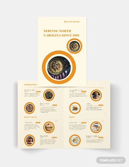
Fast Food Bi-Fold Brochure Template
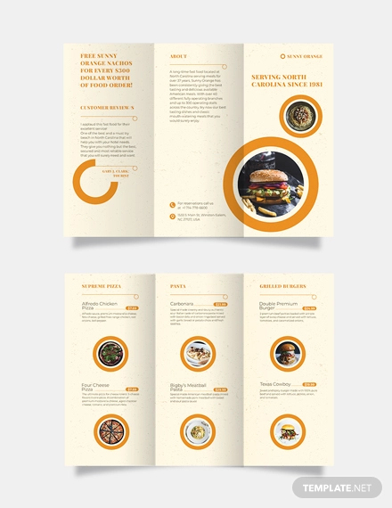
Fast Food Tri-Fold Brochure Template
Despite the downsides being associated to brochures, the truth remains that brochures are still great marketing tools even in today’s technologically-driven world. The use of brochures is the best way to provide a lot of relevant and useful information to both current and prospective customers.
There are actually infinite ways that you can use brochures effectively that no digital marketing tool can match. If you need inspiration on how you are going to design your fast food brochure, here are some examples of food brochure templates that will definitely inspire you.
Tri-fold Fast Food Brochure Template Example
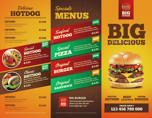
Fast Foods Brochure Design Example
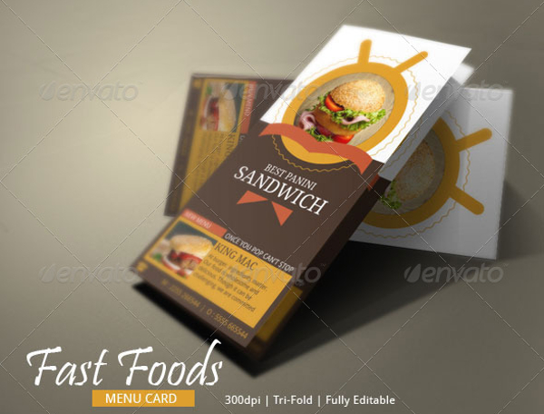
Fast Food Tri-fold Brochure Example
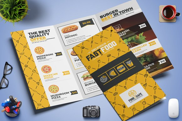
Fast Food Menu Bi-fold and Tri-fold Brochure Design Example
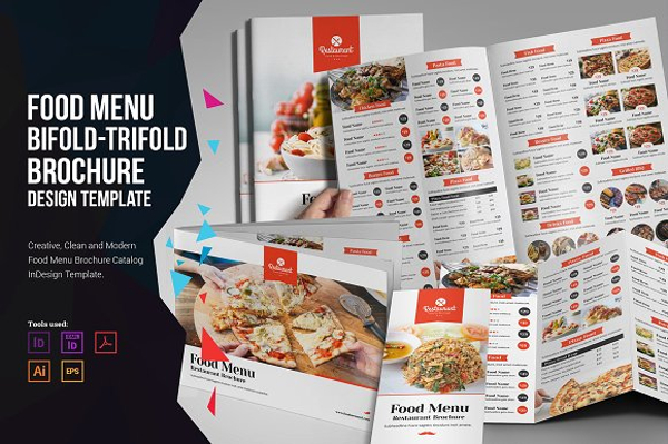
Trifold Fast Food Menu Brochure Example
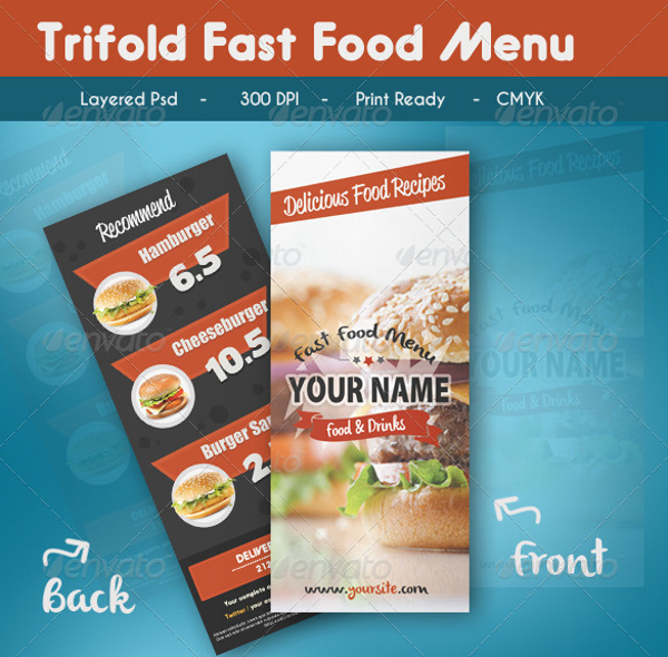
Delicious Fast Food Tri-fold Brochure Example
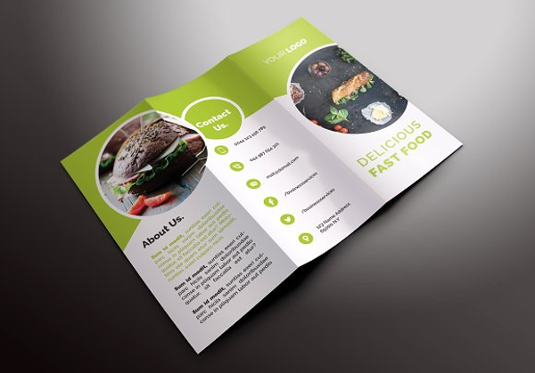
Bi-Fold Fast Food Brochure Example
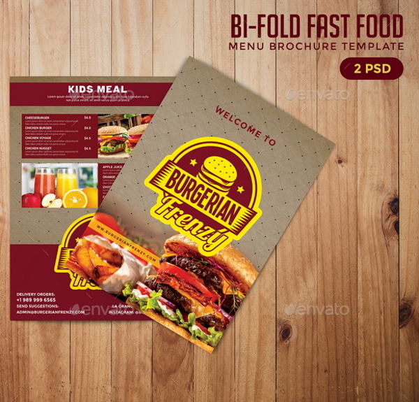
Do’s and Don’ts When Designing Fast Food Brochures
Do’s
1. Know your purpose
Before you begin designing your fast food brochure, you must know the purpose on why you are creating a fast food brochure and what you want to get out from creating a brochure. But remember that one of your purposes should be getting ahead of your competitors. Before you get your fast food brochure ready for publication, make sure that the brochure has all the necessary features that will help your message in getting across easily to your customers and prospective clients.
2. Make use of white space
Sure, you want to make your brochure as informative as possible but do not make the mistake of cramming too much information into a single page of the fast food brochure. This will definitely cause your readers to ignore your brochure as every detail and information are crammed into a single space. One way of redirecting traffic from your brochure is to make use of white space, specifically removing a few images and text.
3. Always include a call-to-action
Never forget to include your contact details in the brochures. This can be either be your phone number, email address, or social media accounts (i.e. Facebook, Instagram, Twitter, etc.). Do not make the mistake of putting your call-to-action in a page or section where it can’t be seen.
4. Experiment with designs
There is no limit on the designs you want to use for your fast food brochure. You can go with a minimalist design, a three-color combination, or even a variety of 3D textures. But no matter what design you choose, make sure it fits the theme of your restaurant. You may also see techniques for designing food brochures.
5. Spend time designing the cover
The cover of the brochure will make or break the rest of your fast food brochure. It will become the first impression of your brochure, and most times, the last. A poorly designed cover will result in your entire brochure being ignored and neglected.
Make sure to spend serious time in designing the cover of your brochure. The cover should be powerful, captivating, and compelling enough that people would actually read it, including the entire contents of the brochure. Your message should easily get across to your audience when they take the first glance at your brochure.
Red and Blue Fast Food Restaurant Bi-fold Brochure Example
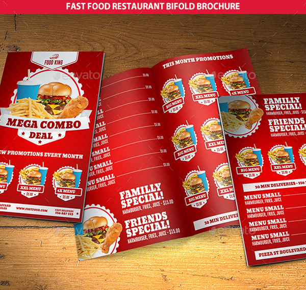
Colorful Tri-fold Fast Food Menu Brochure Example
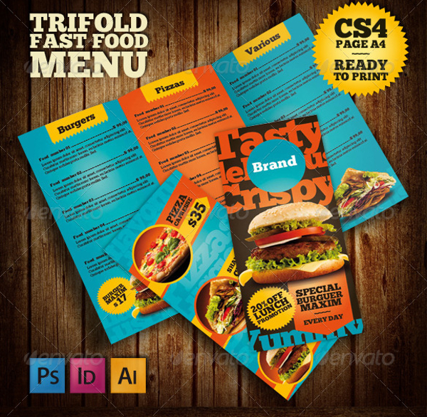
Fast Food Tri-fold Brochure Design Example
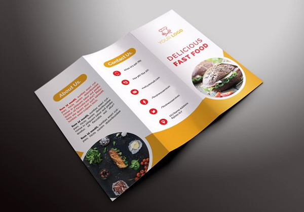
Fast Food Restaurant Tri-fold Brochure Example
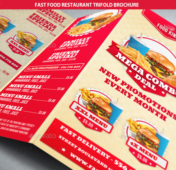
Fast Food Brochure Template Example
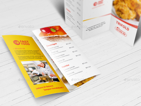
Fast Food Bi-fold Brochure Design Example
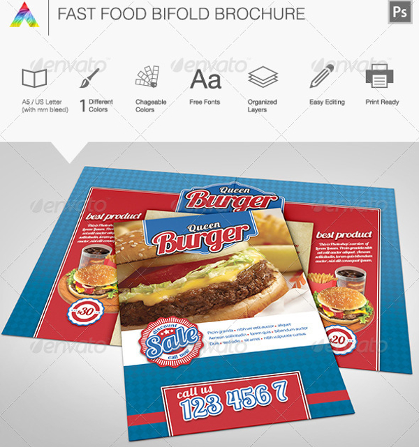
Do’s and Don’ts When Designing Fast Food Brochures
Don’ts
1. Don’t be afraid to use creative typography
The use of creative typography is always a risk for any form of design. But risk always comes with reward. Do it right and you can easily steam roll through your competition. Use typography which matches the theme of your fast food restaurant and you can also a variety of typography designs to create a more stunning look in your brochure. You may also see modern brochure design.
2. Don’t make the content overwhelming
It is a common mistake to include all information in the brochure. This will definitely overwhelm your customers as well as confuse them. You are also putting at risk the opportunity to attract potential clients as they will find the content of your brochure too overwhelming. Remember that a function of a brochure is to showcase the highlights of the restaurant, such as your best selling food and your promotions/discounts. every single thing about the business in a brochure. You may also check out landscape brochure designs.
3. Don’t compromise the use of colors
As previously mentioned, use colors which match the theme of your restaurant. Don’t use random colors as it will make your brochure unprofessional. For example, using green and orange colors in the simple brochure when you are using blue and yellow themes for your restaurant. Additionally, you don’t need to incorporate a dozen colors in your brochure. Keep it simple as you are only highlighting the best selling dishes and promotions in your brochure.
4. Don’t compromise image quality
Never compromise the images in your brochures. People hate it when they are only looking at text, especially for restaurant brochures. Additionally, avoid having pixelated images in your brochures as they look cheap and it will feel like no effort was exerted in creating them. You may also see business brochure designs.
5. Don’t forget to proofread
This is highly crucial yet often times overlooked. Make sure you proofread your brochures before they go into printing. Customers have a sharp eye and can easily spot errors in the brochures, not only in the text but also in the images. Numerous errors can become a big embarrassment for your restaurant which will result in low sales and eventually closure. You may also like tri-fold brochure designs & examples
Elegant brochures are timeless marketing tools. They are easy to make and easy to give out. So, make sure you purchase from any of our designs above and watch your business easily beat out the competition.


