15+ Food Billboard Examples to Download
Putting up billboards is an excellent marketing strategy and tool that companies, especially businesses in line with food, have been using for quite some time now. Unlike posters that only a few would be able to see depending on where it is posted, the use of billboards for advertising is an effective way to gain more audience and encourage customers and prospects. To make the design process more efficient and visually impactful, many businesses now utilize professionally designed billboard templates, which help create attention-grabbing ads that resonate with viewers and enhance brand visibility.
In this article, examples of food billboards are presented for you to get an inspiration out of. We have also provided tips on how to create an eye-catching billboard for your food-related business as well as the advantages and disadvantages of using food billboards in advertising.
Fast Food Billboard
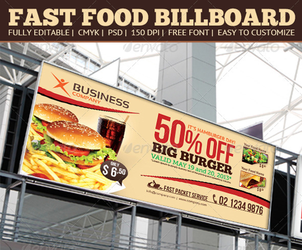
Fast Food Billboard Design Template
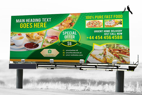
Fast Food Billboard Template
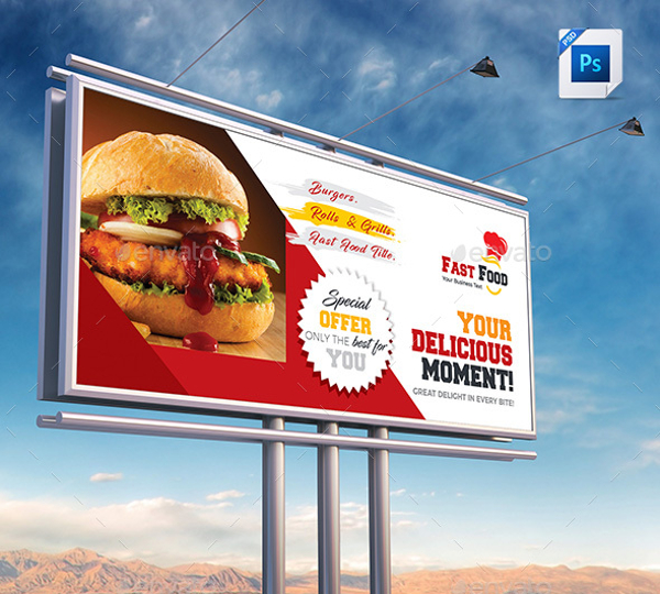
Advantages and Disadvantages of Using Billboards
Advantages
1. You Have a Wide and Varied Audience
Every business has its target audience. For beauty-related businesses, the target audience is usually women because they are more inclined to using beauty products. For toys-related business, the target audience is commonly children. for businesses in line with food such as restaurants and fast foods, you could still have a target audience but when it comes to food, it seems that food is a universal product that everyone will be availing of. You may also see signage and billboard designs and examples.
You may still have a target audience for your restaurant or fast food but there might be another kind or group of audience that you may have missed because you are too busy focusing on getting the attention of your target one. Having billboards as one of your means of marketing your businesses can be the best way to generate attention not just from your target audience but the other kinds and groups of audiences as well. Billboards are usually and generally placed in high or elevated areas that can be visibly seen by a lot of people who are in the high ways and in the busy streets. If your billboard is placed near a road or highway that is always congested, the people inside the vehicles that get stuck in the traffic will surely take notice of your billboard and of what you are advertising. Whether they like it or not, they can really see your billboard and it will eventually get stuck in their minds and isn’t it one of the things that advertisers are aiming for?
2. You Can Have a Customized Placement
Billboards can be placed anywhere but it will still be visible from afar due to its humongous size. Which means you can place your billboard advertisement wherever you feel a lot of people can view. The most common placement of billboards is placed near highways and busy streets. Highways and busy streets are usually congested with traffic. And what does traffic mean? It means that there are a lot of people are stuck and even if they are going to entertain themselves with their phones, there are surely times wherein they would look up. Now you would want to take this opportunity that whenever they would look up, it’s your billboard that they are going to see. You may also like examples of advertising banner design.
Burger Fast Food Billboard
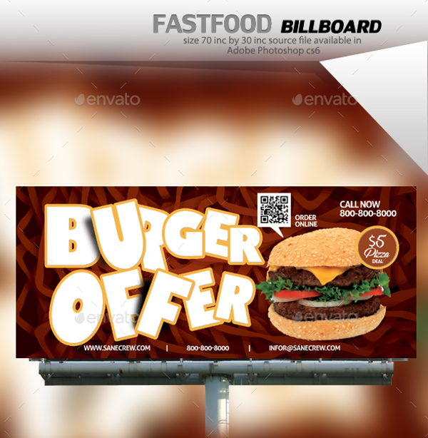
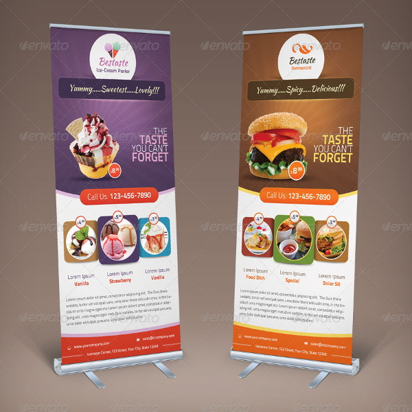
BesTaste Food Billboard Roll Up Banner
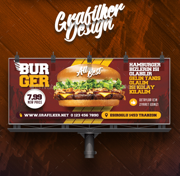
Burger Billboard
Disadvantages
1. Your Message Should be Delivered Briefly
As much as you want to deliver a paragraph length lines, you will have to succumb to one or two lines so an average person, who only has an attention span of two to three seconds when reading billboards, can get hooked with your advertisement on a billboard. This means that you really have to make most of the short time that they would be paying attention to your billboard. This means that you have to take an extra effort to design your billboard in a way that either a person would immediately get hooked or a person would take a second look. You may also see examples of vector design.
In reality, the images you put on your billboard weighs more than the text. Sure, there are some people who would really read advertisements like it’s their job but keep in mind that billboards are often seen by people who are driving and drivers shouldn’t be distracted. Another thing is that they are also usually in motion, which means that it would be difficult to read texts. You may also see printable banner examples.
2. Having Billboards are a Long-Term Commitment
Billboards have made businesses enter into contracts that are a long-term commitment. This means that putting up a billboard takes a lot of time, energy and money in order to maintain and constantly change your billboard ads. Before taking billboard advertisement as a means for you to market your food-related business, you should analyze first the way your business would change its advertising campaigns. If it goes on a weekly or monthly basis, things can get difficult and especially costly. This makes billboard advertising work better for your overall business and brand advertising and not just for temporary promotions, specials and sales. You may also check out examples of banner ads.
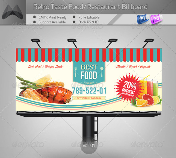
Retro Style Restaurant Billboard
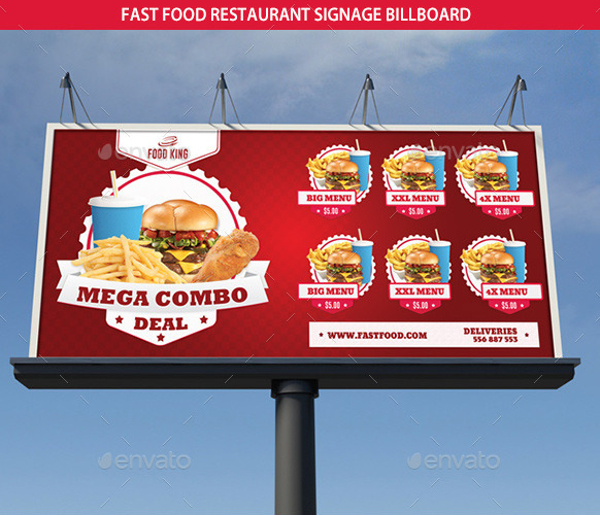
Fast Food Restaurant Signage Billboard
Sample Restaurant Billboard Template
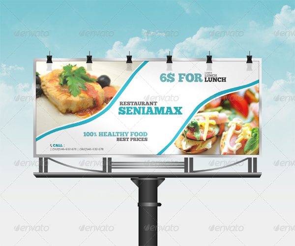
Tips that You Can Follow While Designing Eye-Catching Food Billboards
Sure, billboards are already eye-catching with their size alone. But if you will have a billboard that is carefully designed, you can convince your customers and prospects to buy the food you are selling. With that, here are some tips you should consider when you want to design an eye-catching billboard. You may also like examples and techniques for designing food brochures.
1. Do Everything to Get Noticed but Don’t Come Off as a Huge Distraction
Billboards are usually aimed at drivers, bikers, commuters, or pedestrians. If your billboard shouldn’t be so captivating it becomes eventually as a distraction. You don’t want to get complaints regarding your billboard being distracting, right? And, you also don’t want to be responsible for minor and most especially major accidents. Analyze the difference between being noticed and of being a distraction. You may also check out examples of fast food branding.
Full Layered and Editable Billboard Templates
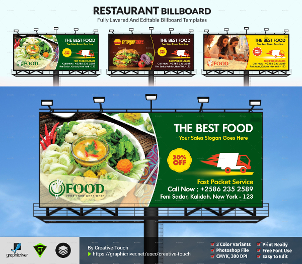
Sample Restaurant Billboard
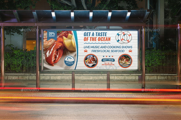
Seafood Restaurant Billboard
2. Show; Don’t Tell
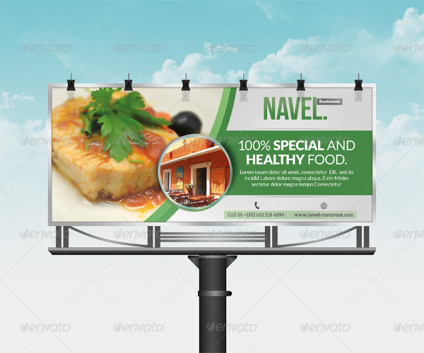
Again, billboards usually should contain more images than text because too much text can already lose the attention of your customers and prospects. Make sure that the photos you include do not just tell but it shows effectively the message it wants to get across. Since you are creating a billboard for food, you have to ensure that your billboard, indeed, shows food. You can get professional photos taken of your food and use these photos on your billboard. With this, you get an opportunity where you can create something that is eye-catching and memorable for anyone who will be able to view it. You may also see tips for designing effective banner ads.
Sample Breakfast Buffet Billboard
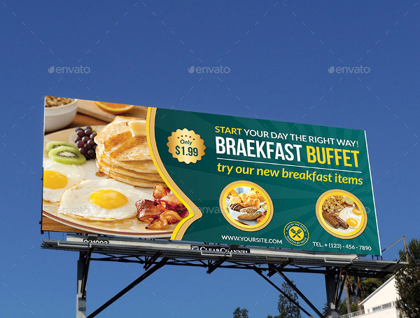
Breakfast Restaurant Billboard
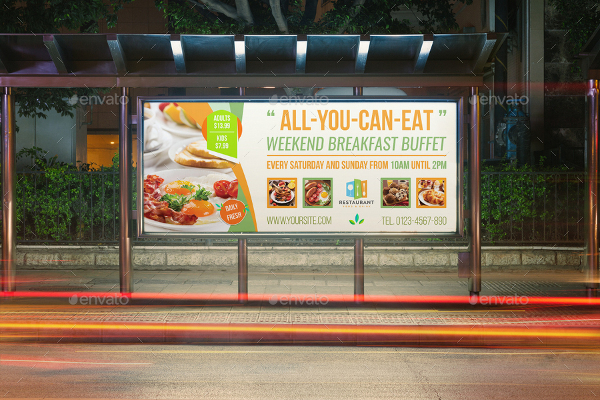
Indian Restaurant Billboard
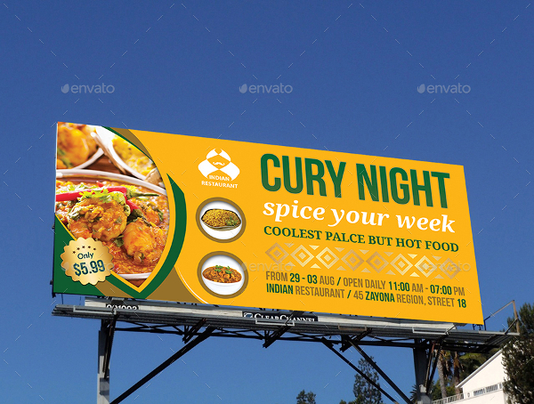
Restaurant Business Billboard
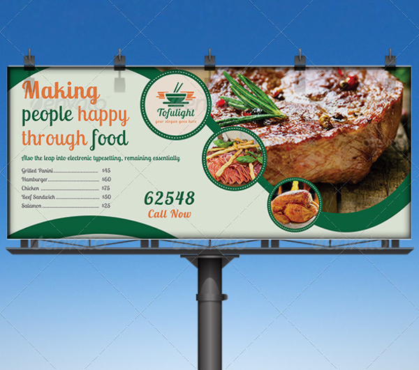
3. Keep it Short and Simple
Again, people have a short attention span when it comes to reading billboards and that they are also in motion which makes it hard for them to read long texts written on billboards. You need to get your message across customers and prospects without having a very complicated food billboard design. If you want to be poetic and verbose with the food you are selling, making billboards as your medium may not be the best way to do that. You may also like examples of vintage poster design.
Being short and simple means that you have to avoid putting on long sentences. Be witty; catch their attention with the use of five or fewer words. Maximize the quick comprehension by the people driving by. You may also check out brochure designs & examples.
We hope this article has helped you in creating your own food billboard design.


