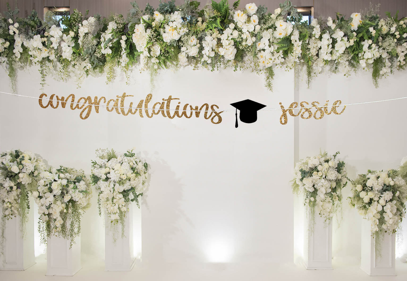
14+ Graduation Banner Examples to Download
If you carefully observe your surroundings and filter your view in such a way that you only take heed of the banners in the area, there are actually tons of banners that you failed to notice. This is not because they can hardly be seen or they camouflage with the walls or the surrounding building but because they are poorly designed, making them hard to notice. You may also see roll-up banner designs & examples.
We do not want that, right? All we want is to stand out from the crowd and be noticeable amidst the crowded and busy streets. However, as we take a look at the public places, there are already lots of effective banners being posted on walls, street posts, or railing, and it is tough to have a competition with those existing banners in terms of artistic design and layout.
You might have tried your best in making a large banner, but your efforts fail for some reasons that you do not know. Nevertheless, although size can be a determining factor why your banners do not get noticed, there are also some aspects that you must focus and work on. If you are to create your own banner, design it in a way that it is both informative and eye-catching at the same time. More of these tips in designing your banner are in the succeeding sections.
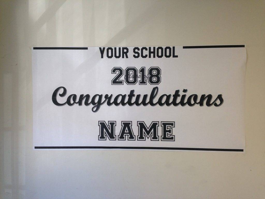
Custom Large 2018 Graduation Banner Example
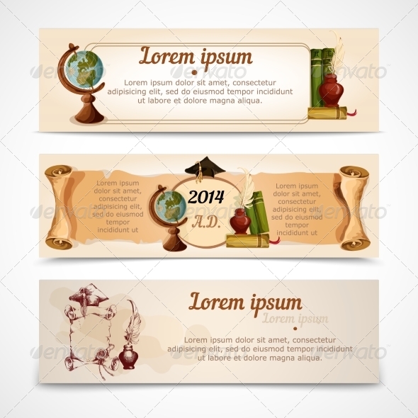
Graduation Banners Set Example
Tips for an Effective Banner Design
As previously said, in order for your banner to gain attention and interest of the public, you must design it well and the information that you include must be useful to the people. However, never think of pleasing everyone because not all people have the same preferences. Just know and remember who your target market is and from there, create a stunning and effective banner design.
Below are some important tips that you must know when you first create a banner:
1. Add an eye-catching tagline
The first thing that you must work on is the tagline of your banner. The general rule of thumb is to use a short catchphrase. The shorter, the better. Be creative in your headline, but keep it relevant to the rest of the information in your banner.
Use appropriate language that is understandable by your target market, and if there is a need to include a message, choose a shorter one as it is easy to read especially when the audience is a passing pedestrian. Choose words that can catch people’s attention and at the same time connected with your main message. You may also see examples of advertising banner design.
2. Choose the perfect size
You must also take into consideration the size of your banner. However, it is not always that bigger size is always better compared to the smaller ones.
You must also think about your transportation method when you want to have a bigger banner, as well as the printing cost. If you are a small company, albeit you might want to print on large banners, your company cannot support such expenses because it is way more expensive than the allotted budget. Also, if you have a small booth for your banner, it is inappropriate to use very large banners. You may also like pop-up banner designs & examples.
3. Properly arrange your lead
Avoid clutter. You must know what are the highlights in your text and you must know where to place them. If you will not arrange it properly, the reader cannot easily identify the important parts and will never bother reading your banner again. They might think that your banner is just a useless piece of paper or cloth that contains no important information at all. You may also check out event banner examples.
To avoid this, place the most important graphics and text on areas and spots that are easy to read. Lastly, avoid burying your leads in the sea of texts and graphics.
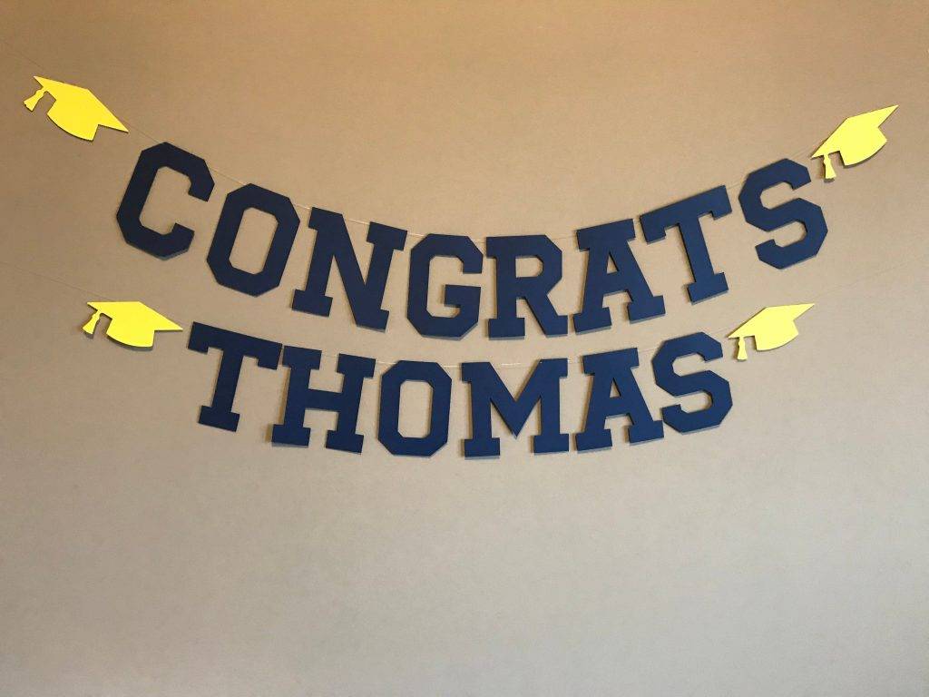
Congrats Name Banner Example
Graduation Party Decoration Banner Example
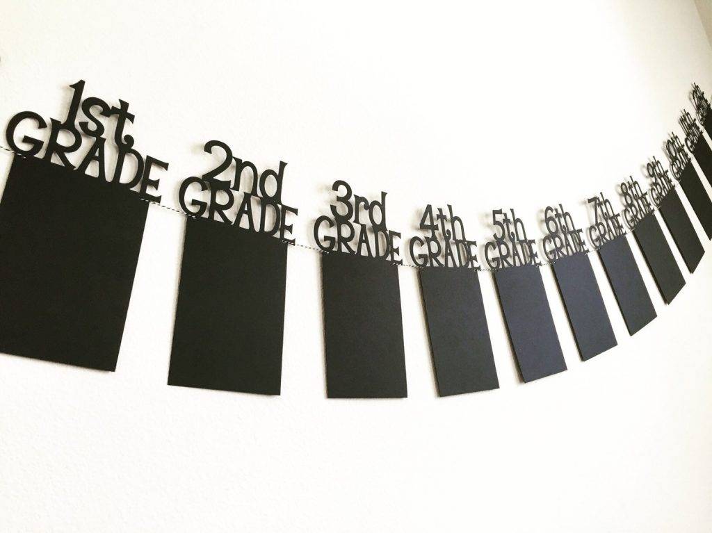
Graduation Banner Set Example

4. Use attractive graphics
Graphics are very strong elements in your banners. Most people would get attracted through the graphics that are being incorporated in the banner. In choosing for graphics, do not settle for blurry or pixelated photos; choose those that are photographed using a high-quality camera. You might be interested in examples of anniversary banner designs.
Make sure that the resolution of your photo is high enough for it not to be pixelated. Also choose those that are relevant to the ones you are presenting in your text as some graphics can be misleading if you are not carefully choosing your photo.
5. Choose colors wisely
Colors are great attention-grabber and head-turner. They are a great way not only to enhance your design but also to reinforce your branding efforts. In choosing for the colors, always take into account the color scheme of your modern logo or any company identity. In this way, your banner can easily be recognized by the people who have known your brand. This will also give increased familiarity to the audience regarding your brand or products or services.
6. Include your contact details
Your contact details is highly important especially when you are venturing in the business world. You must maintain a good communication especially with your customers and prospects.
Place this information on an area where it will not distract the main message but is still readable and accessible by the readers. You may include your phone number or secondary phone number in case they cannot reach you, website URL, email address, and social media account. Remember that this is not your main area being discussed and this does not have to be in huge fonts.
7. Be concise
For simple banner aspects, the famous phrase “less is more” can be applied. It is a big no to overburden your readers and audience with excessive use of words especially when there is also poor typography or a collage of big images with colors that are not complementing with each other. Keep your message straight, direct, and concise. No one would want to spend an amount of time reading longs lines of text. Hence, you must limit yourself from adding useless words in your banner.
8. Invest in high-quality materials
Apart from the design and face of the banner as well as its content, you must also take heed on the materials that you will be using in your banner. Invest in high-quality material for a high-quality output.
Determine the amount of usage you intended for your banner so you can estimate what material is perfect for your design. If you are planning to put your banner on areas with varying weather conditions, it is better to choose high-quality materials rather than taking chances on the cheaper ones. You may also see sale banner designs and examples.
9. Ensure its endurance
The last thing that you must consider is the endurance of your banner. You must ensure that your sign can stand in whatever conditions both outside and inside.
For outdoor banners, they need to be stable so they would not topple over especially in strong wind conditions. Their printing must also be fade-resistant if you are planning to expose them under the strong heat of the sun. Make sure that they can withstand in both of these weather conditions and they would last long enough. You must invest in a good-quality material rather than settling for materials with lower costs but can easily be damaged or broken. This is also true for your printing. You may also like company banner examples.
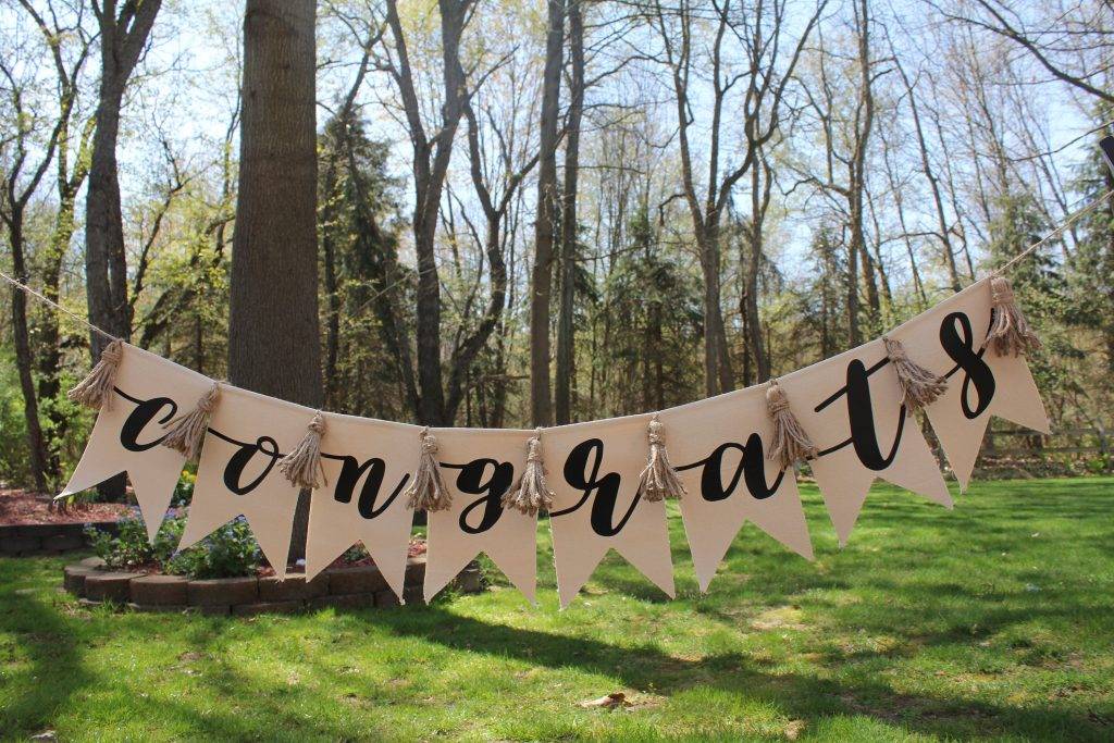
Congrats Pennant Graduation or Wedding Banner Example
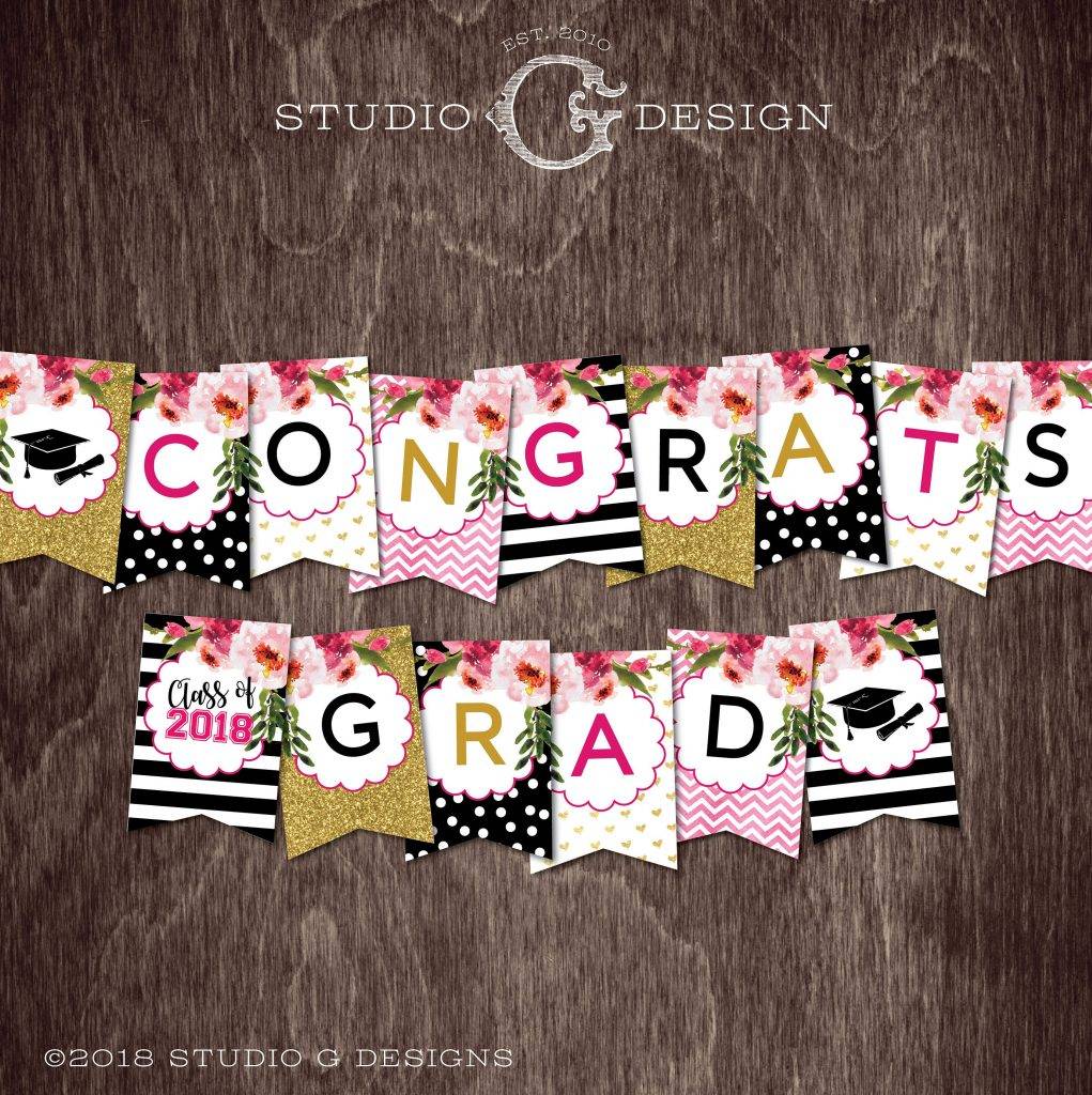
Stripes and Gold Glitter with Flowers Graduation Banner Example
Pastor’s Graduation Ceremony Banner Template Example

Bonus: Graduation Announcement Wording Examples
Since our examples focus on graduation banners, here are examples of graduation wordings for your graduation announcement that you might need to put in your banner. You may also see vertical banner designs and examples.
Example 1
“In learning, we have found friendship.
The Faculty and Students at
(Name of School)
celebrate the graduation of
(Graduate’s Name)
Commencement Exercises
on (Date)
at (Time)
(Location)”
Example 2
“(Parent’s Names)
are proud to announce
the Graduation of (Graduate’s Name)
from
(Name of School).
They invite you to share their blessings and happiness
at Commencement Exercises
on (Date)
at (Time)
(Location)”
Example 3
Every yesterday is
a memory of dreams.
Every tomorrow is a vision of hope.
With great pride and honor,
(Parent’s names)
announce the graduation
of their (son or daughter)
(Graduate’s name)
from (Name of School)
on (Date)
at (Time)(Location).
Example 4
(Parent’s names)
are greatly proud to
announce the Graduation of
(Graduate’s name)
from
(Name of School)
on (Date)
at (Time)(Location)
as Class Valedictorian (or any honor or award)
(Graduate’s Name)
is heading on to (Name of School)
and study (Course).
Example 5
(Graduate’s name) worked really hard to succeed!
(Parent’s Names) are so proud
to announce the graduation of
(Graduate’s name)
from (Name of School)
Commencement Exercises
on (Date)
at (Time)
(Location).
Custom Grad Banner Example

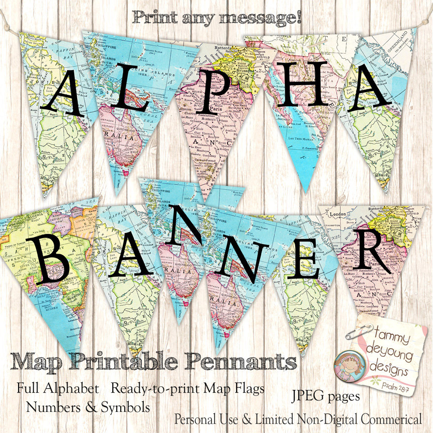
Map Banner Garland Graduation Banner Example
School Graduation Vertical Banner Example

Graduation Party Decoration Banner Example Design
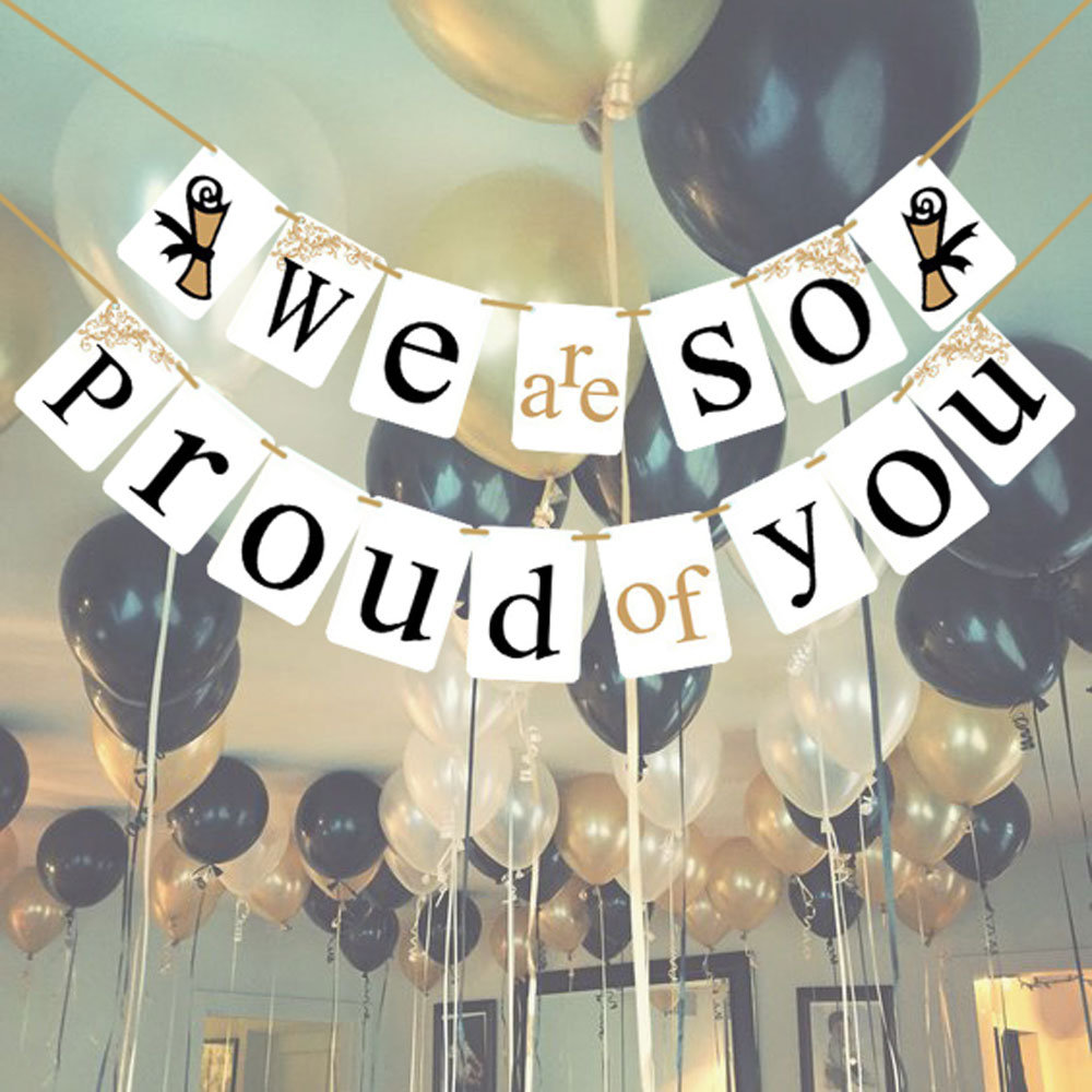
Personalized Name Graduation Banner Example
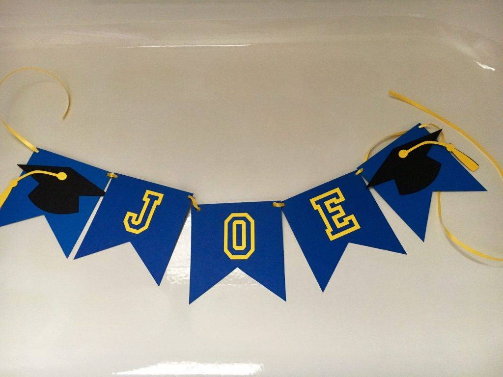
Graduation Signage and Banner Template Example
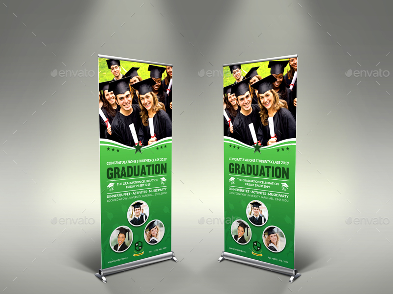
Custom Name Graduation Banner Example
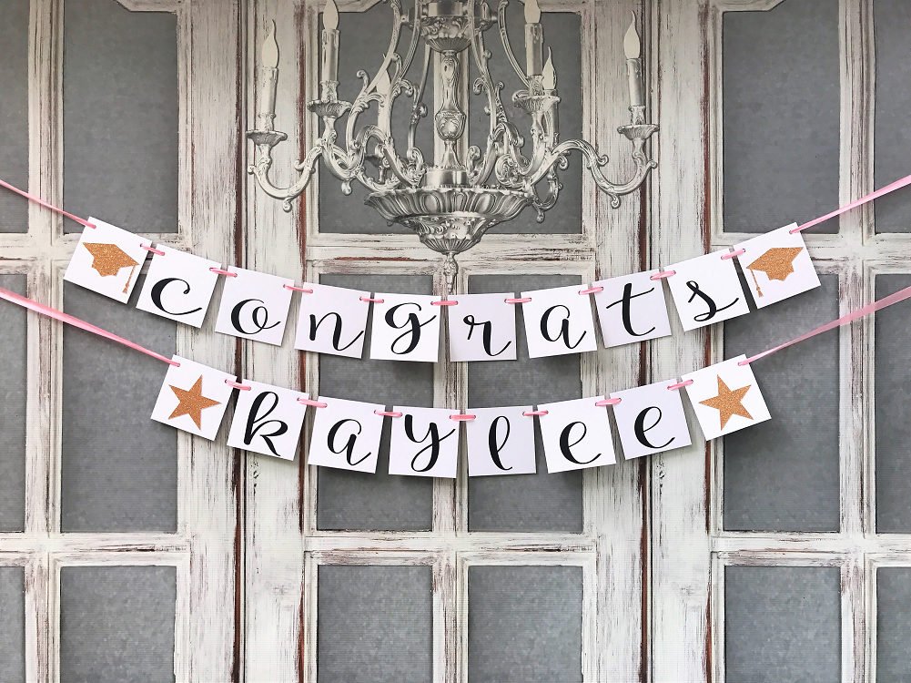
Summary
To sum up, if you want your banner to stand out and get noticed, do not just settle for less design, quality, and layout. You must work on every aspect of the design while targeting your target market.
In brief, if you create a banner, your must see to it that you add an eye-catching tagline, choose the perfect size for your banner, properly arrange your lead, use attractive graphics, choose colors wisely, include your contact details, be concise, invest in high-quality materials, and lastly, ensure its endurance. Always remember that you must work on both the content and aesthetics of your banner. You may also see party banner designs and examples.
Hopefully, these information will help you get started in your creation of a banner and may the examples of graduation banner design help you in your banner needs.


