14+ Health & Medical Logo Examples to Download
In any types of businesses or organizations, logos are very important in building strong brand recognition especially in a multi-billion healthcare and medical industry. The market has been very competitive and companies strive independently to out-stand in the industry.
No matter what size of the company you have, whether it is a medical clinic or a hospital, health and medical logos are utilized as the face of their brand. Many companies will even hire high-end designers to create a professional logo for them. Marketing a business usually starts with coming up a logo design that people will easily recognize them.
Lab Medical Logo Design

Simple Medical Logo Design
Bio Health Medical Logo
Medical Center Logo
Medical Herbs Logo

However, creating a logo from scratch is not that easy especially when you need to consider a lot of things. It’s important for the company to make sure that their logo will also symbolize their objectives without losing the necessary design details- such as the colors, fonts and overall package of the logo. To give you a head start, we listed some sample logos and tips on the do’s and don’ts in crafting an outstanding logo for your health and medical business.
Importance of a Presentable Health and Medical Logo Design
Being able to create a logo is just the first step in creating the face of your company. Making them remember you is another story. You should be able to create a remarkable visual that everyone can easily associate you with. Good corporate branding paired with an outstanding visual representation can strengthen your identity as a health care industry and it will surely lead you to success.
First Impression Last
Most of the time, the first impression of our customers greatly affect how they see our long-term. That is why it is crucial to have a logo that will leave a good first impression. People nowadays would prefer to know what your business is about by just looking at your best logo and skip the long talks and explanations. After all, what you surely want is to be remembered as a company with an outstanding representation of its business.
It adds to your business reputation
Business logos are not just the visual representation of what you are selling but it is the soul of your marketing strategy. The logo greatly affects your business reputation. Every color, icon, and texts placed in your logo says a lot about your company especially these days when people are becoming more visual. Don’t judge the book by its cover definitely does not apply here. With one look, you definitely need to convince your target market that your company is worth their trust.
Customers Will Feel at Ease
In a healthcare and medical industry, it is very important that patients will feel at ease once they see your round logo. Care and hospitality should be one of the main concepts for your logo so that people can feel the warmth of the medical industry. A perfect balance of colors, shapes, and fonts will definitely give you a good start. One of the reasons why hospitals, clinics, and even yoga centers use light colors for their buildings is to surround the people with good vibes and calmness. Feeling safe and at home in health and medical industry is definitely one of the factors to be considered.
Blood Donation Logo Design
Medical Doctor Logo Design

Hunger Health Logo

Nature Medical Logo

Medical Supplements Logo
Pill Medical Logo
5 Things to Consider When Creating Your Logo
Having a rough draft of how you want your logo to look like is just the start of a long process of adding and deleting details until you’re satisfied. One draft is surely not enough to come up with your final pick. Just like other things, there are also points to consider when creating your abstract logo. We list some of the important do’s to consider in creating a logo.
Color combination
In an industry that promotes health and wealth, colors that are pleasing and calm to the eye will surely give you an advantage. Most of the healthcare industries use primary colors in light shade as it gives a feeling of comfort- two to three color combinations will do. Even the walls of clinics and hospitals are painted with light colors to let their patients feel relaxed. Dark colors usually signify strong ambiance which is the opposite of what healthcare and medical industry offer. Restaurants and malls usually use dark shades to signify excitement and sharpness. After all, you would not want to scare your patients by just seeing your logo.
Font Style
The font style you use also tells a lot about your industry. Fancy font styles usually coincide with bars and eateries while formal ones are commonly used in the healthcare industry. Most of the times, hospitals and clinics use wide fonts in bold to make it readable even from a distance. Thin fonts are less likely to be used as it is confusing when reading the texts. Make sure that when you use thinner fonts, have it in bold so it can be clearer.
Icons
Some of the usual fonts used in logos are the cross, heart and blood drip. When you see these symbols, you can easily point out that it has something to do with healthcare and medical industry. Including these icons in your logo is fine but don’t forget to play with your creativity to avoid having almost similar logos with other companies. Icons should be as big as your texts, especially in logos. There are times that small texts look good in big icons but to avoid overlapping, it is best if you will have the two in just the same sizes so that when you look at the logo, the texts and the icon can both be recognized.
Good Quality Logo
No matter how creative your logo is, when made with low-quality images, it will still look bad. Make sure to be a bit detailed when choosing icons to be used. Higher resolution means better quality and better pixels results to a good quality output. It is best to have your logo pixels set up to the highest resolution so that it is ready to be used in anywhere- tarpaulins, leaflet, hospital designs and business cards.
Don’t Forget your Brand
Even when creating a logo, do not forget to include your identity that people know you of. It is very important that you include symbols that you can be easily recognized. Choose the icon that best describes you and plays with it. It is easier to start with something that you are certain than starting from total scratch. When you got the main icon, deciding what colors and texts to include will be easy for you.
Medical Checkup App Logo

Health Tree Logo
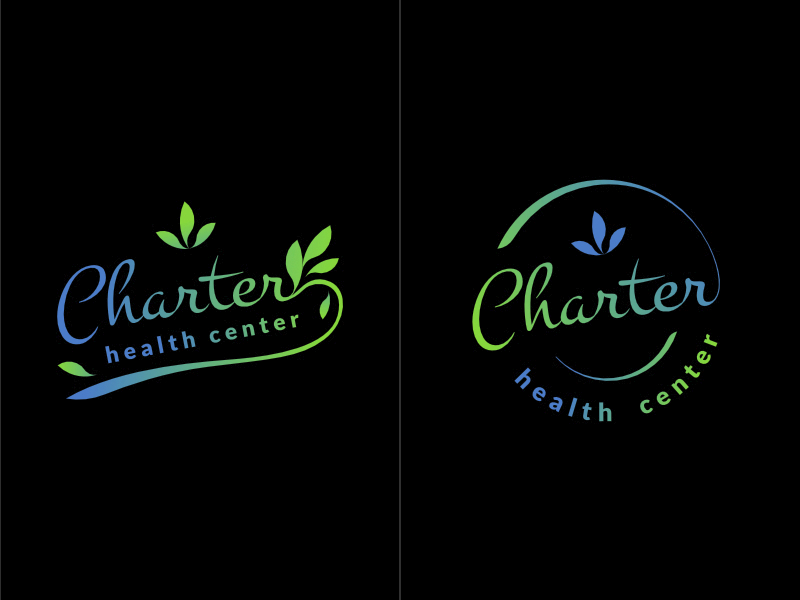
Charter Health Logo
4 Common Mistakes When Creating Your Logo
Too much Information
Your logo is your visual representation and not your business card. Simplicity and clarity is still the best option as it helps the readers identify your business easily. Never include your contact information in your logo. You can include it in your leaflets and banner designs but not in your logo. A good logo alone can speak of what your company is about.
Big Icons, Small Fonts
The icons and fonts in your logo should be of equal importance. Most of the time, we give more importance to the icons that we use and less importance to the texts. Not at all times that your logo can tell everything about your company, especially when you used complicated designs. Your logo should go with your name as it will help people know your business.
Overuse of Fonts and Colors
Most of the times, our creativity leads us to overdo. We tend to try a lot of color combinations and play with fonts as well. What we do not notice is that we already used multiple fonts and colors and we overused everything. A perfect combination of colors, shapes, and icons will definitely give you the best result that you are looking for. Not unless you want your business to be represented by a rainbow logo which definitely not what health care companies are all about. Simplicity and clarity is still the best option.
Overuse of Icons
It is good to use typical icons for health and medical industry for your log but using a lot is a big no. Using one or two will already work just like using a blood drip and across to signify that your company is all where people can donate blood. In the medical industry, creating a logo means less is beautiful.
Creating a health and medical logo is a bit tricky as it has a direct target audience. Compared to other industries, you need to be more considerate of the themes that you use in order to connect with your audience. Remember that your logo is your visual presentation and the soul of your brand. The smart goals are to capture the heart of your audience and make them feel cared.


