19+ Indesign Menu Examples to Download
As self-proclaimed food-lovers, it’s not hard to see why the restaurant business is flourishing with investors, clients, and other stakeholders. But there are various components that act as effective marketing tools to help these restaurants lure in prospects, with the menu being one of it.
Considering the value possessed by these mediums, designing a menu that can effectively communicate your brand offers is vital to the restaurant’s success. For this reason, careful considerations must be made towards even the slightest details of your menu design, including the menu descriptions, layout, and prices.
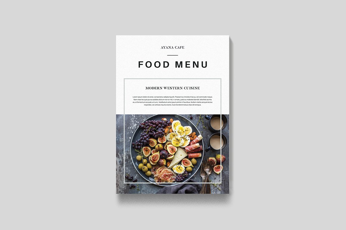
Food Indesign Menu for Restaurants Example

Food Bi-Fold Indesign Menu Example

Fast Food Restaurant Indesign Menu Example

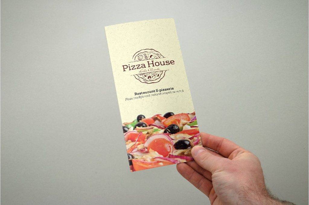
Tri-Fold Pizza Indesign Menu Example
5 Common Types of Menus
Have you ever noticed how menus come in wide varieties?
We have table tent menus that offer restaurant specials during certain seasons, or even menu cards that present these offered items in a smaller, more summarized manner. While menus may come in different shapes and sizes, there are specific types of menus that companies in the food and restaurant business use for a distinct purpose. You may also see sumptuous seafood menu examples.
1. À La Carte Menu
An À la Carte menu typically lists each food item separately, and this means without a drink or side dish, depending on what is being offered. Though the price range of À la Carte menu items are slightly more expensive compared to those from a Table d’Hote menu, this type of menu contains a greater selection of goods for customers to choose from.
There are some restaurants and diners that allow customers to order individual items from their menu as well. For instance, a customer can request for varied combinations of breakfast food, such as different types of bread, specialty egg dishes, flavored waffles or pancakes, and meat items from their À la Carte menu. With this menu type, there is greater flexibility and value in terms of food quality for customers to enjoy. You may also like cafe menu designs.
2. Beverage Menu
Many restaurants and bars create a separate menu for their offered beverages. Drink menus and wine menus are often made specific for customers that only want to enjoy a nice cold beverage for the night. These menus may also contain specialty liquor, teas, coffees, and cocktails. The restaurant may even provide meal suggestions that might go well with your drink such as peanuts, cupcakes, and cookies.
3. Static Menu
A static menu consists of food items that are offered all-year long. This type of menu is popular among fast-food chains and diners like McDonald’s, Burger King, Taco Bell, and KFC. Here, items are usually separated into food groups (appetizers, entrees, and desserts) to make it easier for customers to decide on what to order. Although static menu items stay the same over a period of time, most restaurants like to entice customers by adding in a few seasonal offers and promotions during certain holidays. You may also check out barbecue menu examples.
4. Du Jour Menu
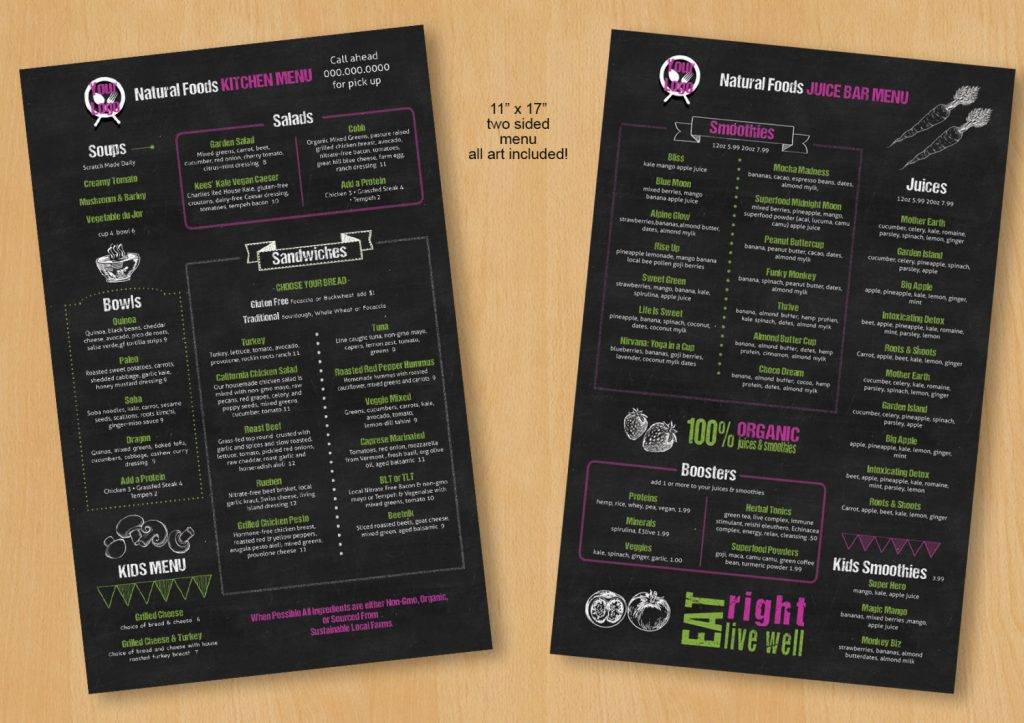
Unlike a static menu, a Du Jour menu changes on a day-to-day basis. This usually depends on the availability of seasonal items, or whatever dish is recommended by the head chef. In most cases, items in the Du Jour menu are also offered at a discounted price to customers. And since menu items change regularly, they are often written on chalkboard menus for quick and easy customization.
5. Cycle Menu
For cafeterias and small-sized diners that serve customers by the masses, having a scheduled, ready-to-go system is vital in keeping operations in an orderly fashion. Say for example, the restaurant could serve pasta every Friday, and fish every Tuesday. This cycle may run in a bi-weekly or monthly basis, depending on what has been agreed upon by the management.
Modern Bistro Indesign Menu Example
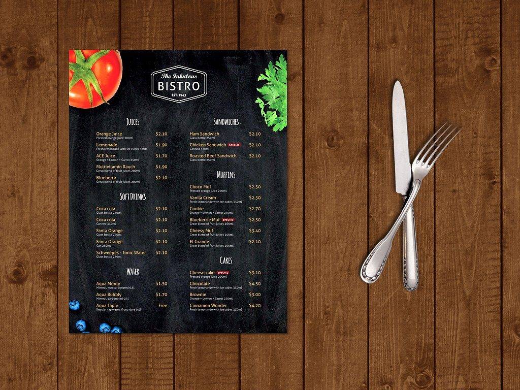
Restaurant Indesign Menu Brochure Example
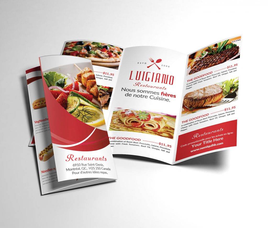
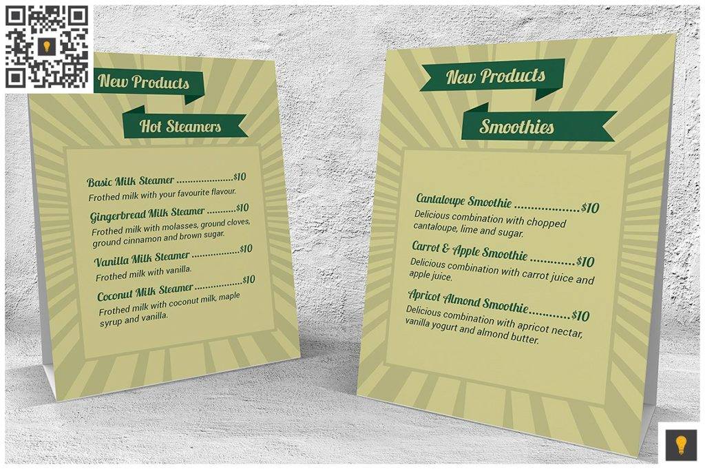
Retro Coffee Shop Table Tent Indesign Menu Example
Design Tips for Creating an Effective Menu
Strong marketing obviously plays a major role in running a successful business. So when it comes to developing the right marketing strategy for your restaurant business, you need to focus on two important parts of your plan: getting people into your eatery, and persuading them to order as much food as they can while they’re there. In both instances, a strategically-designed food menu is crucial to marketing success.
The way your menu looks is extremely important to buying customers. Keep in mind that the menu reflects the principles and culture of your entire business, making it a fundamental marketing tool that must be prioritized.
1. But Before You Start…
Take a look at what your competitors are up to. In order to identify the strengths and weaknesses of your restaurant menu, you must first study the different strategies employed by competing business. After checking them out, ask your the following questions:
How will my menu be any different?
The most important thing to remember when designing your menu is to create something that will stick. This should allow customers to distinguish your business from entities that offer similar services. This is everything from the visual design of your simple menu to your product pricing. You need to determine the key features that will separate you from the masses to ensure individuality in the market.
What menu items do my competitors have as well?
Let’s be real, you can’t expect every single item on your menu to be 100% original. There are hundreds of places that serve the same type of hamburger as a dinner option, yet customers can still point out the difference between each. To stand out in a saturated market, you need to turn an overused idea into your own creation by adding a personal twist that customers can take notice of. You may also see salad menu samples.
Does my menu pricing match my competitors?
Menu offers from competing businesses are often priced differently due to a number of reasons, such as the quality of their ingredients, or perhaps even for reasons of branding. But if you’re charging $25.00 for a steak that is sold at $11.00 elsewhere, then you must be able to justify the price with an offer that’s hard to resist. Otherwise, who do you think diners would choose over the other? You may also like examples of a food menu.
Custom Daily Indesign Menu Example
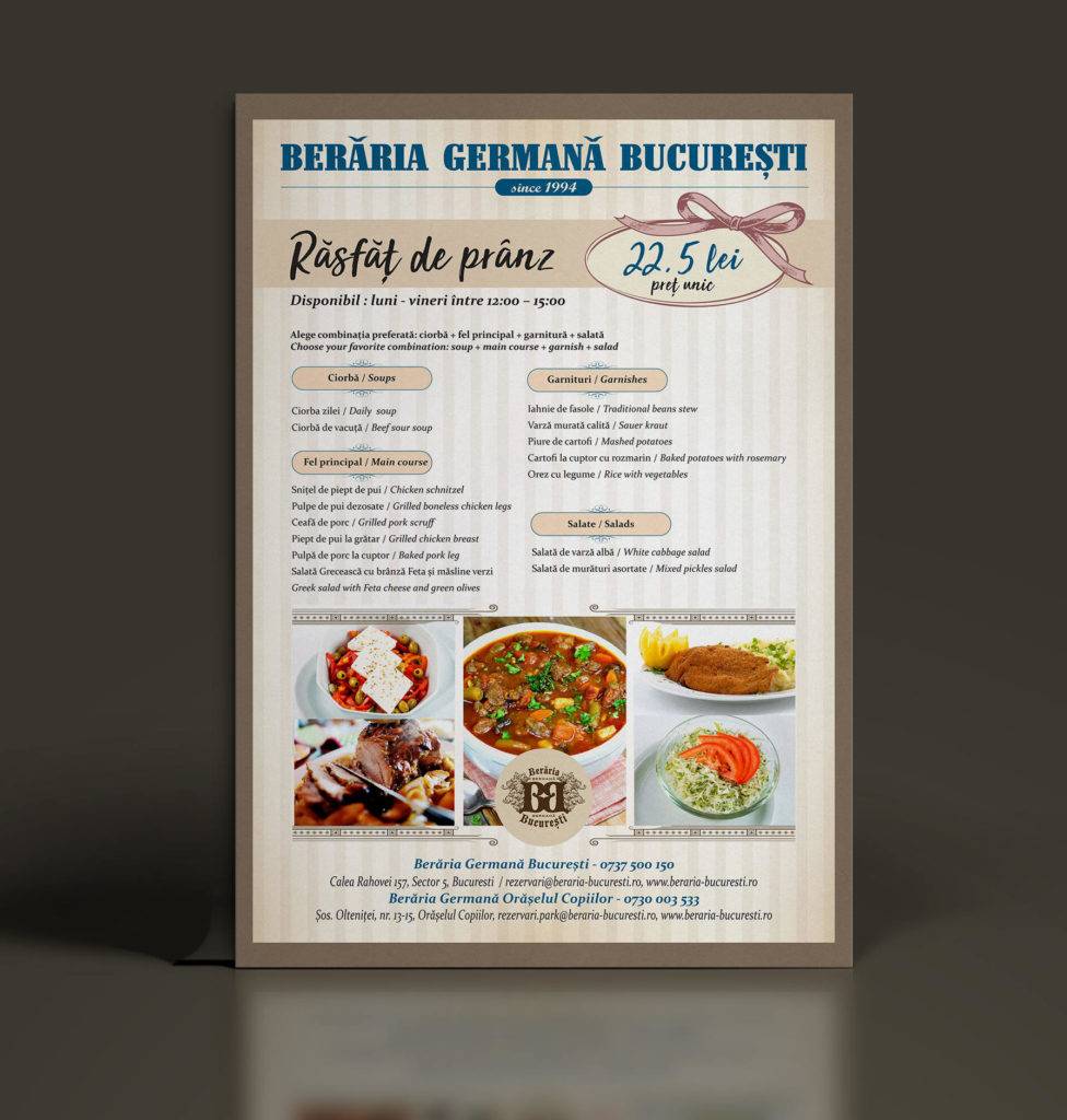
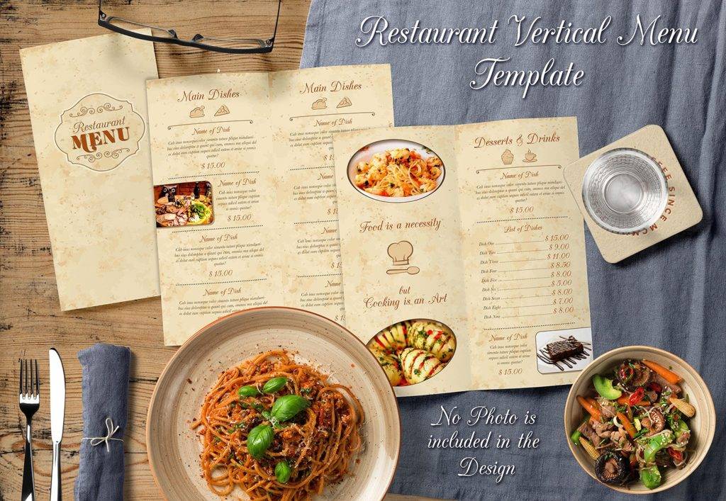
Restaurant Indesign Menu Template Example
Once you have established a deeper understanding of competitive behavior, it’s now time to create a stellar menu design. Though this may sound like the easiest task to accomplish, designing an effective menu involves an extensive process that goes beyond just printing a list of food and beverage items on a software program like Adobe InDesign.
1. The Basics of a Menu
Before anything else, you first need to decide what items to offer on your modern menu. This will help you determine how the menu should be structured, the manner in which these items are categorized, and the general concept that must be followed throughout the menu design. Take note that the menu must be tailored according to the needs and demands of its respective audience. In doing so, this would ease the decision-making process for a better dining experience.
2. Strategic Pricing
Once you have decided what to offer, you must then calculate the correct food cost for each item. You need to be realistic with this approach, as you don’t want to finalize anything based on mere assumptions. Along with the food cost, pay attention to portion control as well. This will help justify the price of each item listed on your menu, just in case you’re forced to deal with curious customers who might point out the price difference between your business and that of a competing brand. You may also see takeaway menu designs and examples.
Another way to guarantee profit for the business is to create a proper balance between expensive and inexpensive offers, as well as limiting the use of price items in the market.
3. Creative Layout
From the colors of the layout to the general theme of your design, every single element of the menu is a reflection of the business itself. Luxurious bistros often incorporate sleek and elegant colors and fonts into their menu to shape a customer’s perception towards the business. This is a driving force that promotes consistency throughout your establishment to make sure customer expectations are met. You may also like wedding menu examples.
When crafting your menu, it would be best to start off with a draft of your layout. The draft should serve as a guide for you to identify significant elements of your menu design, along with the different marketing techniques that would be applied later on in the process. Beware of choosing fonts and colors that overshadow some components of your design, otherwise, readability could be a principal issue to fix. You may also check out restaurant menu designs & examples.
4. Savory Descriptions
The secret to clever menu marketing is to create a menu description that is vivid and alluring enough to make a person’s mouth water. Most descriptions are kept brief with only the primary ingredients of a particular dish being stated. Other restaurants, however, add a bit more flair to their menu by telling compelling stories through these item descriptions. But regardless of how you choose to do it, a good rule of thumb is to write short and simple menu descriptions that are easy to comprehend. You might be interested in salon menu designs and examples.
5. Local Produce
Using local produce offers a lot of benefits to businesses in the food industry.
For one thing, this assures customers that the meals served at the restaurant are of top quality. Locally-produced goods often taste a million times better than those grown in commercialized farms. Besides from serving fresh cuisines, this is also a great way to support local farmers and the economy. But local produce goes beyond just homegrown fruits and vegetables, as this may also include sustainable beef, seafood, artisan food, and the like. You may also see examples of lunch menu designs.
Tropical Indesign Menu Template Example

Multipurpose Indesign Menu Example
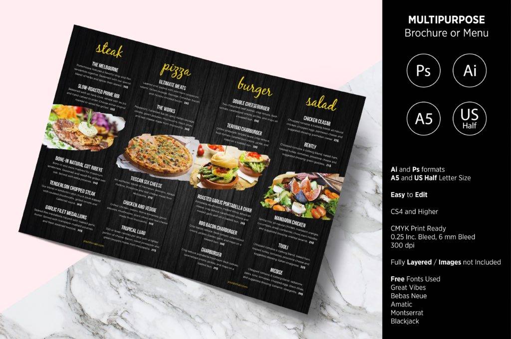
Chalkboard Restuarant Indesign Menu Example
Clever Menu Tricks to Tempt Diners
We merely perceive menus as a simple medium used to communicate a restaurant’s offers to customers in a systematic manner. But little do people recognize the importance of menu psychology in persuading diners to order and spend more than they have initially planned. Just like any other business striving to make a sale, restaurants desperately try to sell customer more goods in an attempt to raise profits. You may also see spa menu designs and examples.
It’s no secret that restaurants, cafes, bars, and other food outlets engage in various menu design tactics to increase sales. But what might surprise is the sheer dedication and sophistication that goes into administering them.
To get a better view at how businesses exercise these techniques, let’s look into some of the sneakiest menu design tricks in the book:
1. Using Exotic Dish Names.
Pommes de Terre Duchesse, French for Duchess of Potatoes, which is basically a cuisine of mashed potatoes baked with eggs.
Cassoulet, a French term coined for the English casserole that we’re all familiar with.
From the examples above, it’s clear that choosing the right dish name can greatly impact one’s notion towards the menu item. Using exotic names for otherwise boring cuisines is the perfect way to entice customers. Could you even imagine if a restaurant decided to name their dishes for what they are? You may also like pasta menu designs and examples.
Instead of ordering French Toast, we’d be asking the waiter for some toasted bread and butter. Some restaurants even use these ridiculous adjectives to make a dish sound as appetizing as humanly possible. Not only does it sound utterly plain and dull to say out loud, but it’s also says a lot about how lazy and unimaginative the business really is.
2. Playing with Size Names.
Sugarcoating terms and definitions is a smart marketing strategy that has been practiced across the food industry for many years now.
Like for example, notice how Starbucks carries out a different approach in naming serving sizes for their drinks? Would you even consider it a Starbucks experience if you didn’t have to choose between a Short, Tall, Grande, Venti, and Trenta? And if you think about it, Tall isn’t exactly the same size as the standard large but because of its name, this technique somehow obfuscates actual serving sizes right under our noses. You might be interested in italian menu designs & examples.
Though we don’t really suggest deceiving customers with obscure serving size names, it’s still a slick tactic to apply. This simple yet clever touch to marketing can help strengthen your brand to consumers as well.
3. Determining an Optimal Number of Food Images.
While it’s always important to use images sparingly in your menu, you also need to examine the type of establishment being run.
Fast food restaurants often rely on images to lure in customers. These cardboard menus are usually blown up into massive sizes for prospects to take notice. Upscale establishments, on the other hand, follow a more minimalist approach with their menu designs to embody sophistication in its purest form. Most high-end restaurants even opt for illustrations rather than actual images of their cuisines. You may also see breakfast menu examples.
So before deciding which technique to follow, make sure you have understood your brand first.
4. Taking Note of Reading Patterns.
Knowing the reading pattern of an average diner can be a critical factor to your menu design.
For starters, there are two areas that customers would likely set their eyes on when they look at your menu: the middle portion and the upper-right corner. Line breaks, boxes, shapes, and other graphics which give an illusion of something being enclosed in an area also have the tendency to direct our gaze towards a specific direction. You may also like price menu designs and examples.
Other design elements that can change the natural course of our reading patterns include various typographic techniques that emphasize particular menu items for customers to pay attention to. For this reason, you need to be cautious about the text and product placement on your menu.
5. Stimulating Appetite with Colors.
Color theory has always played a huge part in marketing, which is why applying this concept to your menu is incredibly important.
According to the color theory, the colors red, yellow, orange, and green have a way for subconsciously inducing excitement and hunger in a way that only experts can explain. This principle has inspired many designers to incorporate these colors into their menus. You may also check out menu card samples.
Custom Die Cut Indesign Menu Example
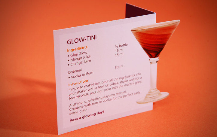
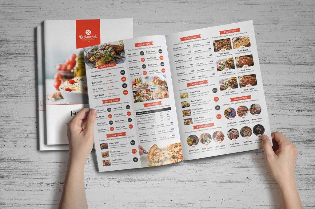
Bi-Fold Food Indesign Menu Example
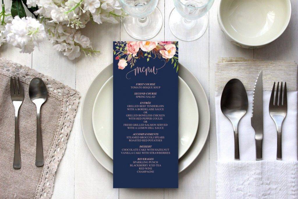
Printable Navy Wedding Indesign Menu Example
6. Following a Tactical Design Arrangement.
Diners tend to scan menu items pretty quickly, probably because they’re in a hurry, or maybe the pressure of having a server stand close by to take your order can be quite nerve-wracking for most individuals.
In average, a diner spends 109 seconds scanning a menu before they finally decide what to order. This leaves you with barely two minutes to make an impression. With this in mind, securing clear sections, a limited number of choices, and a categorized selection serves as the perfect way to influence consumer decisions. You may also see burger menu designs and examples.
7. Employing Calculated Price Deals.
Fooling customers to thinking they’re getting a ‘better’ deal by pricing other food items at a cheaper value might sound an act of evil, but it’s actually a common technique practiced by many notable food chains.
“Anchoring” is basically a trick that involves showing an expensive item next to a reasonably-priced offer to make it seem like the latter is of better value. There are many reasons why restaurants use this approach to control a customer’s decision, one might be to increase sales for a particular item, or perhaps the dish is a lot cheaper to make, therefore has a better profit margin for the business to take advantage of. You may also like examples of kids menu.
But if you do plan on incorporating this idea into your menu design, make sure the business plan has already been developed beforehand.
Another trick that you could utilize in terms of menu pricing is called the number trickery. Instead of offering a meal at $10, the restaurant would turn into a $9.99 meal to make it seem like a better bargain. Though the slight difference isn’t much to work with, when customers are surfing prices, the cheaper stuff can be too tempting to ignore.
8. Making Price Comparisons Impossible.
A lot of customers take an ample amount of time scanning through your menu because in their heads, they’re comparing prices to make the most out of the better deal.
The best solution to this problem is to offer set meals, with drinks and add-ons located in inconvenient places that diners wouldn’t even spend time to find. Some menu designs also list item prices after each description to make it tedious for customers to compare products. Although efforts to avoid price comparisons can be advantageous to your business, you might not want to complicate things too much, as this can also boost table turnaround times for waiters and servers. You may also check out examples of bakery menu.
Additionally, you might want to omit dollar signs or any currency symbols from the menu as well. The absence of these symbols will prevent customers from being overly conscious about the amount of money being spent on a single item. While it might seem like a slight psychological ploy to carry out, it’s proven to be effective nonetheless.
9. Creating Brand Associations.
How many times have you encountered a menu description that specifically states the brand of an ingredient? Like how TGI Fridays uses Jack Daniels BBQ sauce as one of their main ingredients for their staple dishes. Naturally, fans of the famous whiskey would immediately take notice of the name and associate it with one of their favorite alcoholic beverages. You might be interested in pizza menu samples and examples.
Buying things with a brand name on it can be…cool? Hip? Exciting? Some might even claim that the dish would taste a lot different if a non-brand ingredient was used. It might not be rocket science, but nobody could really put their finger on the exact cause for such mentality.
10. Choosing the Right Print Materials.
First things first, who in their right mind would every opt for a poorly printed marketing tool over a high-quality design?
Ensuring that colors are matched correctly and that everything visualized on file translates exactly how it’s supposed to on print is a challenge that many newbie designers struggle with. You also need to make sure that there are no room for errors in your final print by using proper trimming and bleed technique to avoid any mishaps. Finally, if you are working with a printing firm, see to it that their services meet the technical specifications that are required to produce your attractive menu.
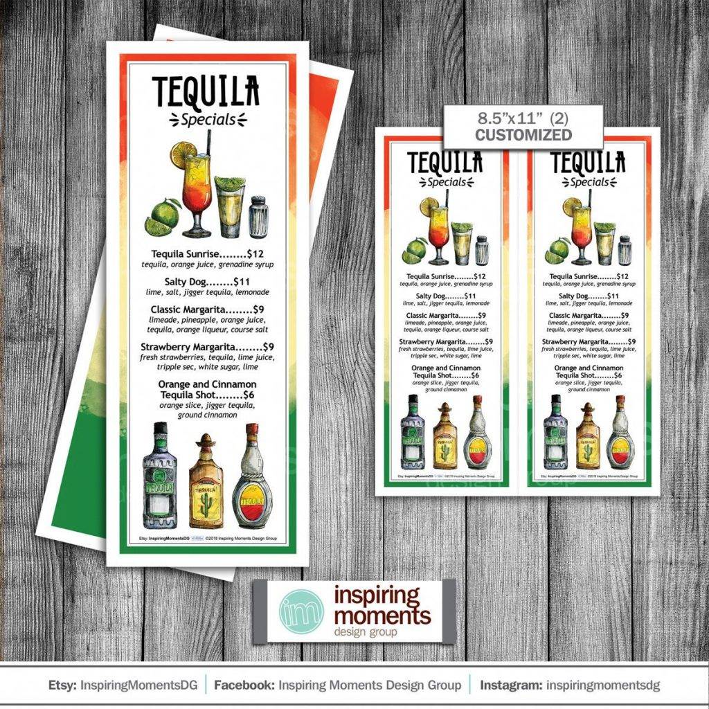
Tequila Special Drinks Indesign Menu Example
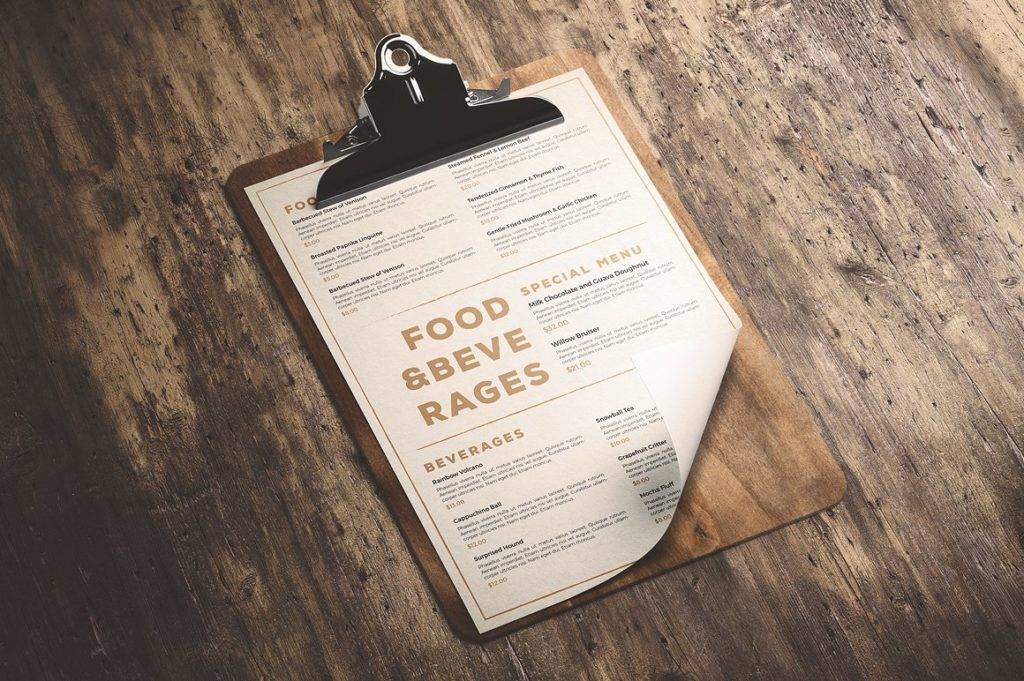
Clean & Classic Indesign Menu Example
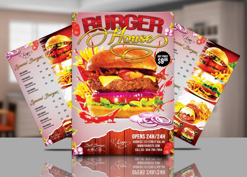
Burger Indesign Menu Example
Remember…
A. Price Shouldn’t be an Issue.
When creating a menu, concentrate on what you have to offer and not on the price of each item. Promoting cheaper items or special ‘dollar menus’ isn’t always a wise move for a business to risk.
As an alternative, you could decrease the size of the font used for presenting product costs to make it seem less intimidating. Some restaurants even keep menu descriptions and prices at a uniformed size, but take out the currency symbols to drive the focus away from its value. You may also see party menu designs and examples.
Ideally, the goal is to give customers a wide selection of dishes to choose from according to what sounds the most delectable, and not based on the most affordable option.
B. Generic Terms Are Boring.
When it comes to naming items and categories of your menu, steer clear of any generic terms that do not add life to the menu in any way. It’s a good idea to be specific yet creative with your offered dishes. Dividing broad categories into simpler groups can also make it easier for diners to find what they’re look for. You may also like catering menu examples.
For instance, instead of using the term ‘Entrees’, providing a more defined description of these dishes, like ‘Pastas’, ‘Pizzas’, and ‘Burger’ is a lot easier to visualize than an general expression.
So when customers are having a hard time deciding what they want to eat, using certain keywords could bring these particular sections of the menu to their attention in order to speed up the decision-making process.
C. Size Matters
But in this case, less is definitely more.
Avoid adjective-filled descriptions that take a sufficient amount of time and effort to read.
Rather than mentioning every single ingredient (and probably a cooking procedure of how it’s done), keep your menu description short and to-the-point. You could even hire a professional writer to create a compelling description in the smallest possible word count to make menu items sound more appealing than usual. There’s nothing wrong with leaving some empty space to make significant parts of the menu appear more visible and less tiring to go through. You may also check out wedding menu card designs & examples.
As for the use of images, you don’t really need to have a photo for every other listed item on the menu. Not only will this take up valuable space, but it can also be quite messy to look at, especially when they aren’t applied correctly.
Similar to other aspects of marketing, creating an effective menu design is something that requires constant work and effort in order to perfect. Tweaking your current menu and trying out new techniques is the best way to assess which method is giving you the best results. So when running any type of business in the food and restaurant industry, you need to focus on designing a menu that communicates your message effectively to target consumers in the most creative, strategically-planned method possible.


