20+ Invitation Examples to Download
An invitation serves as a formal request for an individual’s presence at an event, and its design is often just as important as the event itself. With countless invitation templates available today, creating personalized and visually appealing invitations has become easier, helping hosts capture attention and set the perfect tone for any occasion.
Examples of invitation designs, from birthday invitations to wedding invitations, are found on this page. We have quite a selection of designs for you to choose from and take inspiration from depending on the event that you are having or planning to have. Simply click on the download button of your desired choice to access the file.
Wedding Invitation Example
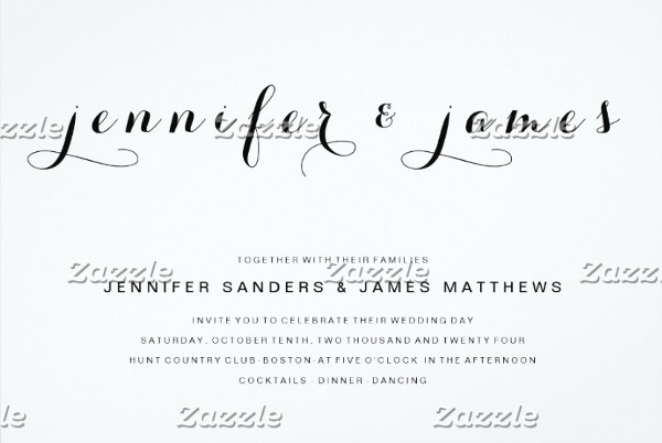
Modern Wedding Invitation
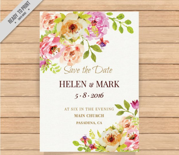
Floral Wedding Invitation
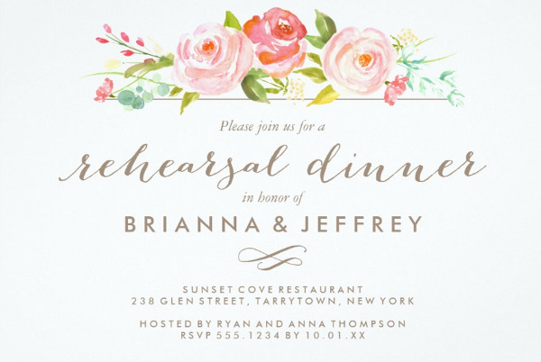
Wedding Dinner Invitation
Wedding Anniversary Invitation
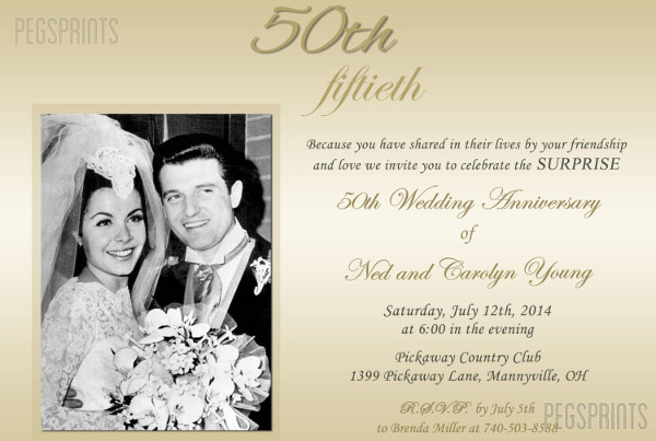
Birthday Invitation Design
Surprise Birthday Invitation
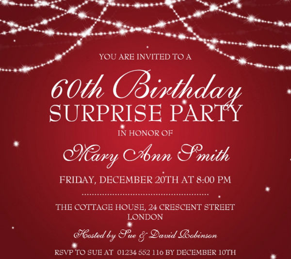
Birthday Party Invitation
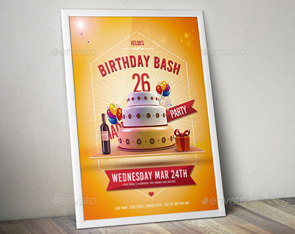
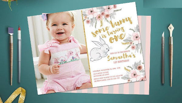
1st Birthday Invitation
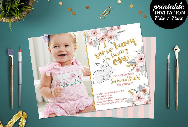
Party Invitation Design
Cocktail Party Invitation Design

Business Party Invitation

Engagement Party Invitation
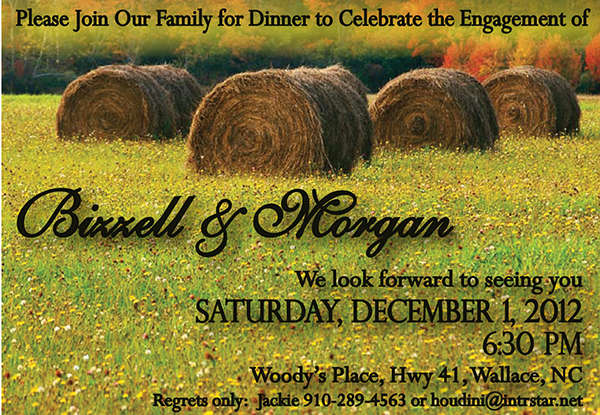
History of the Invitation
There is a long history regarding the origins of invitations. Holiday invitations have been used since the 18th century. This has been the norm for kings, queens, and nobility of England and France to inform their guests of a lavish party or occasion they are going to hold.
In a way, this was also a venue for them to showcase their castles, villas, or homes. This is also a way for them to build good relationships with other men of power or nobility.
The task of making these lunch invitations went to the hands of the monk who then were very skilled at calligraphy. These invitations also marked a proof of education. Back then, education was only for the few privileged members of society and the rest just simply didn’t know how to read or write.
Basic Invitation Guidelines
1. Consistency
It is important to have consistency in terms of styling throughout the layout of your design. The graphic aspect of your invitation design should not clash with the text and vice versa.
As seen in the Floral Wedding Invitation Example above, all elements of the design point toward the theme of a Floral Wedding.
2. Basic Information
Important information should be contained in the invitation such as:
- name of the host
- name of the event
- date
- hour
- place
- reply instructions
- attire instructions
- directions to the event
3. Imagery and Text Elements
The design for your invitation should dictate what the invitation is for. It should clearly convey the message across to the guests.
- Minimal Text
Looking at an example on this page of a birthday party invitation, basic information such as the event, date, time and place are wisely placed around the main graphic which is the cake. It clearly states what the event is about without having to take up too much space and adding more text. - Text Heavy
Looking at another example below of a formal wedding invitation, it is clearly seen having a reasonable amount of text but cleverly incorporating exquisite graphic elements at both ends to balance the overall design.
Formal Invitation Design
Formal Wedding Invitation

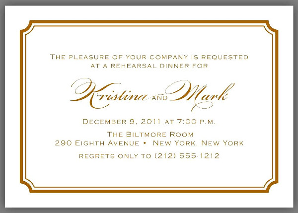
Formal Dinner Invitation Example
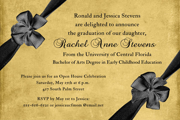
Formal Open House Invitation
Graduation Invitation Designs
College Graduation Invitation
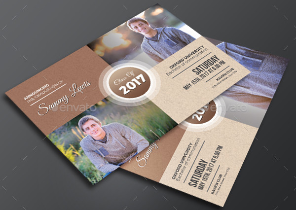
Graduation Ceremony Invitation
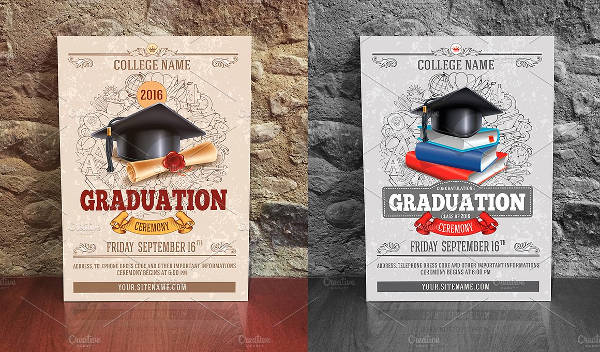
Free Graduation Invitation
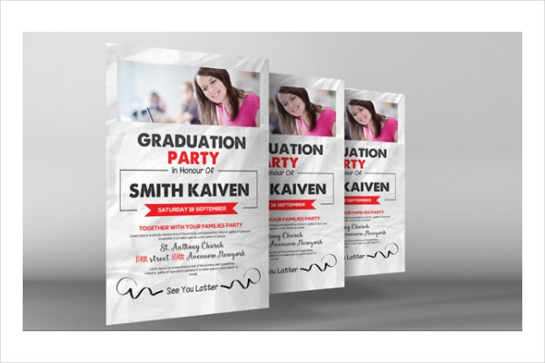
Graduation Party Invitation
Business Invitation Examples
Corporate Business Invitation

Open House Business Event Invitation
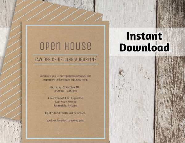
DIY Corporate Business Invitation
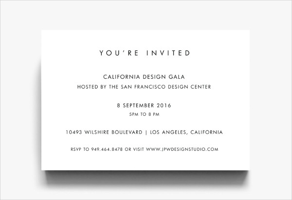
Anniversary Invitation Design
Wedding Anniversary Invitation
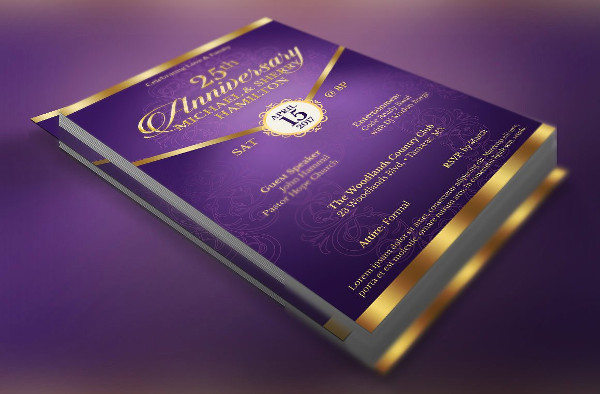
Church Anniversary Invitation
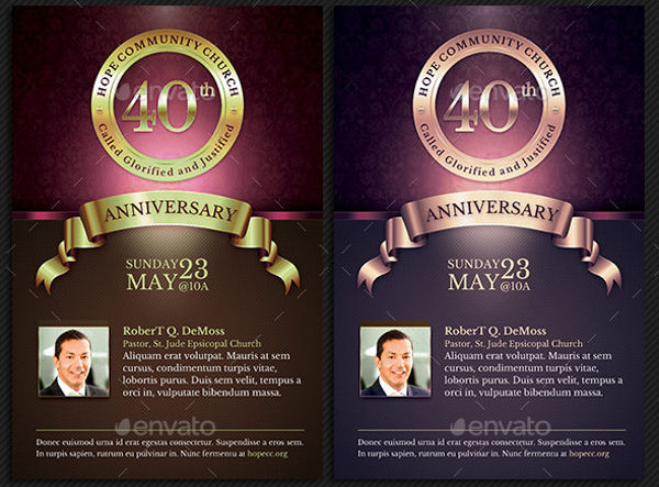
Invitation Guidelines (Continued)
4. Photography
The main element of your design can also focus on a great photograph provided the image does not fight with the text and an area should be provided for the text to be comfortably read.
- The Naming Ceremony Invitation can be seen below depicting this. The focus is turned to the photo of the child being named with the text being in an area where it is easy to read.
5. Scale
Another aspect to be considered in the design for your invitations is scaling.
- Considering the same example of the Naming Ceremony Invitation, text for the child’s name is highlighted and scaled up for that aspect to pop-out. This only further accentuates the event or ceremony.
6. Balance
As with every aspect of designing, a balance has to be achieved in order to get the proper information across to the receiver. Having the correct proportion of graphic and text elements bring the whole invitation together.
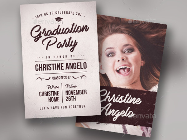
- Another great example for this is shown above as an example of a party invitation. The photo clearly depicts what the event is about without fighting with the text elements set to a classic cursive font.
7. Borders
A border design helps direct the attention to what the border contains.
- A good example would be the Formal Dinner Invitation that can be found on this page. The border surrounding the text points the attention of the eye towards the contents of the border.
Having a borderless design also makes good use of negative space around your design.
- The example of DIY Corporate Business Invitation on this page is a good example of a borderless design that makes the overall design of the invitation not to appear crammed.
8. Full Bleed
This design makes use of the visuals going beyond the edge of the page or card.
- The Chalkboard Business Invitation Example shows this as the polka dot design expands way over the edges of the card.
Vintage Invitation Design
Vintage Wedding Invitation
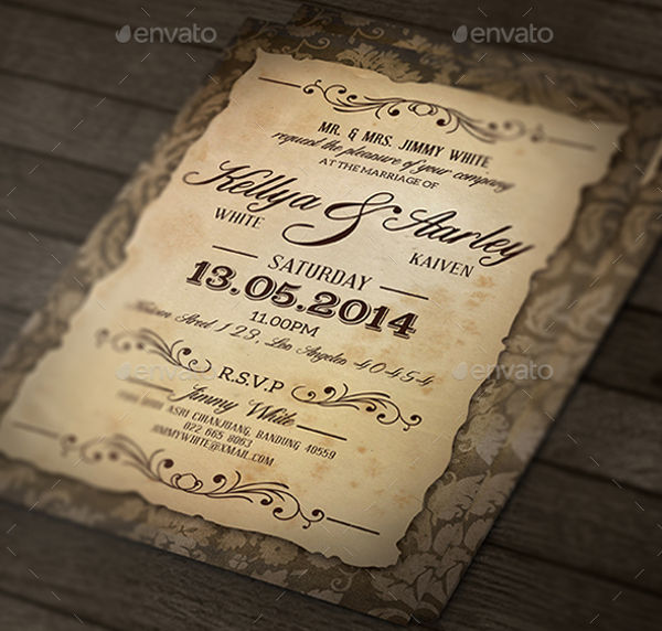
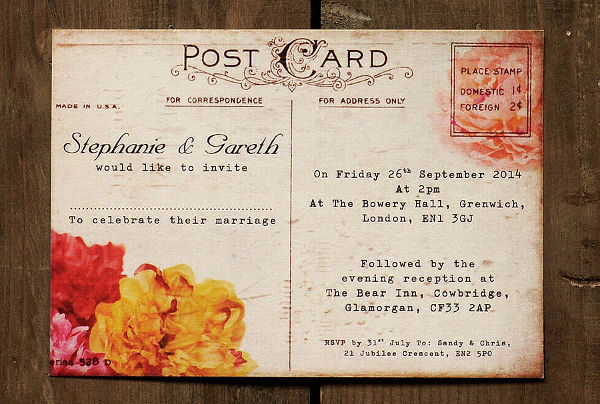
Vintage Postcard Invitation
Vintage Party Invitation

Ceremony Invitation Examples
Corporate Invitation Design
Corporate Event Invitation
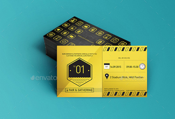
Corporate Party Invitation
Layout Pointers
Having mentioned the most basic invitation guidelines, the following pointers should help you in making the final layout of your invitation design.
- Quantity vs Quality – Ultimately, the final decision would rest on you who are in charge of the design. Putting too much of something at the same time is risking confusion to the target of the invitation. You should be able to weigh the different factors involved with the event and take all those into consideration. Sticking to basics should get you the results that you are aiming for.
- Graphic and Text Elements – These two main elements of the design should obtain balance and be complementing each other. They should not be fighting for dominance over the invitation. Not putting enough information or a bigger picture on a bridal shower invitation for instance, sometimes takes away the whole message of the invitation leaving a somewhat lesser intended impact.
- Border Designs – Designs involving borders should be made to leave a relaxed and comfortable space between the border and the text it contains. Get the mix wrong and the design would look cluttered or squeezed in. Border designs greatly help in highlighting anything that is showcased within the border but it is also important to allow decent space around the text element of the design.
- Borderless Designs – Like in the event invitation example above, imagine you have an invisible border every time you are using a borderless design. Picture out the invisible border to be at least a quarter of an inch away from the physical edge of the card or page. Doing so helps keep the focus on the message at the center and not on the negative space surrounding the design.
There are no exact formulas to achieving an amazing invitation design but following these guidelines should be of ample help in improving and getting a good quality invitation out there.


