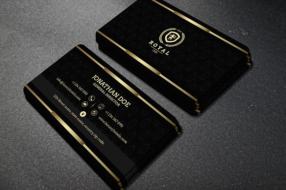
11+ IT Business Card Examples to Download
Business cards are, on top of everything else, a medium for passing on information. But aside from that, they are also a representation for your brand. Which means that they serve a dual purpose: to introduce you to the business world, and to make sure you are remembered.
These are especially created by businessmen, freelance artists, or even students to deem themselves prepared when a serendipitous encounter with a potential client (or an existing customer) finds them in need of handing out their business’s contact information. Best business cards do not only make the delivering of details quicker and more professional, they can also allow the card’s recipient to unconsciously recollect the feelings they have towards your business.
If your meeting or transaction has been satisfactory to the client, a business card – a well-designed business card – can help impress upon him his good views of your services.
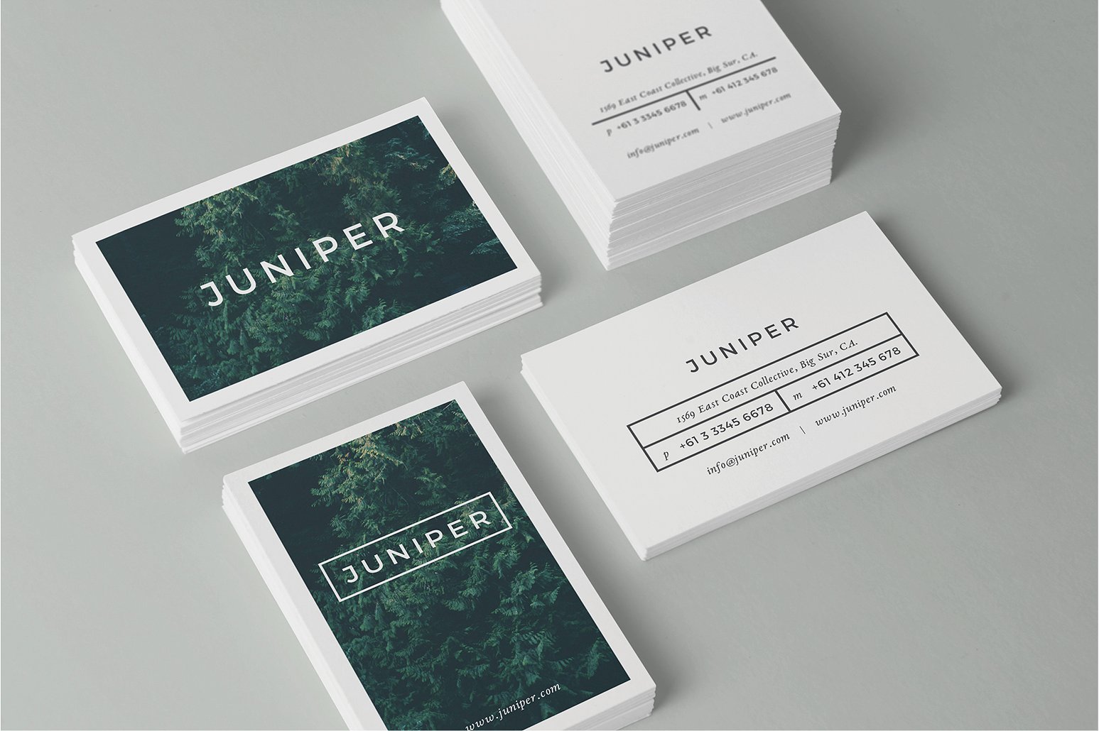
IT Company Business Card Template
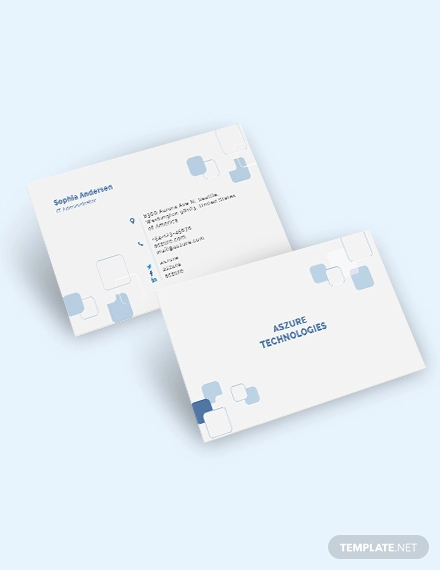
Simple Software Developer Business Card Template
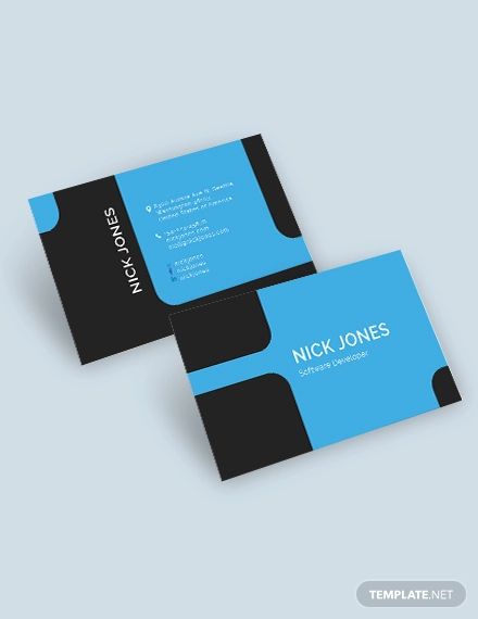
Creative Software Engineer Business Card Template
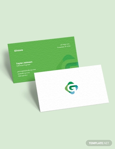
IT Multipurpose Business Card Example
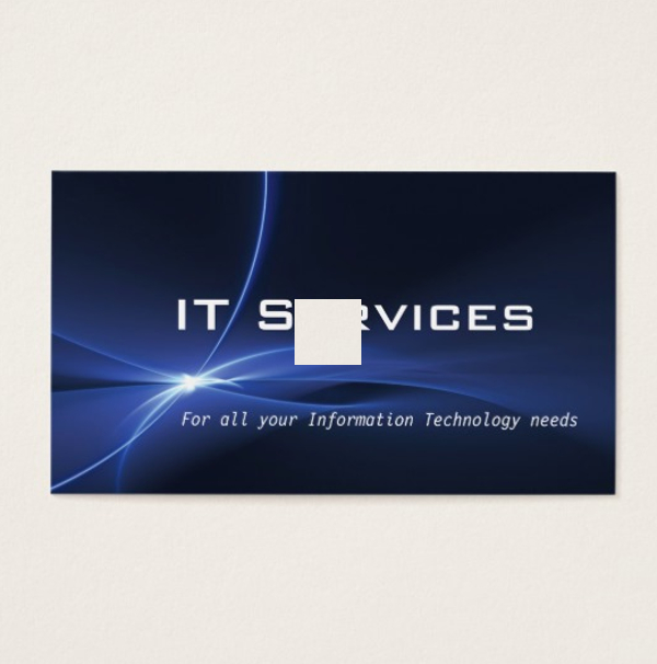
IT Services Business Card
Which is why, despite all of the technological advancements within our reach and the social media platforms we can freely utilize, the simple business card is still unconquered in effectively helping businesses gain a good reputation among their clients.
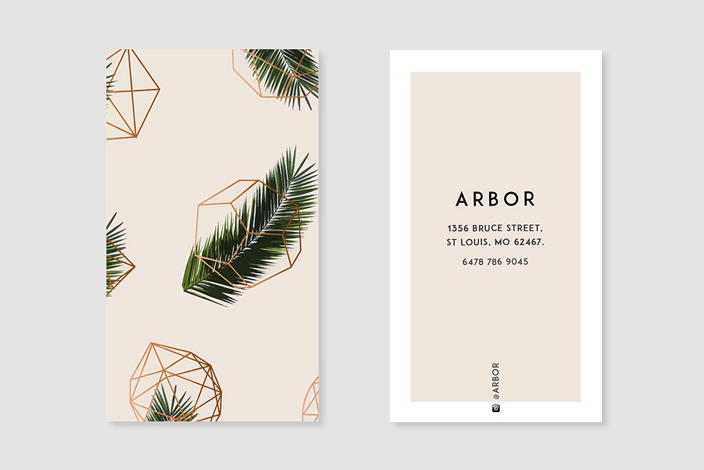
Geometry-themed IT Business Card Example
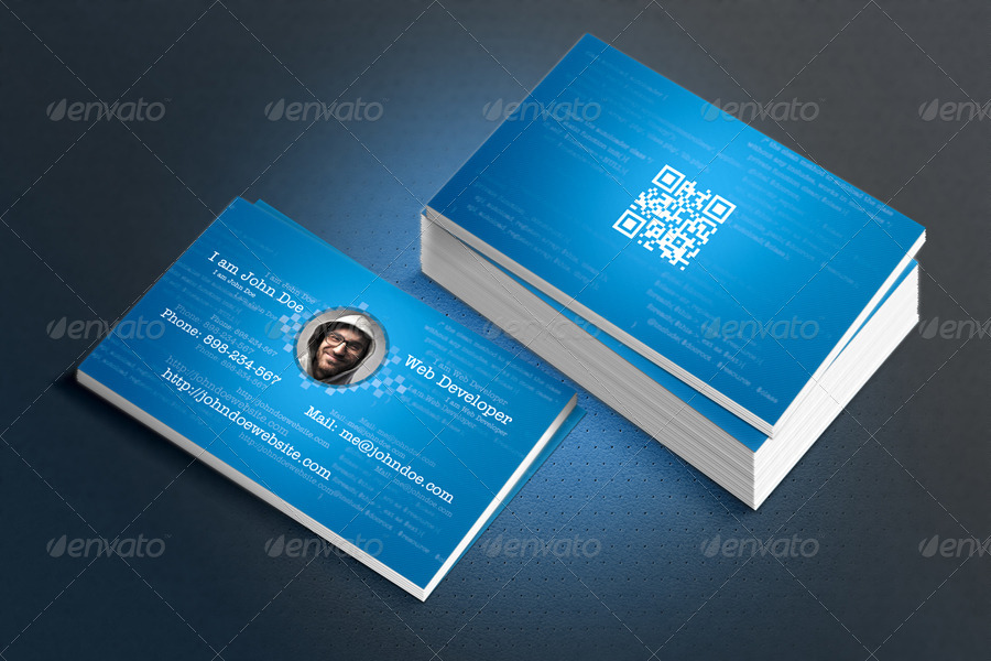
Web Developer Business Card Example
What Makes a Good Business Card?
Since general business cards are tasked in doing two important roles for your business, it is crucial that they are armed ready as much as you are. Which means that if you want to be remembered by your clients, your business card should be memorable, too.
If you want to be distinctive, your business card should stand out, too. Consider yourselves a team. If your business card is such an important extension of you and your business, then it only seems right that you at least try to make it look unique and catchy. Here are a few things to remember to make your business card the perfect representation of your business:
1. Be Bold.
Nothing can make your luxury business card more interesting than incorporating it with a style or design that not everyone has the courage to go for. Instead of going for the basic graphics people usually decorate their business cards with, why don’t you try personally sketching a few geometric figures or other interesting patterns on it? This can speak volumes about your ability to create fascinating products which can have a positive impact on your business.
2. Be Simple.
One of the main errors that people commit when designing their business card is placing too much information on it. You may see cards that have links to a variety of social media accounts, plus the owner’s phone number, telephone number, fax number, and personal email address. It’s a handful! Your client will not need all that contact information. In fact, two will suffice.
Putting all your information on your business card will just make you look desperate and we don’t want that mud on our image. An active phone number, a website link, and an email address will suffice.
3. Be Authentic.
This is the main thing that people should go for when designing business cards. What’s the best way for people to remember you? Have something NEW to offer. It doesn’t even have to be a big thing. Something small yet unconventional can already give your card the spice you need
4. Be Stimulating.
Your creative business card should not only inform, it should also engage. You have the option of interacting with your clients through your card. Use that chance. Blend humor with your details, or include a witty phrase or comment into your card. There are no rules against being fun! So use that to your advantage.
5. Be Personal.
Your business card speaks for your service. Which means that it expresses the values of your business as well. If you are in the IT or engineering industry, make your business cards embody this. Allow your clients to get to know you and get an idea on how you run things through the image your card represents.
6. Be Amusing.
One of your main goals is to solicit some sort of reaction from your clients. What do they first think of when you hand them your attractive card? Nothing? Does your card make them feel nothing? Then, it’s not working for you. It’s not doing it’s job. The overall design and look of your card should be enough to at least amuse or interest your clients. This is how you’ll know that your card has stood out among all the others.
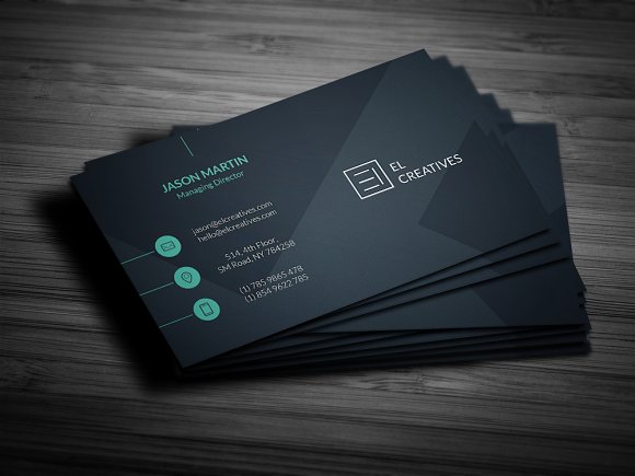
Soft Classy IT Business Card Example
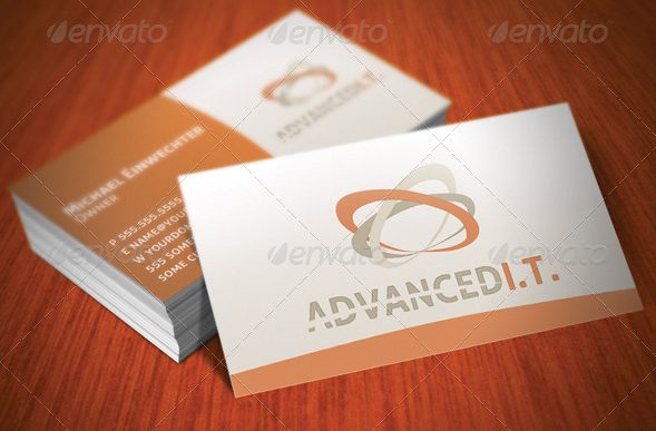
Advanced IT Business Card Example
The Perfect Business Card Type For You
A business card can be designed in various ways. They can even embarce different formats. It is basically up to you to choose what type of business card suits your style. Here are the types you can choose from:
1. Folded or Flat.
The more common of the two is the flat business card. Just your standard rectangle with the owner’s information strewn across. This format is perfect for you if you only need to include a couple of important details about yourself. However, if you feel the need for a lot more space, a folded business card will work miracles for you. Instead of two sides, you can have four sides (or more, depending on you) to your disposal.
2. Two-sided or 1-sided.
Most people utilize both sides of their (flat format) minimal business card. This is so they could fit all the details they want to include, or to simply avoid having blank space. But if you only want to make use of that one side, then it’s up to you. Just be careful to not give your clients the impression that your empty space means you have nothing else to say instead of an attempt to simplicity and cleanness.
3. Horizontal or Vertical.
Yes, your awesome business card can also go either way. The most commonly used format is the horizontal business card. This is perfect if you want your business card to portray stability and confidence. But for an interesting twist that speaks a lot about your creativity and nonconformity, go for the vertical format.
4. Die Cut or Standard Rectangle.
The standard rectangle business card format is the format for more traditional industries or business in sales and finance. Die cuts, on the other hand, since they come in all sorts of business types, are perfect for any business. It can add a little more fun to your standard business card.
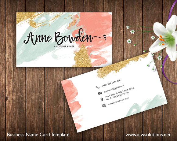
Pastel-Colored IT Business Card Example
Types of Printing Techniques For Your Business Card
People have long discovered the magical ability of a good printing technique in making a business card instantly look twice as better. However, in choosing one, you must consider each technique to be able to choose one that will fit the design and overall presentation you want to achieve for your clean business card. Here are a few printing techniques you can choose from:
1. Spot uv.
The beauty of this printing technique is that it adds gloss and glam to your business card without having to try too hard. Beside a basic printed fashion business card, yours will look so much better! Your card will also be matte coated by varnish which, aside from being prettier, will also add to the durability of your card. You also have the option of coating only certain parts in your card to accentuate the bits you want.
2. Embossing or Debossing.
This technique is perfect to achieve an elevated elegance to your card. With embossing, heat is pressed onto your card that accentuates your formal letters without the use of ink. Debossing, on the other hand, is the opposite. It creates a 3D effect by denting the letters you want into your card. These styles can bring out the simple style in your card, something that plain printing cannot do for you.
3. Foil.
Similar to embossing, this technique utilizes pressed heat on paper, but while using color foiled. If you want to use typography in your card, this printing technique can help give a quality sheen to it. It can also enhance the look of your logos.
4. Laser Cutting.
More and more professional business card users, particularly designers, have embraced this printing technique. It makes the classic business card look completely out of the ordinary without having to jeopardize class and simplicity. Through die cutting, you can cut your card in certain places to add to its style and uniqueness.
5. Lamination.
There are two types of lamination: the matte lamination and the shine-glossy lamination. Similar to Spot UV, matte lamination can also give your card that shiny, glossy look. The shine-glossy, on the other hand, can give it a softer, silkier luster. Aside from this effect, lamination can also give your card a protective shield. You may also like construction business card designs and examples.
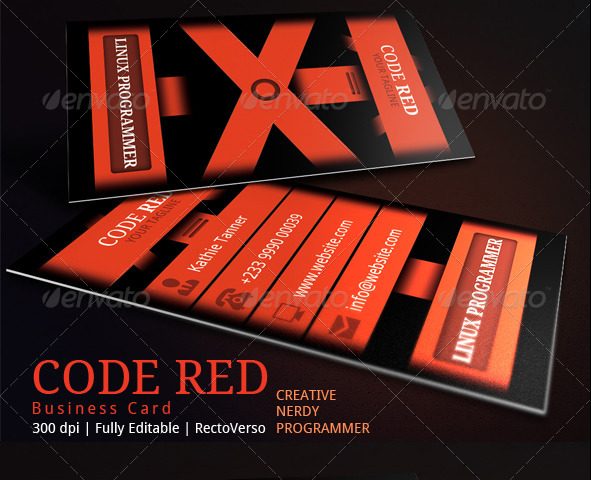
Creative Coder Business Card Example
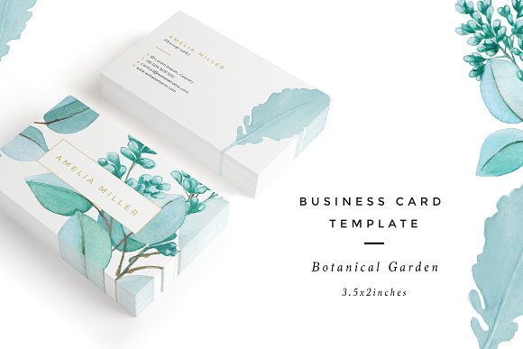
Botanical IT Business Card Example
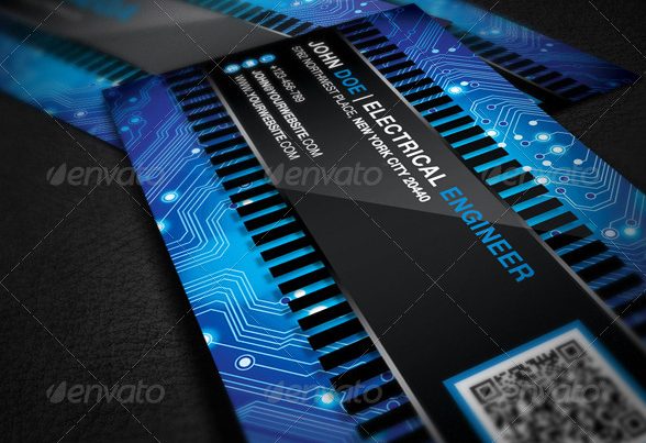
Chips Inspired IT Business Card Example
Conclusion
People think that a modern business card has strict qualifications that you need to stick to. On the contrary, you can be as insane with designing it as you can. The only important thing to remember is that you can successfully send your message through it. This is, after all, the main reason you’re creating one. If you really want your clients to get to know you and your business, inject as much personality into the making of your card. This will build the initial, and most lasting, impression they will have of you.
Choose what works best for you and your business. Only you can decide on that.


