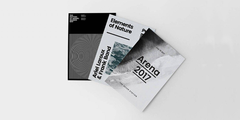
16+ Minimal Flyer Examples to Download
Imagine if flyers — or any print media at that— never existed. How can companies promote their products and services to their market? These days, advertisers take drastic measures just to make a big break in the industry. However, the cost for such can be a bit too much for a lot of small companies to manage.
So instead of investing on a monthly billboard space, you can appreciate how big things come in small packages. Sure, there’s always a modern-day approach of using social media as a platform for marketing. But little do people realize how flyer designs and other physical advertising mediums can make a huge difference.
Minimal Electro Futuristic Flyer Template
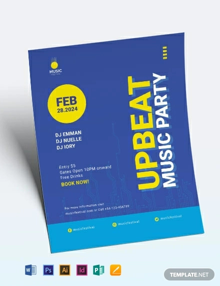
Minimal Futuristic Club Flyer Template
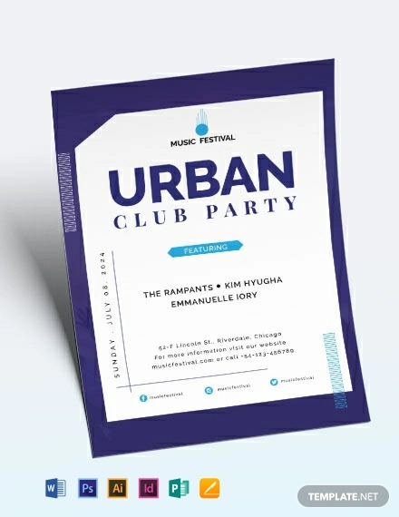
Flyers possess the ability to persuade customers to purchase certain goods at a time. There are various design techniques that graphic artists may use to influence an individual’s decision, one of which may be done through a minimal flyer design. But for you to come up with an effective flyer, you must be knowledgeable about how its design can affect its impact on the market. In this article, we guide you through the basics of flyers in marketing and how you could achieve an impactful design with the help of a few tips.
Minimal Photographer Flyer
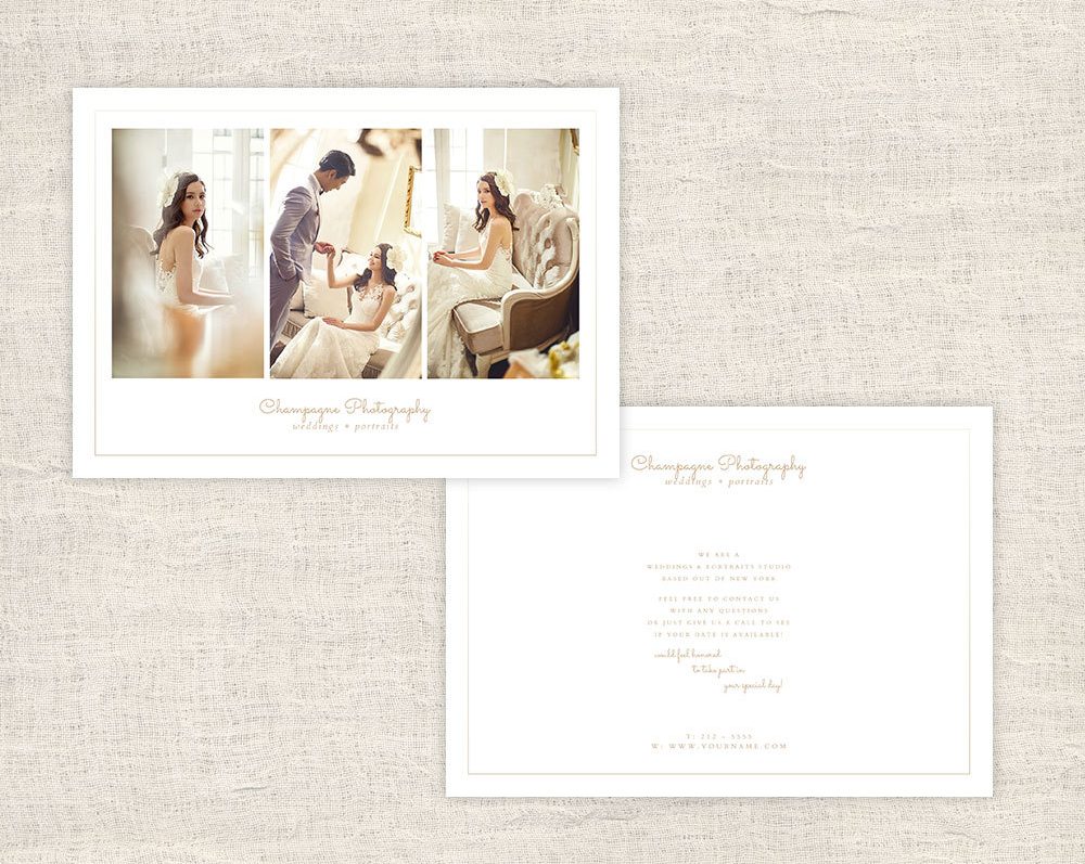
Hipster Minimal Flyer

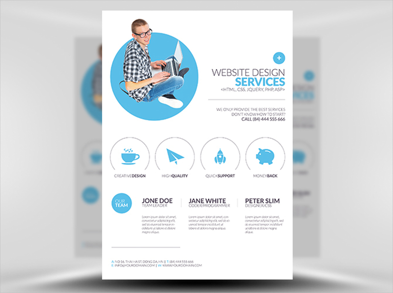
Minimal Web Design Flyer
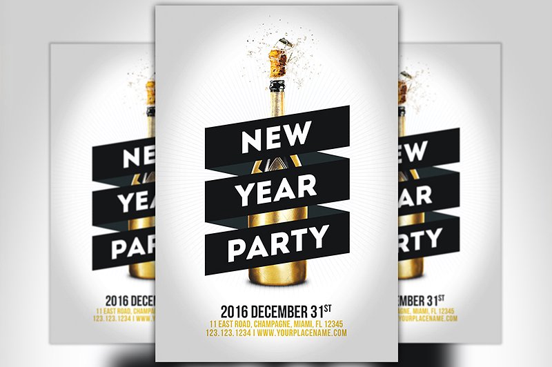
Minimal New Year Party Flyer
Minimal Flyer Designs: Why They Still Matter
It’s not unusual for people to think of flyers as an old-fashioned advertising tool, especially since it’s easy to see why. A common misconception that designers need to get rid of is thinking that a full-colored and dramatic flyer design is the most effective approach. But the truth is, you can make something extravagant without having to pull all the strings.
In today’s age, it’s all about the aesthetics. People pay full attention to every detail, often criticizing anything that looks out of place. But what makes a minimal flyer design effective is how it naturally highlights specific elements that the advertiser would like to emphasize.
For instance, one of the best ways to make a text stand out is to add it on top of a plain background. This lets the text become the center of attention among every other design element surrounding it. Some designers would even go for a black and white approach, and then add a pop of color in a place where they want viewers to look.
Minimal flyer designs serve as an excellent advertising tool for any given circumstance, whether this is an event flyer or a product promotion flyer. But one of the challenges that advertisers have to face is making an impression within a given time frame.
Most people simply glance at a flyer before deciding on whether to keep it or throw it away in the nearest trash bin. With that in mind, you have to make every second count. A minimal flyer design allows you to stick to the very basics, which includes every essential detail a person needs to know what you are promoting.
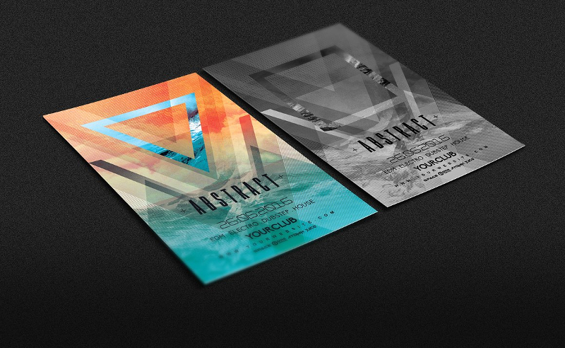
Abstract Minimal Flyer
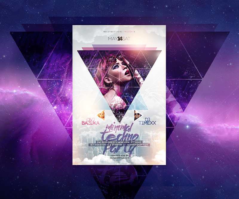
Minimal Event Techno Flyer
Minimal New Year Flyer
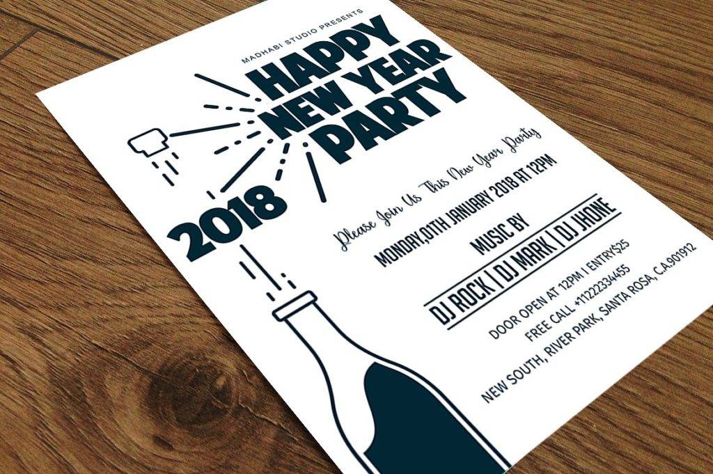
Minimal Futuristic Party Flyer
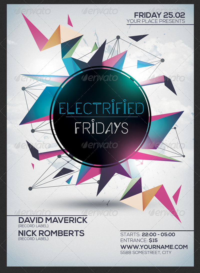
Minimal Fashion Flyer
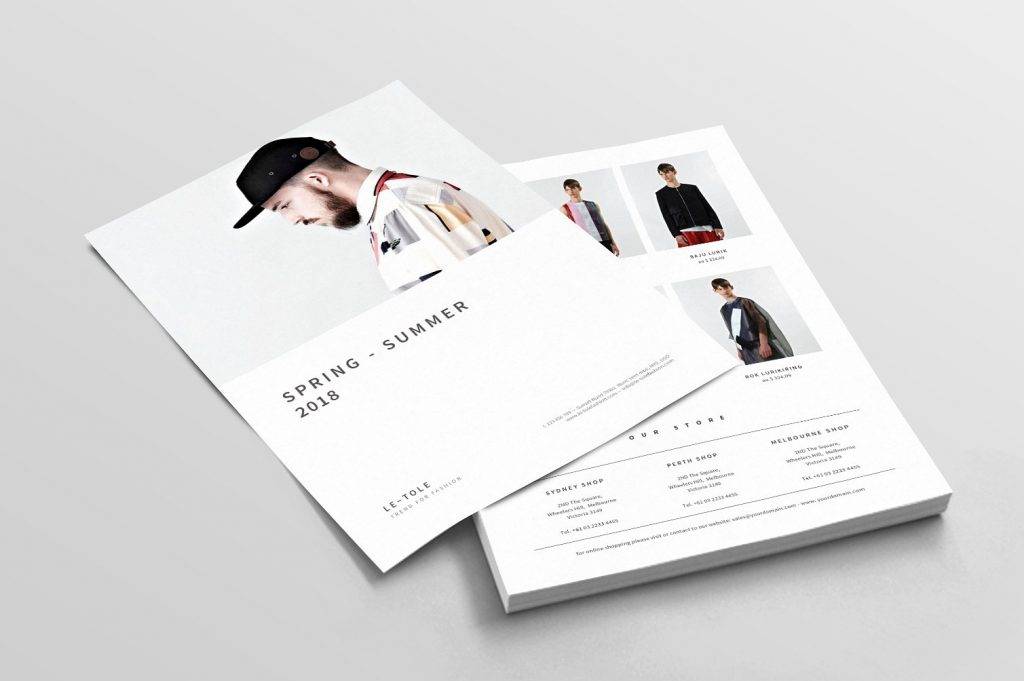
5 Good Reasons Why You Should Use Flyers
There’s a reason why we’ve been using the same promotional technique for centuries. Believe it or not, flyers do work! Whether you’re creating a concert flyer or a restaurant flyer design, there’s no denying how effective flyers are in getting your message across.
If you’re thinking twice about printing your own advertising flyer, here are five good reasons to convince you why you should consider it:
1. It’s a cost-effective option
For most small to medium businesses, paying for an advertising space on a billboard or newspaper can be quite costly. That being said, it would be best to look for a low-cost alternative instead. Print media, such as poster designs, marketing brochures, and flyer designs, would be a perfect choice.
Flyers are made out of lightweight materials, making it easier and cheaper to produce compared to other promotional mediums. With this, you can market your goods, services, and events and expect a high return on investment — all for a reasonable price!
2. Low on effort, high on impact
The process of developing flyer designs does not require much effort. You could have an in-house graphic artist create one or hire a professional designer to work with you. Once this is done, your flyer will be ready for printing. The great thing about a flyer is that despite of its simplicity.
It still has the ability to leave a lasting impression on its audience. A good flyer design can definitely grab anyone’s attention in no time! Flyers are an efficient yet effective marketing tool to use for any type of business.
3. It can reach a wider audience
If you’re worried about the means of distribution for these flyers, fear not. Apart from personally handing out flyers to prospective customers, you also have the option of uploading these flyers to your website or social media accounts for digital marketing. Flyers may be sent through the electronic mail and direct mail as well. It’s incredibly easy to get these into a person’s hands.
They can be pinned just about anywhere the holder wishes, too. In fact, you’d be surprised how some establishments would be happy to post your flyer up on their storefront for no additional fees. This can help keep you connected with your target audience whenever, wherever.
4. It’s perfect for branding
Successful branding lies on how well you are able to make your market presence known. It’s about building an identity that customers will know you for. You see, the industry is composed of a wide range of businesses that serve specific markets and oftentimes, it becomes a competition of who can do better.
Knowing this, you must find a way to stand out. Remember, whatever you put on your layout is a clear reflection of your brand. Your flyer is composed of a variety of information that may be associated with your business, this includes anything from your logo design to your corporate details.
5. Adds a personal touch
Whether you decide on using a template or not, flyers may be personalized in any way you want. You can customize your design according to your brand image, making it easier for customers to distinguish you from competing brands. The way these flyers are distributed contribute to its personal touch as well.
For instance, when you hand out these flyers, you also encourage interaction. Those who are curious about what your flyer has to offer may ask questions and expect clear answers in return. This helps you maintain a personal relationship with your audience, allowing them to feel like a significant part of your company.
Minimal Black Friday Flyer
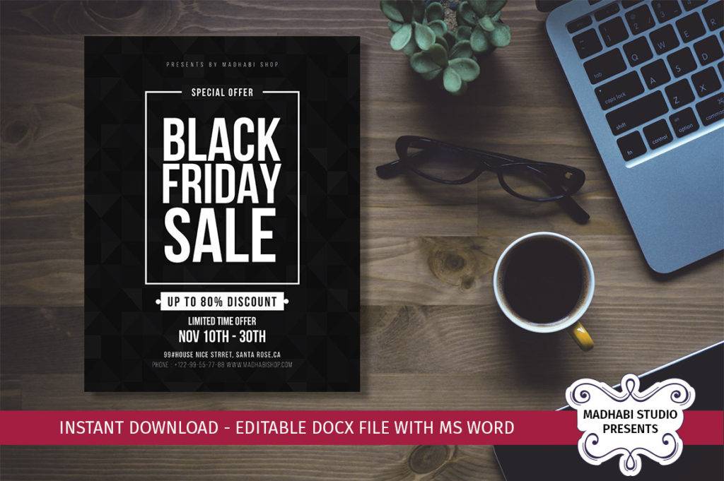
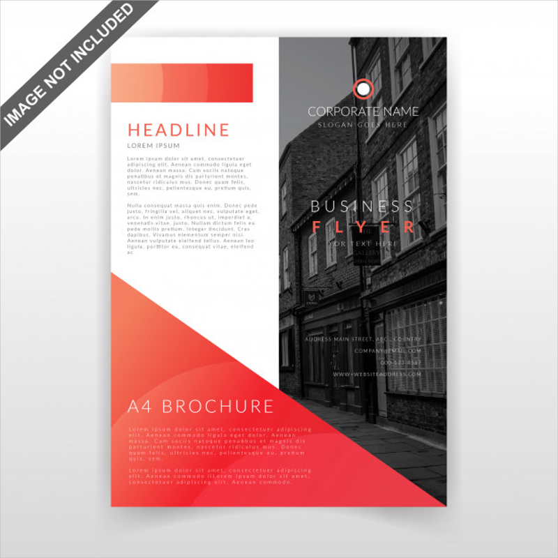
Corporate Minimal Flyer
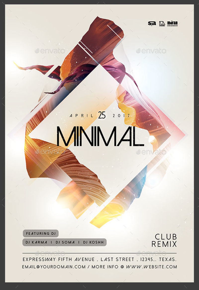
Minimal Club Flyer
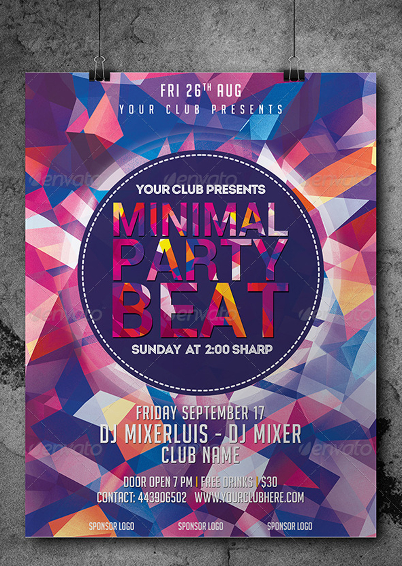
Minimal Photoshop PSD Flyer
Clever Flyer Design Tips to Keep in Mind
A visually appealing flyer design can attract potential customers in a blink of an eye. If you want your flyers to reach maximum impact, you need to establish an incredible visual design that your target audience can relate to. But even the best designers have a tough time figuring this one out. So to help you on your journey, here are some amazing design techniques to make an effective flyer:
- Create a compelling headline. The best way to make an eye-catching flyer design is to make your headline as compelling as possible. This can quickly grab a person’s attention, prompt a reaction, and allow your flyer to do its magic. It isn’t necessary to come up with a funny joke or pun for this, as a simple catchy statement is enough to spark one’s interest. Allow a person to grow curious about your flyer using the right choice of words.
- Prioritize and organize important details. Apart from the graphic elements of your flyer design, you need to make sure it stays informative as well. Determine what information may be necessary for your audience to know about. Once this is done, you must be able to organize such in a typographic hierarchy where textual elements are arranged in a logical manner. Viewers must know where to find important information along with its supporting details. This typically includes the event title, the company name, and the incentives or discounts offered. Make sure to create a systematic content for this, so as to not confuse viewers of its general purpose.
- Be bold and bright. In design, colors can be both your best friend and your worst enemy. For one thing, choosing the right color pattern for your flyer can be a challenge. You have to choose colors that stand out, while still applying the concept behind color psychology. This can affect the way a person perceives your flyer, giving you the opportunity to convey your message. It can take a while before you finally decide on the final color pattern, so don’t be afraid to experiment with these elements.
- Choose fonts wisely. Less is more, even when it comes to your font choice. You need to keep it professional by using the proper font style and size that suits your flyer design. If you wish to emphasize certain information, you can always opt for a bold or italicized version of the given text. Bear in mind that your fonts are also a part of your branding element, so it would be best to keep it consistent with other promotional mediums.
- Keep it readable. Refrain from using typefaces that are difficult to read from a distance. If you want your audience to understand your message, you first need to make it clear enough to read. Use simple language that one may easily grasp. But most of all, keep it concise. Flyers that contain long paragraphs are bound to get ignored, as most individuals do not have the time nor the patience to actually read it.
- Don’t forget a call to action. Order now! Avail today! Buy now! — These are just some of the most common “call to action” phrases that advertisers like to use. This serves as a method to direct your customers on what to do and how to act. It encourages an individual to respond immediately to the wishes of the given advertiser. Most businesses even offer discounts and incentives to entice customers even more. To do this, you can get creative by making unique catchphrases and slogans that are easy to remember.
When it comes to a minimal flyer design, it’s all about creating something that’s worth a second look. Not only are flyers attractive to look at, but they also remain informative enough to serve its desired purpose. This is what makes it a great marketing investment for any business to take on. So with the help of technological advancement, you’re sure to create a stunning and effective flyer design in no time!


