34+ Minimalist Flyer Design Examples to Download
Minimalist design is used mostly in undertakings and activities related to visual arts. It is a kind of design style that does not rely on overwhelming materials but rather on the content of what the expected design output would like to present. Minimalism has been applied not only in the creative field but also on industries where corporate transactions occur. Nowadays, even corporations and business establishments apply minimalism in their marketing tools and materials so that they can fully present their products, services or brand accordingly.
Especially with the rampant spread of the usage of minimalist designs, you can actually see this design style in a variety of fields of expertise and industries. One of the tools where minimalism is usually incorporated is the flyer. There are different types of flyer designs that are used depending on the aesthetic of the business or any entity who would like to use the specified marketing and promotional tool. If you want to create a minimalist flyer design but you do not know how to start, you can be guided by the samples, tips, guidelines and other relevant information available in this post.
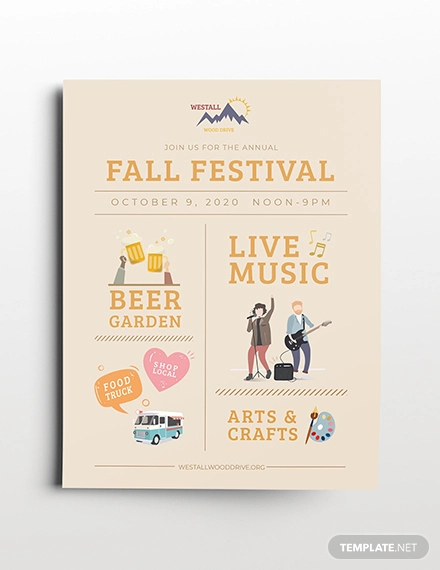
Elegant Festival Flyer Template
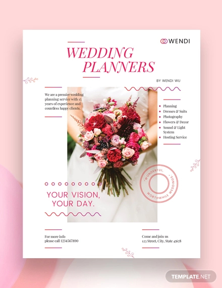
Wedding Planners Flyer Template
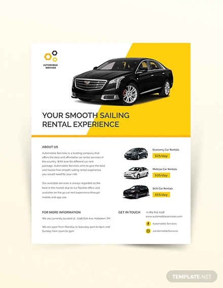
Car Rental Flyer Template
DJ Party Flyer Template

Abstract Minimal Flyer
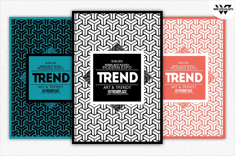
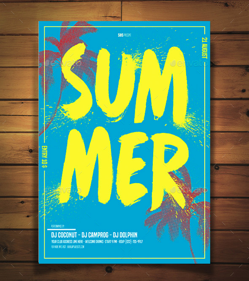
Summer Minimalist Flyer Design
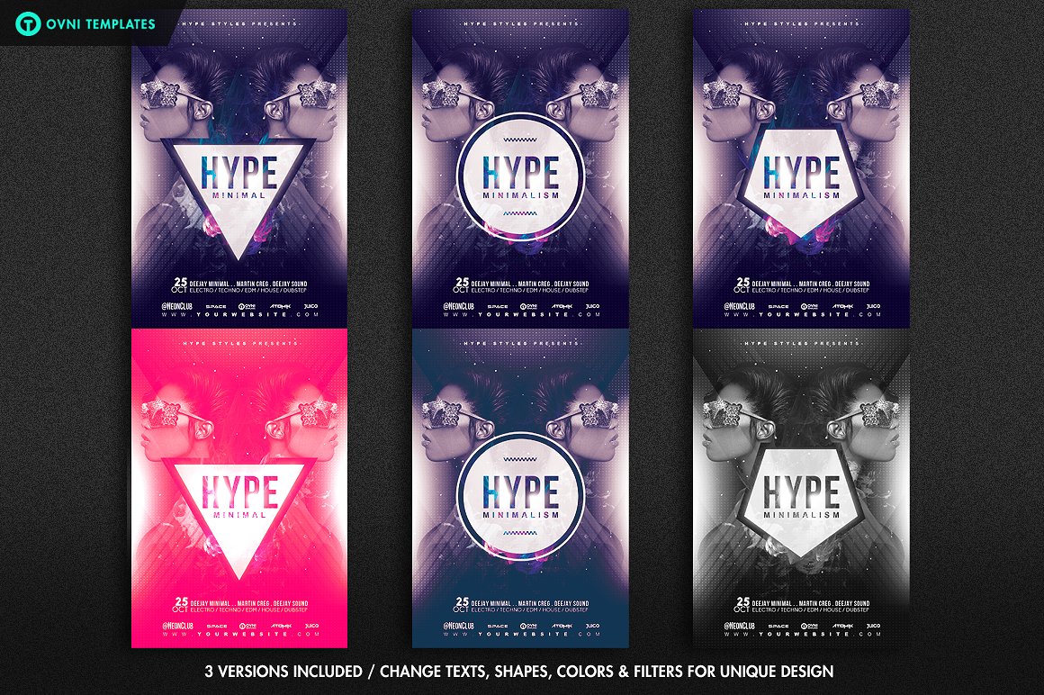
Hype Minimalist Flyer
Why Incorporate Minimalism in a Flyer Design?
A minimalist flyer design focuses on the space where particular information will be laid out. With the simplicity of a flyer design comes a greater possibility for the details that the company would like to disseminate to be more appreciated and observed by people. Here are some of the reasons why we highly suggest you to incorporate the minimalist aesthetic in your flyer design:
- If you will use a minimalist flyer design, you can use great looking and beautiful typography that can get the utmost attention of your target market. This will allow your marketing processes to be efficient and effective.
- A minimalist flyer design is refreshing to look at. Customers have been so used to seeing flyers that are filled with a lot of design. Flyers that are heavily designed can actually turn off potential customers as they can strip the focus on the necessary information that customers should be knowledgeable of.
- If you will incorporate minimalism into your flyer design, there will be more ways on how you can use the specified tool. Using a minimalist flyer is actually one of the best options if you are currently dealing with a number of design projects. All you need to do is to create a base that you can update from time to time so that you can easily insert details based on your particular needs.
- You can get the most out of the flyer’s usage if it can both represent the brand and image of the business while relaying precise and direct information. Fully maximizing a minimalist flyer can help you achieve your corporate objective especially when it comes to giving out details about current offers, future deals, and exemplary service.
- Minimalist actually can encourage or promote the implementation of purpose. Let’s be real, you do not need an impressive marketing tool without content. If you will give a highlight on what you would like to say while adding interesting design materials, then it is already enough for you to spread the word about your business establishment and its products.
- Since minimalist designs do not go overboard when it comes to putting together design items, you can actually remove all the elements or factors that are unnecessary and irrelevant to your final flyer. This will help you to give focus on the items that are expected to be in the document and are very important to be noticed in specific layout spaces or spots.
Minimalist Flyer
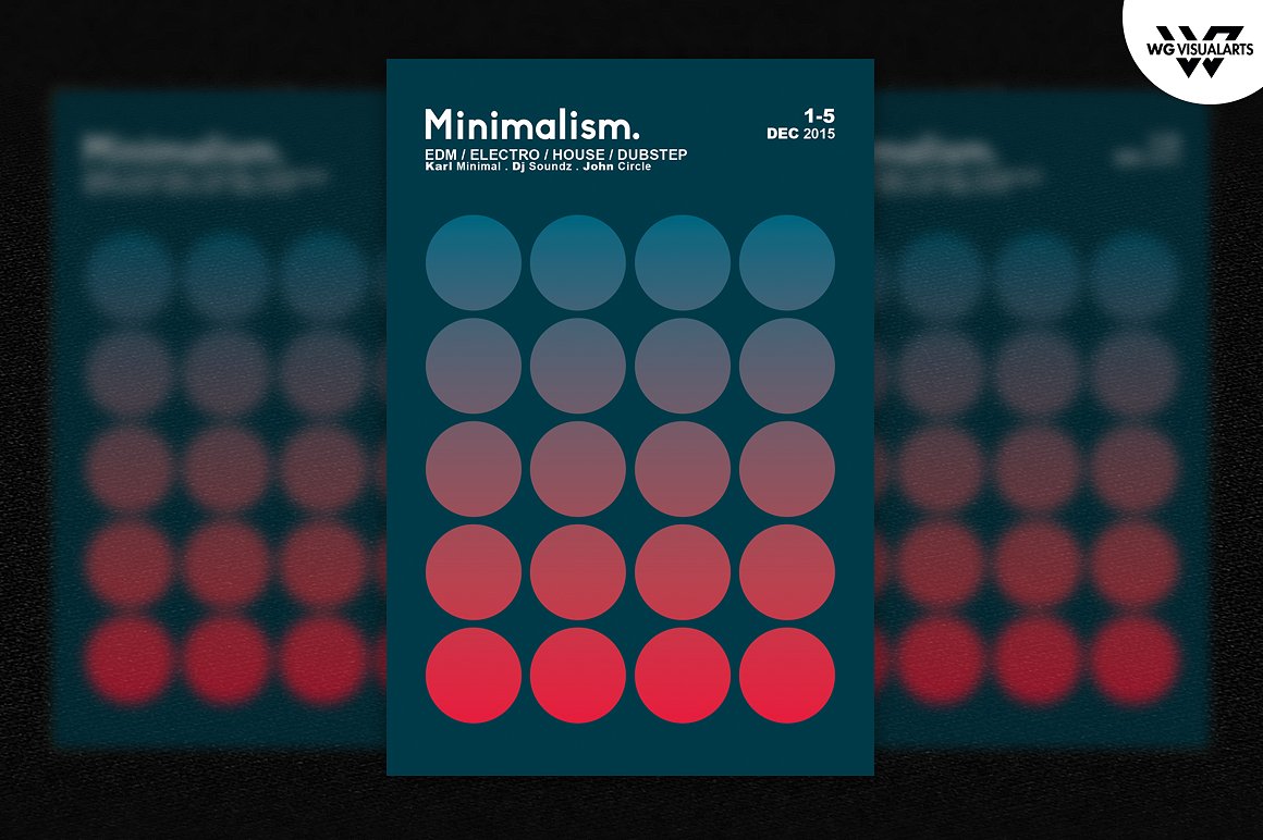
Minimalist Show Flyer
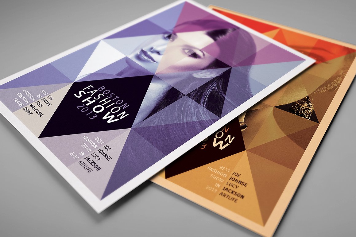
Festival Minimalist Flyer Template
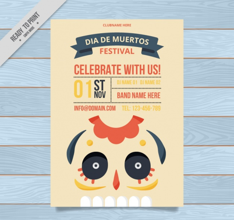
Benefits and Advantages of Using a Minimalist Flyer Design
Since there are only a few elements that are present in a minimalist flyer design, you may think that it is easy to create one. However, its simplicity should not deceive you. It is actually easier to put together a lot of things than to strip down a design idea to the minimum. There are a lot of practice that you need to go through so that you can come up with an informative yet impressive minimalist flyer design.
Once you are already aware on how to create a visually-pleasing minimalist flyer design, there are already a lot of benefits that your business can experience from it. Some of the advantages of using a minimalist flyer design include the following:
- Your flyer can be designed with content as its core. This will help you to have a relevant flyer design that can carry out the purpose of using one.
- Minimalist flyer designs can be used in different mediums without editing a lot of its structure, format, and visuals. Since you have only used minimal designs, you can easily put minimalist flyer designs on your websites, online pages, bulletin boards and social media accounts.
- A minimalist flyer can actually make the design processes faster. With the usage of a few details and precise information, the marketing and advertising team of the business can narrow down their design selection which in turn can help them have faster design planning and implementation activities.
- A minimalist flyer helps businesses to provide details that can be perceived by the market in the correct manner. With more focus that can be given to an uncluttered minimalist flyer design, people can think more of what the content of the flyer is all about.
- It is actually a fact that minimalist flyers work best with environments where customer or client response is actually expected. Since you have already presented all necessary information directly, then it will be faster for people to think of how they will act based on the call to action suggested by the marketing tool.
Abstract Minimal Flyer Template
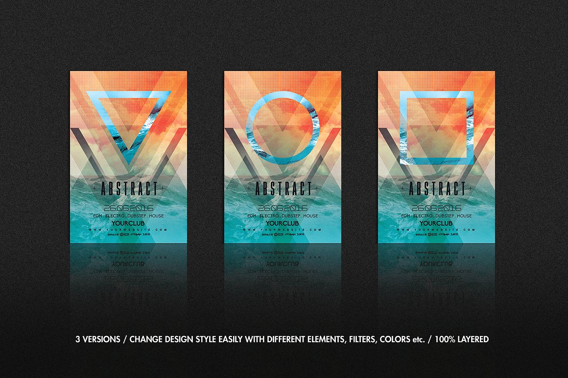
Clean and Minimalist Corporate Flyer
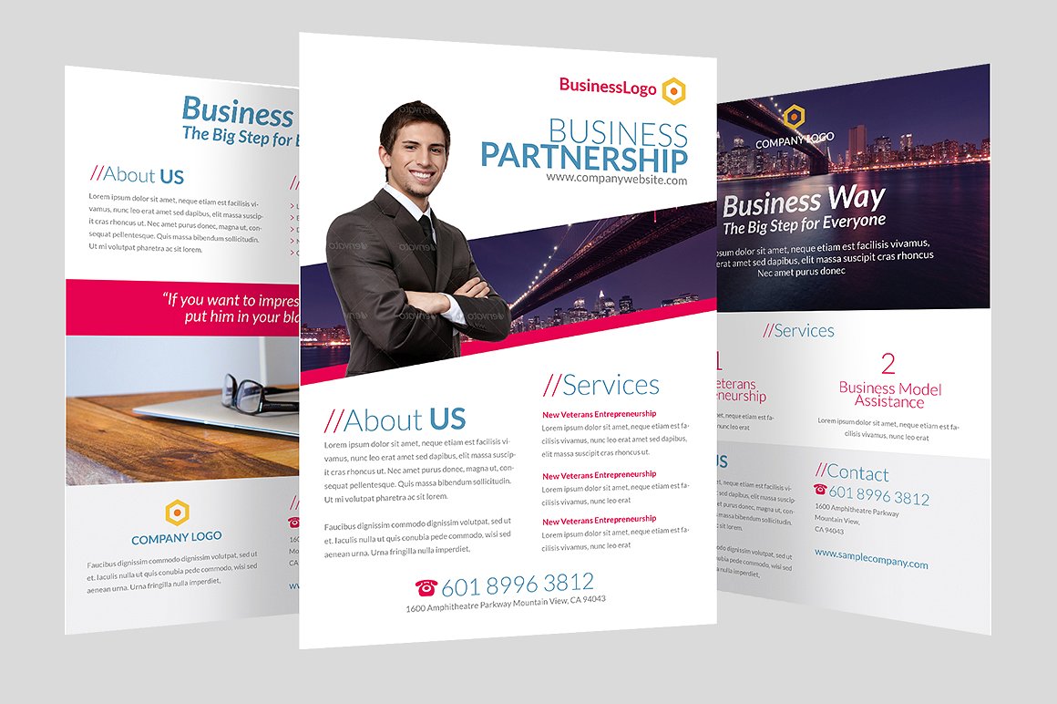
Minimalism as a Flyer Design in the Modern Days
A minimalist flyer design relies on the framework of simplicity, precision, and organization. A minimalist flyer design undergoes the same production process that is applied in the creation of other kinds of flyers. The development of a minimalist flyer requires patience as there are different ways on how this kind of flyer may come out – hence, a lot of trial and error phases for the team that will be tasked to create it.
If you want to use a minimalist flyer design, you should have a full understanding on how you can apply minimalism in the design processes that are used in the modern days. If you still want to be in-trend without veering away from the image of the business when using a minimalist flyer, here are some ways on how you can be more aware on the application of minimalism in the processes of flyer designing and development:
- Do not over think when it comes to applying minimalism in the flyer design that you would like to come up with. In all honesty, there is not much difference on how minimalist is applied in design processes before and now. It is just that minimalism has been more appreciated nowadays because of trends.
- Minimalism can actually work with other design trends and their application. If you want to come up with a more interesting design, you can actually combine minimalism with the usage of abstracts, geometric shapes, double exposures and even typography.
- Never forget to give utmost importance with the information that the flyer will carry. Use appropriate border designs and color schemes which can look well and cohesive with the space that you have come up with in the flyer design. As much as possible, limit the usage of images to two or three items.
- There are no strict rules when it comes to the application of minimalism as a design for flyers. What you can do is to observe the common factors that can be seen in minimalist flyers. This will allow you to know the proper way on how you can use identifiers that can fully speak out the minimal nature of your flyer design.
- Always be subtle when it combining elements. Incorporate these items accordingly so you can make your final flyer design still put together. Minimalism is a combination of classical design and modern trends. Hence, you need to have a great plan that will allow you to put classic and current materials in an organized manner.
Do not be afraid to try out different minimalist design approaches when developing your flyers even if we are already in a modern civilization. Always include original or personal twists that can separate your minimalist flyer design to that of your competition.
Minimalist Real Estate Flyer
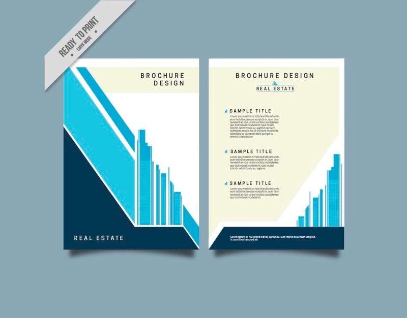
Minimal Flyer Template Sample
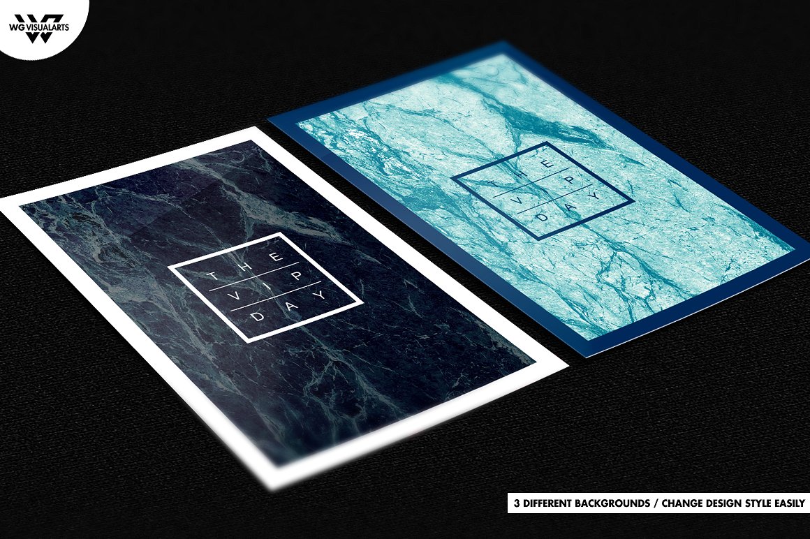
Minimalist Party Flyer Example
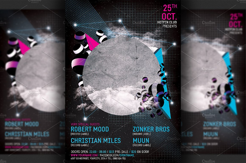
Minimalist Club Flyer
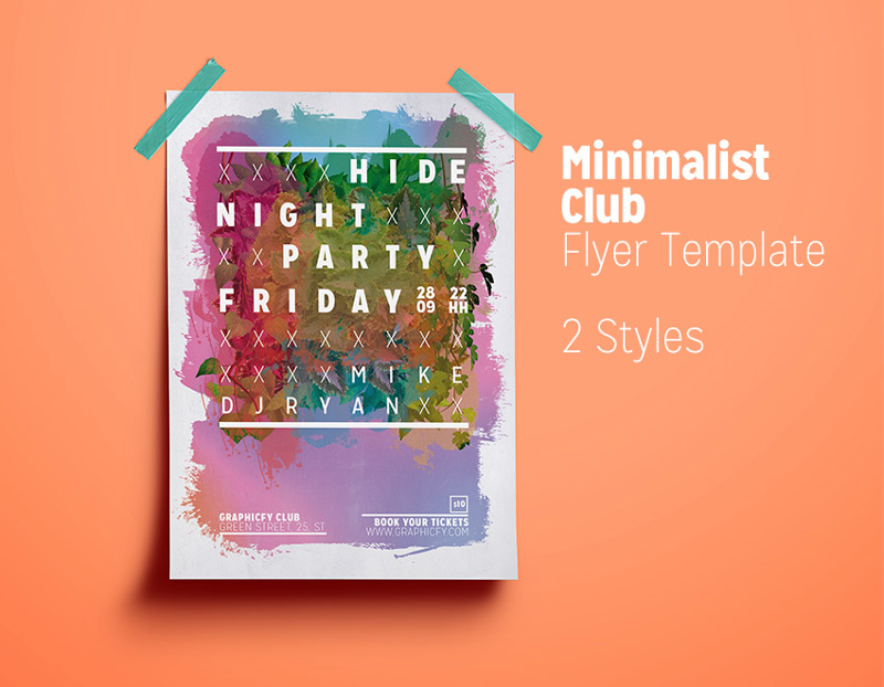
How to Properly Create a Minimalist Flyer Design
Do not forget that only important information and relevant designs should be seen in a minimalist flyer. You always have to think of functionality so that you can be guided on what to put in a minimalist flyer. As what we have mentioned above, minimalist is not a new thing that is used in design undertakings. It is actually a reoccurring trend that has been more appreciated which is the reason why you can see it anywhere today. Listed below are some of the ways on how you can properly create the minimalist flyer design that you have in mind without making the tool look boring and generic.
- Always remember that consistency is key. If you want to brand your business properly when using minimalist flyer design, you have to be consistent with the minimalism in all the flyers that you will use within the entirety of your operations. A minimalist flyer can help you create a brand identity that is simple, relaxed and approachable.
- Make things simple but never copy the minimalist design of your competition. Always come up with original minimalist designs. This can be seen if you will use the color palette and scheme used by your business in the overall design of your minimalist flyer.
- Develop a thought process when creating a minimalist flyer design. Always be clever whenever you are in the process of developing a flyer design that is minimalist in nature. Minimalism can actually be tricky at times especially when used as a design style. As you have observed in the samples included in this post, there are not just about the lack of images or a lot of other design materials. Cohesion and organization are essential elements in this process and these two are actually some of the hardest design aspirations to be mastered.
- Consider functionality above all else. A minimalist flyer design can promote clear information dissemination. It is a great and brilliant way to ensure that customers can notice the clean slate of the business. This allows them to trust the corporate entity especially when it comes to transparency. An uncluttered design is very functional which is the reason why you should always think of this factor when creating a minimalist flyer design.
- Create balance in the overall aesthetic that you will come up with. All the design elements that you will put together, though simple, can still be cluttered when not curated in a precise and organized manner. When thinking of balance, you need to look at the final flyer design in the point of view of your target market or audience. Always create design harmony so that people can have a great time looking at the minimalist flyer design that you will present them with.
Space Minimal Flyer Template
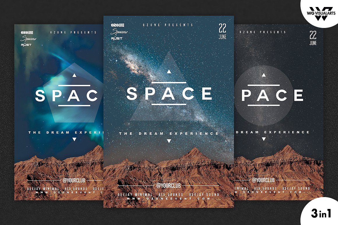
Minimal Abstract Flyer Template
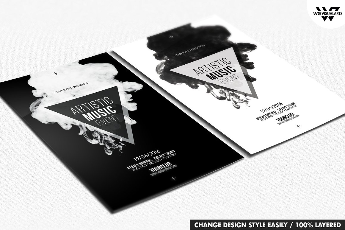
Minimalist Business Flyer
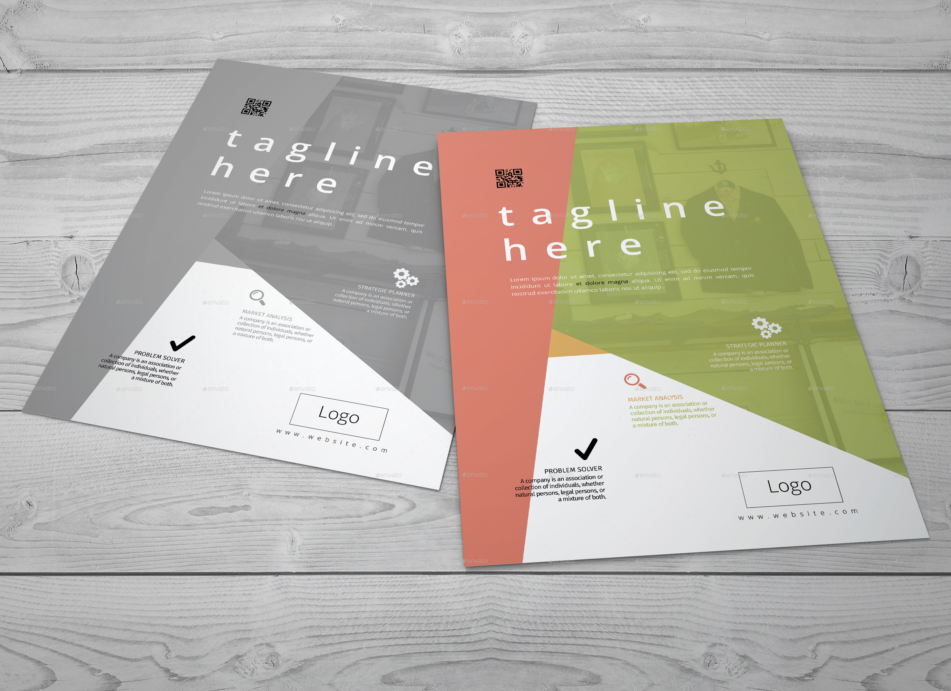
Minimalist Corporate Flyer

Tips in Designing a Minimalist Flyer
A minimalist flyer design is always usable. It is a classic tool that will never go out of age. Minimalism, when used as a flyer design, is very beneficial and advantageous to the entity who will use it as it can actually be a simple and basic combination of various styles, design trends, and techniques. if you want to create a great minimalist flyer design, there are actually some guidelines that you should be aware of. Listed below are some of the tips that can help you design a minimalist flyer.
- Know the design and aesthetic relationship of the design items, materials, and information that you will put together.
- Come up with a color palette that can make the entirety of the flyer design look more put together.
- Go all out when it comes to the implementation of minimalism. Do not have design hesitations as it can actually let you veer away from using simple elements.
- Ensure that you will still be creative when implementing a minimalist approach when designing your flyer. Having simple designs does not mean that you should be less enthusiastic when it comes to creating the flyer that you will use.
- Consider the spaces that you will use. It is not only the content that matters in a minimalist flyer design. The spaces that make items apart or together actually play a big role in achieving the minimalist design that you plan to have.
Minimalist Party Flyer
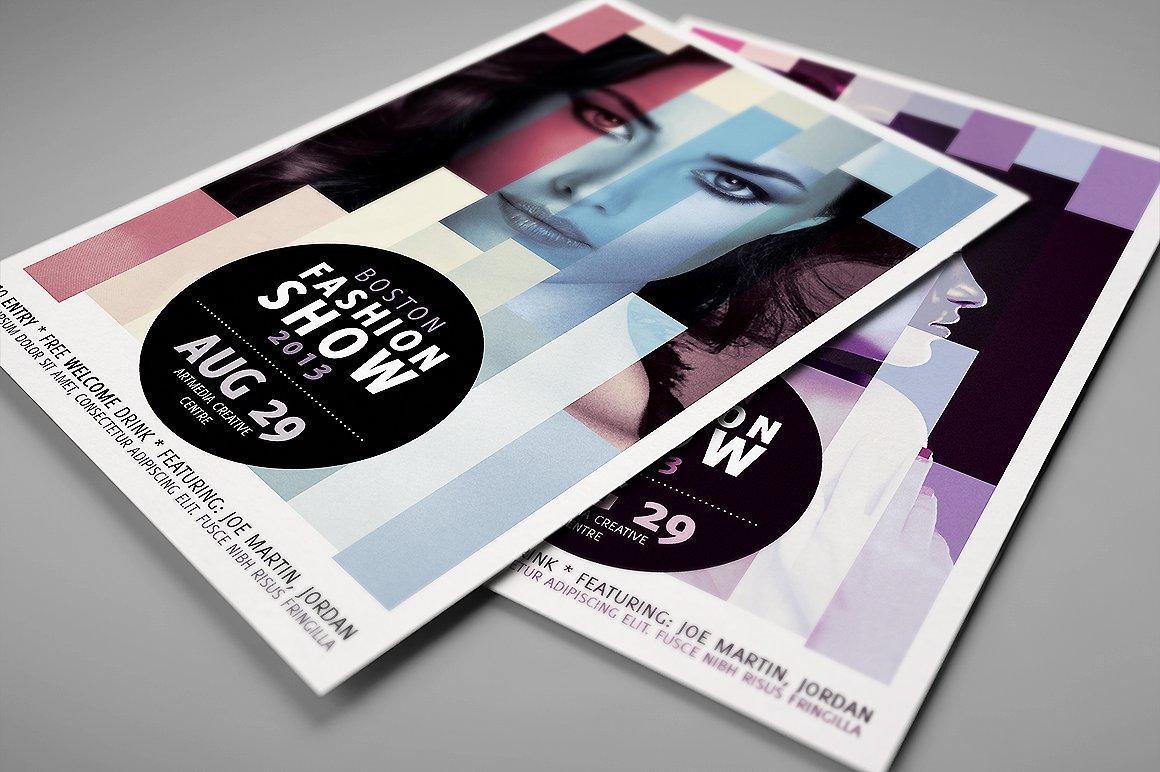
Neon Minimal Flyer Sample
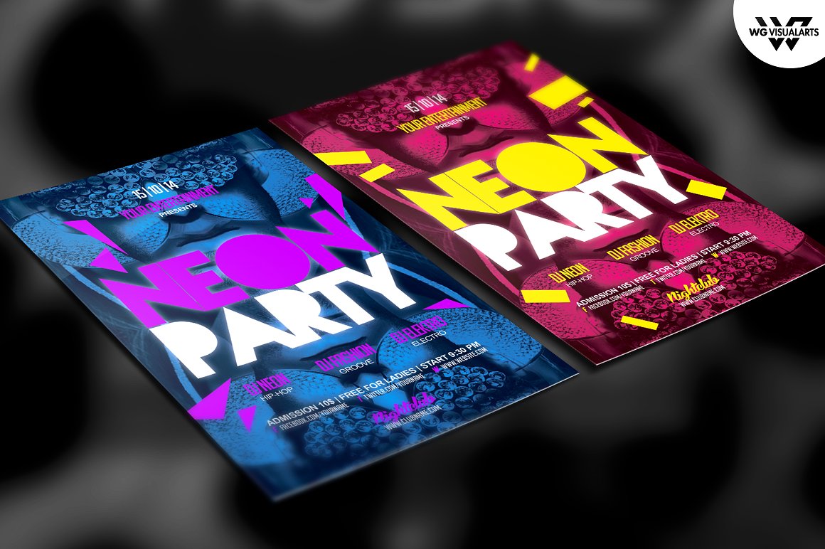
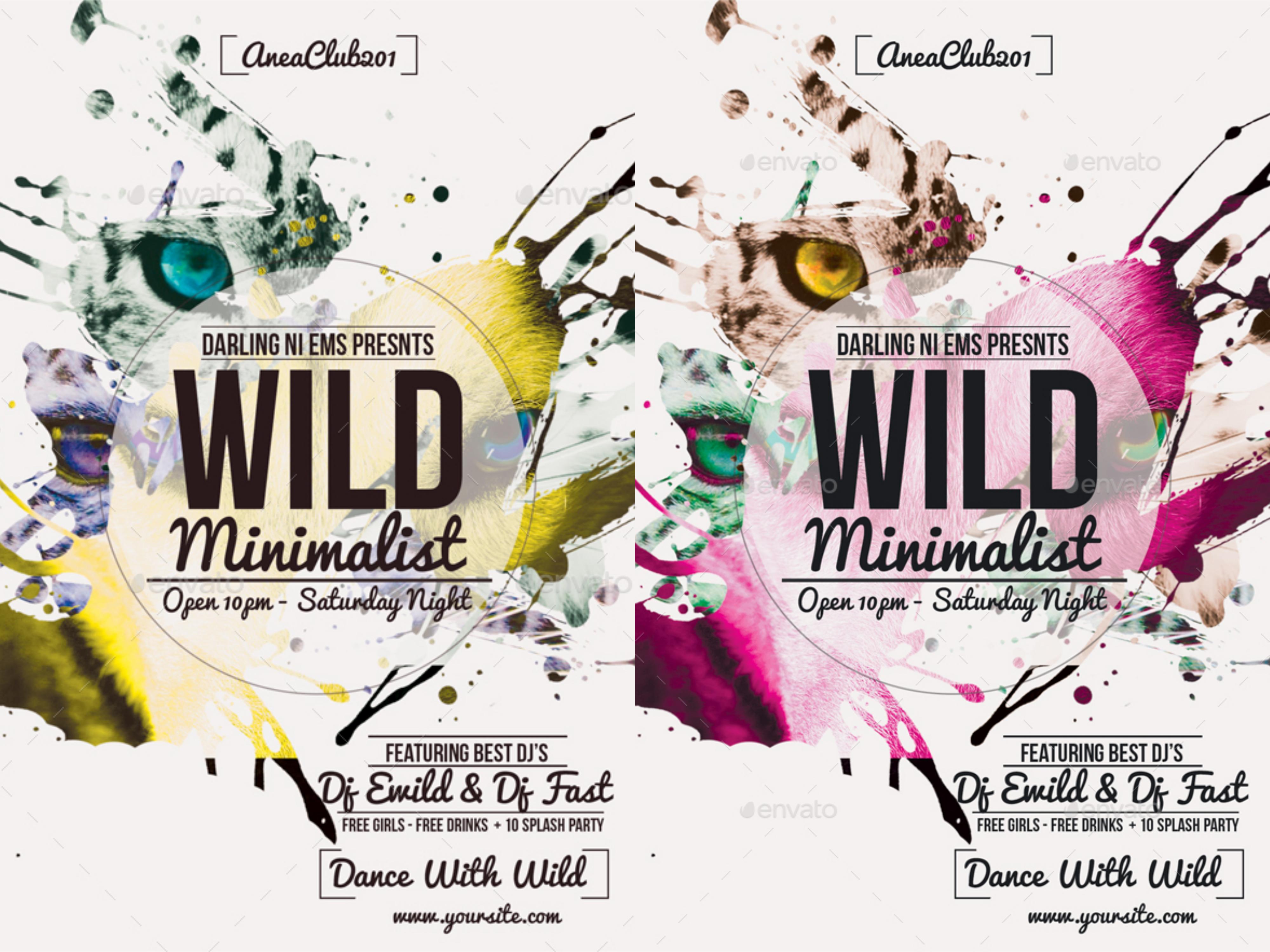
Wild Minimalist Flyer
Things to Consider When Developing a Minimalist Flyer Design
A minimalist flyer design is timeless. Though considered simple, this tool can actually be used from time to time as it can surely help the business achieve a lot of marketing objectives especially when created accordingly. There are some factors that you need to look into when developing a minimalist flyer design and a few of them include the following:
- Traditional design rules. As we have specified, you can experiment when creating a minimalist flyer design. However, you should also consider traditional design rules which include spacing, color combinations and the like. Visual elements will look good together if you will follow traditional design rules and upgrade it with possible trends that are already present today.
- The spacing of information and design. There are ‘negative spaces’ or spaces that will not be used that should remain in the layout of your minimalist flyer design. You have to remember that these spaces can actually not make your flyer blank but organized. Spaces can be a breathing ground for the visuals of the entire document. Hence, separating all the information based on how you would like them to be grouped.
- The textures that you will put together. Since there are only limited design materials present in a minimalist flyer design, you have to ensure that you can still get the interest of your market or audience by playing with different kinds of textures. The roughness or smoothness of your design can actually help get the attention of people who will look in the flyer.
- The style of the content that you will include. The text of the minimalist flyer design is actually one of the center of attention in relation to design aspirations. Do not forget to apply minimalism in text fonts, styles, and colors. However, you can use different kinds of text phases and such so you can still make the design of your information listing interesting.
- The material where you will print your minimalist flyer. The design of you flyer should look good in the material that you will use. May it be a paper, a sheet, or a board; a minimalist flyer design can only look at its best if the particular material that you plan to use can give justice to the approach that you have applied when designing the tool.
Minimalist Summer Themed Flyer
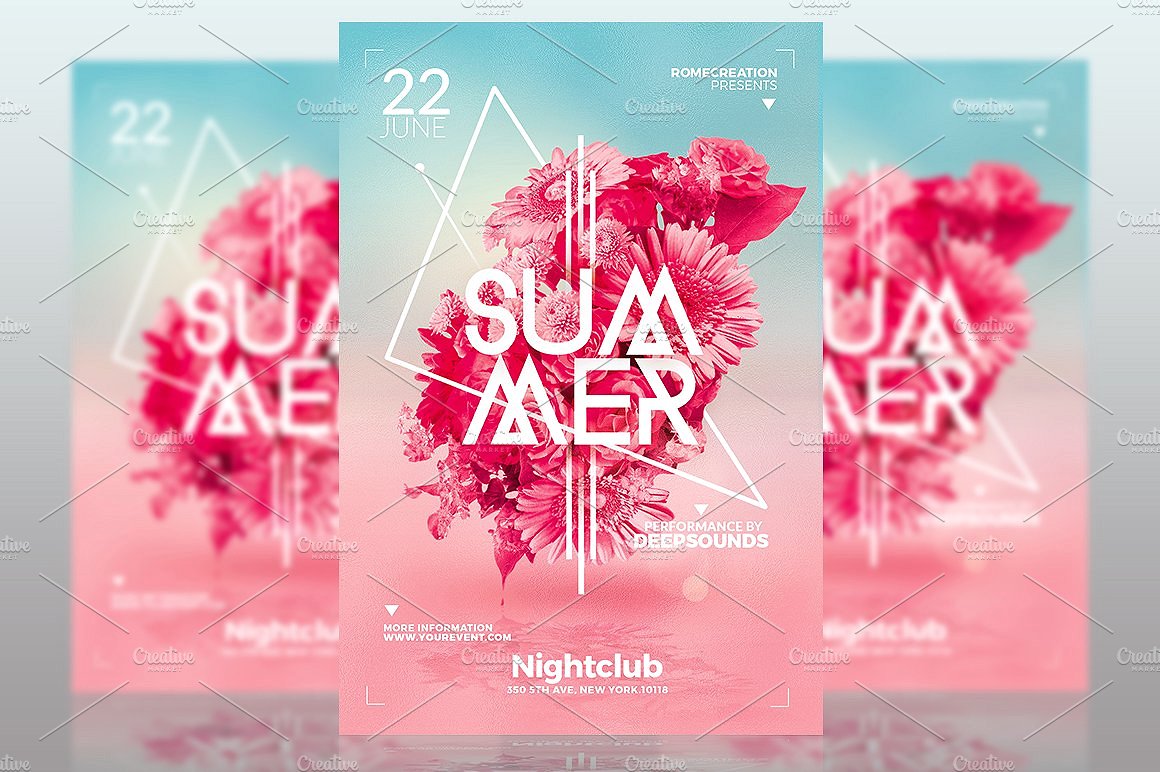
Minimal Shapes Flyer
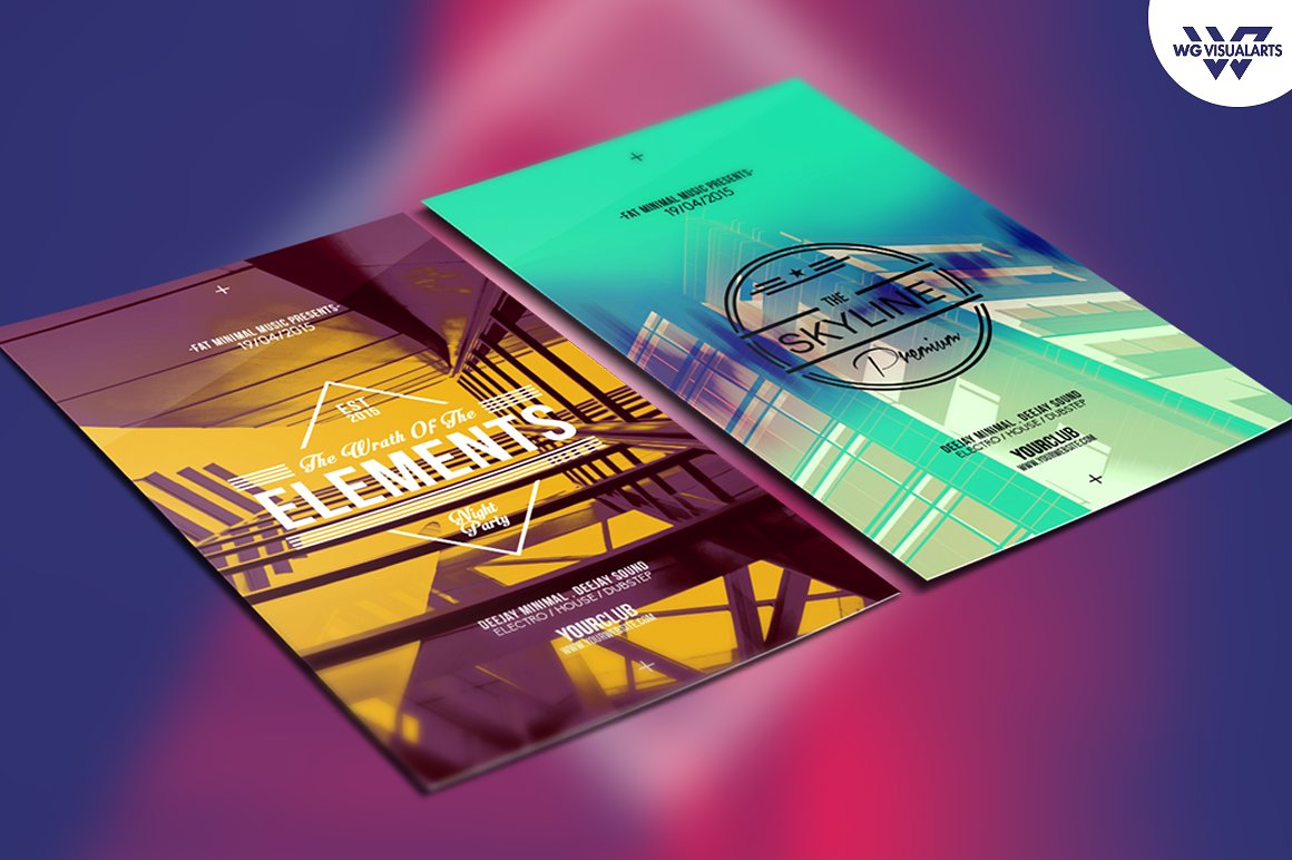
Minimal Abstract Shapes Flyer
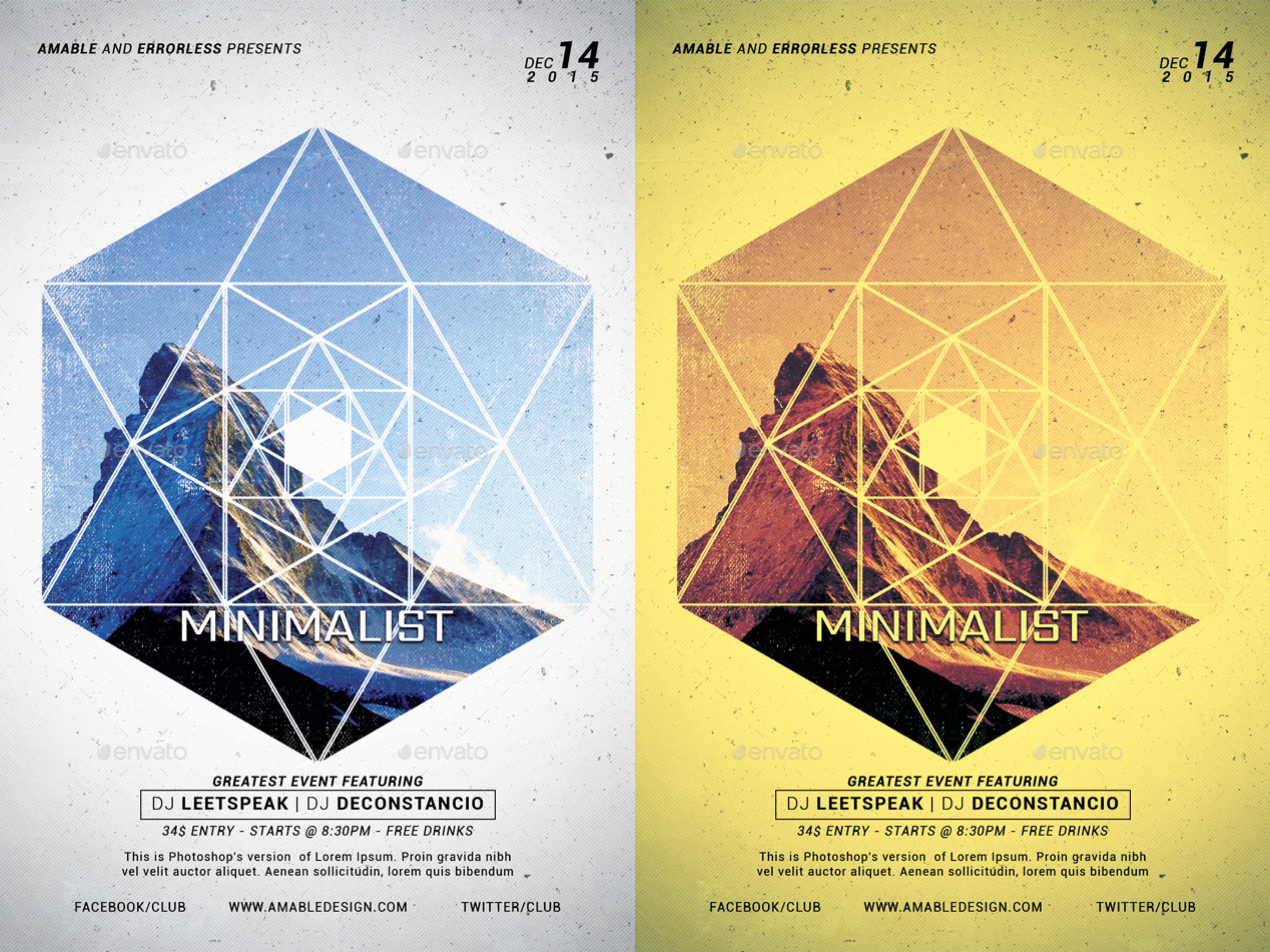
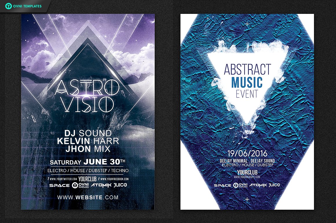
Electro Minimal Flyer
How to Be More Effective When Using a Minimalist Flyer Design
When creating a minimalist flyer design, always think outside the box. Since minimalist can sometimes be translated to a generic style when not well thought of, you have to make sure that you can think of ways on how to realize a simple yet visually attractive flyer design. Do you want to be more effective when it comes to designing a minimalist flyer? Here are some basic guides on how you can do so:
- Consider the positioning of the design items that you will use so you can create a composition that works well when looked as a single material.
- Think of the color combinations that you will use. It is a misconception when people think that a minimalist flyer design should only have the colors black and white. Though monochromatic colors are favored, minimalist flyers can still make use of a number of colors that look good together.
- Always be direct and precise with your discussion. The less design elements that you will use, the more opportunities there are for you to relay your message in an effective manner. Communicate with your audience when developing a minimalist design so that you can be guided within the entirety of the minimalist flyer design development.
- Be flexible with how you will apply minimalism in your flyer design. There are some minimalist design aesthetic that may not work with the initial plan that you have. Being resilient with the implementation and application of minimalist style designs can help you come up with a flyer that can stand the test of time.
Minimal Sounds Flyer Template
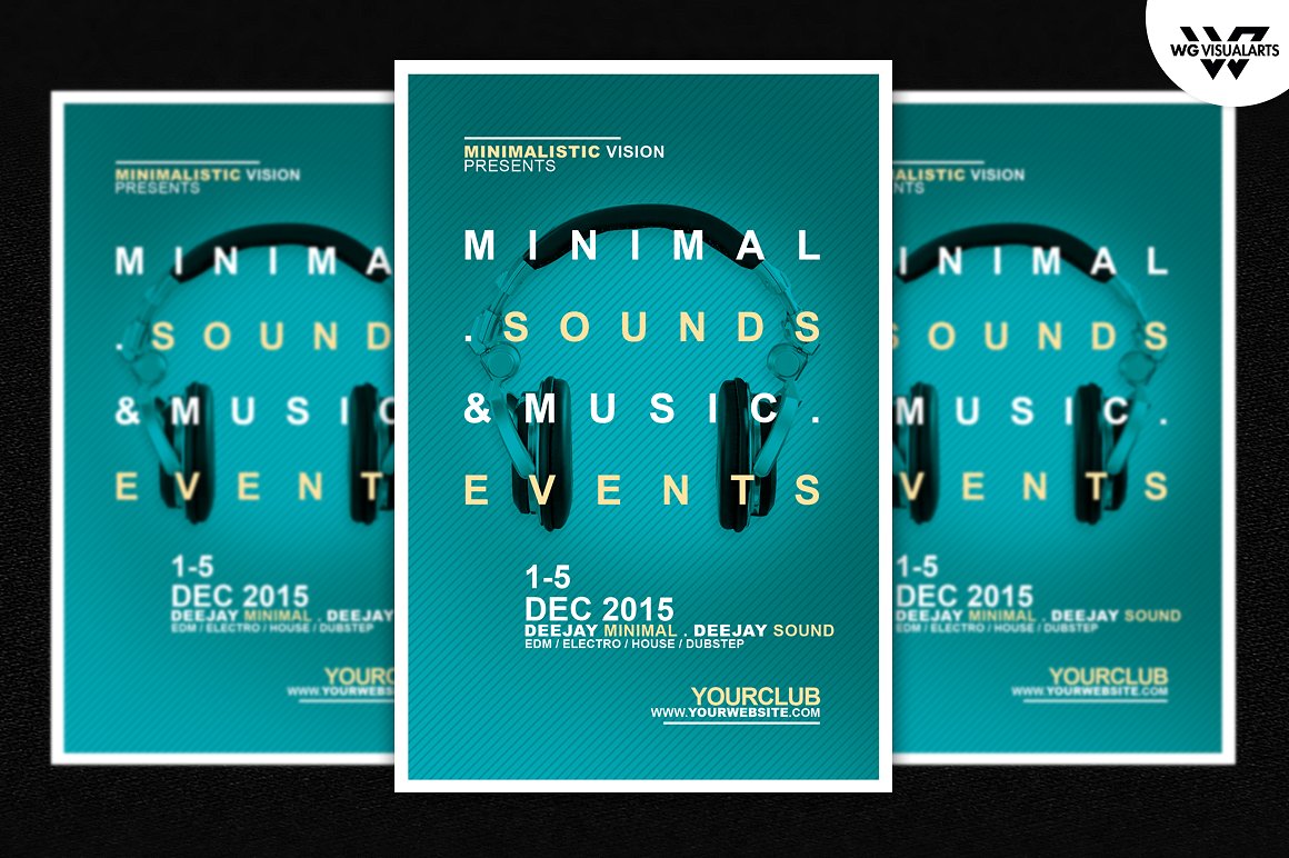
Minimalist DJ Flyer
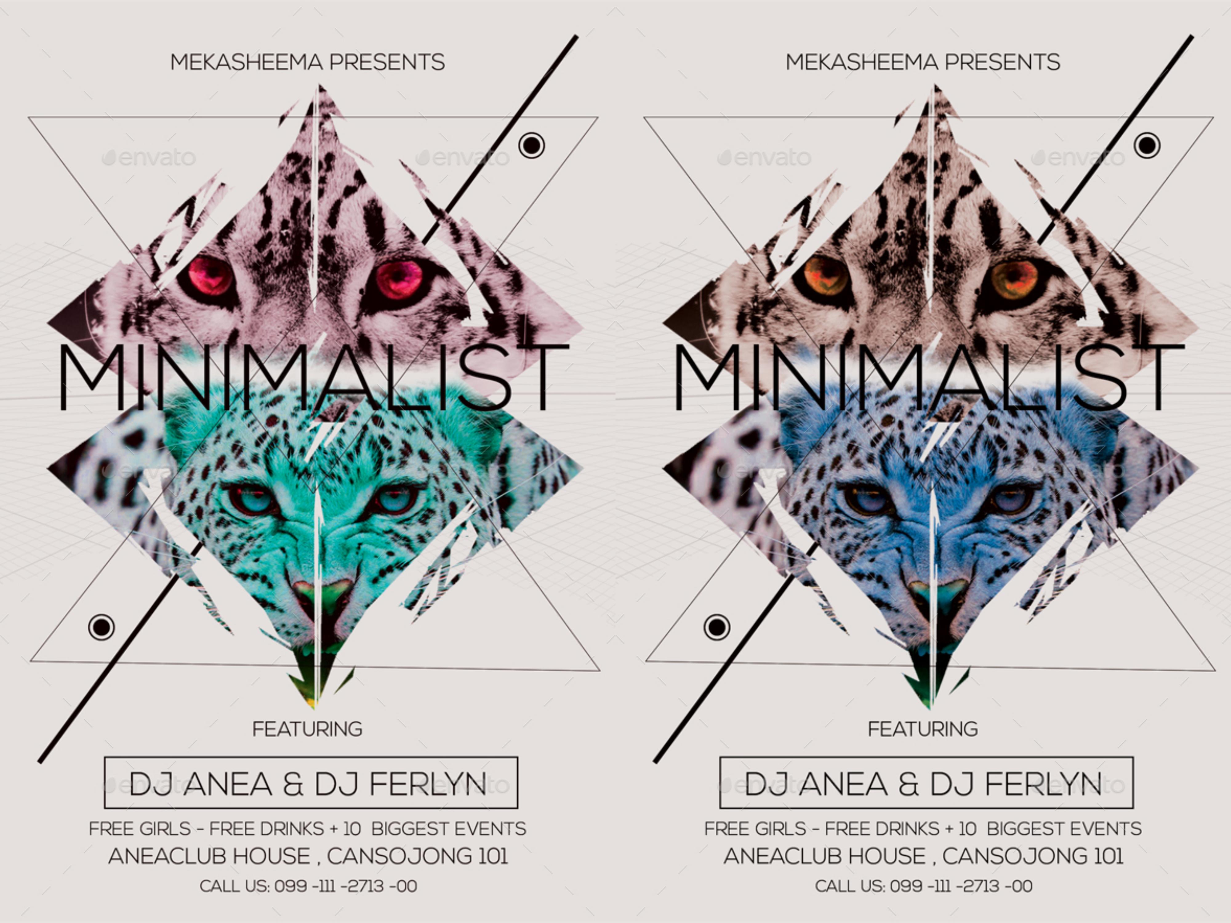
Minimalist Party Flyer Sample
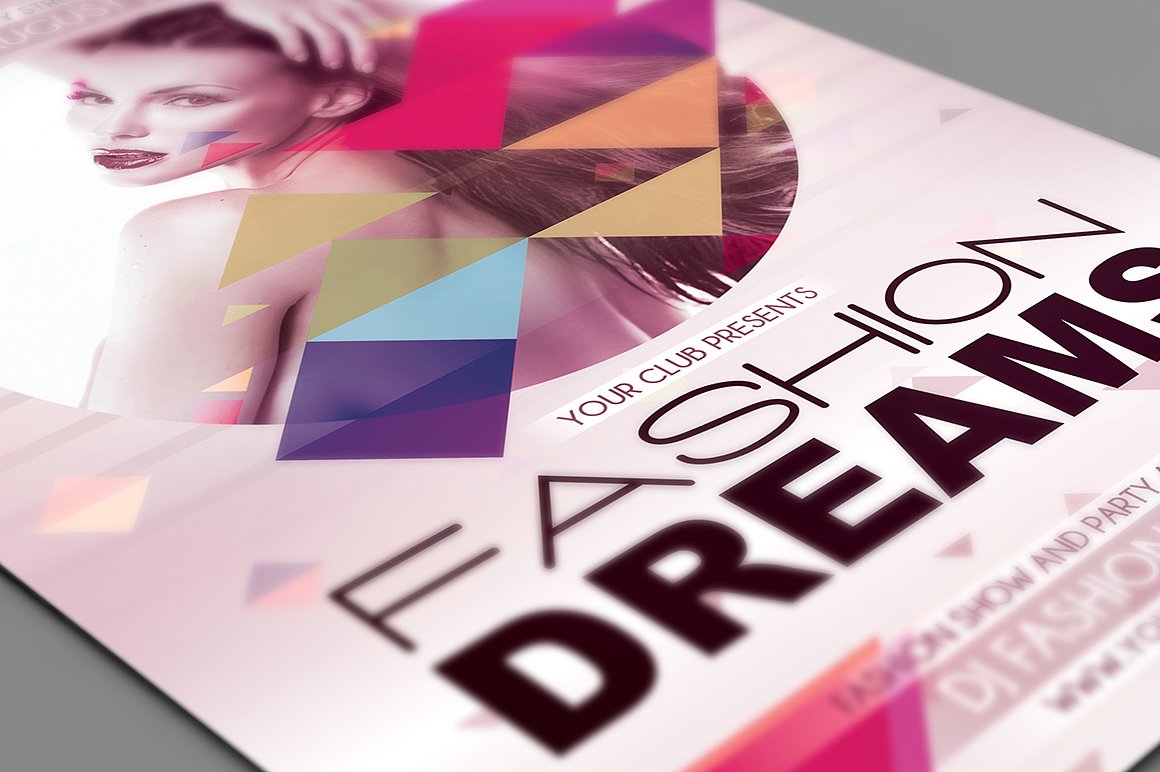
Minimalist Abstract Flyer Template
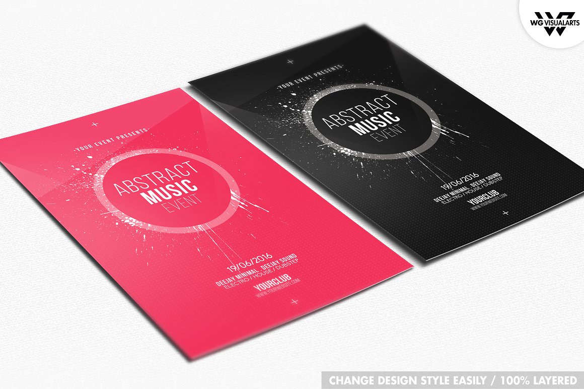
Minimalist Sci-Fi Flyer
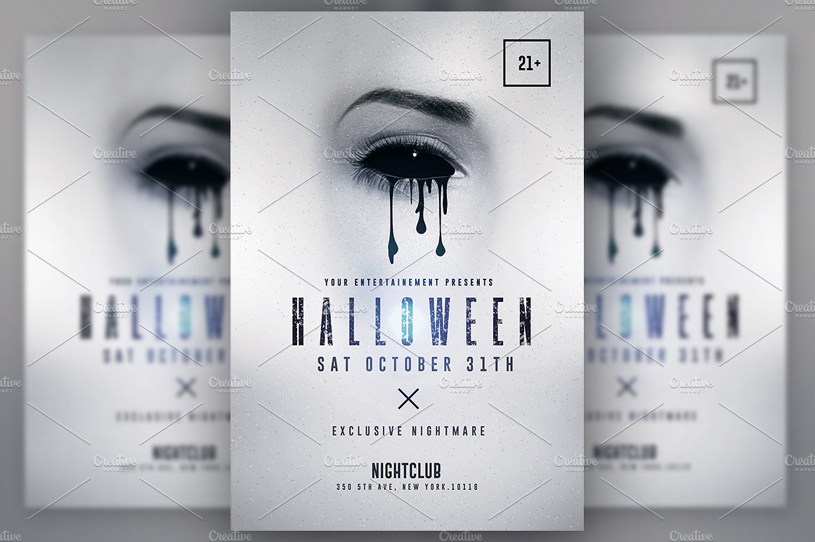
Halloween Minimalist Flyer
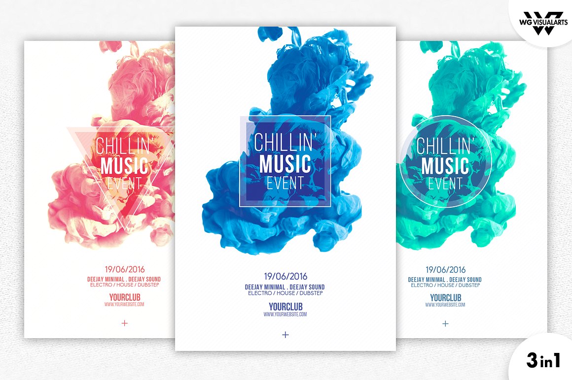
Minimalist Smoke Abstract Flyer
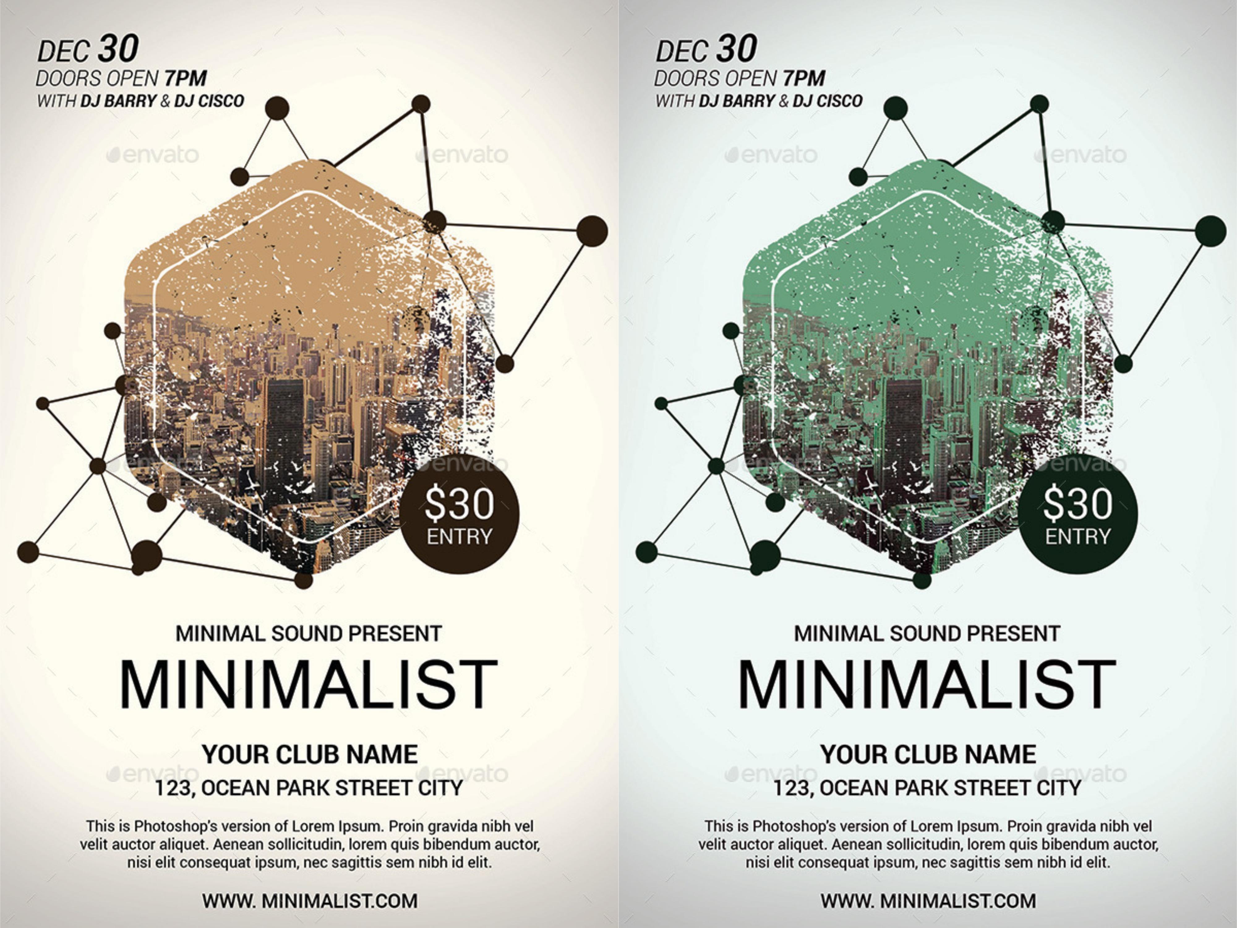
Minimalist Flyer
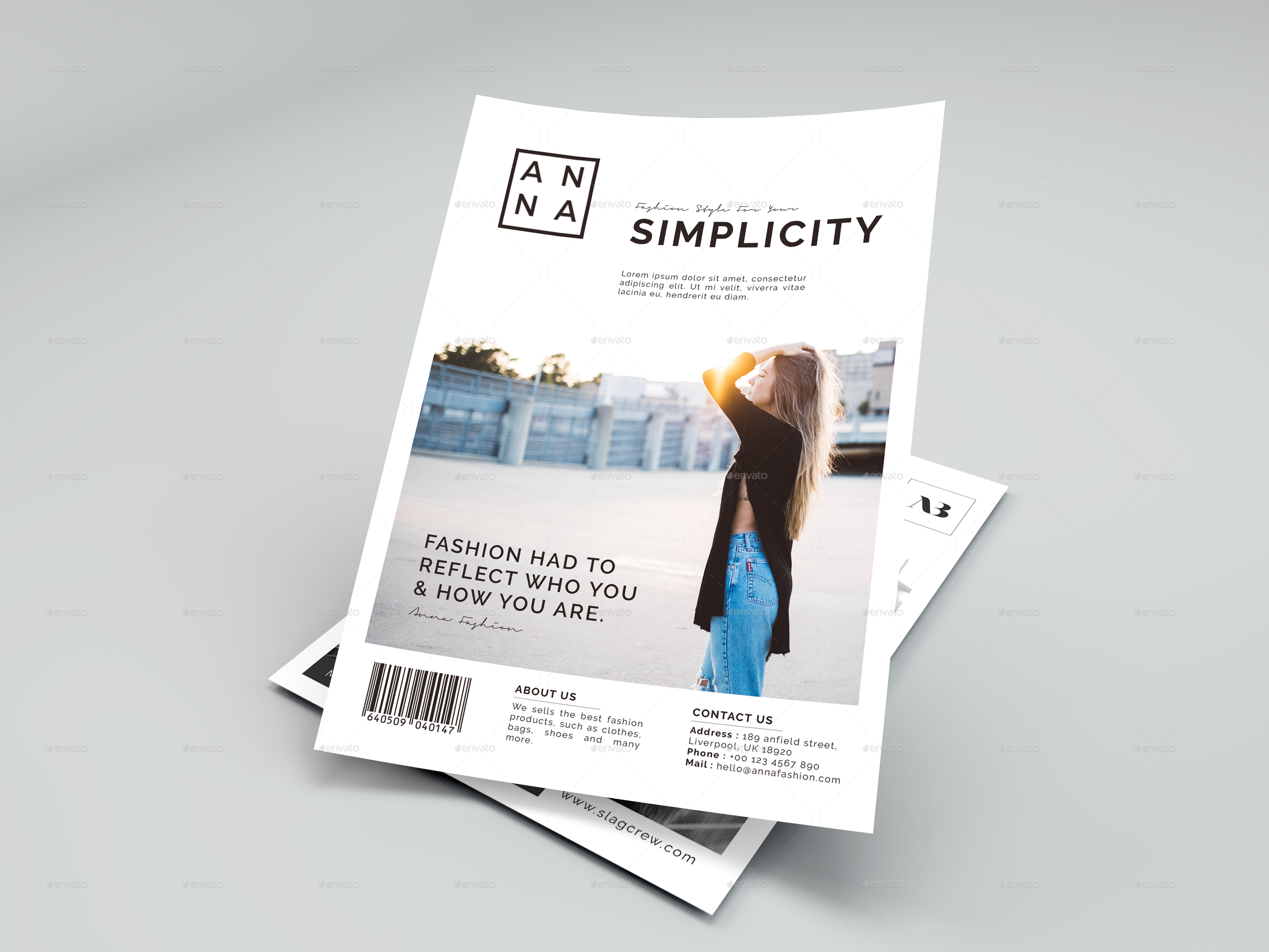
Planning to Use a Minimalist Flyer Design?
Have you already finalized your decision on whether to use a minimalist flyer design or not? All in all, a minimalist flyer design actually is no different to the flyers that you can seen everyday when it comes to the function that it can provide. However, there is a great difference when it comes to how this type of flyer can draw attention even in the simplest manner. A basic aesthetic can actually be more pleasing when done accordingly compared to flyers that have a lot of design items that are not properly placed together.
Since a minimalist flyer design does not contain a confusing design or aesthetic, you can easily guarantee your audience that you are truly knowledgeable on how you would like to deliver your message. When developing a minimalist flyer design, always remember that the success of this material can actually be based on what you can remove rather than what you can add. Use a minimalist flyer design right now so you can see how its benefits can be advantageous to your operations.


