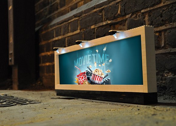
7+ Movie Billboard Examples to Download
Have you ever passed a movie billboard with a feeling of excitement and urgency that makes you want to scream, “I NEED TO SEE THIS MOVIE?” From train stations to busy freeways, bus stops to airport terminals, billboards are practically everywhere! Considering the wide-spread use of billboard advertising, using a movie billboard to promote your film guarantees the good word reaches its desired demographics quickly and effectively.
Neon Signboard Movie Billboard Example
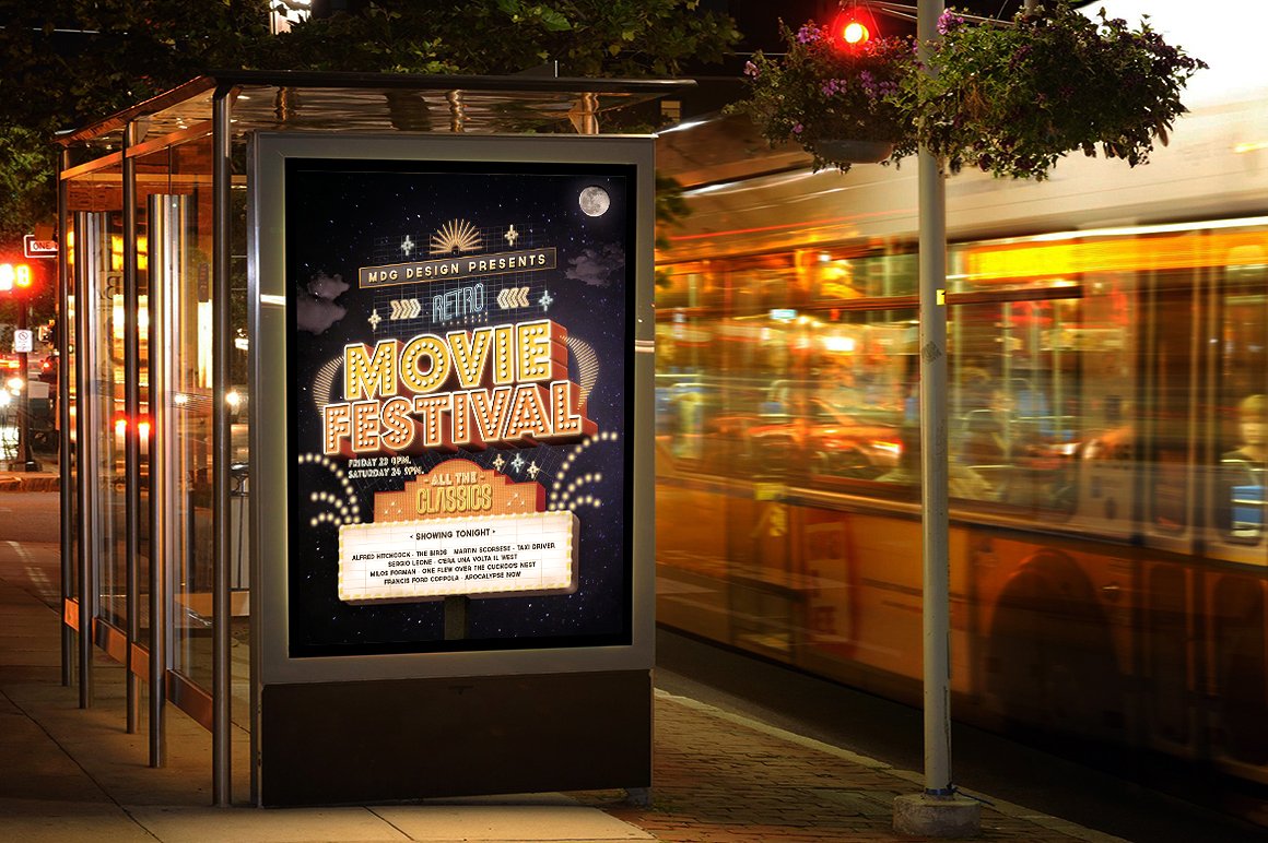
Movie Studio Billboard Example
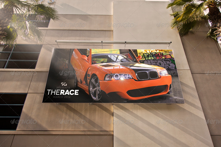
Variable Movie Poster Billboard Example
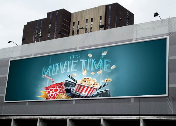
Animated Movie Billboard Example
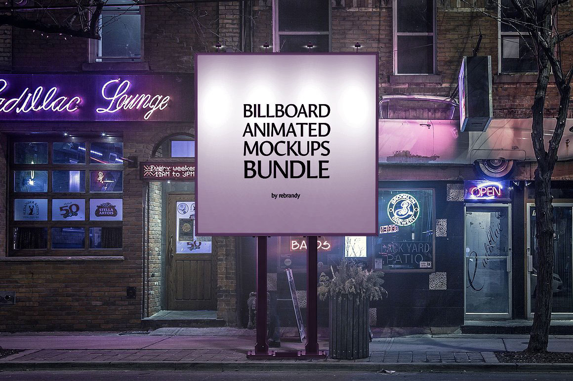
The Art of Movie Marketing with Billboards
There are times when a movie can gain the highest reviews from critics, but fail to become blockbuster hits due to poor movie marketing. Not only is this an unfortunate loss for the production company behind the film, but the creative works and imaginative minds of the movie’s writers and cast would also be put to waste. For the most part, many movie-goers aren’t aware of the latest releases unless they research about it or see some sort of advertisement of the said film. While TV commercials, movie posters, and online ads seem like a great way to reach audiences; you have to admit, not everyone is bound to see it.
Truth is, it’s so easy for us to switch channels when whatever is on screen fails to capture our interest. Posters fail to reach a person when it isn’t visible from a distance, or perhaps when a person isn’t within its vicinity as well. And online ads? Well, various social platforms are programmed with a particular algorithm where users are likely to see sponsored posts based on their interests and social activity. Knowing this, using multi-channel strategies that are hard to ignore will be your best option. You may also see outdoor billboard designs & examples.
Simple billboards, being one of the largest print and digital advertising tools in terms of size, serve as an effective medium for communicating with a target audience. Unlike other promotional tools, billboards are constantly exposed to drivers, passengers, and pedestrians of a given location. This is composed of individuals that may or may not pass by the same area on a regular basis, but are bound to encounter the billboard ad nonetheless. This helps build consistency and familiarity that will allow passersby to develop an emotional connection with the ad. After all, it’s difficult to avoid something that’s standing loud and proud in front of you.
While it’s obvious that billboard advertising is great for product and service promotions, why should film marketers ever consider using movie billboards to advertise a motion picture?
Besides the advantages previously mentioned, billboards are an extremely flexible medium. Advertisers can create mini trailers of the film to fit the specifications of a digital billboard ad, or they could opt to design a blown-up version of their poster to suit the standard billboard size. The great thing about a versatile medium is that it allows advertisers to be creative and innovative with their ads. This offers endless design possibilities for advertisers to create movie billboards that are both eye-catching and memorable.
So instead of having people look for the movie ad, the billboard ad brings the fun to its audience in the most convenient way possible. Through this, you’re sure to reach a great number of people for effective mass marketing.
Urban Poster Movie Billboard Example
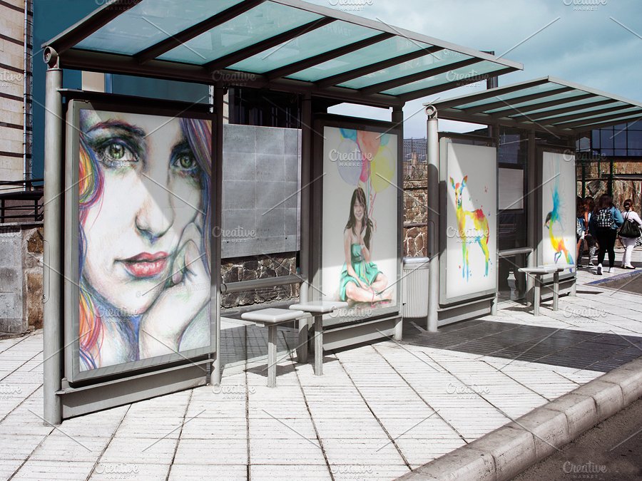
Variative Movie Billboard Example
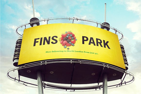
Facts About Billboard Advertising
Admit it. You probably recognize billboards as those huge print ads found across busy highways and city centers. While this is true, there are a few interesting facts about billboard advertising that may help you as an advertiser.
1. The largest billboard size in the campaign are the standard billboards, otherwise known as the “bulletin”. This is usually 14 feet high by 48 feet wide, but the billboard size may also vary depending on its location. For instance, billboards located along traffic-prone areas are usually larger in size due to the mass number of people it’s intended to reach. While smaller billboards, also known as poster billboards, are more ideal for indoor advertising campaigns.
2. Billboards during the First World War were used for an entirely different purpose than advertising. These billboards were filled with motivational and powerful messages to prep troops and soldiers going into war, which is a far cry from the type of billboards that fill our surroundings today.
3. Long before digital printing made it easier for advertisers to produce large-sized media, billboards were created by pasting sections of paper together to form one huge image. Thankfully, printing tools have since advanced, allowing advertisers to print an entire image on a single sheet. Not only can we print billboards at a quicker rate, but the quality of these billboards have also improved tremendously. You may also see real estate billboard designs and examples.
4. Renting a billboard space typically grants an advertiser a 12-week time period for their campaign. This means a billboard ad would be displayed for about 3 months for the public to see, making it a go-to platform for advertisers that seek long-term messaging. Considering the time frame given, consumers can easily grow accustomed to the company behind it, which is great for building brand recognition. You may also like food billboard designs & examples.
5. Technology and its innovative measures have lead to the development and growing popularity of digital billboards. This minimal billboard type offers a number of benefits for advertisers looking to take a modern approach through digital marketing. Not only are they creative enough to grab the attention of onlookers, but they also add to the natural landscape that advertisers can adjust their advertisements to. In some instances, clients are given the chance to timeshare their ad space with other companies, where the visuals alter from one ad to another every few minutes.
6. One of the largest and most expensive digital billboards in the world, which is estimated to cost $2.5 million for a 4-week advertisement, is located in the heart of Times Square, New York. Rising at a jaw-dropping height of eight stories, the billboard space is said to be the equivalent of a football field. You may also check out signage and billboard designs and examples.
Street Movie Billboard Example
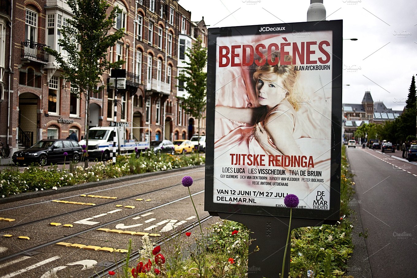
Real Life People Movie Billboard Example
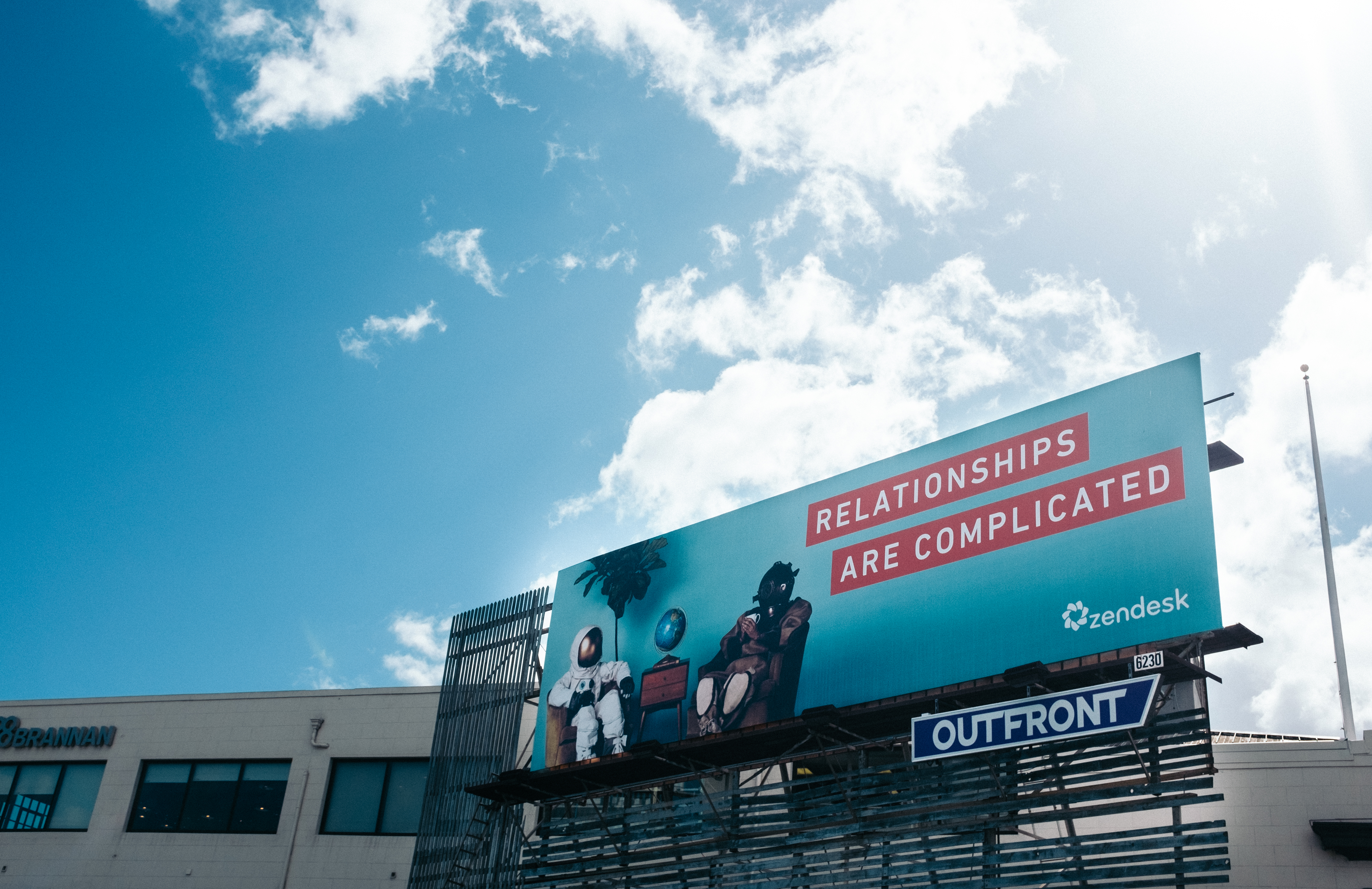
Outdoor Movie Billboard Example
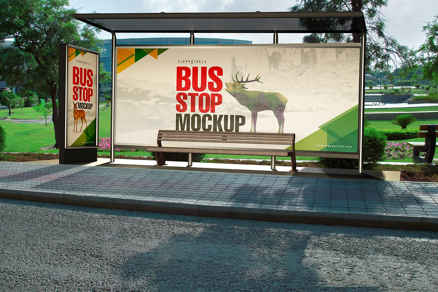
Outdoor Movie Advertising Billboard Example
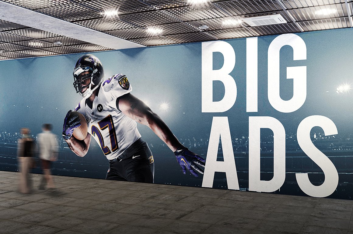
How to Design an Eye-Catching Billboard Ad
Business billboards are literally everywhere you look — whether you’re living in an urbanized city or along the outskirts of town. They have become a significant part of our landscape, and an important part of the out-of-home marketing mix.
But if you’re going to invest your hard-earned money in a high rise billboard ad, then you want to make sure it generates successful results. So to guide you through the design process, here a few tips for you to consider:
1. Make it Loud.
Though the size of the corporate billboard ad is enough to grab one’s attention, you need to ensure that the ad communicates accordingly as well. Ensure that your brand message is delivered properly to viewers by using clean, bold type that guarantees readability despite the distance given between the platform and its readers. You also need to make sure that there is balance among every design element in order to emphasize the message conveyed by the ad.
To put it in a nutshell, simplicity will be your best weapon to obtain effective advertising.
2. Go Beyond Expectations.
Given how billboards are located not far from one another, advertisers must strive to create a billboard design that stands above the others. This has nothing to do with the size of the billboard nor its type, but its about the ability of an advertiser to get a message across successfully to its ideal audience.
In the past, billboards were designed in a similar manner. They were of a standard size, and were made simply to advertise a product, service, or event. But these days, advertisers have finally learned how to make their advertisements more memorable by thinking out of the box. For instance, three-dimensional billboards have slowly made its way to the marketing scene by using realistic imagery to capture the attention of viewers. And instead of giving an obvious indication of what the ad is about, some advertisers use plain text that feature company taglines or catchphrases for people remember. You may also see retro billboard designs and examples.
3. Tell a Story.
Imagery plays a key role in visual storytelling, as this is what deepens the connection between a brand and its target audience. Since we’re all guilty of being terrible at remembering facts, telling a story through images and text is the best way to leave a lasting impression.
The secret to clever billboard advertising is to either use images that tell everything while also saying nothing, or to play with words that form a rhyme or chuckle that can help your message stick. The only thing you need to worry about is whether or not the ad is good enough to make an impact within five seconds or less. This is why testing the proposed ad with potential consumers must be done before the campaign is launched. You may also like poster billboard designs & examples.
4. Keep Text to a Minimum.
In average, drivers only have less than ten seconds to view your billboard, read its text, and comprehend the message given. Keep in mind that a driver could be busy glancing from the road to the billboard, and vice versa. With this in mind, you need to keep your message as short and as to-the-point as possible. After your initial message, any details that follow must be relevant to the billboard’s purpose. For example, most movie billboard simply consist of an image, and the film’s release date to create a sense of excitement and suspense among audience members. Prioritize what is necessary and keep information organized to prevent a cluttered layout that might make it difficult for prospects to read. You may also check out vertical billboard designs and examples.
5. Colors Matter.
Using bold and vibrant colors can definitely get a person’s attention. Applying contrasting colors that complement the theme of your billboard is a great way to highlight images or text that serve as the focal point of your billboard design. This way, each element of your design wouldn’t have to fight for attention but instead, it would lead the eyes toward the central message of the advertisement. You might be interested in restaurant billboard designs and examples.
6. Choose a Strategic Location.
Check your map. Billboards make the best impact when they are placed strategically at a particular location. One example for this is putting up a billboard ad that uses local slang to target a specific market. Drivers who are on the road for hours on end would really appreciate a good McDonald’s ad which points to the nearest store location. Not only can this appeal to hungry motorists, but it also influences a person to take immediate action. You may also see fitness billboard examples.
Without a doubt, investing in a good billboard advertisement will help you reach audiences in a cost-effective manner. It is one of the many ways to carry out out-of-home marketing to reach customers and clients through print and digital media. Creativity like this is worth exploring for many advertisers, as it allows you to incorporate unique yet relevant ideas into a simple billboard ad. Not only can this boost a brand’s market presence, but it also serves as an impactful ingredient to obtain successful branding.


