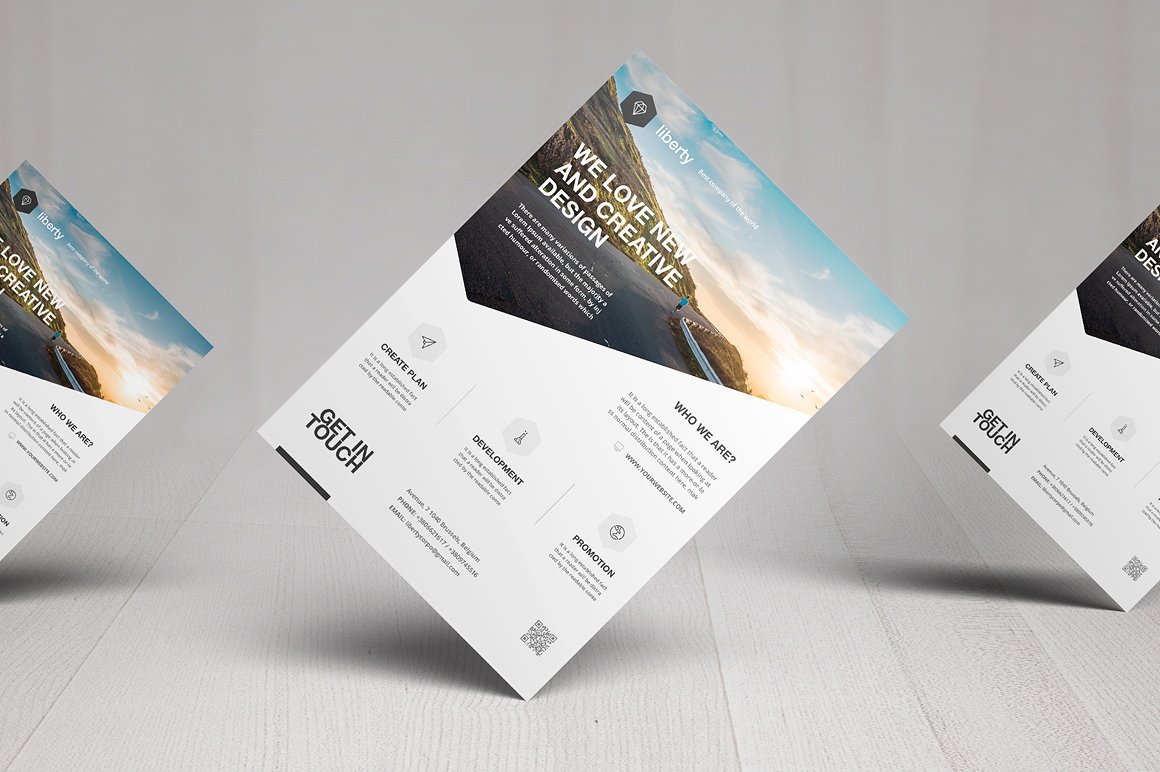
23+ Multipurpose Flyer Examples to Download
Marketing is considered to be one of the most important sectors of a business. The aim to create a strong brand lies on how well a marketing team can boost awareness and convert such opportunities to sales. But since marketing is about creating exposure towards your brand, you must be able to disseminate sufficient information regarding your product and services efficiently and effectively.
Flyers, as one of the cheapest marketing methods available, serve as the perfect advertising tool for business development. There are various multipurpose flyer designs that may be altered to fit a particular theme and purpose. But it’s not enough to just make a flyer design that’s attractive to look at, you also need to make sure your flyer speaks to your target consumers accordingly.
Multipurpose Flyer Template
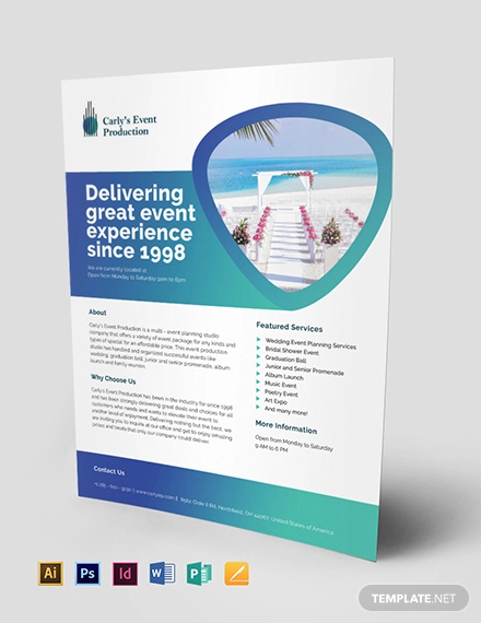
Simple SEO Flyer Template
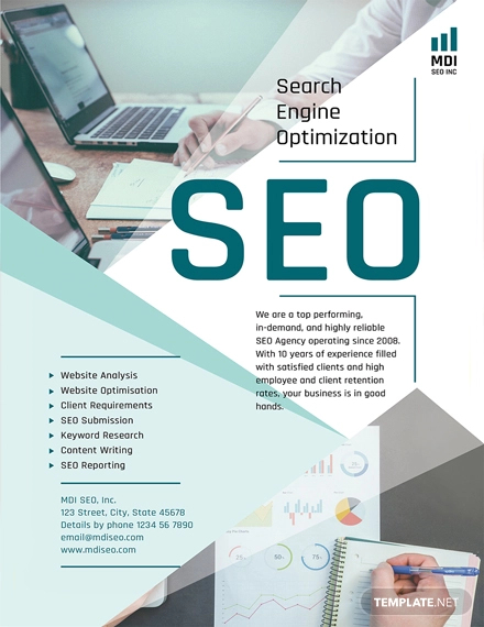
Corporate Flyer Template
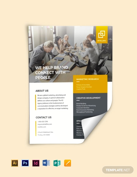
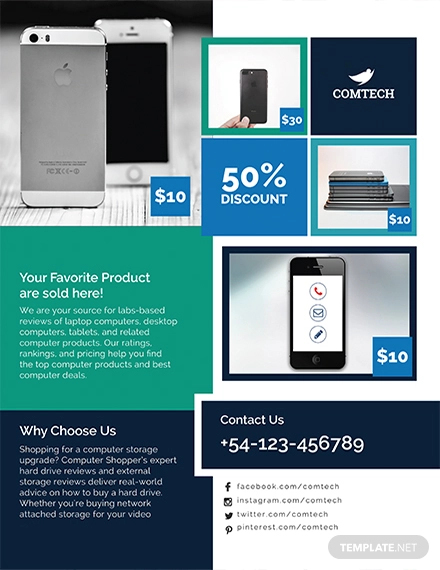
Free Multi Purpose Product Promotional Flyer Template
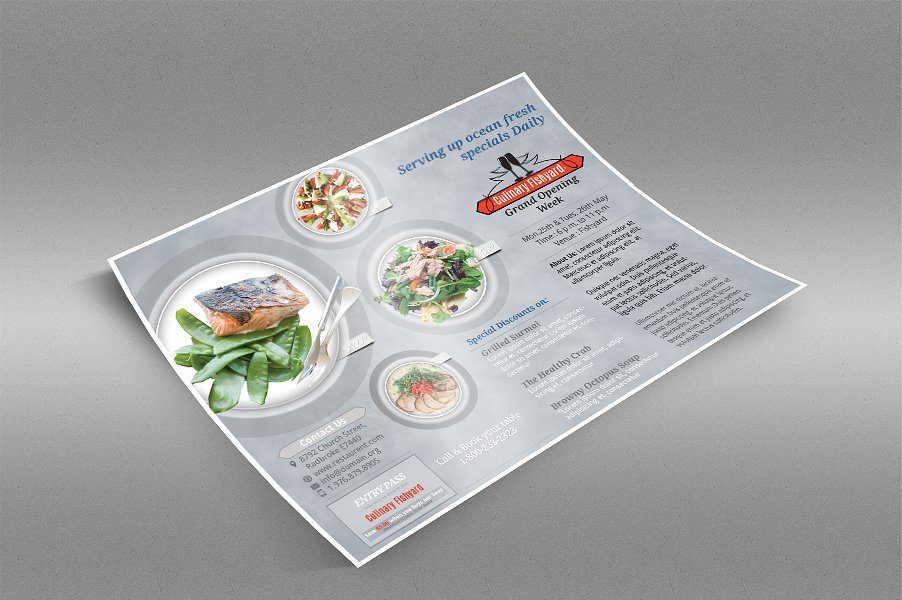
Multipurpose Restaurant Flyer Design
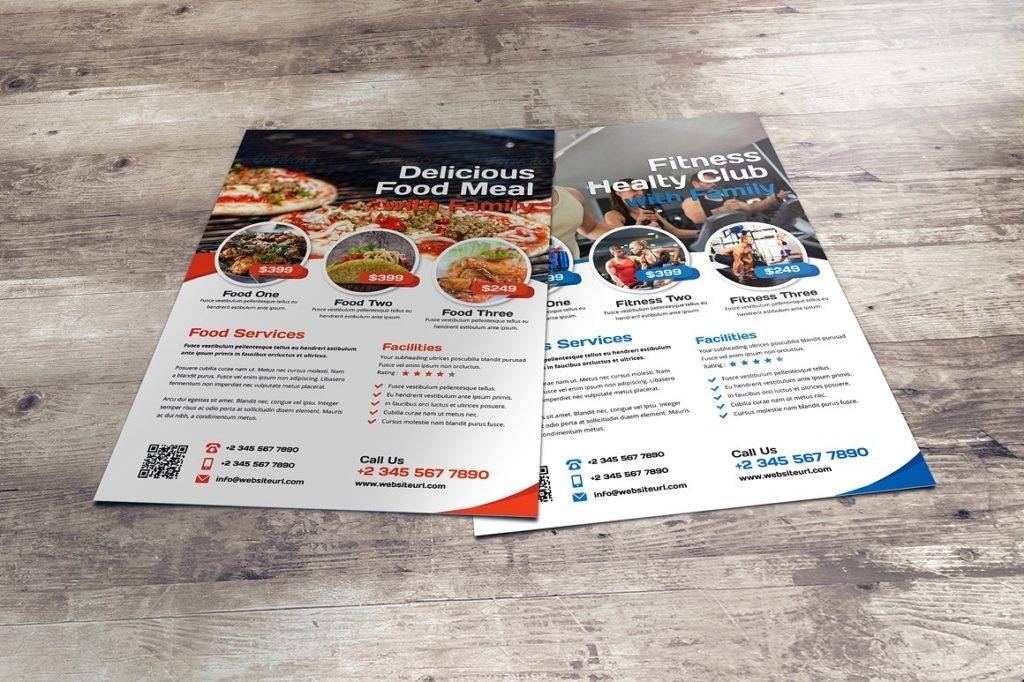
Multipurpose Corporate Flyer

Multipurpose Advertising Flyer
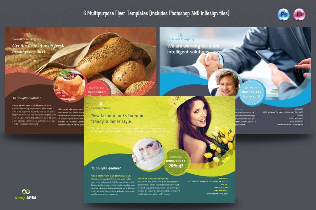
Simple Multipurpose Flyer Template
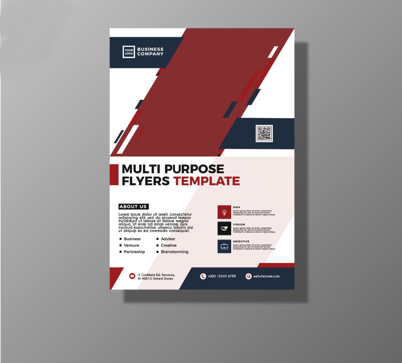
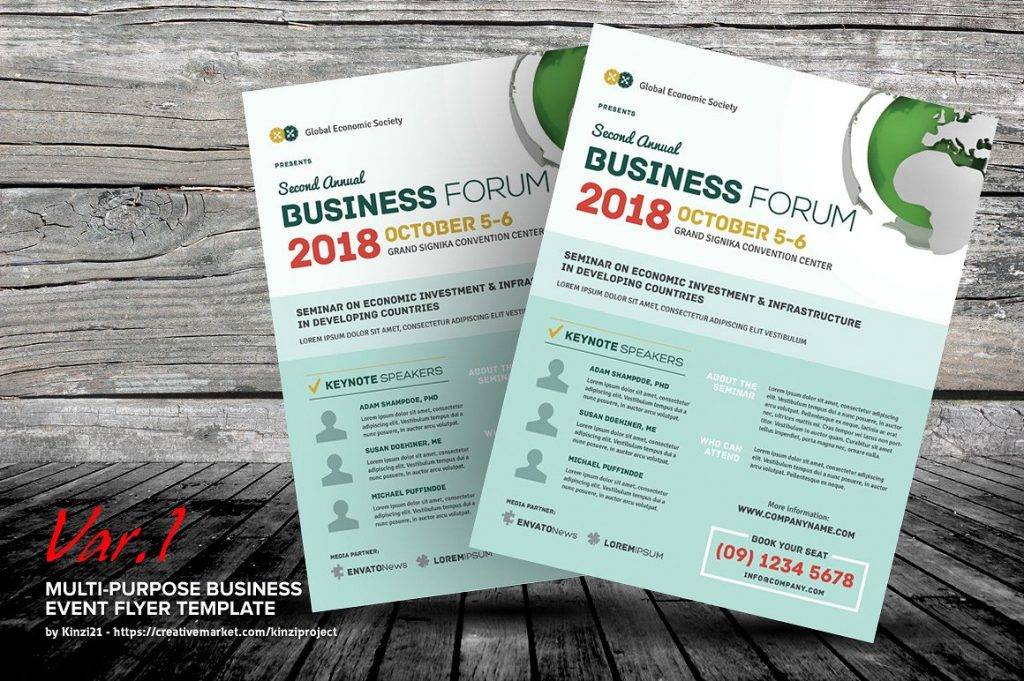
Multipurpose Business Event Flyer
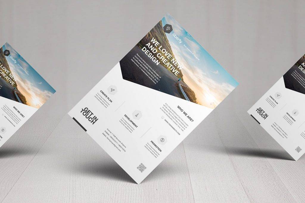
Multipurpose Business Flyer
Why Flyers Still Matter?
There’s no doubt technological advancement has paved the way for endless opportunities for advertisers to market their goods and services to consumers through various social media and digital marketing platforms. Companies take advantage of websites and popular social networks, such as Facebook, Twitter, and Instagram, to reach out to their online audience in the most efficient way possible. But with this advanced approach to marketing, can traditional marketing devices still make an impact?
Flyers have been around for years. You see them handed out around street corners or you may even have gotten one in the mail at some point. Like the regular marketing brochure and advertising poster, flyers are every advertiser’s favorite promotional tool to use. There are many reasons why a flyer can be just as effective as any other marketing medium, and it has a lot to do with its physical output. If you think about it, companies have been using this advertising technique for centuries, so it must be doing something right.
For starters, minimalist flyers are great for spreading brand awareness. You don’t have to worry about ad blockers that most online marketers struggle with. Not only is it relatively inexpensive to produce, but its means of distribution is quick and easy as well. Flyers are made out of a lightweight material, which makes it convenient to carry around and distribute in bulk. It’s also something that people can get their hands on. We have become so accustomed to online advertising that anything considered “real” can fascinate us almost immediately. And, because of how it awakens our human senses, it helps create a personal connection between advertisers and their prospective customers as well. This is great for building curiosity and interest among readers. The best part is, people actually take the time to read flyers! Social media posts may easily be ignored with a swipe of a finger, but flyers tend to be more inviting in nature. This is enough to make an individual pause and read the message you are trying to get across.
Multipurpose Corporate Flyer
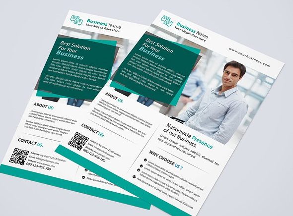
Multipurpose Real Estate Flyer
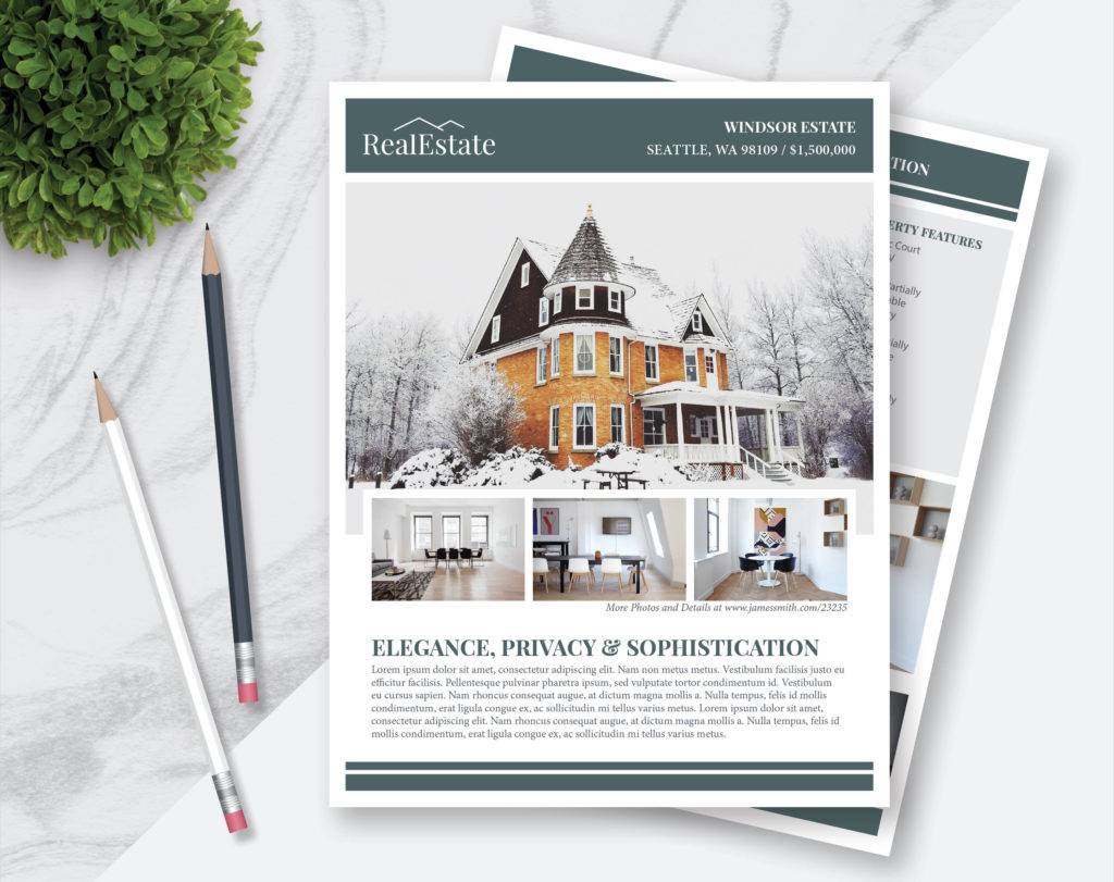
Multipurpose Company Flyer
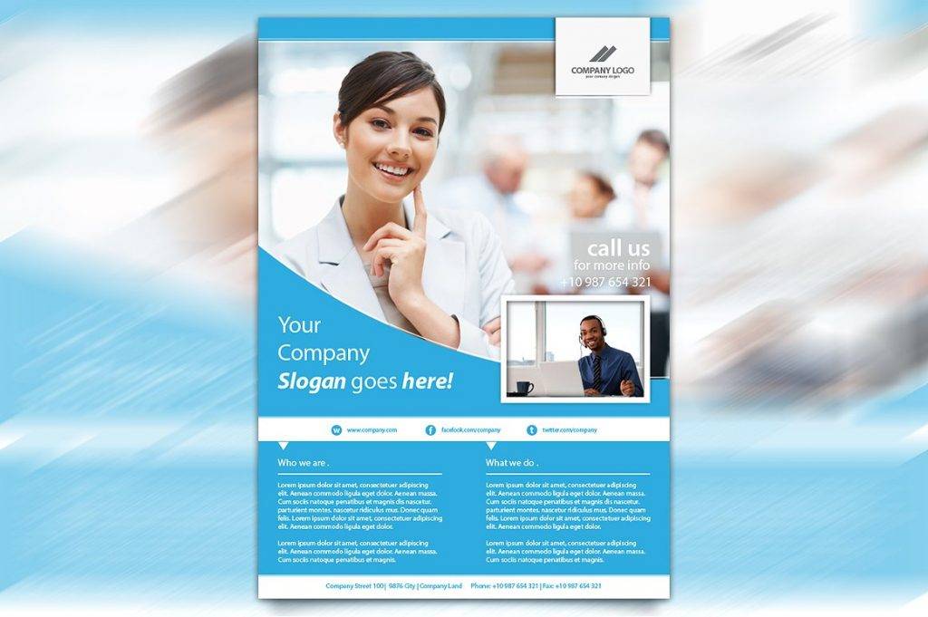
Multipurpose Service Flyer Design
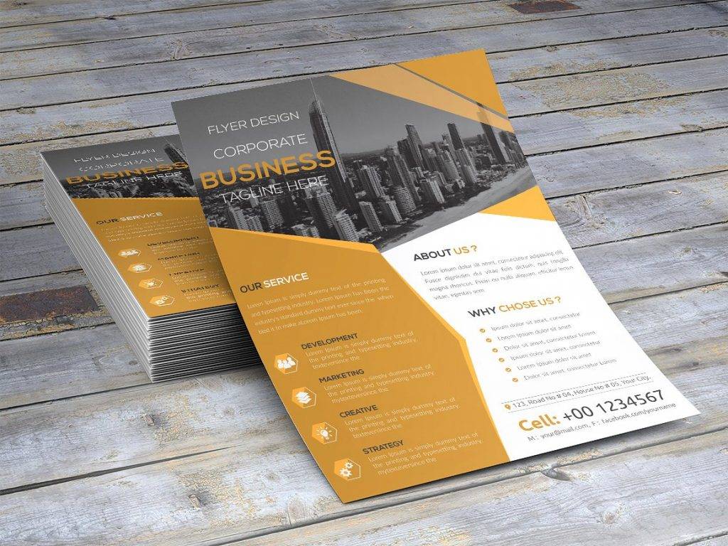
Multipurpose Retro Flyer
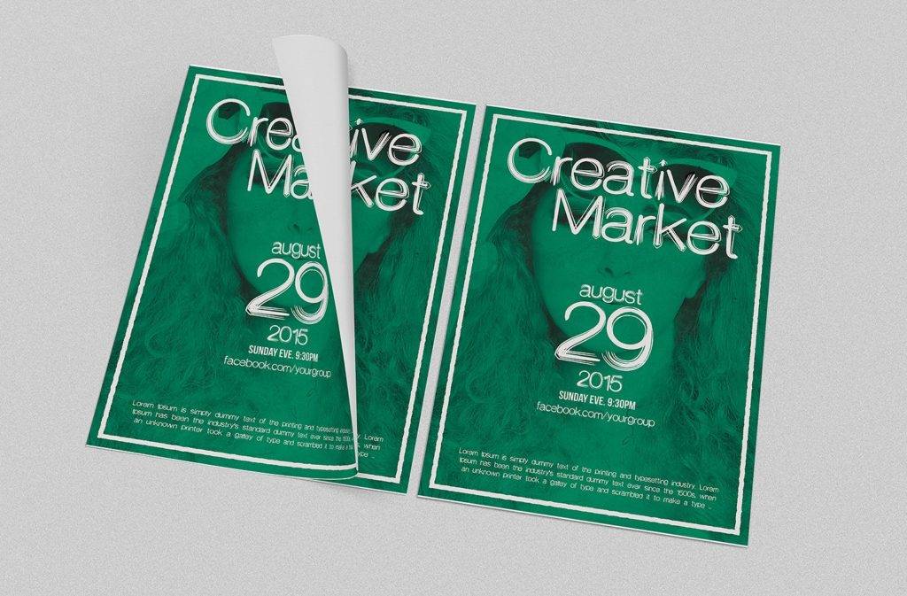
5 Common Flyer Design Mistakes (and How to Avoid Them)
How can you tell if a design is good or bad? While it may be subjective to some extent, there’s no doubt that a good design is one that can effectively communicate a message to its target audience. A bad design, on the other hand, would do the exact opposite. It might even give an advertiser a bad name. To avoid the unfortunate fate of a bad flyer design, here are five surprisingly common design mistakes ever committed by designers: You may also see DJ flyer.
1. Unbalanced Design Elements
Balance is considered to be a fundamental principle of design. The way various elements of your design are distributed throughout your layout provides a sense of clarity and stability. Although creating asymmetric design layout may seem like your best option, do not limit your creative ideas to such. Sure, it’s easy to associate balance with symmetry but when it comes to an advertisement flyer design, an asymmetric layout can do the trick just as well.
The secret is to create visual interest through the placement of your content. Text, images, and other design elements must be strategically placed in certain areas of your layout. This can also help you highlight sections that you want a person’s attention to be drawn to, making it easier for viewers to find the information they are looking for.
2. Not Enough White Space
The worst thing you can ever do is strew random content all over the entire page of your flyer. If you want to communicate effectively, then a cluttered layout won’t do you any favors. White space can help you control the proximity between the different text and design elements of your flyer. This allows you to keep related items together, making it easier for a viewer to grasp essential information. White space also leads the eyes to a particular direction, often creating a visual hierarchy that is logical enough for one to understand. But most of all, white space can help you effortlessly achieve a minimal and clean layout. You may also see grand opening flyer.
3. Awkward Text Alignment
If you want to avoid a sloppy design, then you may want to steer clear of the center-align option for your text. By all means, feel free to utilize a left- or right-alignment instead. Center-align would be ideal for headlines and single lines of text, as these do not produce awkward, ragged lines. It would also be best to justify your text to maintain consistency among each paragraph. Text alignment is an important principle to consider, as this can sometimes affect the look and feel of the design.
4. Overuse of Text
Long lines of text can often lead to disinterest. For some reason, reading lines of text of a certain length can cause fatigue. Your best solution is to keep it as short and as practical as possible. An average of 45-75 characters of text per line would be your most ideal option, so try to keep it at that. If you experience any trouble with such, then you can always adjust the size of your font, or may even your wording. Proper kerning must also be observed to attain a visually organized content. You may also see fundraiser flyer.
5. Use of Raster Images
Have you ever created a logo design before? If yes, then you may know why raster images aren’t a good idea.
To put it simply, raster images tend to appear pixelated and blurry when stretched or enlarged. A poor quality flyer isn’t exactly the most appealing marketing medium there is, so this is a common mistake you’d want to avoid. Vector designs, on the other hand, are exactly what you need. These may be scaled in any way you want and you wouldn’t have to worry about losing the quality of your design.
Printable Multipurpose Flyer Design
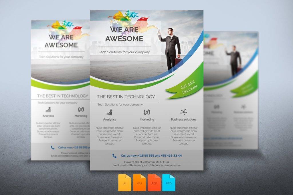
Multipurpose Modern Corporate Business Flyer
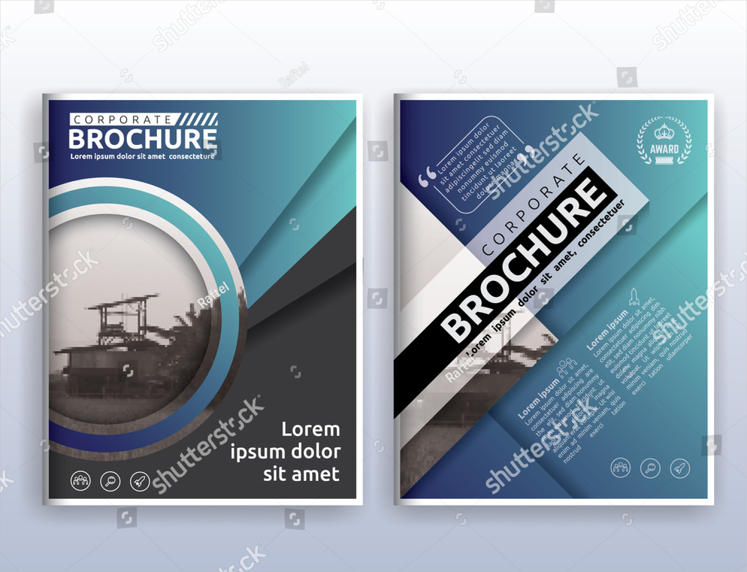
Corporate Agency Flyer
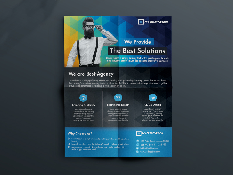
Multipurpose Web Flyer
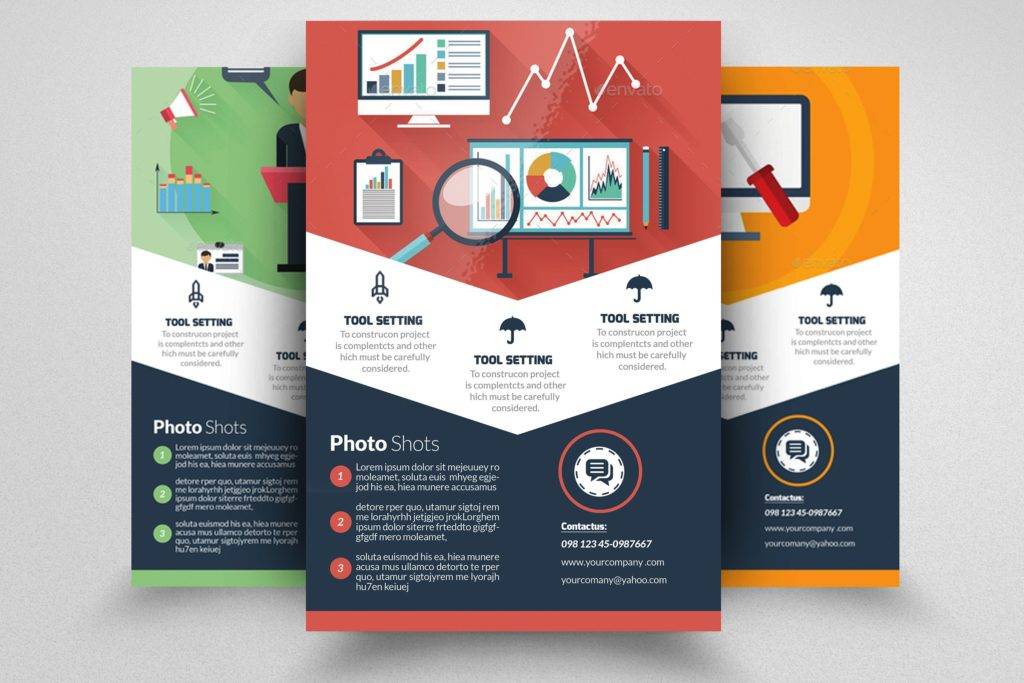
Multipurpose Marketing Flyer
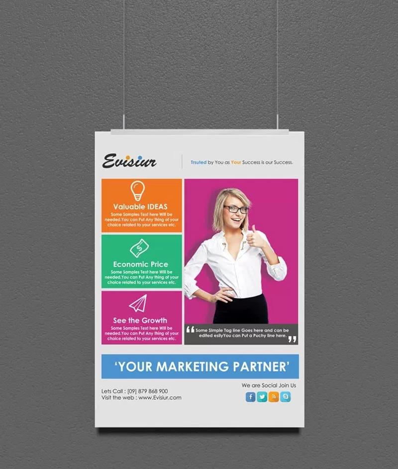
Multipurpose Service Flyer Design
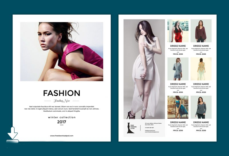
Multipurpose Fashion Flyer
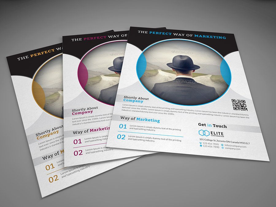
Colorful Multipurpose Marketing Flyer
Flyer Design Tips to Remember
We’ve all established that the primary purpose of a product promotion flyer is to attract new customers and keep the loyal ones engaged. But making something look good isn’t enough to generate sales, so you need to make sure to convey the right message as well. To create a flyer design that’s just as informative as it is attractive, here are some essential flyer design tips to bear in mind:
- Make it concise and easy to read. Keep in mind that the attention span of the average individual is extremely short, especially when something appears to require time and effort to go through. That being said, it’s important to keep it concise by adding the necessary details only. Font choice is also a major factor to consider, as this can affect how the text may appear from a distance. Be sure to follow the rules of typography when doing this to avoid unreadable text from dominating the layout of your flyer.
- Use grids if necessary. Space can be a huge issue when it comes to a flyer design. For instance, business flyers require more text details than regular party flyers, as its primary purpose is to keep customers fully informed of company products and services. But because the amount of information added may go against the idea of keeping it concise, you must be able to maximize the space available in the best way possible. Most designers settle this issue by utilizing layout grids. This allows the flyer to retain a clean and minimal look without having to eliminate any content. It won’t hurt to spend some time mapping out your grid before you begin the design process.
- Make a bold statement. A headline has to be one of the most significant elements of any flyer design. It’s usually the first thing a person sees on your flyer, giving the reader a general idea of what you are advertising. It doesn’t need to be catchy, just compelling enough to earn a second look. This encourages an individual to pick up your flyer, which gives you the opportunity to make your sales pitch.
- Keep it simple, yet eye-catching. A minimal flyer design can do wonders in the world of advertising. For one thing, aiming for an aesthetic that is subtle and calm can easily draw attention. This is because it emphasizes certain elements that support the message you want to convey to your audience. Apart from choosing colors of a cooler tone, you also need to keep photos to a bare minimum. Photos and other graphic elements are there to simply serve as a support system, not to overshadow your central message. Go for icons that add to the visual element of your design, as these will help enhance your message without dominating your overall flyer design.
- Be approachable. Never underestimate the power of a smiling human face on the cover of any advertising material. For most people, the flyer represents what your business stands for. You need to leave a positive impression by using photos or other design elements that symbolize a friendly approach. This can make customers feel at ease whenever they come across your brand. But be careful when you do so, as you may end up looking a bit forced and corny in the process.
- Tweak the mood through color. By now, you must be aware of the vital role color plays in your flyer design. You see, color is more than just a decorative element, as this is what gives life and personality to a design. The color palette that you choose may greatly affect the overall tone and mood of your design, so be sure to choose wisely. Try experimenting with various color patterns and see which suits the message of your flyer best. For instance, blue and grey tones portray straightforwardness and intellectual capacity, which is ideal for corporate flyer designs. But if you’re designing a concert flyer, then you may want to use colors that reflect the image and personality of the artist playing.
You could have the most powerful marketing idea in place but without a good design, your clever idea could get lost in translation. It’s every advertiser’s dream to create a clean and professional content. But this is almost impossible to attain without proper knowledge in flyer design. So whether you’re starting a business or promoting an event, remember to keep all these design facts and tips in mind!


