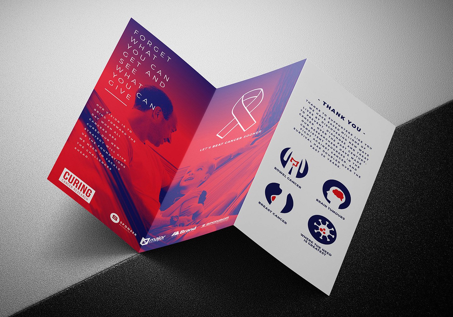
19+ Nonprofit Brochure Examples to Download
There’s no doubt technology has made life a lot easier, allowing us to complete everyday tasks so much faster than before. So with the birth of digital tools and online marketing, how relevant are brochures to today’s age?
You’d be surprised to know that brochures still play a significant part in advertising for our modern-day society. Sure, it may not be as popular as it used to be, but it maintains its status as a common marketing tool for companies and organizations to reach out to their audience. It’s not so much that digital marketing isn’t effective enough, but most companies appreciate the convenience and cost-effectiveness of the old-fashioned brochures. For one thing, it’s an affordable medium that nonprofit organizations can use to spread awareness about their cause and encourage the public to get involved through an informative and impactful brochure design.
Non Profit Annual Tri-Fold Brochure Example
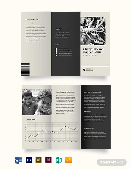
Non Profit Annual Bi-Fold Brochure Example
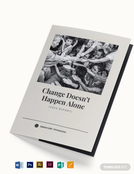
NGO Annual Report Bi-Fold Brochure Example
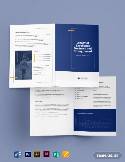
NGO Annual Report Tri-Fold Brochure Example
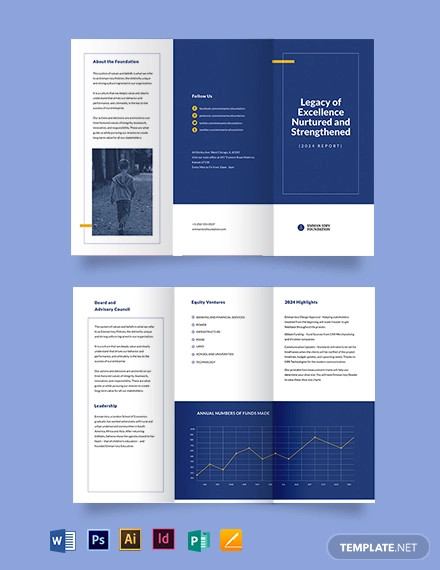
Free Non-Profit Tri-Fold Brochure Example
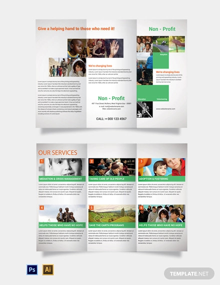
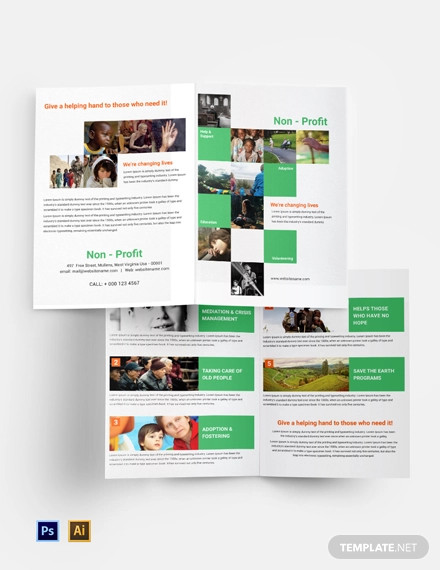
Free Non-Profit Bi-Fold Brochure Example
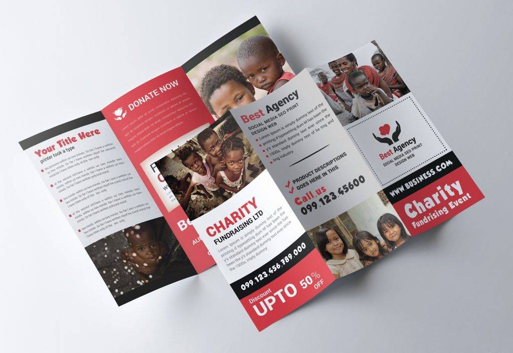
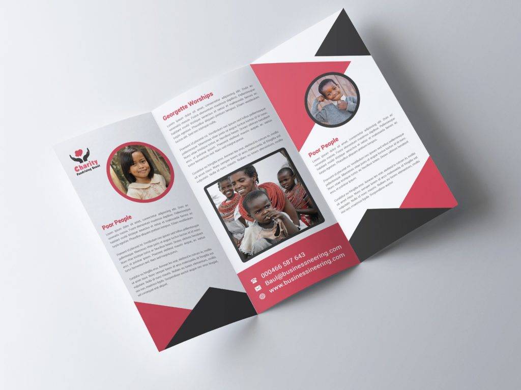
Charity Tri-Fold Brochure
Church Mission Brochure
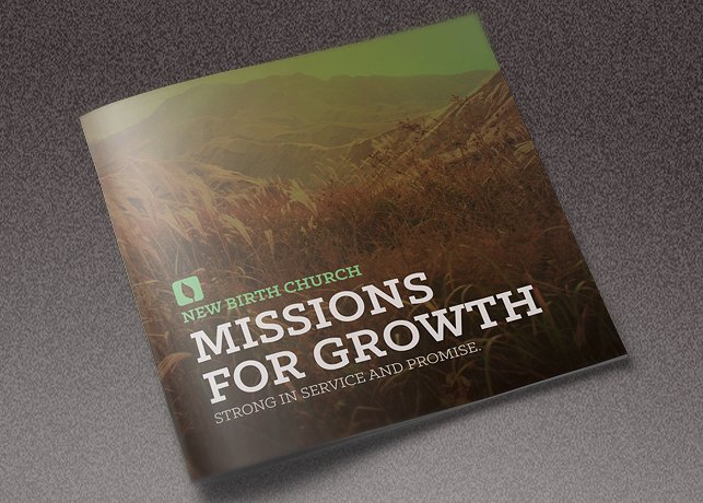
Brochure is an effective way to attract your clients and showcase your services in an organized way. You can use this Bi-Fold Brochure examples to edit and customize in any way you want. It also comes with high quality pictures and attractive design. It is not only handy to use but also will definitely help you attract more customers and grow your business rapidly.
Modern Nonprofit Brochure
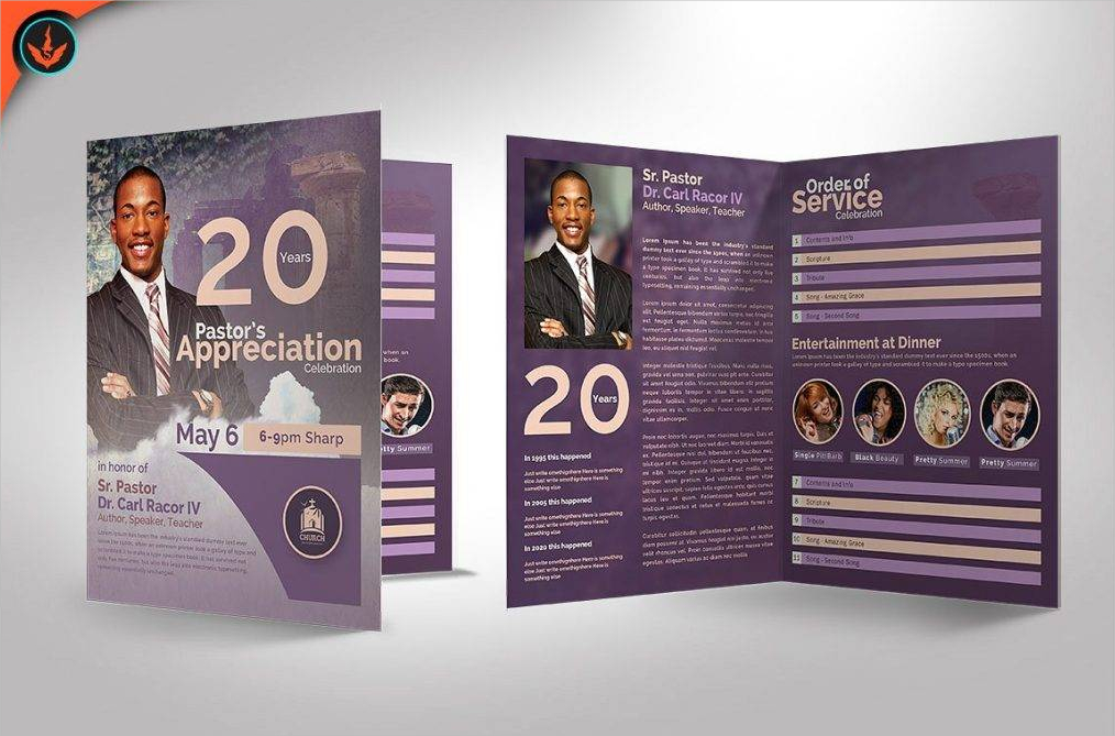
Simple Charity Brochure
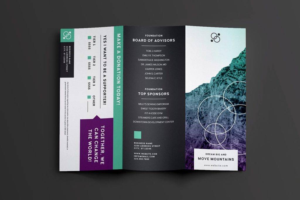
Nonprofit Tri-Fold Brochure
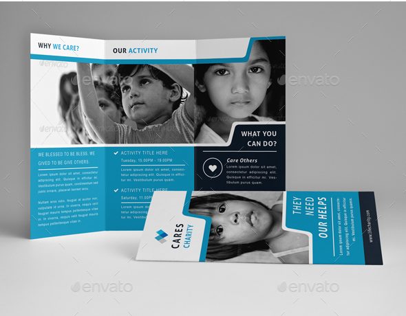
5 Key Elements of an Effective Brochure
We all know that brochures are meant to market a given product, service, or event. But how likely is it for a person to pick up and open your brochure at a given moment? To make sure your efforts don’t go to waste, here are five essential attributes of an effective brochure:
1. Attention-Grabbing Cover
Brochures are meant to be informative reading materials that demand a call of action. But to begin with, how are you supposed to get your message across without even grabbing the attention of your prospective readers? There are three characteristics of a captivating brochure cover: a striking image, an eye-catching headline or phrase, and your organization or company logo. By adding these to your cover, you can pique one’s interest and prompt them to take a good look at your brochure.
2. Compelling Text
Now that you have successfully captured a person’s attention, it’s now time to take full advantage of this opportunity. What a reader looks for in a modern brochure is both the problem and the solution that would benefit them, or in the case of charity programs, benefit society. Focus on providing significant information that your readers will ponder on, probably a gist of what they should know rather than a detailed history of what you do. You could make use of visual imagery, such as charts, graphs, and images to present and support these details more clearly for your audience to fully grasp.
3. Typeface
Little do some designers know how important type is in making an effective brochure. You see, the font you use, along with the size you choose, affects the overall mood and impact you leave your readers. For example, most experts would say that it’s almost sinful to use Comic Sans for a company brochure, or for any instance in that matter. You want the content of your brochure to look professional, while still being readable. Additionally, you could use different sizes to provide emphasis on important information. This will draw one’s attention to the statement, forcing a reader to comprehend on its message.
4. Call to Action
While brochures are made for various reasons, they all share a common purpose, and that is to move people to act on a particular situation. Do you want them to make a donation for your cause? Apply as a volunteer? Or maybe purchase a certain item? A good call to action tells a reader what to do without beating around the bush. If anything, this element should stand out the most among all others. Keep it short and simple, yet powerful enough to make a difference.
5. Engaging Photographs
Apart from the text, colors and graphics of your brochure, photographs play an essential role in visual impact. If we had to be honest about it, images seem to appeal to us more than mere words. Having that in mind, it would be best to include photos that reflect what your company does, like actual scenarios that support your cause. Make sure these photos send a clear message and are of high-quality as well.
Core Church Brochure
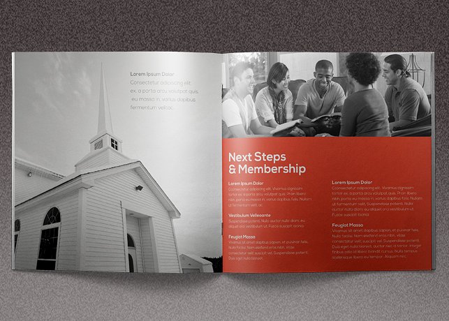
Cancer Charity Brochure

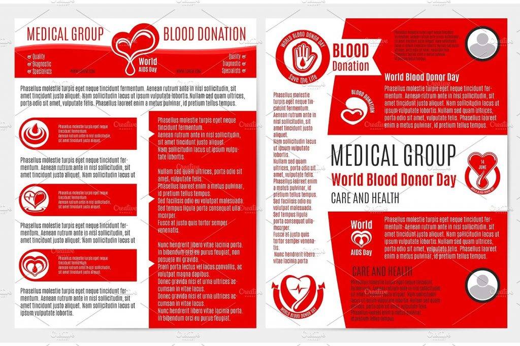
Blood Donation Brochure
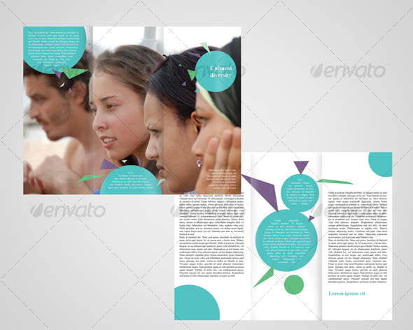
Church Group Brochure
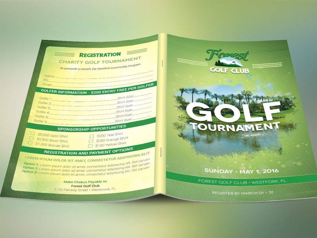
Charity Golf Tournament Brochure
Importance of a Good Brochure
Brochures play a key role in marketing, as they are considered to be light promotional tools that may be produced and distributed easily by bulk. They are both effective and convenient to carry around compared to catalogs and magazines, not to mention a lot more affordable than paying for a space on a newsprint ad. This allows a company or organization to focus entirely on what the business has to offer, without having to compete for attention.
But are brochures really necessary in this era of digital marketing?
Apart from being cost-effective, brochures help you target specific markets. Unlike sponsored social media ads and emails, people actually take the time to scan through the brochures handed or sent to them through mail. Not only are you given the privilege to be heard, but you also have enough time and space to elaborate the nature of your business. This includes basic information about your company, such as products, services, and contact details. Now, you wouldn’t need to have an hour-long conversation with your customers regarding your business, as everything they need to know is summarized in a brochure. This can reduce customer traffic in retail stores and offices, leaving you with satisfied customers all throughout.
Nonprofit Charity Brochure
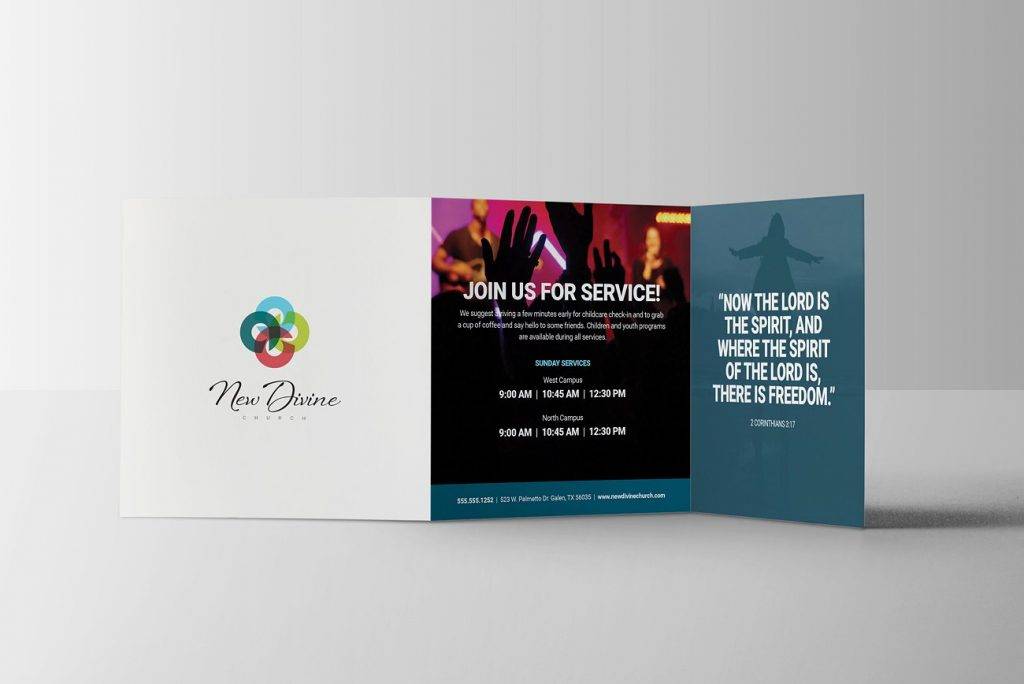
Modern Church Brochure
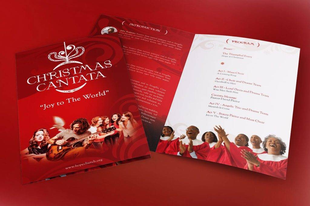
Christmas Program Brochure
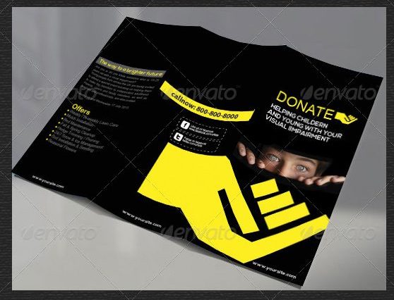
Tri-Fold Donation Brochure
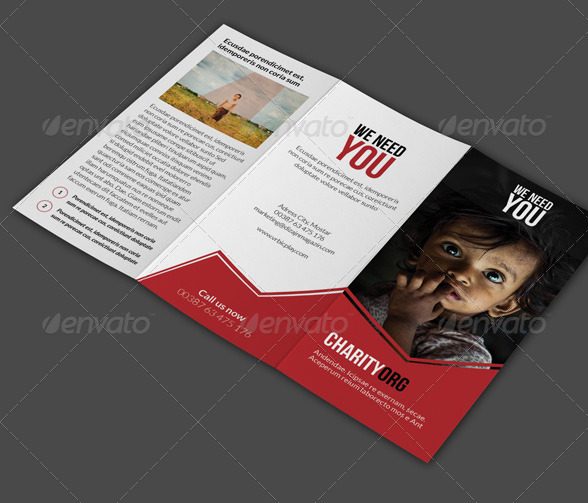
Community Charity Brochure
6 Creatives Tips for Making a Brochure
When you’re tasked to design a brochure, what’s the first thing you do? Do you immediately sketch out what you envision the brochure to look like? Or do you brainstorm several ideas and narrow it down to the best one? Although every graphic artist has a personal approach to designing a brochure, here are six helpful tips you might want to consider:
- Know your purpose. Before you jump into the whole process of developing a brochure, start by doing your homework first. Communicate with your client on different options and preferences. Learn more about the company, specifically the values they hold and the market they serve. This will allow you to set goals for yourself and conceptualize on a central idea. Keep in mind that it’s impossible to achieve success without a clear path in place.
- Limit the use of fonts. In the world of marketing, clarity and consistency go hand in hand. It’s important to refrain from using multiple fonts by using a maximum of three different ones (for the heading, subheading, and body text). In terms of font choice, clients that have already built a corporate identity usually take the lead for this. But don’t hesitate to give your own take if the circumstance calls for it.
- Put emphasis where it is needed. The problem with brochures, or any reading material for that matter, is that people tend to skim through them than actually read its content. This is why it’s important to highlight the significant parts of your brochure, which includes the headlines and call to action. You can even magnify these parts by adjusting the layout of your material.
- See from a reader’s perspective. As a designer, you always have to consider the end purpose of your creation. Who are you trying to impress? When and where will your brochure be used? Look at your brochure from a different angle, one that is completely clueless of what it stands for. Without being biased about it, ask yourself whether the brochure bears all the necessary elements to give you the urge to pick it up. This will help you find the mistakes you may have overseen in the beginning. Remember, you’re designing for the benefit of the reader, not for yourself.
- Make use of simple statements. If you want to make your brochure stand out, you have to make sure it relates to your market. Being relatable doesn’t constitute to a cliché design, it just has to be simple enough for a person to fully understand the message you want to get across. Avoid jargon, as this can also cause misinterpretation and confusion among readers. And as much as possible, your brochure should be appropriate enough, in terms of content, for all types of individuals.
- Leave a good impression. While there’s a time and place for everything, there’s a proper approach to every situation. Let’s look at this way, society is quick to judge a certain person or object based on its physical attributes. If your brochure bears a luxurious design, then people would think you spent good money on it. This reflects a jewelry shop or a high-end brand accordingly but for a charity group, not so much. Everything about your brochure, including its material and content, will affect the perception of your audience towards your company, and therefore influence their decisions.
Brochures have helped companies and organizations connect with their prospective audience in the most efficient way. And although digital ads with 3D graphics and the like succeed in garnering public attention, there’s nothing like a good brochure to read, carry around, and share with friends. Yes, print ads still exist. And yes, they can do the job just as well.


