19+ Poster Examples to Download
When it comes to mass advertising, words won’t be enough to effectively deliver your message. You need a striking visual to draw attention, make a point, and gain a response. Fortunately, this can easily be obtained with the help of a good poster design.
In this article, we have provided a few templates, examples, and design techniques to inspire you create a stunning poster design for any given purpose.
Elements of a Good Poster Design
Listed below are the key elements that a good poster design must have:
1. Headline: The headline of your poster carries general information about the subject being celebrated or advertised. It’s usually printed in a much larger font size and style to help emphasize the text presented. The headline must be kept short yet compelling enough to garner attention and pique one’s interest. This should make your purpose known even at a single glance.
2. Message: Along with any other marketing medium, the message conveyed by your poster should help you achieve a defined goal. Consider how you want people to respond to your ad after they have encountered it. It can be anything from buying concert tickets to see your band or calling a number to inquire about a new product offer. This is usually translated through the text and graphic elements incorporated into your design.
3. Graphics: Colors, illustrations, and other forms of graphics are a significant addition to your poster design. Not only can these graphic elements capture a person’s attention, but they can also give your audience something to remember you for. This enhances the overall look and feel of your poster, helping you stand out from a sea of competitors.
4. Branding: Whether or not you represent an established brand in the industry, incorporating your brand identity into whatever advertising material you make is highly encouraged. This allows you to introduce and remind people of your brand to help maintain consistency and build awareness. Using something note-worthy like your logo design is sure to stick on top of one’s mind.
5. Contact Information: Some of your readers might have a few questions or inquiries that need to be addressed. The best way to entertain them is to provide an updated list of your contact details. This includes your phone number, email address, and social media accounts. That way, you can still stay connected with prospects and customers long after your event has passed.
19+ Poster Templates
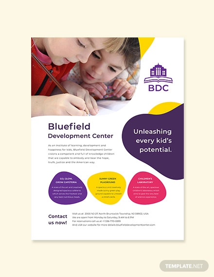
School Poster Template
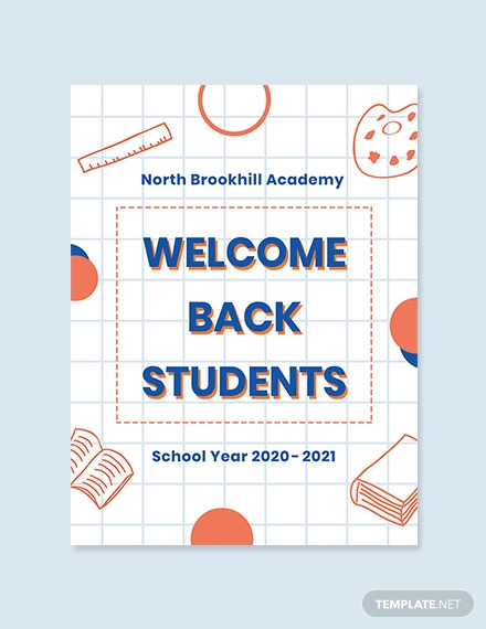
Back To School Poster Template
Armed Forces Day Poster Template

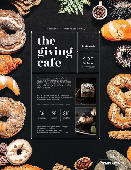
Artisan Bakery Poster
Charity Event Poster

Jazz Music Concert Poster

Jewelry Store Discount Poster

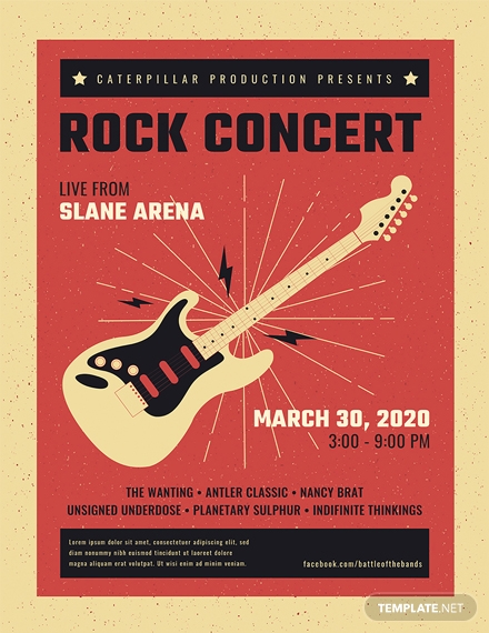
Live Rock Concert Poster
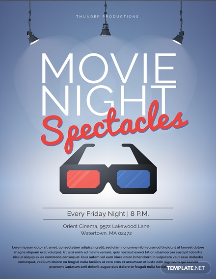
Movie Night Poster
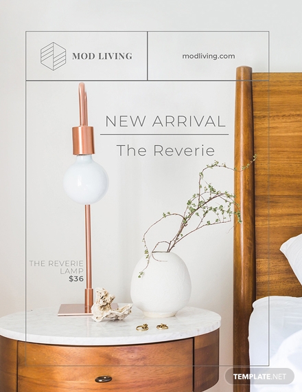
New Arrival Announcement Poster
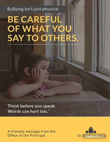
School Advertisement Poster Template
Summer Camp Poster Design

10+ Poster Examples
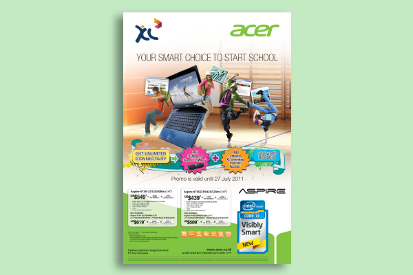
Acer Back to School Poster
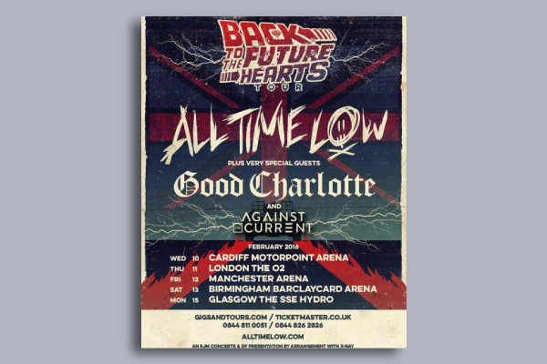
All Time Low Tour Poster
Dunkin’ Donuts National Donut Day Poster

Harvard Demand Response Poster

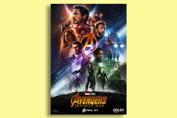
Marvel Infinity War Poster
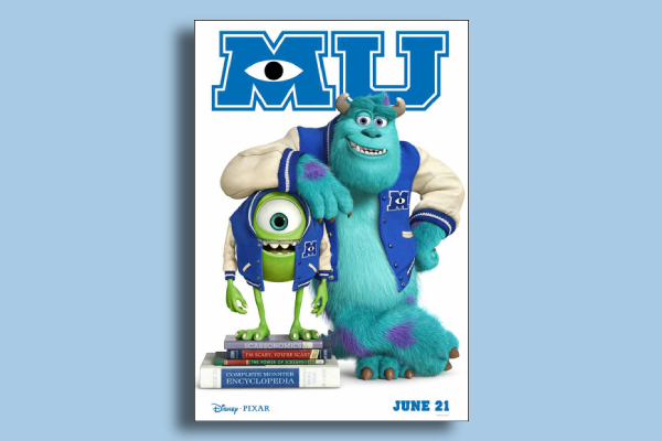
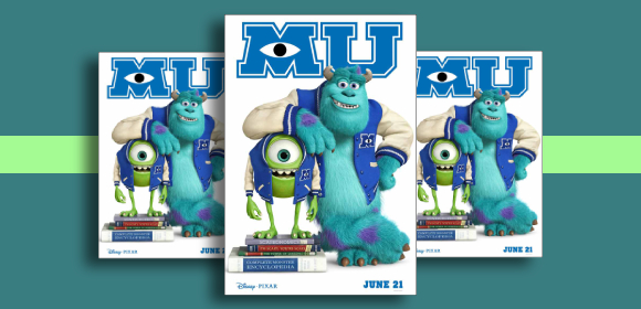
Monsters University Movie Poster
Star Wars Movie Poster

Vans Warped Tour Mexico Poster

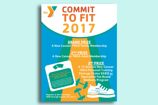
YMCA Campaign Poster
How to Create a Poster
Designing a poster isn’t as difficult as you might think. Since we’ve already established what the general elements of a poster design are, here is a five-step guide on how you can create a poster with ease:
1. Decide on a format: This includes the size and page orientation of your poster. This will help you maximize the space and function of your poster in the best way possible. By choosing the right format, you can easily determine the placement of elements in the succeeding steps.
2. Brainstorm and conceptualize on your design: Before you put pen to paper, gather your thoughts together to form one clever idea. This should be relevant to your purpose, yet impactful enough to generate a positive response from viewers. It’s best to collect ideas from your colleagues or teammates to build a design that everyone will agree on. After which, you can use this concept to construct the outline of your poster which will guide you through the actual design process. You may also see vintage poster examples
3. Apply the necessary elements: As mentioned earlier, a good poster design is comprised of a few major elements. Each element plays an important role in getting your point across to a desired audience. Note that these elements must be added strategically to your poster design with the help of a few editing tools and features available in the software you are using.
4. Experiment with different styles: Try out different techniques in typography, alignments, patterns, and color applications. There are a lot of things you can do to improve the look of your poster and make it stand out. Don’t think twice about studying the competition and learning a thing or two from popular brand posters. Whether you’re creating a campaign poster or an event poster, there’s bound to be at least five other designs in the market that you can draw inspiration from.
5. Proofread and edit your content: Never take proofreading for granted. Always remember to review and revise your poster whenever necessary to prevent any mistakes from ruining your final output. After all, this can be a costly venture to undergo. It’s also a good idea to omit unnecessary details from your layout to keep your poster fresh and clutter-free.
Simple Tips for Designing an Eye-Catching Poster
Now that we’ve covered the basics of crafting a good poster design, let’s find out how you can enhance the impact of your poster through the following techniques:
- Make it readable from a distance: Posters, as a whole, are visible from a fair distance due to their large size. However, the information they hold can sometimes be difficult for viewers to read. Keep in mind that it’s not always possible for a person to come close to the poster just to read it. Sometimes, you simply need to use a readable but interesting typeface to draw attention. You can use a prototype or mock-up of your poster for testing before you proceed to the printing process.
- Start with a grand idea: When it comes to a great poster design, it’s not always about the aesthetics. Anyone with the skills can make your poster look good, but it takes a whole other level of creativity to make your idea clever. The secret is to gather your deepest thoughts together in order to create a visual that’s unique yet memorable. However, try not to make it too complicated for the average person to comprehend.
- Consider the location: Several factors of the poster design may be determined once you have decided on the location of your ad. This includes the size of the poster and its internal elements, as well as the visual clutter. For instance, if you plan to display your poster along the walls of a busy street corner, be sure to use a contrasting color scheme that’s hard to go unnoticed.
- Maximize space: This is a popular technique that advertisers apply to movie posters and product advertisements. The use of space dramatically enhances the visual impact of the poster, making it difficult to ignore. This also improves the readability of your content by keeping it clean and organized. You may also see business poster examples
- Explore various styles in design: Never limit your capacity to what you already know or to what people have been telling you to do. Sometimes, the greatest designs are a product of discovery. Learn to go beyond one’s expectations by experimenting with loud colors, vintage elements, and funny images. Not only can this entertain your viewers, but it can also make your design experience all the more enjoyable.
Types of Posters
Here are the common types of posters you’re likely to encounter:
- Standard Posters: This refers to the posters you find at bus stops, bulletin boards, and storefronts. Standards posters are more informative than decorative as they are typically used to advertise an event or cause similar to how any other promotional device would. They can be taped, stapled, or pinned to the wall to keep the material in place for everyone to see. Take a look at advertising posters for reference.
- Hanging Posters: If you think sticking a poster up on the wall is a messy deed, perhaps a hanging poster would be more appealing to you. You can use binder clips, hangers, or magnetic ropes to hang the poster in a frame-like manner. This is a great alternative to the standard type of posters as you won’t have to worry about the edges getting torn apart or ruining the paint and texture of your walls once you have it removed.
- Digital Posters: Because we’re living in the digital age, it’s safe to say that technology has slowly taken over our means of advertising. So instead of printing a few posters to hang up in public areas, many advertisers have taken their campaign to the next level with the help of the modernized digital posters. These posters are often displayed around heavily crowded locations such as train stations, malls, and city centers. What makes these posters unique is how it provides advertisers the opportunity to experiment with animation and other forms of motion design.
Poster FAQs
What is the purpose of posters in advertising?
One of the most notable features of a poster is its visual design. As humans, we tend to respond better to illustrations and graphics when trying to understand the message being conveyed. This is why many advertisers consider posters a key part of their multichannel marketing campaigns. This allows brands to carry their message across to a targeted audience with only a minimal amount of effort required.
What is the best size for a poster?
While there isn’t an official standard size for posters, most printing and advertising companies are consistent with the poster sizes they use for a particular purpose. This includes the smallest poster size (11 × 17 inches), the medium (18 × 24 inches), the large (24 × 36 inches), and the movie poster sizes (27 × 40 inches and 40 x 60 inches). When choosing the right poster size, be sure to consider various factors such as costs, personal preference, location, and longevity.
What paper is used for posters?
Paper choice and weight is usually determined by the type of printer you are using. However, a 170gsm Silk or Gloss Art FSC or 150gsm are highly recommended by most experts. Not only are they a durable selection for your poster design, but they also leave a professional look and touch to your marketing material for prospects to remember.
So there you have it! Create captivating poster designs today with the help of the poster templates, examples, and design ideas provided in this article.
19+ Poster Examples to Download
When it comes to mass advertising, words won’t be enough to effectively deliver your message. You need a striking visual to draw attention, make a point, and gain a response. Fortunately, this can easily be obtained with the help of a good poster design.
In this article, we have provided a few templates, examples, and design techniques to inspire you create a stunning poster design for any given purpose.
Elements of a Good Poster Design
Listed below are the key elements that a good poster design must have:
1. Headline: The headline of your poster carries general information about the subject being celebrated or advertised. It’s usually printed in a much larger font size and style to help emphasize the text presented. The headline must be kept short yet compelling enough to garner attention and pique one’s interest. This should make your purpose known even at a single glance.
2. Message: Along with any other marketing medium, the message conveyed by your poster should help you achieve a defined goal. Consider how you want people to respond to your ad after they have encountered it. It can be anything from buying concert tickets to see your band or calling a number to inquire about a new product offer. This is usually translated through the text and graphic elements incorporated into your design.
3. Graphics: Colors, illustrations, and other forms of graphics are a significant addition to your poster design. Not only can these graphic elements capture a person’s attention, but they can also give your audience something to remember you for. This enhances the overall look and feel of your poster, helping you stand out from a sea of competitors.
4. Branding: Whether or not you represent an established brand in the industry, incorporating your brand identity into whatever advertising material you make is highly encouraged. This allows you to introduce and remind people of your brand to help maintain consistency and build awareness. Using something note-worthy like your logo design is sure to stick on top of one’s mind.
5. Contact Information: Some of your readers might have a few questions or inquiries that need to be addressed. The best way to entertain them is to provide an updated list of your contact details. This includes your phone number, email address, and social media accounts. That way, you can still stay connected with prospects and customers long after your event has passed.
19+ Poster Templates
School Poster Template

Details
File Format
Illustrator
Pages
Photoshop
Size: A4, US
Back To School Poster Template

Template Details
[nbsp]
[nbsp]
[nbsp]
Size: A3, US
Armed Forces Day Poster Template

Template Details
[nbsp]
[nbsp]
Size: (A3) 11×17 inches
Artisan Bakery Poster

Template Details
[nbsp]
[nbsp]
[nbsp]
Size: (A3) 11×17 inches
Charity Event Poster

Template Details
[nbsp]
[nbsp]
[nbsp]
Size: (A3) 11×17 inches
Jazz Music Concert Poster

Template Details
[nbsp]
[nbsp]
[nbsp]
Size: (A3) 11×17 inches
Jewelry Store Discount Poster

Template Details
[nbsp]
[nbsp]
[nbsp]
Size: (A3) 11×17 inches
Live Rock Concert Poster

Template Details
[nbsp]
[nbsp]
[nbsp]
Size: (A3) 11×17 inches
Movie Night Poster

Template Details
[nbsp]
[nbsp]
[nbsp]
Size: (A3) 11×17 inches
New Arrival Announcement Poster

Template Details
[nbsp]
[nbsp]
[nbsp]
Size: (A3) 11×17 inches
School Advertisement Poster Template

Template Details
[nbsp]
[nbsp]
[nbsp]
Size: (A3) 11×17 inches
Summer Camp Poster Design

Template Details
[nbsp]
[nbsp]
[nbsp]
Size: (A3) 11×17 inches
10+ Poster Examples
Acer Back to School Poster

All Time Low Tour Poster

Dunkin’ Donuts National Donut Day Poster

Harvard Demand Response Poster

Marvel Infinity War Poster

Monsters University Movie Poster

Star Wars Movie Poster

Vans Warped Tour Mexico Poster

YMCA Campaign Poster

How to Create a Poster
Designing a poster isn’t as difficult as you might think. Since we’ve already established what the general elements of a poster design are, here is a five-step guide on how you can create a poster with ease:
1. Decide on a format: This includes the size and page orientation of your poster. This will help you maximize the space and function of your poster in the best way possible. By choosing the right format, you can easily determine the placement of elements in the succeeding steps.
2. Brainstorm and conceptualize on your design: Before you put pen to paper, gather your thoughts together to form one clever idea. This should be relevant to your purpose, yet impactful enough to generate a positive response from viewers. It’s best to collect ideas from your colleagues or teammates to build a design that everyone will agree on. After which, you can use this concept to construct the outline of your poster which will guide you through the actual design process. You may also see vintage poster examples
3. Apply the necessary elements: As mentioned earlier, a good poster design is comprised of a few major elements. Each element plays an important role in getting your point across to a desired audience. Note that these elements must be added strategically to your poster design with the help of a few editing tools and features available in the software you are using.
4. Experiment with different styles: Try out different techniques in typography, alignments, patterns, and color applications. There are a lot of things you can do to improve the look of your poster and make it stand out. Don’t think twice about studying the competition and learning a thing or two from popular brand posters. Whether you’re creating a campaign poster or an event poster, there’s bound to be at least five other designs in the market that you can draw inspiration from.
5. Proofread and edit your content: Never take proofreading for granted. Always remember to review and revise your poster whenever necessary to prevent any mistakes from ruining your final output. After all, this can be a costly venture to undergo. It’s also a good idea to omit unnecessary details from your layout to keep your poster fresh and clutter-free.
Simple Tips for Designing an Eye-Catching Poster
Now that we’ve covered the basics of crafting a good poster design, let’s find out how you can enhance the impact of your poster through the following techniques:
Make it readable from a distance: Posters, as a whole, are visible from a fair distance due to their large size. However, the information they hold can sometimes be difficult for viewers to read. Keep in mind that it’s not always possible for a person to come close to the poster just to read it. Sometimes, you simply need to use a readable but interesting typeface to draw attention. You can use a prototype or mock-up of your poster for testing before you proceed to the printing process.
Start with a grand idea: When it comes to a great poster design, it’s not always about the aesthetics. Anyone with the skills can make your poster look good, but it takes a whole other level of creativity to make your idea clever. The secret is to gather your deepest thoughts together in order to create a visual that’s unique yet memorable. However, try not to make it too complicated for the average person to comprehend.
Consider the location: Several factors of the poster design may be determined once you have decided on the location of your ad. This includes the size of the poster and its internal elements, as well as the visual clutter. For instance, if you plan to display your poster along the walls of a busy street corner, be sure to use a contrasting color scheme that’s hard to go unnoticed.
Maximize space: This is a popular technique that advertisers apply to movie posters and product advertisements. The use of space dramatically enhances the visual impact of the poster, making it difficult to ignore. This also improves the readability of your content by keeping it clean and organized. You may also see business poster examples
Explore various styles in design: Never limit your capacity to what you already know or to what people have been telling you to do. Sometimes, the greatest designs are a product of discovery. Learn to go beyond one’s expectations by experimenting with loud colors, vintage elements, and funny images. Not only can this entertain your viewers, but it can also make your design experience all the more enjoyable.
Types of Posters
Here are the common types of posters you’re likely to encounter:
Standard Posters: This refers to the posters you find at bus stops, bulletin boards, and storefronts. Standards posters are more informative than decorative as they are typically used to advertise an event or cause similar to how any other promotional device would. They can be taped, stapled, or pinned to the wall to keep the material in place for everyone to see. Take a look at advertising posters for reference.
Hanging Posters: If you think sticking a poster up on the wall is a messy deed, perhaps a hanging poster would be more appealing to you. You can use binder clips, hangers, or magnetic ropes to hang the poster in a frame-like manner. This is a great alternative to the standard type of posters as you won’t have to worry about the edges getting torn apart or ruining the paint and texture of your walls once you have it removed.
Digital Posters: Because we’re living in the digital age, it’s safe to say that technology has slowly taken over our means of advertising. So instead of printing a few posters to hang up in public areas, many advertisers have taken their campaign to the next level with the help of the modernized digital posters. These posters are often displayed around heavily crowded locations such as train stations, malls, and city centers. What makes these posters unique is how it provides advertisers the opportunity to experiment with animation and other forms of motion design.
Poster FAQs
What is the purpose of posters in advertising?
One of the most notable features of a poster is its visual design. As humans, we tend to respond better to illustrations and graphics when trying to understand the message being conveyed. This is why many advertisers consider posters a key part of their multichannel marketing campaigns. This allows brands to carry their message across to a targeted audience with only a minimal amount of effort required.
What is the best size for a poster?
While there isn’t an official standard size for posters, most printing and advertising companies are consistent with the poster sizes they use for a particular purpose. This includes the smallest poster size (11 × 17 inches), the medium (18 × 24 inches), the large (24 × 36 inches), and the movie poster sizes (27 × 40 inches and 40 x 60 inches). When choosing the right poster size, be sure to consider various factors such as costs, personal preference, location, and longevity.
What paper is used for posters?
Paper choice and weight is usually determined by the type of printer you are using. However, a 170gsm Silk or Gloss Art FSC or 150gsm are highly recommended by most experts. Not only are they a durable selection for your poster design, but they also leave a professional look and touch to your marketing material for prospects to remember.
So there you have it! Create captivating poster designs today with the help of the poster templates, examples, and design ideas provided in this article.

