10+ Price Signage Examples to Download
If you are running a business for quite some time now, you may already know how important marketing is in your business. For those who have just started their business, you must know that marketing is what keeps your business running. You must do whatever it takes to communicate to people and let them know what you have in store for them.
There are several marketing strategies and advertising tools that are utilized by marketers. Among the commonly known effective advertising material is the signage. A signage plays a lot of roles—as a prohibition, as a warning, as a mandatory sign, as a safe condition sign, and as a directional sign.
However, signage can also be used in marketing, for example, to inform people of your business, products or services, and promos, to advertise, to direct people towards your establishment, and to post your prices. Utilizing your signage is the key for it to be effective in the aspect of marketing. More tips for creating an effective price signage will be discussed in the later section. You may also see vertical billboard designs and examples.
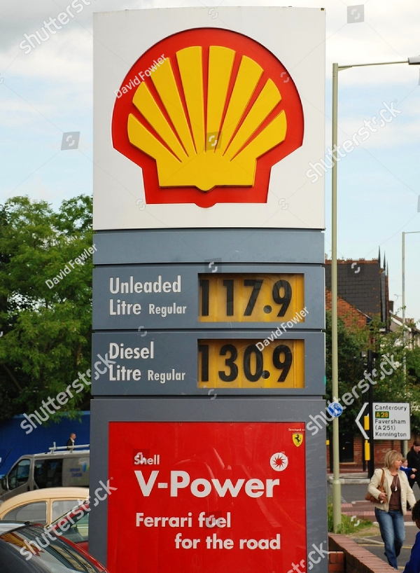
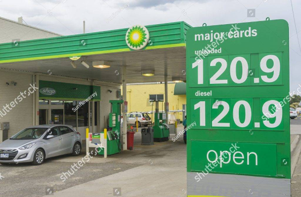
Shell Petrol Filling Station Price Signage
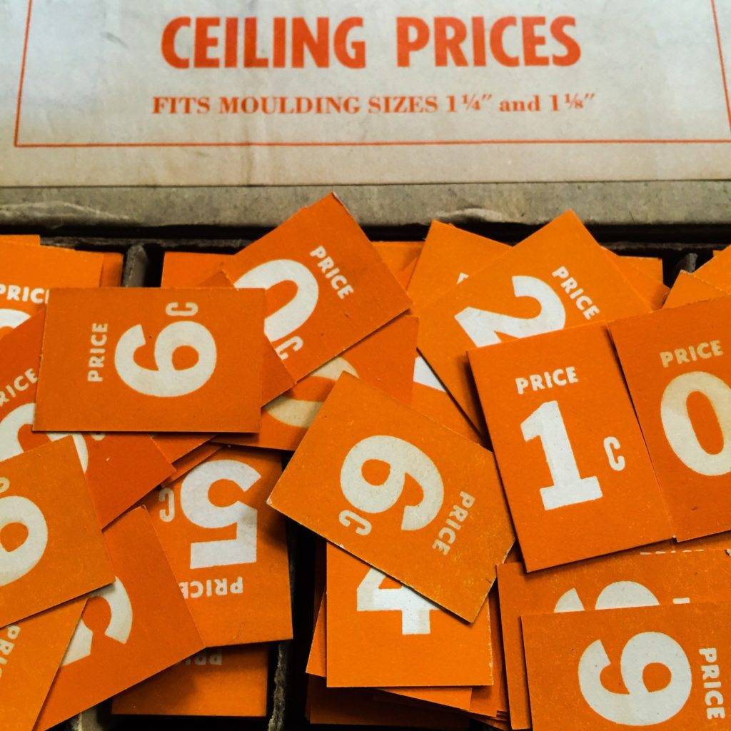
Vintage Paper Ephemera Grocery Signage Ceiling Prices
Tips for an Effective Price Signage Design
Let’s face it. There are price signage that presentable while there are also those that can easily be ignored. Creating the latter is so easy, but creating something that can catch the public’s attention despite their busy thoughts is challenging. With a lot of price signage around the area, how can you make one that will stand out from the rest of the competitors? How will you create a price signage that appeals and triggers the interest of the customers?
Normally, business entities no longer devote time in creating a price signage as it they perceive it as not important at all. However, you must remember that everything you present to people is your advertising tool. Never think that a price signage is only there to inform people of the price of your products or services. You may also see signage and billboard designs and examples.
Note that you must always incorporate your branding even price signage. Let your price signage speaks the personality of your business entity in its own way. Price signage may not be used similar to poster and flyers which contain with them direct advertisement, but you can surely design your price signage that can maximize its purpose and can go beyond the impression that they are just to hold prices. You may also like business billboard designs and examples.
Wanna know how to create an effective signage? Below are some tips to help you get started with your price signage.
1. Ensure Visibility
First thing that you must consider in creating an effective signage is the visibility of your signage. Your signage must be visible in different times of the day, may it be morning, noon, afternoon, night, and even daybreak. It must also be visible of all ages and even when the viewer is looking at them without an eyeglass, with sunglasses, or through a windshield. You may also check out restaurant billboard designs and examples.
2. Avoid Obstructions
The next thing that you must consider is the area where you will place your signage. Keep the place from any obstruction from any source such as a tree, bush, railings, decors, or another signage. Determine the most visible location for your signage, the area where there are no possible obstruction by driving past your business establishment from all directions. You might be interested in outdoor billboard designs & examples.
3. Ensure Readability
You must also ensure that your signage is readable from a distance. Do not make the fonts too small enough that passersby cannot read them while they are walking. But do not make them too large that it would consume a very large space similar to a billboard. Remember that you are creating a signage, not a bilboard. But similar to a billboard, the fewer words, the better.
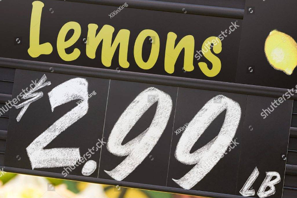
Supermarket Lemon Price Signage
Retail Pricing Signs

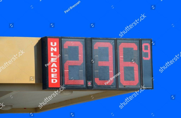
Close-Up of Petrol Price Sign
4. Be Simple
Just keep your signage simple and free from crowding. Crowding is when you include too many words in your signage that people looking at it can no longer get what you are trying to convey to them as they do not know where to start reading your signage. Hence, make your signage brief and simple as this is critical to its effectiveness.
5. Grab Attention
For a signage to be effective, it must be something that can grab the people’s attention. Create a signage that will reach out to people and where people can connect. There must be something interesting on the signage for the people to turn their heads towards them. Remember that your signage is also a form of advertising material so make sure it would serve its purpose of alluring people. You may also see examples of minimal billboard advertising.
6. Appeal to Impulse Buyers
It is common for the business owners, managers, or key personnel to think that a signage is just something that contain the information of the business. They might think that it is merely a device that identifies the business. However, the according to marketers, 55% of all retail sales are a result of impulse buying. People will first get the idea of what they want through your signage. You may also like fitness billboard examples.
7. Create Lasting Impression
We still believe in the popular phrase “first impression lasts.” Your signage is the first thing that the people will see with regard to your business so it must feature an image you want the public to recognize you. It is like your handshake with the buying public. Believe it, people will judge the inside of your business based on their impression of your marketing advertisements outside.
8. Utilize New Technologies
Now that we are living side by side with technologies, we must utilize these resources to enhance our marketing tool. Notice that there are already electronic billboards created and put into the market; there must also be electronic signage that you can use for your business. Signage are relatively small as compared to billboards so it is presumed that electronic signage are much cheaper than electronic simple billboards.
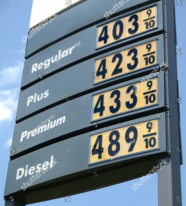
Gas Price Sign
Lemon Fruit Price Signage

9. Keep It Near to Your Viewers
Again, you are creating a signage, not a general billboard. Although you must design it in a way that is readable by people, make sure that you place the in areas near to your viewers like at the side of your doorstep, a few meters away from your establishment, or anywhere you think that your customers would probably be around in that area.
10. Incorporate Graphics
Keep your signage simple but also incorporate something that can attract most of the people like graphics. It does not need to be a realistic graphics or a 3D image, but it must represent what you are trying to convey to the public. You can even include line arts and doodles if that will not defeat your purpose in creating signage. You may also check out corporate billboard designs and examples.
11. Make It Memorable
You also have to design your signage in a manner that people can easily remember them. Furthermore, make sure that your products or services as well as your location easy to remember. In this way, people can easily drop by at your place whenever they need something that they have seen in your signage. You may also include a map in your website to give directions to the customers. You might be interested in poster billboard designs & examples.
12. Consider Colors Carefully
You must also take into consideration the colors that you will be using for your signage. Choose only few colors as too much color will affect the readability of your signage. The color combinations that perfectly complement with each other and still ensure readability are white and black, black and yellow, and yellow and dark blue.
13. Be Consistent in Your Branding
The next thing that you must always remember is to ensure the consistency in your branding. Your advertising materials such as elegant flyers, attractive posters, modern banners, and stylish menu must contain similar graphics, color, or design with each other. So as signage. It must contain something that people can easily associate them with your business company.
14. Avoid Clutter
You must also avoid clutter in your signage. You must not go overboard with your texts and graphics that it would seem heavy for the audience when they look at your signage. Always consider leaving enough white space to ensure readability. White space refers to the area in your signage that is left uncovered by either text or graphics. It is recommended to have a white space of 30% to 40% of the area of your signage for optimal readability. You may also see real estate billboard designs and examples.
15. Check and Recheck
Always check and recheck your signage in case you have some errors especially in graphics and grammar as this can affect the credibility of your company.
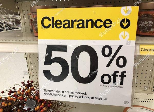
Clearance Sign
Price Signage for Fruits at Supermarket
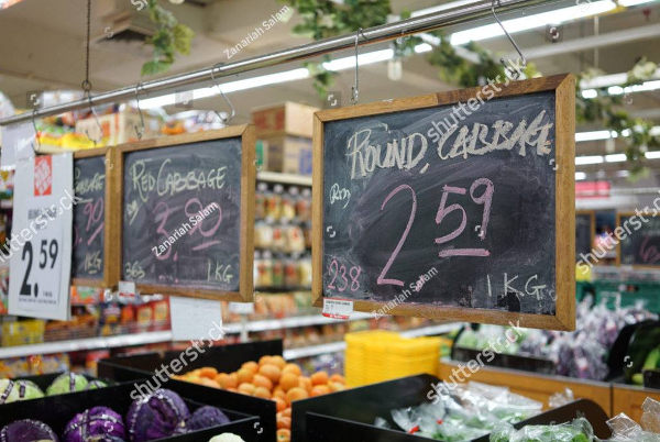
Fruit Price Indicator

Quick Recap
It is vital that you know how important it is to devote an extra attention to the marketing aspect of your business. Marketing keeps your business moving and be known to the public. Among the commonly used marketing tool that is proven effective through the ages is the signage. It can be used as a directional sign pointing towards your business entity, as an advertisement sign for your products and services, as an informative material that provides information regarding your business, and as a price holder. You may also like food billboard designs & examples.
Because signage can play these important marketing strategies, it is proven effective in the field of marketing and advertising.
Several tips have been provided for the creation of an effective signage which can be summarize as follows: ensure visibility, avoid obstructions, ensure readability, be simple, don’t attempt to sell. grab attention, appeal to impulse buyers, create lasting impression, utilize new technologies, keep it near to your viewers, incorporate graphics, make it memorable, consider colors carefully, be consistent in your branding, avoid clutter, and lastly, check and recheck. You may also check out vector billboard designs and examples.
Lastly, don’t forget to check put the examples of price signage designs provided above and never miss out the opportunity of introducing your business to the public.


