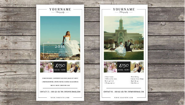
34+ Rack Card Designs Examples to Download
Wedding cards, birthday cards, mother’s day cards, some consider these the old-fashioned way of extending one’s well wishes. But believe it or not, these things still exist. And yes, people still do appreciate them. We see them everywhere, sometimes being handed out by people along the street. Similarly, rack cards have remained a timeless marketing tool, compact, eye-catching, and easy to distribute. Many businesses and event organizers now use customizable rack card templates to create visually appealing rack cards that effectively promote services, events, or special offers while maintaining a professional look.
Rack cards are simple yet informative commercial pieces commonly used for advertising or marketing concerns. They’re often eye-catching and are sometimes impossible to go unnoticed. Rack cards are usually comprised of greeting cards, invitations, and company brochures. They are considered to be one of the most affordable and effective marketing tools distributed on print.
Food Catering Rack Card
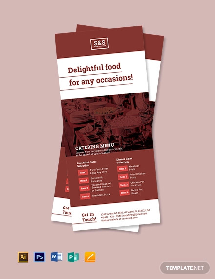
Travel Agency Rack Card Template
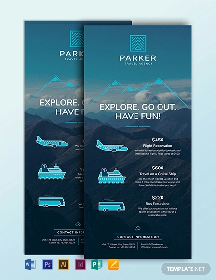
Creative Agency Rack Card
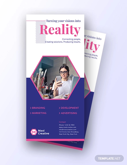
Catering Rack Card Template
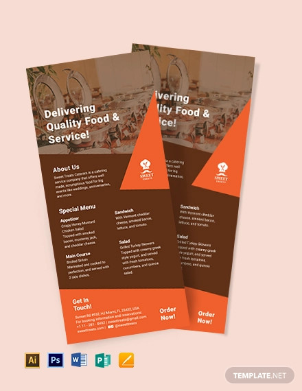
Sample Advertising Consultant Rack Card
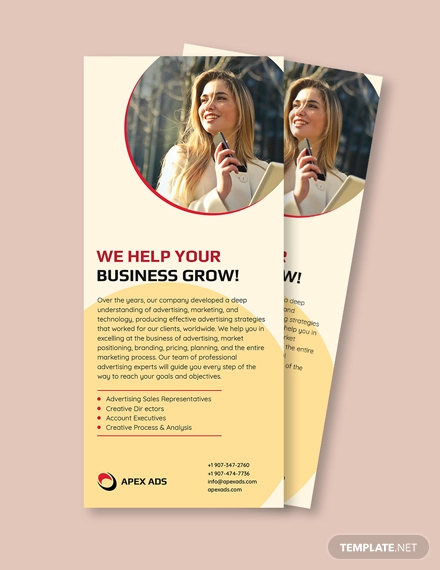
Royal Resort Rack Card Example
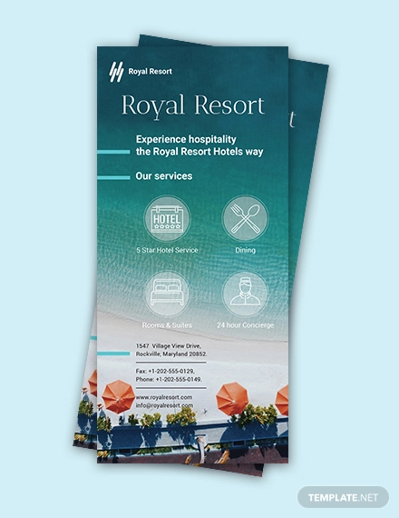
Coffee Shop Advertisement Rack Card
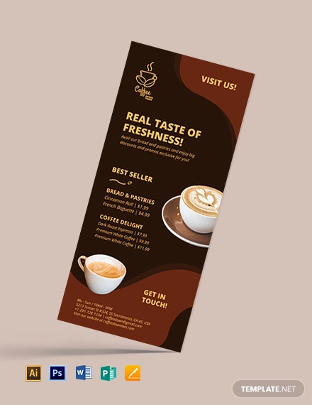
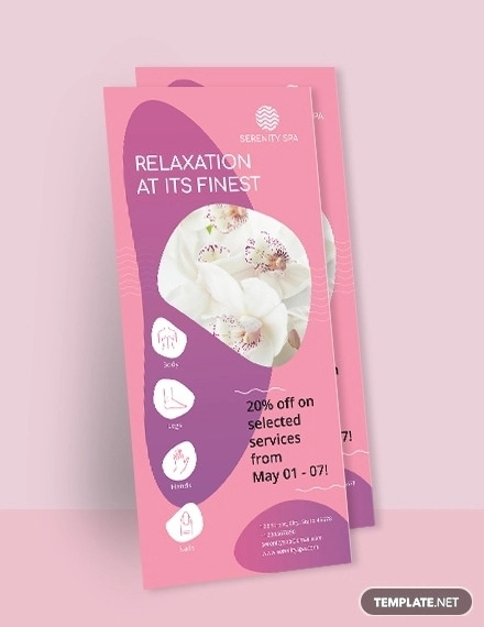
Spa Rack Card Example
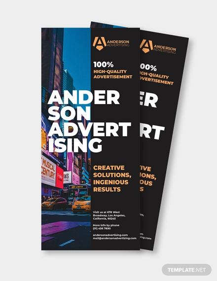
Sample Advertising Agency Rack Card
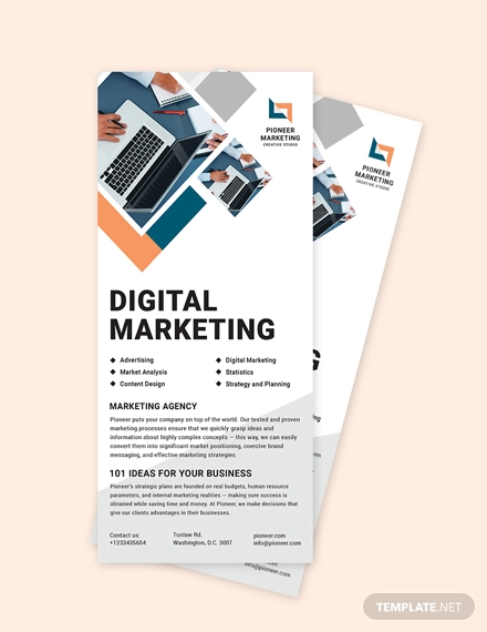
Marketing Agency Rack Card Example
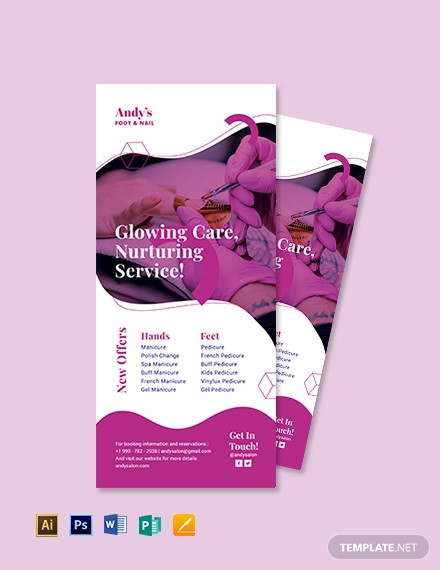
Nail Salon Rack Card Template
Catering Menu Rack Card Template
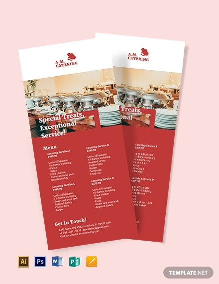
Coffee Shop Rack Card Template
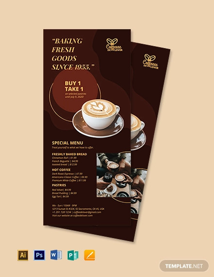
Salon Rack Card Template
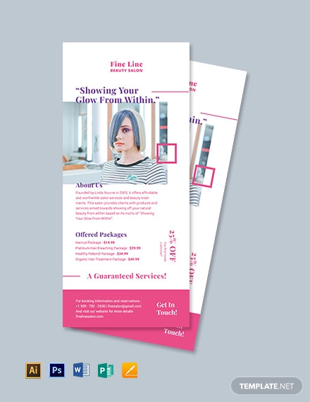
Wedding Rack Cards
Wedding Program Rack Card
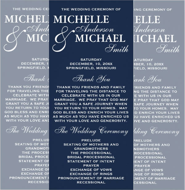
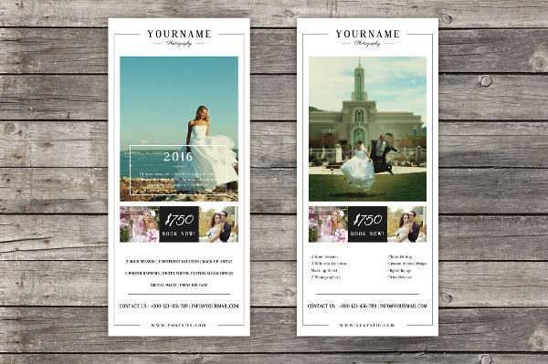
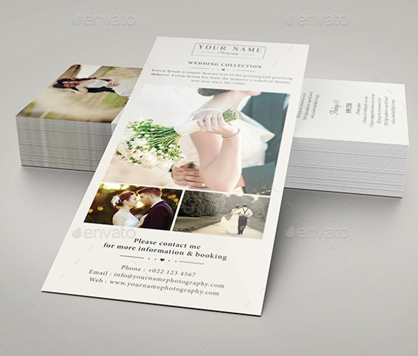
Wedding Photography Rack Card
Travel Rack Cards
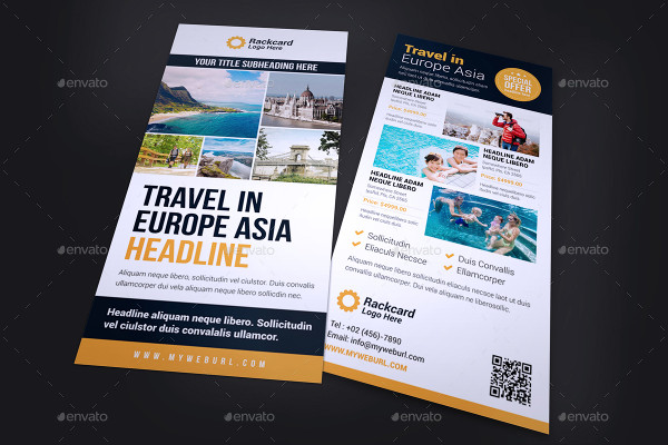
Travel Agency Rack Card
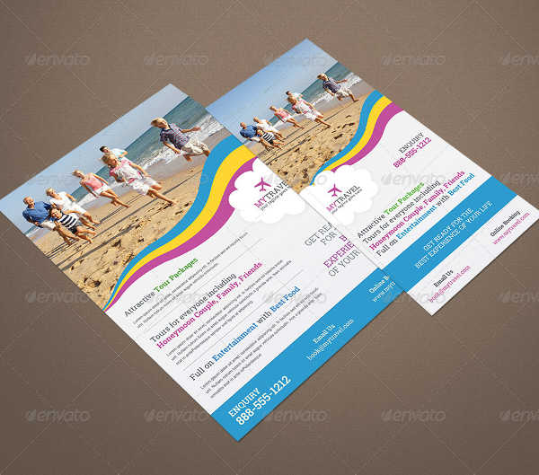
Travel Business Rack Card
Advertising Rack Cards
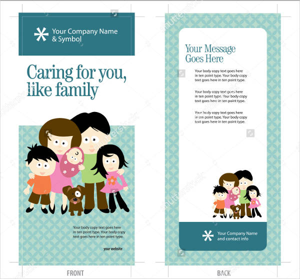
Insurance Advertising Rack Card
Fitness Advertising Rack Card

Business Advertising Rack Card
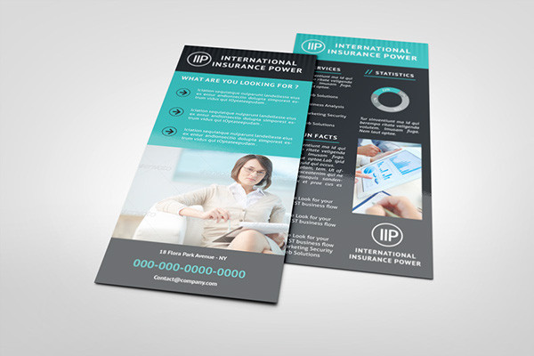
What Makes a Good Rack Card?
To make an effective rack card, it needs to be attractive. The ability to stand out in a rack full of print materials filled with plain text and images can be quite tricky.
So, what does one see first when it’s on display?
The material’s front layout, of course. Rack cards often come in a back-to-back three-piece fold, making the front layout the main attraction for when the name card is on display. It should contain the main points of the card, preferably the card’s purpose, allowing the audience to catch a glimpse of what’s inside. The front layout should allow the material to sell itself to the audience, panoramic images and interesting catchphrases often do the trick.
Some companies even take the more daring approach by creating rack cards of different shapes and sizes, those that are out of the norm. Greeting cards are the easiest to design since graphics and sweet messages are all it takes but for business rack cards, formality should also be observed in designing the card’s front layout.
Other things to keep in mind:
- For marketing or promotional purposes, rack cards need to be as self-explanatory as possible. Since its content is limited due to space, it’s important to focus on the message that you want to get across to your target audience.
- It’s good to include visuals of the company, brand logos, contact information, locations, and services. Present relevant information clearly and concisely.
- Most importantly, avoid making a card too wordy. Seeing a card with too much text will come as a red flag to your audience, not everyone has the time and patience to read something that looks like a page torn out from a history book. It’s important to keep in mind that images and text work best side by side.
- Always remember that a good rack card is just as informative as it is appealing.
Restaurant Rack Cards
Restaurant Menu Rack Card
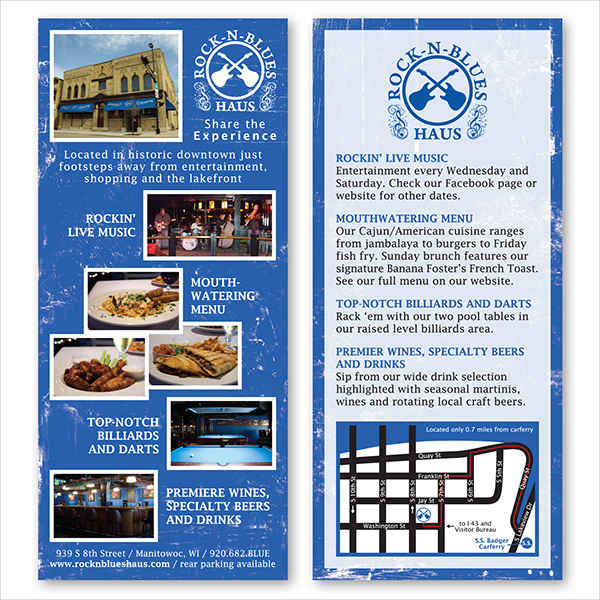
Pizza Restaurant Rack Card
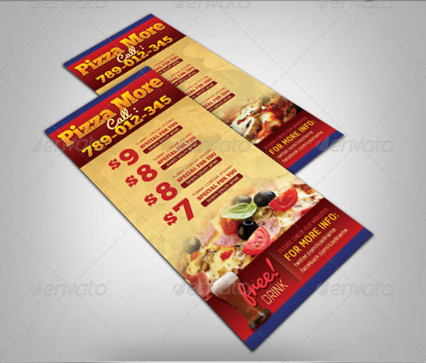
Restaurant Opening Rack Card
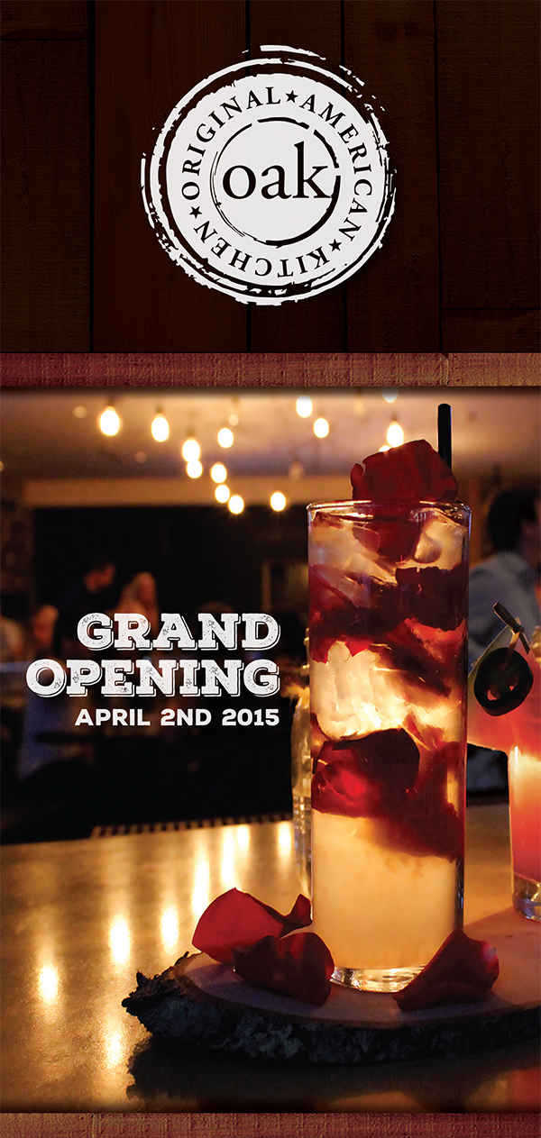
Salon Rack Cards
Beauty Salon Rack Card
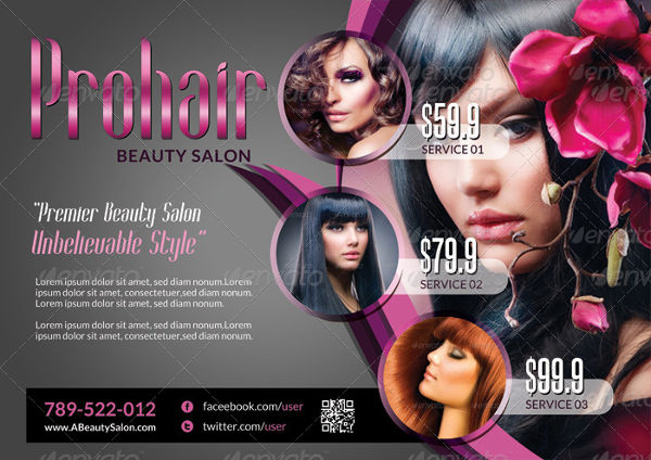
Salon Menu Rack Card
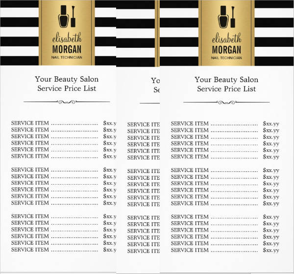
Jewellery Rack Card
Jewellery Store Rack Card
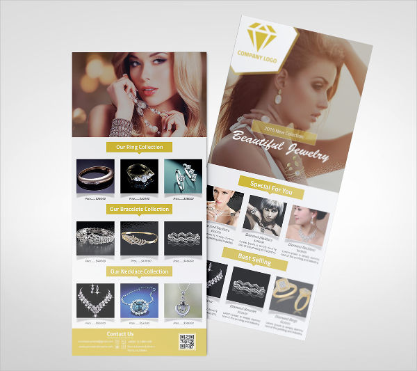
How to Design a Rack Card
Designing a rack card is a creative process. You can either do too much or too little. Here are some tips to keep in mind:
Layout
Keep it simple. This is probably the golden rule in every design project. Although the goal is to make something noticeable, sometimes less is more. When visualizing your design, bear in mind that overdoing the card’s design and creating lengthy texts can cause disinterest with your audience. Instead of connecting with them, you’re directing their attention to something more pleasing than yours. Always make sure that your layout represents the card’s purpose.
Content and Colors
The theme of a card’s design will help determine its overall look.
- Colors should be relevant to the card’s purpose, it could even be based from the company’s colors. Muted colors are most effective in coordinating images with text.
- Using relevant images and providing supporting texts to such will be helpful for readers. Make sure the images utilized are of top quality as well, images of low quality will appear pixelated on print.
- Texts should be kept informative yet concise. It’s also best to divide the card’s content into easy sections, this is so your audience may easily find the information they are looking for.
Use Templates
For beginners, templates could be your best friend. Templates are standard formats of a particular document or file. In designing a rack card, observing proper margins and font sizes are proven essential especially in the process of printing.
Keep in mind that a printed material may appear differently from its soft copy. To avoid printing problems such as alterations in text alignment and cropped images, provide an outer border allowance of at least 1 inch for the the card’s overall design. Don’t worry about extra spacing, alterations may be done to the printed material.
Marketing Rack Cards
Business Marketing Rack Card

Sales Marketing Rack Card
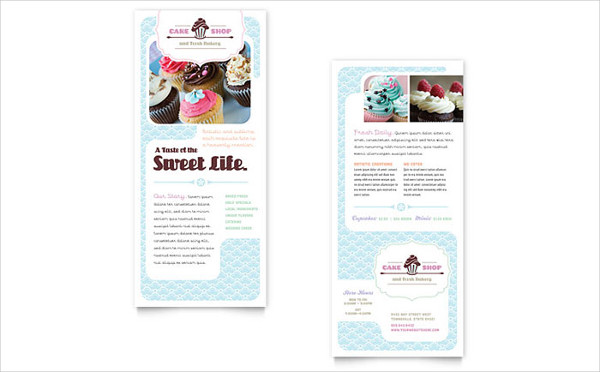
Party Rack Cards
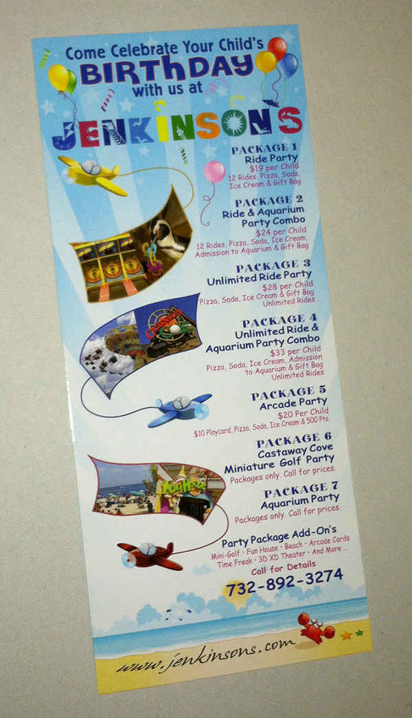
Birthday Party Rack Card
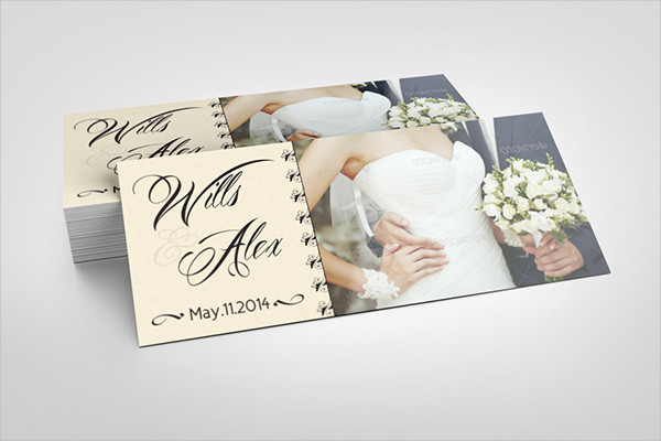
Wedding Party Rack Card
Event Rack Cards
Business Event Rack Card
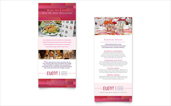
Event Planning Rack Card
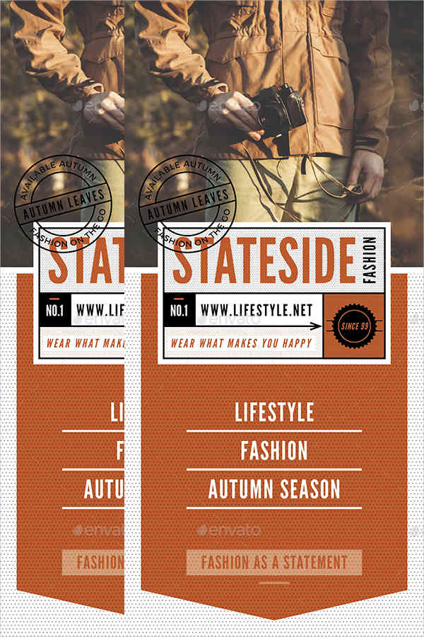
Fashion Event Rack Card
Why Use Rack Cards?
From event invitations to company brochures, rack cards cover a wide variety of commercial marketing that has proven to be both affordable and effective.
It is one of the best ways to promote services and events to the general public. But coming up with a good rack card isn’t as easy as it seems. A lot of thought must be put into its designing process. The aim is to spark the interest of your audience and make sure your card doesn’t end up in the nearest trash bin.
How to Spice Up Your Card Design
Rack cards that look like every other card are easily overlooked. After all, nobody wants to waste their time reading something plain and ordinary. It’s important to add something bold and captivating to the card’s design that is sure to be appealing to your audience. This could be through charming headlines or vivid colors. Just make sure you know your limits, anything over the top may appear distracting rather than inviting.
Although a good-looking rack card can easily capture one’s attention, you also need to know how to keep it. A card that looks appealing but has nothing else to offer is pretty much useless. When designing your business card, make sure to focus on your content as well. The content of your card must be informative and to the point. There should be enough information for your audience to find useful.
As rack cards also serve as an entryway for your to establish your brand, you may also include important business information and similar services. Another way to spice up your rack cards is by adding promotional incentives and benefits, whether it’s special coupons or discount codes.


