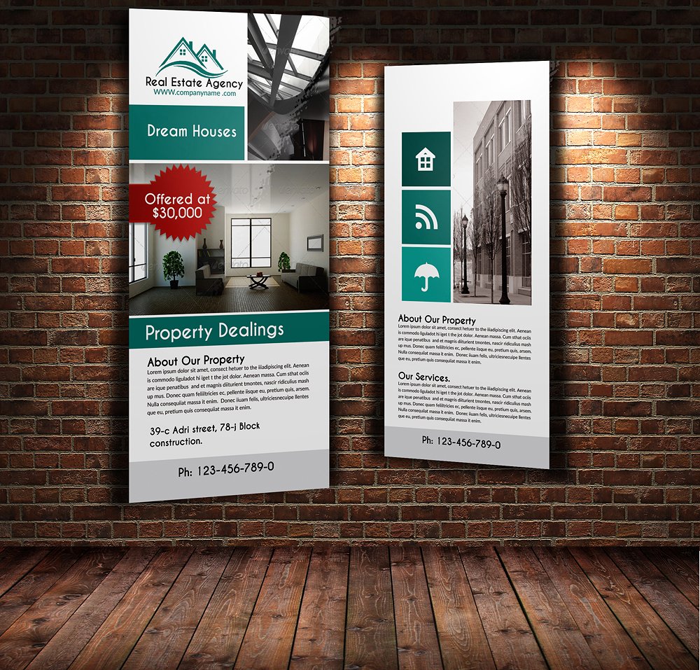
16+ Real Estate Billboard Examples to Download
Billboards are among the advertising materials that have been widely accepted and used since it is proven effective to promote products and services. Billboards are usually placed on areas that are accessible to most people, especially to the target market of a certain company. The audiences that are usually being targeted are mobile, such as drivers, pedestrians, passersby, bikers, among others.
So how can you advertise your product to such moving potential customers? This is a little bit challenging to the marketers to promote their offers to these people. Hence, billboards are designed in such a way that it is big enough to catch people’s attention with designs that must be eye-catching even to those running at 65 kph. The colors must perfectly complement with each other and the text must be big enough to ensure readability. To know more about how to create an eye-catching billboard, you may refer to Signage and Billboard Designs and Examples for a discussion on how to design your billboard.
Real Estate Billboard Template
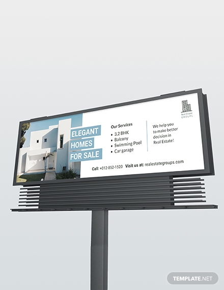
Real Estate Agent/Realtor Billboard Example
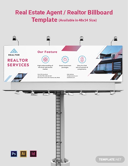
Every business establishment is in need of simple billboard to have a wide range of scope of advertisement, and real estate businesses are not an exemption. Because real estate businesses are very much in need of promotion because of the nature of the business, which is challenging because of the large price it entails, billboards are needed. Below are the different examples and designs of real estate billboards that might perfectly suit your billboard needs. Alternatively, you may check on other billboard designs as well.
Real Estate Billboard and Roll-Up Template Example
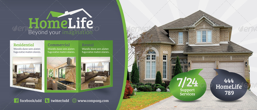
3-in-1 Real Estate Billboard Example

Real Estate Business Billboard Example
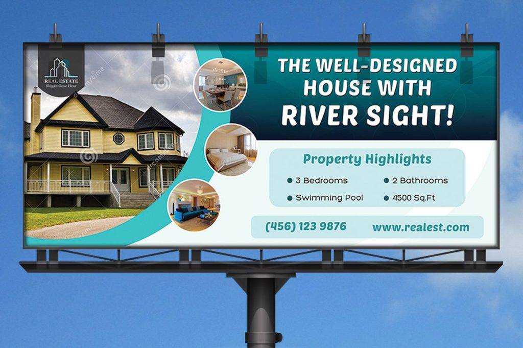
Tips in Making an Effective Billboard Design
Wondering how one company survived despite of the tight competition in the market? Well, let me tell you their secrets in this article.
Many people would be afraid to enter into a certain type of business because of reasons like tight competition for products that are basically needed by people such as food and clothing or products and services are not in demand such as real estates and paintings. Truly, business is really not for the faint-hearted. You must have the courage to pursue on what you have started and make it flourish more than ever. You may also see vertical billboard designs and examples.
What made successful companies successful is their drive and motivation towards achieving their business goal. And because of that goal, they find ways to achieve them. In business, the goal that is usually set by the company is to have a specific increase in the sales of the company for a specific period of time. To start working for that goal, promotion, advertising, and marketing are needed so that people will know your name in the market and you can establish your brand in the industry.
Billboards, being one of the most commonly used promotional material because of its effectiveness, has been utilized by most companies. So, how can you stand out from the crowd and make your company known? Here are few tips for a successful and effective billboard design.
1. Memorable Campaign
The first thing that you must work on is to make your campaign memorable. You must make an impression that will last and will make people remember your advertisement. In this way, they will be thinking of your billboards after they have read it and replay in their minds for a couple of times on what they have seen. You may include perks in your campaign, but always remember that your goal is to give clear message rather than a clever one. Jargons, complex visuals, and wordplay are highly discouraged since it may confuse the reader especially that they only have several seconds to absorb what you are saying. Hence, it is better to be direct and concise than being clever and complex when it comes to billboard designs. You may also check out examples of advertisement design.
2. Short Message
As a rule of thumb, the number of words for your billboard must be seven words or less. The message you incorporate in your billboard must be short enough so people will have ample time reading them and analyzing its content. Remember that your target reader is moving and almost all of them will not stop just to read your ad. Hence, you must be concise and choose words that speak a lot. You are not there to let the world know you are good in poetry, so save the details and explanation for your ad on your other marketing materials such as elegant flyers and best brochures. Your primary goal is to convey the message in your ad by curating every single word rather than posting a detailed message with a prose.
3. Captivating Images
The notion that “less is more” can be applied in selecting the image to be included in your billboard as billboards are fundamentally a visual experience. To know if a photo can grab people’s attention, see it for yourself first. If you find the photo striking in your first glance, then most probably, many people will also find your message captivating. Sometimes, it is not about the colors within the picture alone, rather, it is the message that your picture conveys, especially when it comes to designing billboards. If you have already picked a photo, ensure that it is of good quality, one that is not pixelated, and with colors and hues that complement well with each other. You may also see what is direct marketing?
Real Estate Billboard and Roll-Up Banner Design Example
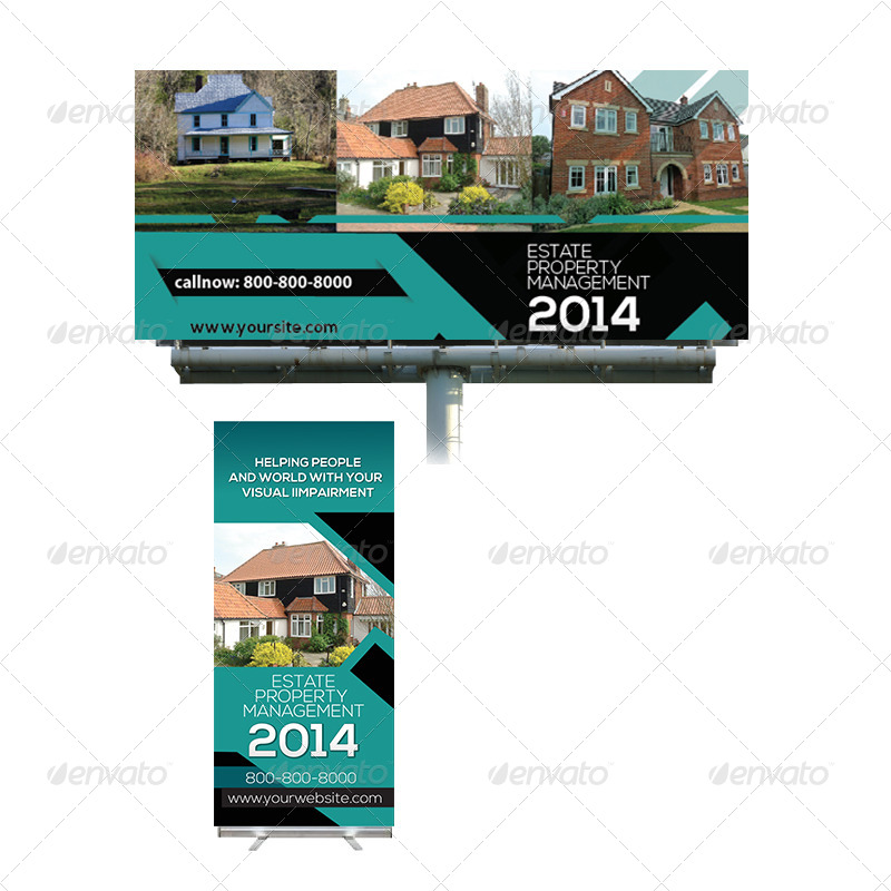
Editable Real Estate Billboard Template Example
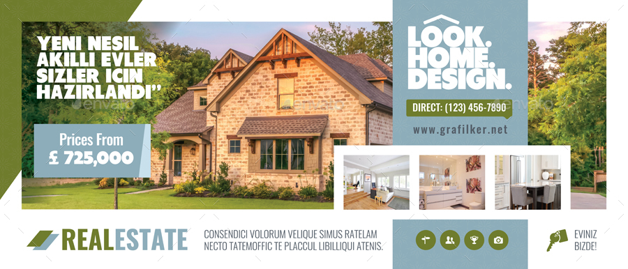
Real Estate Rack Card Template Example

Real Estate Billboard Roll-Up Example
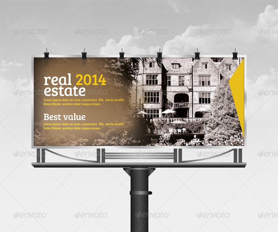
Customizable Real Estate Billboard Example
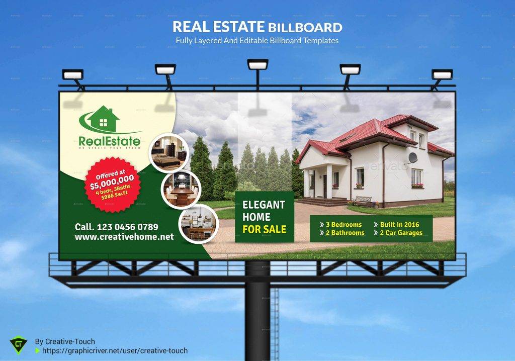
Real Estate Billboard Signage Design Example
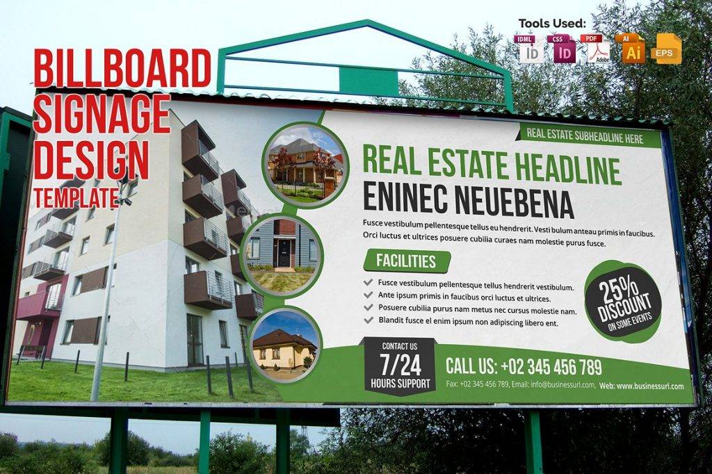
Corporate Real Estate Billboard Example
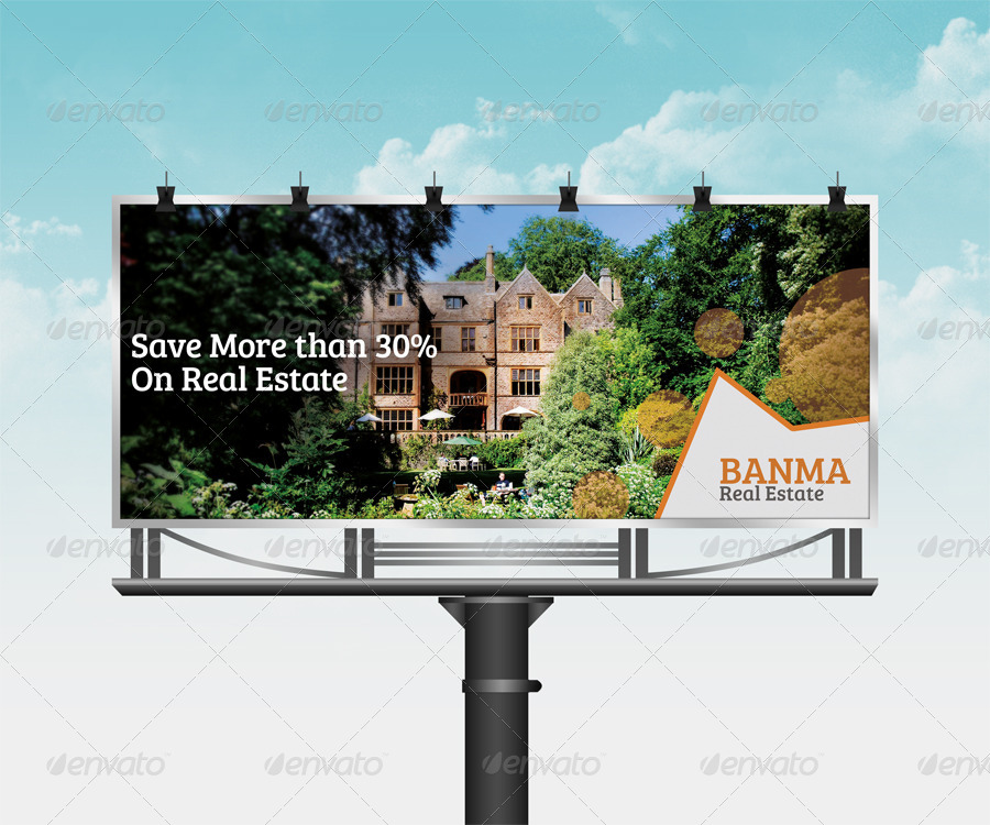
Real Estate Billboard Templates Example
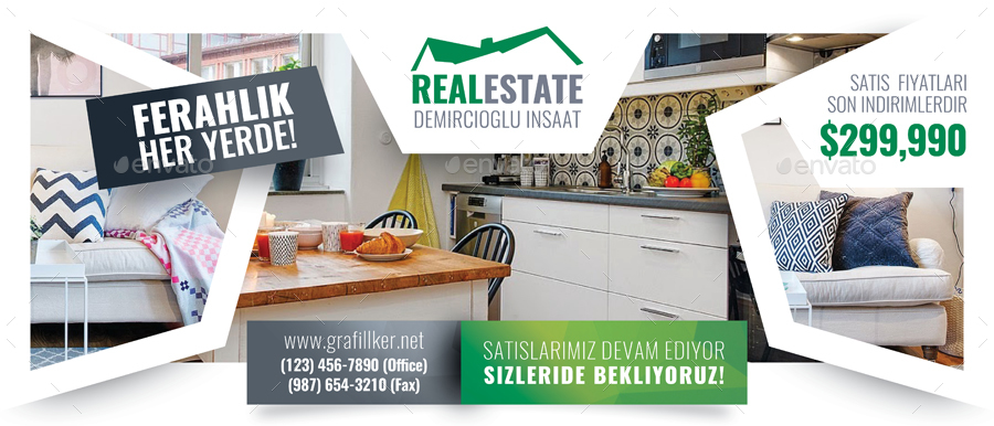
Real Estate Billboard Signage Design Template Example
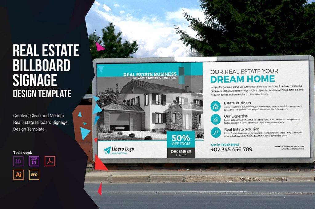
Dream Home Real Estate Billboard Example
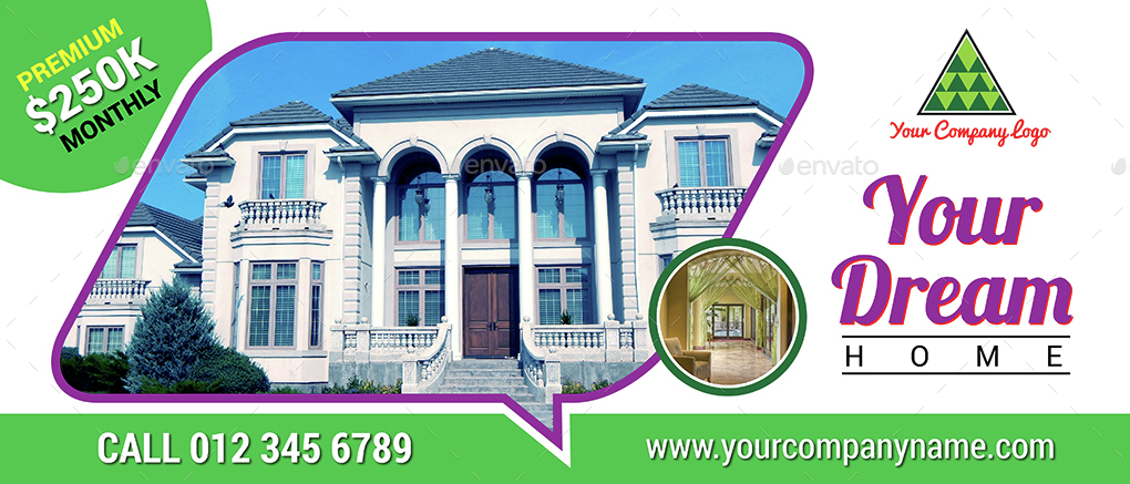
Fully Editable Real Estate Billboard Example
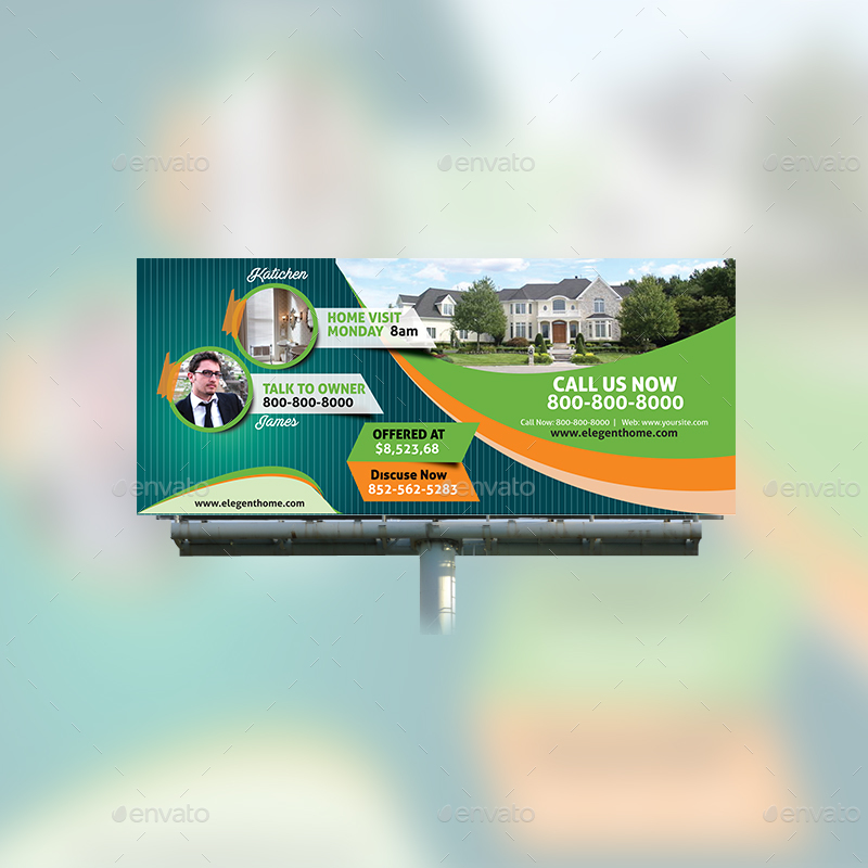
Fully Layered Real Estate Billboard Template Example
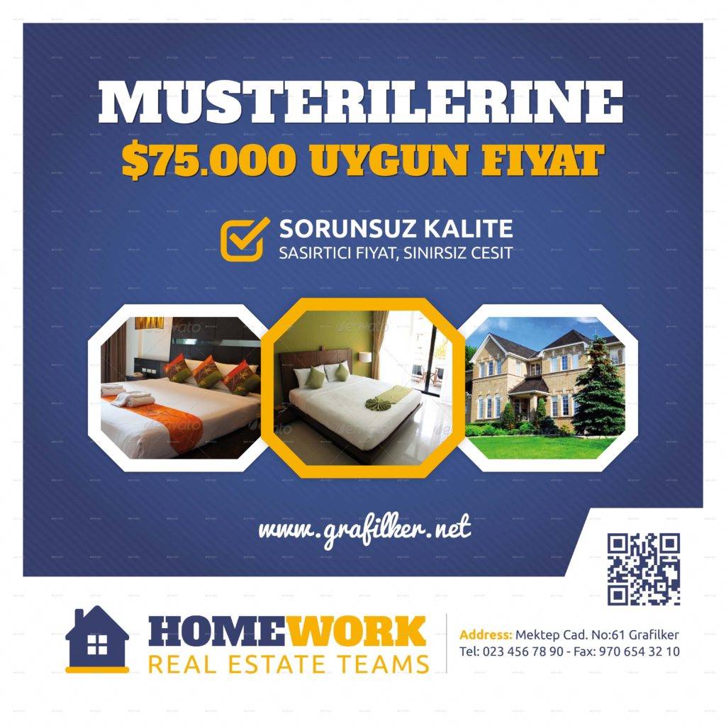
Tips in Making an Effective Billboard Design (continuation)
4. Complementary Colors
In choosing colors that complement well with each other, there are certain recommendations from designers and artists that you must know which are as follows:
- Yellow background, black font
- White background, black font
- Black background, yellow font
The above is the top three list on the most readable font in a certain background colors. Take note that the two colors are not with the same intensity and hue so they perfectly match with each other. Because yellow and white are light colors, black font is the perfect match for them as they can easily be read especially from afar. On the other hand, because black background provides a dark visual for the viewer, a yellow text perfectly matches it for enhanced readability. You may also see examples of marketing strategies.
5. Fonts
For the font type and size, the first thing that you must consider is the readability. Never choose a font that is cursive or with too many accents. This will only hinder the visual presentation of your whole billboard. Instead, choose simple fonts because they can easily be read and do not distract the readers’ view. Serif and sans-serif fonts are among the most recommended fonts when it comes to billboards. Serif fonts include Times New Roman, Garamond, Georgia, and Baskerville. Sans-serif fonts include Verdana, Helvetica, Calibri, Arial, Tahoma, and Lucinda Grande. You may also like billboard mock-up designs and examples.
For font sizes, the obvious rule is to have big sizes. It is a common knowledge that you have to make your text big that even those from afar as well as passersby running at fast speeds can still read your ad clearly. Also, big fonts can consume a lot of space in your panel, so it will help you minimize the number of words for your billboard, giving it more impact to the viewers. You may also check out examples of banner design.
6. Contact Information
Lastly, do not forget to include your contact information in your billboard because that is a way that they can get in contact with your company. However, it should not be the main focus of your billboard, and it should not occupy a large space. Also, contact numbers such as mobile and telephone numbers are highly discouraged because they cannot be easily remembered, except for contact numbers with repeating digits, for example, 87-000 for Jollibee hotline. Instead, a URL is preferred and recommended because it can easily be remembered than numbers as far as marketers would say. You might be interested in niche marketing.
To Cap It Off…
Now, it is expected that you already know how important advertising is in one’s business. It is a way that people will know about your business. You really need promotional materials to have a wide scope in your advertising, extending your promotion to the far reaches of the world. You have also known that there are various promotional materials that are widely and commonly used by several business entities as they are proven effective and convenient. Among those that are still trending in the business world is the use of billboards. Billboards provide a great advantage to a company since, because of its grandeur and noticeable size, it can captivate more people easily. You may also see retro billboard designs and examples.
Hence, billboards are really suitable and fitting for real estate businesses considering that real estate businesses are not really on top of the priority for most people. But to make people read your ad, even those that are running at more than 65 kph, you have to make your billboard ad compelling and alluring. As stated above, to make a successful and effective billboard design, you must incorporate in your design memorable yet short message, captivating images, complementary colors, right and readable fonts, and lastly, your contact information. You may also like marketing goals examples.
Having equipped with this knowledge, you may now start designing your own billboard design. But, we are still here in case you need examples and templates. Just scroll back to the previous section in the article and you might find one that you believe is suitable for your real estate business. You may also check out vertical banner designs and examples.


