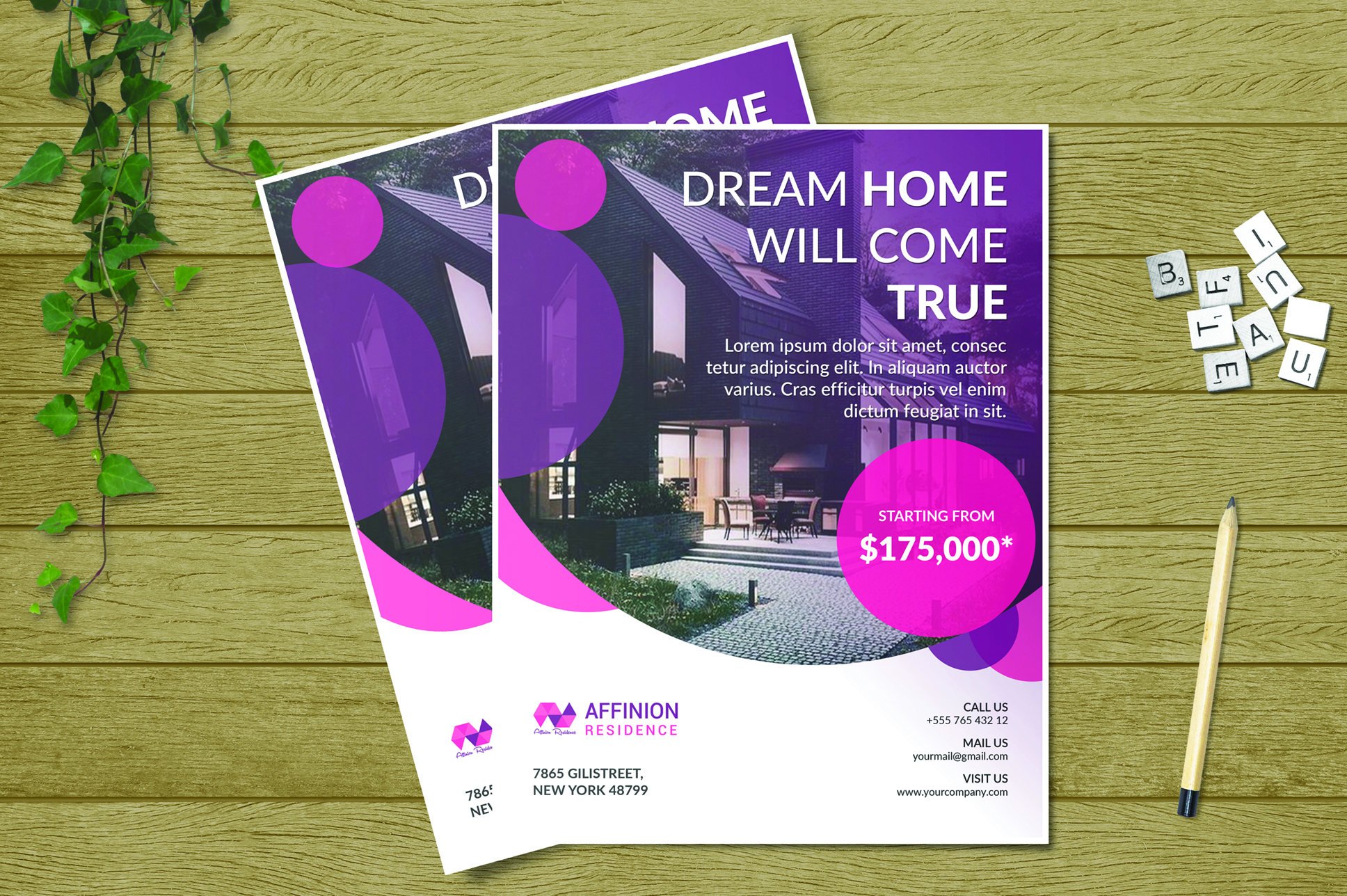
21+ Real Estate Magazine Designs Examples to Download
Real estate nowadays is increasingly in demand despite it being costly. People seek for real estate to be used as an establishment for business or for personal housing. More and more are into real estate businesses as the returns are worth the hardships in marketing the real estate. So if you are in a real estate business, how can you compete in the market? How can you attract customers and prove to them that you’ve got the edge over your competitors? You may also see real estate magazine templates
Creative Real Estate Magazine Example
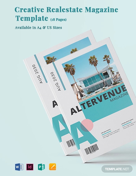
Editable Real Estate Magazine Example
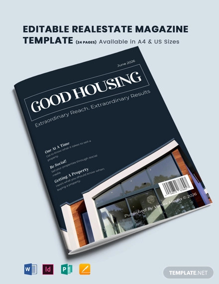
Basic Real Estate Magazine Template Example
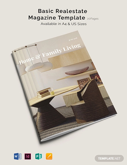
Advertising Real Estate Magazine Example
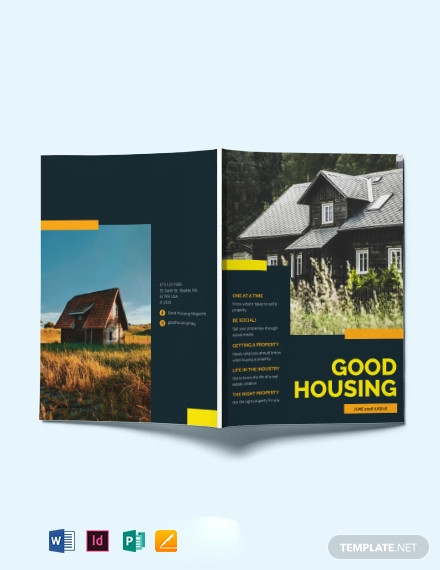
Real Estate Magazine Ads Template Example
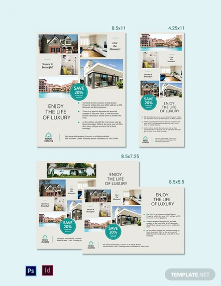
Commercial Real Estate Magazine Example Template
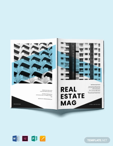
A useful tool would be the use of a magazine in which you can feature your real estate properties that are for sale and even those that are newly bought as a proof that you have customers who are satisfied with the transaction you have with them. If you are looking for a real estate magazine, below are several designs that you can choose from. You may also see real estate catalogs.
Real Estate Agency Magazine Example
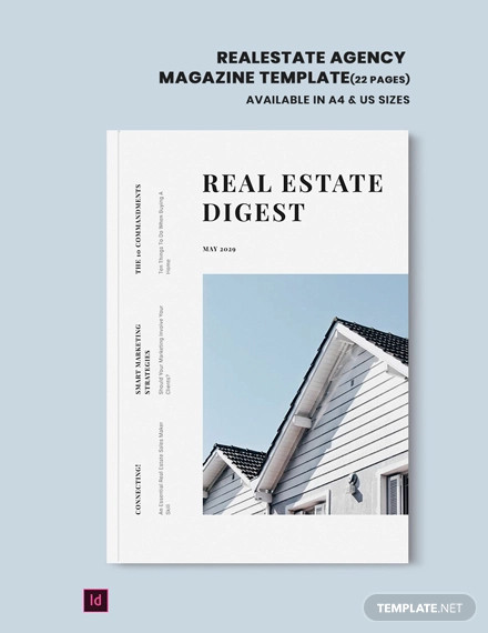
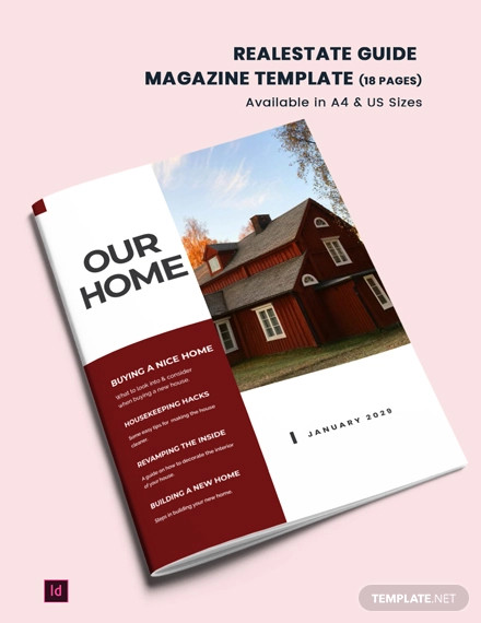
Real Estate Guide Magazine Example
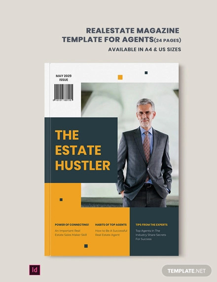
Real Estate Magazine Template for Agents
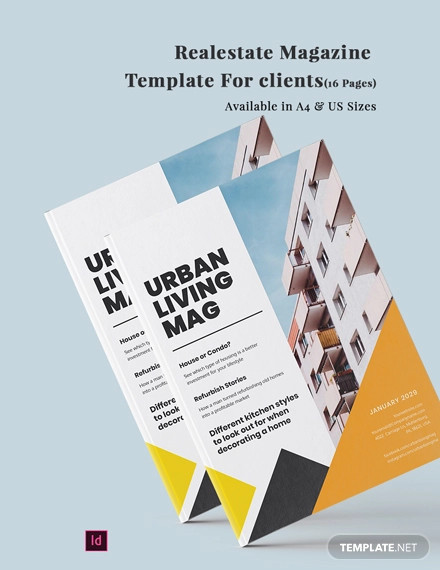
Real Estate Magazine Template for Clients
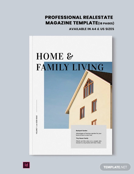
Professional Real Estate Magazine Example
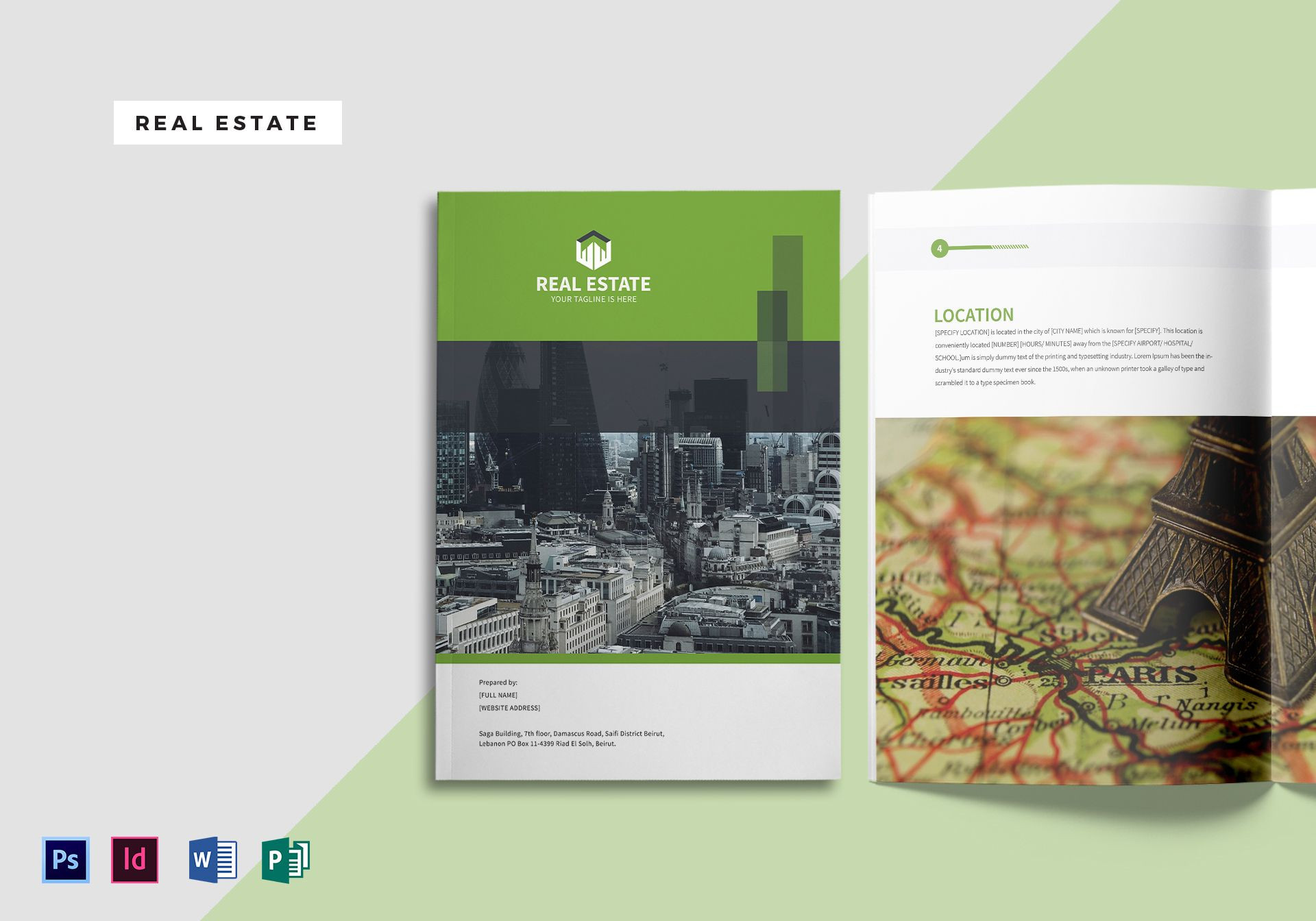
Real Estate Magazine Template
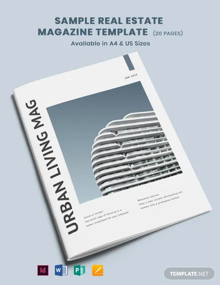
Free Sample Real Estate Magazine Example
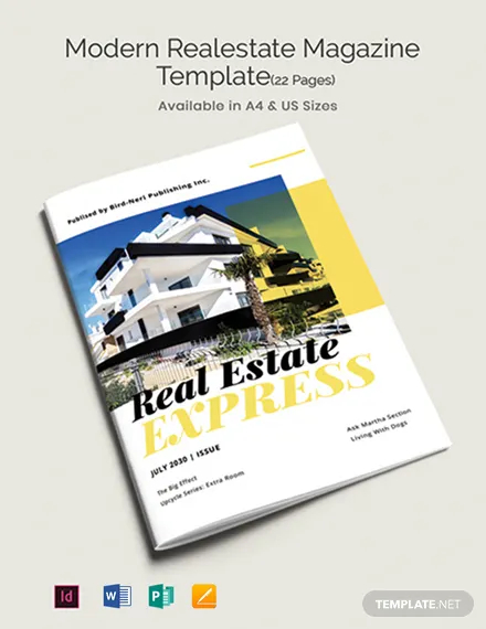
Free Modern Real Estate Magazine Example
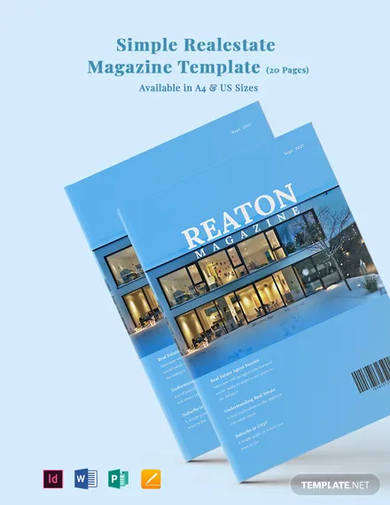
Free Simple Real Estate Magazine Example
Free Real Estate Architecture Magazine Template
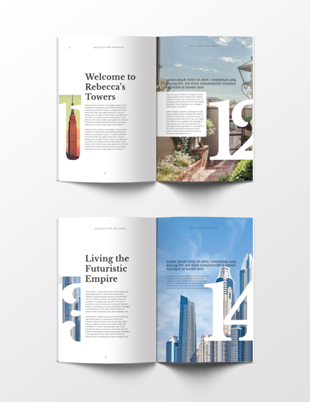
Free Real Estate Look-book Magazine Template
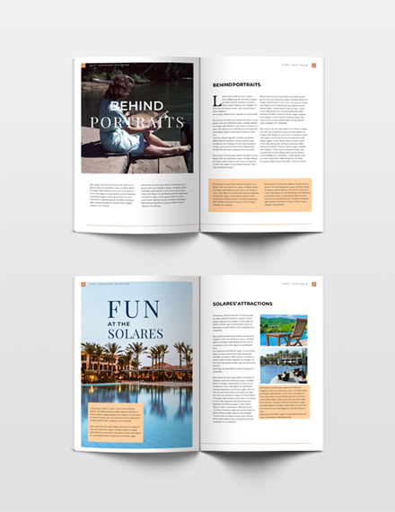
Free Architecture Magazine Template
Real Estate Magazine InDesign Example
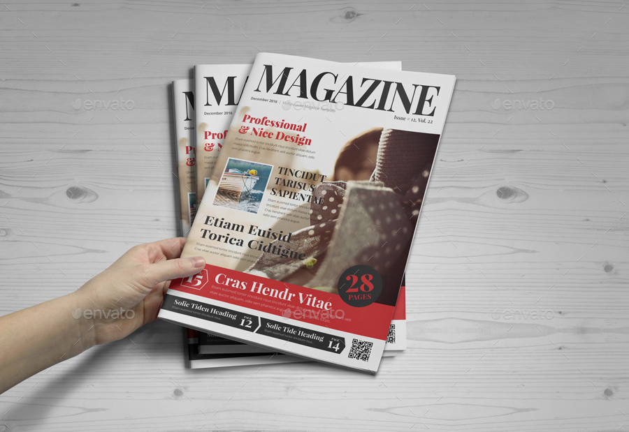
Simple Real Estate Magazine Example
Top Tips in Creating a Magazine
Magazines as of today are still important even with the increasing use of the Internet as it features a lot of discussion and comes in handy. Discussions may be about politics, art, religion, business, fashion, food, photography, and many others which are of concern to many people. It showcases and elaborates the main topic and presents them creatively thus enticing the people to read through all the pages. You may also see advertising posters.
So how can you create a magazine that can still entice people despite the wide use of the Internet and despite tons of other magazines to choose from? Below are some tips to consider in creating a magazine.
1. Get Inspiration
Before you get started in creating your magazine, first, get an inspiration for your topic to be discussed in your magazine. You can do so by purchasing other magazines that caught your eyes or looking for a magazine in a newsstand that interests you.
Decide what are the factors that these magazines caught your eye. The factors might be the photos, layout, subject, or even the main topic itself. These elements that interest you can be used in your own magazine’s layout. There are a lot of software that can help you in your layout, but do not let it dictate your layout and use your own creative imaginations. You may also see nonprofit brochures.
2. Have a Theme and Stick to It
Decide for the theme of your overall design in your magazine. A theme can make your magazine appear organized, uniform, and professional. The theme must have the element of consistency shared across the whole magazine, from the front cover carried across the inside pages and up to the back cover. For example, you may use the color palette of your color for your front cover.
Using the designs you have created and incorporated in your front cover, you can design your table of contents with the same colors and elements that you are using as well as in design for the images, borders, and the back cover. You may also see A4 brochures.
3. Incorporate a Great Masthead
The masthead of your magazine is an important area that you must also take care of. For magazines that are on the newsstand, the standard size that can be seen on your magazine is only the top 2 inches of your magazine when your magazine is not on the front row.
So, make use of the 2 inches and incorporate the important thing that you must place: your logo. It must be the first thing that your readers sees so that they can identify you. It must be legible enough and can be read even from afar. Remember that your masthead will be fighting over other masthead designs for attention. You may also see company brochures.
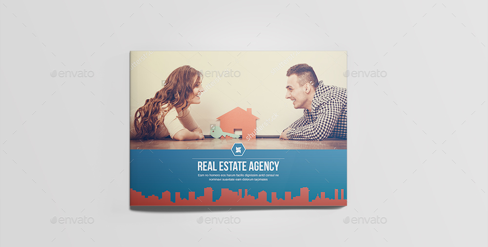
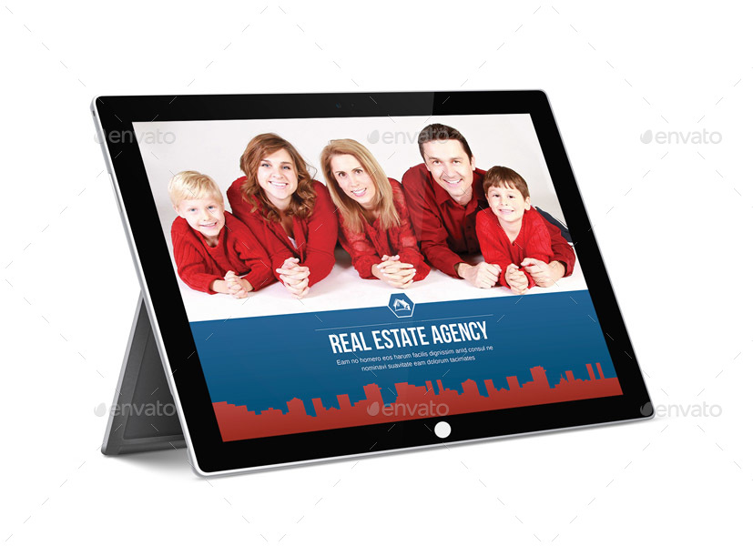
Real Estate Agency E-Book Magazine Template Example
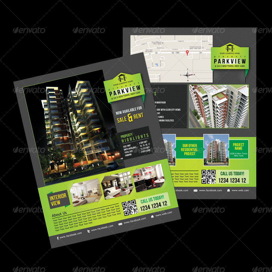
Minimalist Real Estate Magazine or Flyer Example
4. Invest on the Cover Photo
Do not hesitate to spend more on the cover photo of your magazine for a well-designed cover can get your magazine noticed. When people picked your magazine from the rack, the first thing that they will be focusing on is your front cover.
Choose a photo that is not only interesting but also has a high quality to be included in the cover of your magazine. Furthermore, choose a photo that is recognizable to your audience or those that contain unusually attractive colors, photos that are taken from unusual angles, or a combination of both. You may also see furniture brochures.
5. Choose the Right Typeface
Choosing the right typeface is an important factor in creating a personality to your magazine. It also has a major impact in terms of the overall professionalism of the magazine. Avoid using many fonts of different families as this will be visually confusing to the readers and will distract their focus on your text. Instead, use only one to two font families in your articles.
According to some researches, serif fonts are easier to read than sans serif fonts. If you want to emphasize a word, you can use the bold versions of the font that you have chosen and avoid the use of all caps. You may also see portfolio catalogs.
6. Use a Single Pop of Color
In choosing for the color for the designs of your magazine, choose those that are minimalist. When you want something to be the focus of attention for your readers, you can make use of a single pop of bold color as it is more striking than a palette of rainbow brights.
Commonly, a black-and-white photography along with a single strong color can give great impact to the overall photo. You can also add bright typography, banners, and dividers for a simple yet attractive design of your magazine. Never use too many colors, and stay simple and minimalist as possible. You may also see square brochures.
7. Use a Multi-column Grid
As you have observed from many other magazines, they are usually presenting the text in multiple columns. This is important for your magazine to look more professional. The presentation of the flow of your text will also be better on the page, and you have wide options for placing your photos.
For magazines of regular size, you can use three columns as each page is wide enough. On the other hand, for magazines of digest sizes, you may use two columns. Remember to organize your photos well so they represent on the text near them, and they cannot be misunderstood to represent another portion of your text. You may also see landscape brochures.
8. Use White Spaces
Consider the use of white spaces by intentionally leaving some areas of a page blank. This will help you refrain from overstuffing, which is overwhelming for the readers. You can experiment and leave white spaces in your multi-column layout or one column with a text while the other column with a photo or graphic designs.
Never be afraid to experiment until you will come up with a design that will satisfy your visual senses, avoiding overcrowding as much as possible. You may also see multipurpose business brochures.
9. Stay Away from the Edge
It is considerable to fill a whole page in your magazine with a photo. However, for the text, you must not put them close to the edge of the page, and never fill the entire space with pure text. This is too much for the eyes of the reader. The reader would never bother reading through that stumbling block of words.
It is more professional to add spaces or margin on the edge of the page. Also, you will worry on the possibility that the text might be cut off upon printing. It is suggested that the margin should be 0.75 inches or 0.5 or even more. You may also see advertisement designs.
10. Include Infographics
Infographics are commonly used in magazines especially the National Geographic and Esquire as these can help the readers to easily understand the long texts. They also add excitement on and enhance the visual presentation of the article you are presenting in your magazine.
You may add callouts and quotes which are set in infographic-styled shapes and designs. You may also include arrows and dividers to guide the flow of the article and keep the readers’ attention focused on the right direction and flow of your article. Again, never set a whole page with a text-heavy article. You may also see photography portfolio catalog designs
11. Avoid Clip Art
According to many researches, clip arts do not sell to adults. Usually, the reader would base the article on the photo you are presenting. When you include a clip art, they will take your article as something that is not so formal and appealing, and there is a great possibility that the reader will not read or will stop reading your article. However, of course, if you are writing articles with subjects related to and intended for children, then clip art may be acceptable. For all other magazine topics, avoid the use of clip arts if you want your magazine to sell or be picked up. You may also see book cover designs.
12. Choose Good-Quality Photos
When choosing a photo to be included in your magazine, choose those that are not only related to your article or topic but also of good quality. Avoid the use of pixelated or poor-quality photos for this can affect the professional presentation of your magazine. You yourself do not want and will be discouraged upon looking at a magazine with a poor-quality photo. People may also see it as something that is not credible. You may also see landscape brochures.
13. Include Your Contact Information
Another important element that you must not forget to include in your magazine is your contact information. Inform the readers that you are available and are open for queries, inquiries, suggestions, comments, orders, and reservations. Your contact information is also an avenue for someone to become your long-term reader.
You must include in your magazine your address, contact number or email address, and website. Additionally, you must also include the subscription price for your magazine and the instructions on how they can subscribe your magazine. You may also see notebook cover designs.
14. Choose a Good-Quality Paper
When your magazine is all set, you must choose a good-quality paper where your magazine will be printed. Invest on the paper of your magazine because if your magazine is printed with thin and poor-quality paper, it can be easily worn out and you have to print them again, resulting in more expenses to be incurred in the future. Also decide on the finish of your magazine whether you want it gloss or matte finish. You may also see interior catalog examples.
15. Check and Recheck
Lastly, before you send your layouts for print, check if everything is set—all the topics have been discussed, the photos are attached properly, the layout is presented well, there are no misplaced photos, no grammatical errors, and no typographical errors. Make sure that your magazine is free from errors whether it is material or not. You may also see business brochures.
Key Points to Remember
Magazines are important not just for real estates but for other discussions as well may it be politics, art, religion, business, fashion, food, photography, and many others. A magazine showcases and elaborates the main topic as presented in the title of the magazine. You may also see model portfolio examples.
In creating a magazine, there are some tips that you must consider, and these are as follows: look for an inspiration for your magazine, create a theme that you can use for the overall design of your magazine, use a great masthead, invest on the cover photo, choose the right typeface, use a single pop of color, use a multi-column grid, use white spaces, stay away from the edge, include infographics, avoid clip art, choose photos that are of good quality, include your contact information, choose a good-quality paper, and lastly, check and recheck. You may also see professional portfolio examples
Apply the above tips in creating your magazine, and surely, you will come up with a magazine that you desire. Or, you may also refer to the examples of real estate magazine designs presented above. You may also see event posters.


