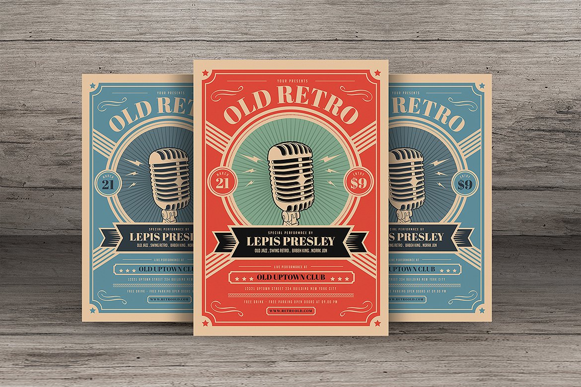
16+ Retro Flyer Examples to Download
There are two ways to promote a brand, you can either use the digital method or take the conventional alternative. Flyers, as one of the most efficient and effective marketing mediums there is, can be of great help in terms of corporate branding. This allows you to grab the attention of your audience, deliver your message, and encourage a response.
Retro Business Flyer Example
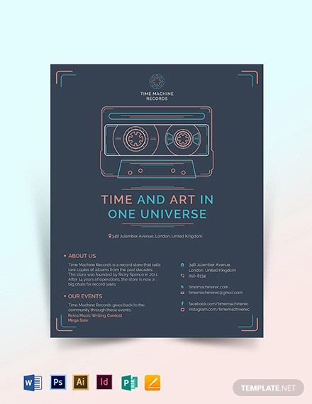
Retro Birthday Flyer Template
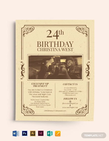
Retro CoffeeShop Flyer Template
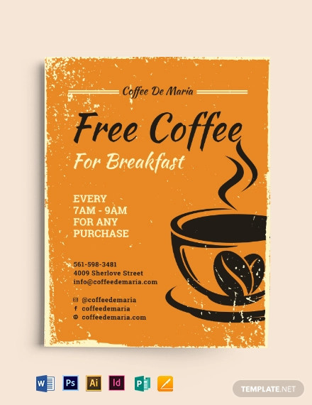
But every flyer design follows a particular theme. While some would opt for a minimalist flyer design, there’s no harm in going for a theme-based approach. So if you’re feeling a bit nostalgic, a retro flyer design will definitely be the perfect option!
Retro Music Party Flyer

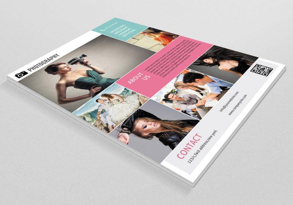
Retro Style Photography Flyer
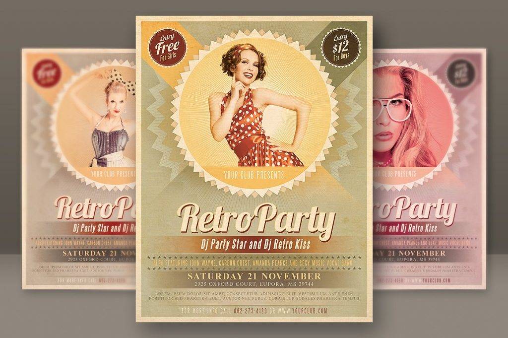
Retro Party Flyer
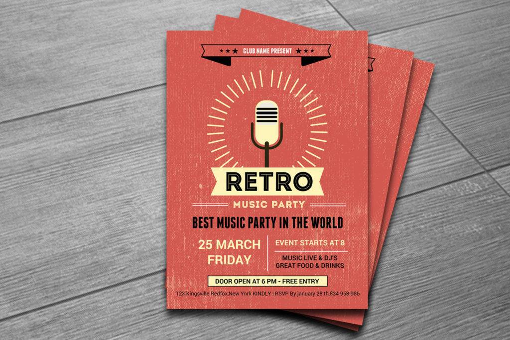
Retro Music Party Flyer
Flyer Advertising in Today’s Age
Technological advancement has paved the way to new forms of advertising. TV commercials, banner ads, websites, and product placements in movies and television shows are just a few examples of digital marketing in today’s age. So with these platforms readily available for advertisers to use, then do product promotional flyers still matter?
Flyer distribution is considered to be one of the oldest methods of brand marketing used. But even in this digital era, flyer distribution still remains one of the most effective advertising methods there is. It poses as a powerful marketing strategy for offline advertising of products, services, and events. This gives advertisers a great opportunity to stay on budget, while still being able to convey a message to their target audience.
One of the advantages of using a flyer is that the cost of production is within reach. For small to medium-sized businesses that are on a tight budget, this can be great news. The mass production of flyers isn’t as pricey compared to other promotional mediums, especially since these are made out of lightweight materials. Even with a limited amount of resources available, you can still expect a good return on investment. Flyers can also leave a lasting impression to prospects but to do so, you must come up with an impactful flyer design. This encourages a response from an individual, allowing them to think about purchasing or availing a given offer presented in the flyer. Its means of distribution would be the least of your worries as well, considering how flyers may be handed out in public areas or sent through the direct mail. This way, you don’t have to sit around waiting for a reply any longer.
For those who yearn for creative freedom, then advertising flyer is definitely for you. Graphic designers often see flyers as a canvas for their art pieces. Since a flyer design typically fills both sides of a paper, it gives designers the opportunity to explore their creative knowledge with the help of various design elements. What matters most is the designer’s ability to successfully convey a message for an audience to grasp. And to be quite honest about it, who doesn’t love the old-school feels that a good flyer gives?
Multipurpose Retro Flyer
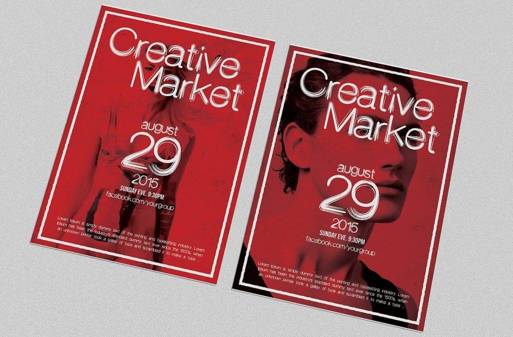
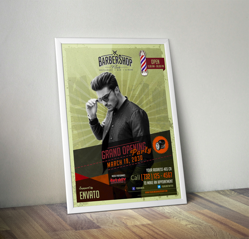
Barbershop Retro Flyer
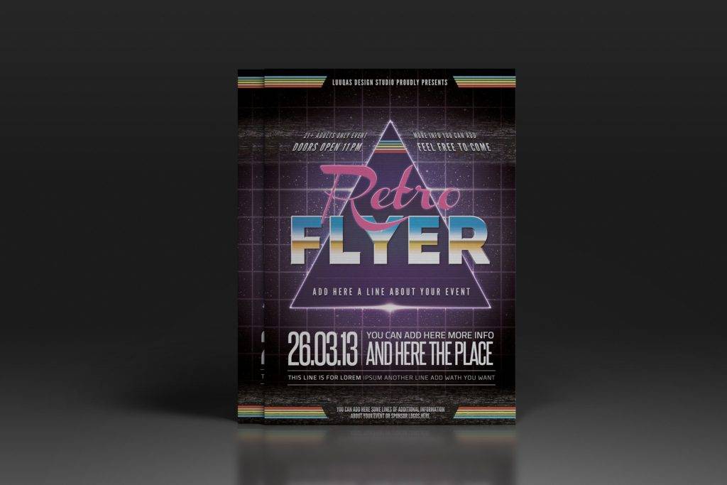
Electro Retro Flyer
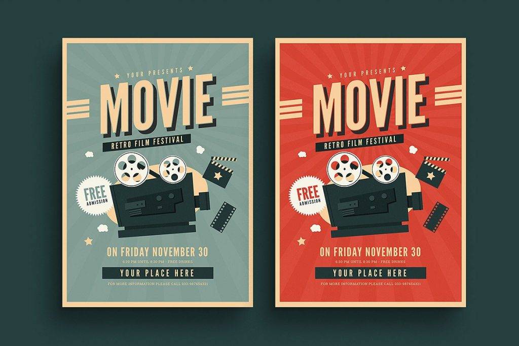
Old Retro Movie Flyer
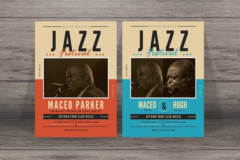
Retro Jazz Festival Flyer
Mistakes to Avoid in Flyer Design
An effective flyer design is a product of wise decisions and creative management. If there’s a way to avoid any blunders with your flyer design, then it’s by learning from the mistakes committed by others. That being said, here’s a list of common mistakes to avoid for the success of your next flyer design:
1. Unreadable Text
There’s nothing worse than creating a flyer that’s hard to read. For one thing, how do you expect customers to understand the purpose of your flyer if they can’t even read it? This is why it’s important to choose fonts of the proper size and style. Typography plays a significant role in the design, so you must pay close attention to the effect it gives your flyer. One way to determine whether your font choice is effective or not is by looking at your flyer as if it’s the first time you laid eyes on it. If the flyer’s text is difficult to read at first glance, then you must make the necessary adjustments immediately.
2. Missing Information
What. Who. When. Where. How.
These are the questions that must be answered by your flyer. Keep in mind that missing details can drive away potential customers from what you have to offer. While including broad details can encourage communication, it’s not always the best idea. You see, missing information can greatly affect the way a person responds. If you fail to give them sufficient details to share to friends and family, then they’re likely to end up forgetting about the flyer altogether. It’s also important to use simple language that every individual can understand. Details should be kept concise as well, as not everyone has the time and patience to read your flyer, especially when they are on the go.
3. Weak “Call to Action”
The general purpose of a flyer is to sell. To do so, you must tackle common scenarios that target customers can relate to. For instance, a beauty salon flyer would entice customers with situations involving hair care and skin care. This creates a deeper connection between the advertiser and the viewer, allowing the latter to realize how he or she may benefit from such offerings. Simply put, what customers are really looking for is a solution to their everyday problems. With that in mind, you must create a statement that can draw in attention from viewers.
4. Misspelled words and Grammatical Errors
There’s nothing worse than a flyer filled with misspelled words and grammatical errors. Not only is this a complete waste of resources, but this can also send the wrong message. To avoid any mishaps, make sure to proofread your flyer before printing. Check everything from your name, contact details, location, headlines to other text elements found on the page. It would be best to consult a friend or colleague to do so as well to ensure that nothing is overlooked.
5. Messy Layout
A cluttered design layout has to be the worst mistake to commit. Why? It’s simple, really.
A messy design can make your flyer look unprofessional, unattractive, and unreadable. This makes it difficult for customers to look for particular details, considering how it’s all over the place. Refrain from going overboard with your design by starting with a draft of your layout. This can help you manage every detail accordingly and determine whether or not a certain design element suits the overall look and feel of your flyer. Remember, “too much” can lead to negative outcomes. Therefore, simplicity is an essential factor to apply.
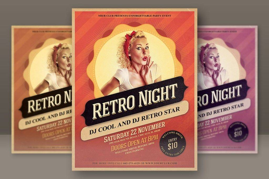
Retro Night Party Flyer
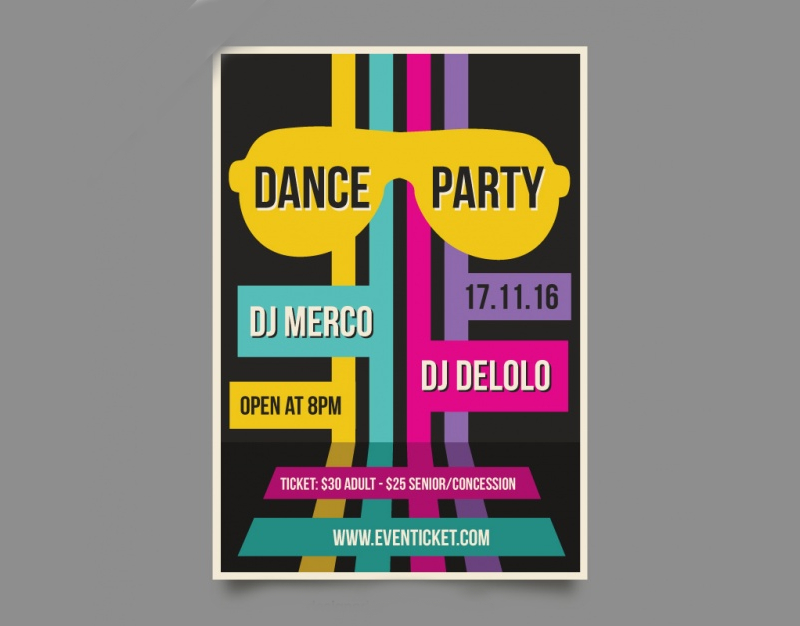
Retro Dance Party Flyer
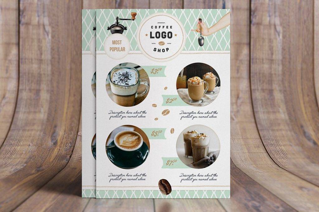
Retro Coffee Shop Flyer
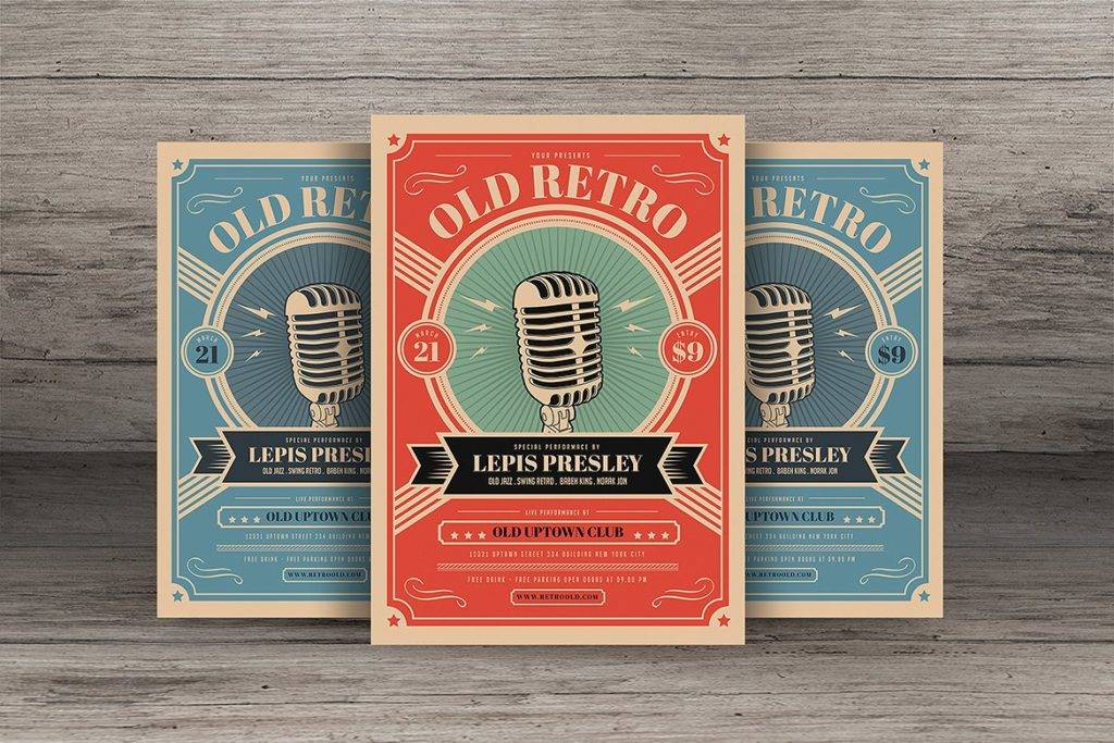
Old Retro Music Flyer
Why Use a Retro Flyer Design?
Apart from being fun to look at, there are various reasons why a retro flyer design is the perfect option. It serves as a good marketing strategy to spark interest among your target customers and remain relevant in the industry.
To Advertise a Theme-Based Event
Planning a retro-themed party? Take your guests on a blast to the past with beautifully-made retro flyer designs! These event flyers are great for advertising your theme night for party-goers to take notice. Having a retro-themed flyer design can give guests an idea of what to expect, without giving out any obvious details on what’s in store for them. This serves as a cost-effective way to market your event through the wild combination of vintage design elements and bright colors.
To Reach a Wider Audience
One of the reasons why a retro-themed flyer is highly recommendable marketing concept is because of how relatable it can be. The trends, music style, fashion pieces, and attitude of a particular decade serves as an inspiration to many art forms. Because of this, many people feel connected to it. Knowing this, a retro style can help you reach out to a wider audience from different markets.
To Keep the Retro Spirit Alive
Admit it, there’s something about the retro-themed concept that appeals to us. The retro vibes is enough to get people dancing to Madonna’s Material Girl in no time! There are many ways to incorporate retro-styled elements into your flyer design, such as through font choice, color patterns, and images. All it takes is a little imagination to make a positive impression with your audience. The best part is, a retro-inspired flyer design can definitely let your creative mind run wild.
At the end of the day, it all comes down to crafting a flyer design that’s worth a second glance. It’s about creating a promotional medium that is as informative as it is attractive. So the next time you think about using a flyer to advertise your brand, make sure to keep these examples of retro flyer designs in mind!


