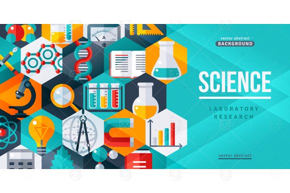
9+ Scientific Poster Examples to Download
Scientific posters are a visual and engaging way to professionally discuss the findings of a research or a study. It is an effective method in condensing all the necessary information about a certain topic in a way that is comprehensible to the audience. This is basically a visual presentation of what you did, why you did it, how you did it, and what you learned. You may also see examples of advertising poster design.
Scientific Vector Template Example
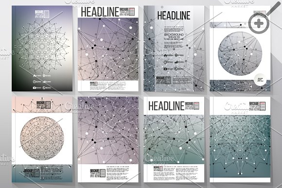
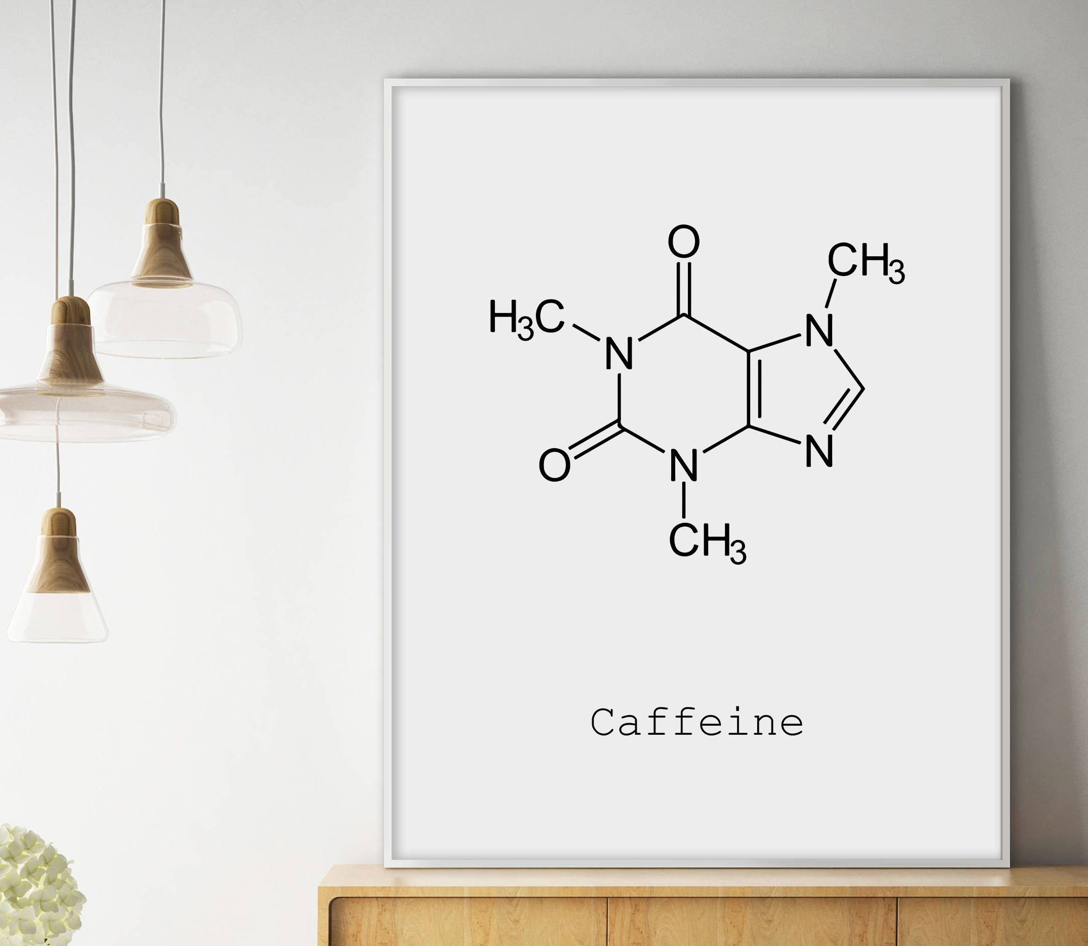
Molecular Poster Design Example
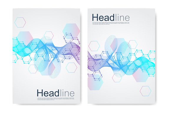
Although posters have the ability of independently delivering the message, a presenter may also engross the audience, particularly in a gathering, in dialogues explaining the research and expanding the already laid out information about the study. With the added help of the poster as a visual presentation, the job of the presenter to explain the research will be easier with less talking required since the poster will do much of the explanation.
Scientific posters are an important medium when you are trying to create a specific structure for the information you are trying to deliver. It can give your data a physical form which can help your audience understand your findings better. It can also make your figures look more organized when you outlay them on tables and general charts.
Posters can also be a platform for constructive criticism and it can save you the tedious work that comes along with preparing lengthy oral discussions and speeches.
Tips On Creating An Effective Poster
The main job of a attractive poster is to interact; to communicate. And this can only be successfully achieved once the poster catches the audience’s attention long enough to relay the information. Unfortunately, a poster’s setting can be quite an issue. Although a big crowd is exactly the ideal place to display a poster, it can also be problematic and it, in fact, holds the biggest hindrance.
With the number of people loitering around and the amount of noise in the area, you can’t expect the crowd to stop by your poster and read it thoroughly. In fact, you can’t expect them to read it at all. With so many distractions, your poster can be the last thing they pay attention to. However, if you use the right tools and play with the perfect elements, your poster can catch everyone’s attention like a pro. You may also check out examples of vintage poster design.
Here’s how:
Attract With Title.
Usually, the title is written in big, bold letters so they are often the first thing that the audience reads and the first thing they look for. With this thought in mind, use your title to reveal your poster’s topic in a way that can appear interesting to them. Once your title catches their attention or at least pique their curiosity, they will stay long enough to read the rest of what you have to say. Here are two important tips on how to make your title appealing:
1. Make your title so prominent, it’d be hard to miss.
Capitalize only the first letters of the words in your title since it would be harder to read otherwise. Make sure that your heading is typeset into being the most noticeable set of words in your entire poster. Use fonts that are clear and attractive. Make your title as big as your free space can allow. You may also see easter poster template examples.
2. Get lengthy with your title.
Although titles often come in the form of phrases, feel free to utilize an entire sentence as your title. If your study presents only one main result, why not try to include that information on your label? This way, the audience can already get your poster’s main essence which already results in effective communication. This is most useful especially since most of your audience have no time to read the entirety of your poster. You may also like conference poster designs and examples.
Those few seconds of attention they give to you are essential. In fact, they can be the only time you’ve got to convince them your poster is worth reading. So express it all on that main title sentence.
Create a Picture.
Literally. You are creating a poster, not a research paper. So fill that thing with the appropriate images, graphs, tables, and charts, instead of using long explanations no one has the time to read. The trick here is to lay it all out for the audience to grasp your content during the short time he spends looking at your poster and images will do what words cannot in a matter of seconds. You may also check out travel poster examples.
Experts say that the best way to measure the effectiveness of your poster is to see if the audience can understand your main topic just by looking at your entire presentation for no longer than twenty seconds. Usually, people can figure out your main topic easier and quicker if your title expresses enough data and your poster contain enough visual prompt. You might be interested in campaign poster designs and examples.
Typography also plays an important role in this one. And make sure that your poster’s color scheme DO NOT clash with your font color since this would make your presentation wholly unreadable to the audience.
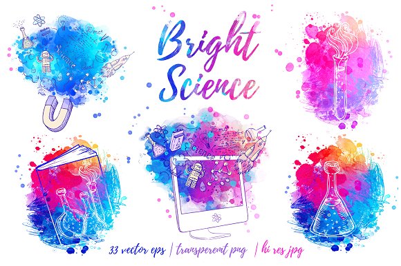
Scientific Element Poster Example
Colorful Science Poster Example
Emphasize Your Study’s Main Points.
Basically, this means that you should make sure that a random person stealing your poster a glance can immediately see what your study is about. Your audience shouldn’t have to look for the important parts, it should be laid out for them. Besides, your study’s gist is exactly what you want to sell. And you can’t sell what you don’t display.
The Trick Is In Being Readable.
Since this is your main objective, for your poster to be read by people, then all your efforts must be focused on this particular endeavor. Anyway, your content, no matter how informative and extensive, will not be appreciated by those who don’t read it. So design your poster in such a way that can make your main sections easier to locate.
The time devoted into reading your poster will differ between people. Not all of them will read everything from the first letter to the last; most will only look for the certain parts they are interested in such as your main topic, your research’s goal, your purpose for conducting the study, and your findings. Make sure these important sections are visible and instantly recognizable by the readers. You may also like hanging poster designs and examples
Use Bullets, Not Sentences. Use Pictures, Not Paragraphs.
Once again, this is not a research paper so playing with words is not the best tactic. Also, refrain from using sentences. Instead, organize your facts and data with bullets. With this, you can give your main points the emphasis it needs. Cover your poster’s face with a lot of relevant images because these will not only make your poster more understandable, it will also make it more appealing to the audience. You may also check out birthday poster designs and examples.
Refrain from using jargon or acronyms as well since some of your audience may not speak your language. Use terms that can be understood by everyone, including the laymen.
Caffeine Molecule Poster Example
Planning The Poster
Although posters are educational and should look professional, it is still important to spend some time on designing it. Since our main goal is to attract an audience, the best way to do this is to design the poster in a way that can easily catch someone’s eye. Here are a few details you should work on:
1. Font.
This is perhaps the most important minute detail of all because your font will help build the general appearance of your poster. To give your perfect poster that professional look (so that people will take it more seriously), it would be better to use Helvetica or Arial. This will also render your poster more readable since these fonts are simple and bold.
Avoid using fonts with swirly designs. This is not an art show. You’re presenting facts and hard-earned data. Use a font that will mirror the earnestness of your study. Also, make sure that your poster, especially the main parts, can be readable from three feet away.
2. Color.
Black and white has always been considered elegant and classy. Unfortunately for you, that look will not work with your poster. Lay out a color scheme that is pleasing to the eye. Utilize soft colors or, if you prefer bold ones, make sure to be be careful in using them. You don’t want your colors to overpower your words or your charts, but you don’t want your poster to look dull either. A nice play in between will do wonders for your poster. You may also see labor day poster templates.
3. Size.
The standard size for posters is 48″ wide and 48″ long. However, if you plan on using a bigger poster, don’t go too far from the preferred maximum. You don’t want your poster to appear gigantic and intimidating, or give the impression of being too big to read. You may also check out concert poster designs and examples.
4. Content.
The important thing to remember is that you don’t clutter your poster’s face. Organize everything in a way that is comprehensible and systematic. There are various formats you can use for your poster, however, here are two, simple formats you can follow:
- Vertical. With this format, you can organize your data in columns.
- Horizontal. With this format, you can organize your data in rows.
The great thing about the vertical and horizontal format is that they are not only very simple, they are also an effective way to systematize your study’s information from the most important to the least. You may also like wanted poster designs and examples.
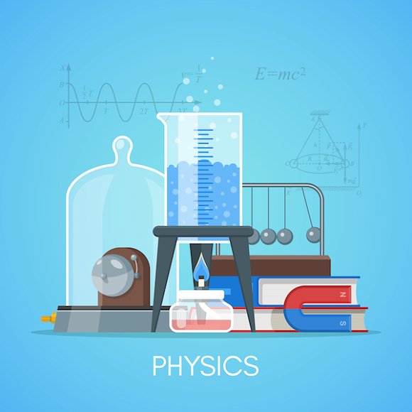
Physics Poster Example
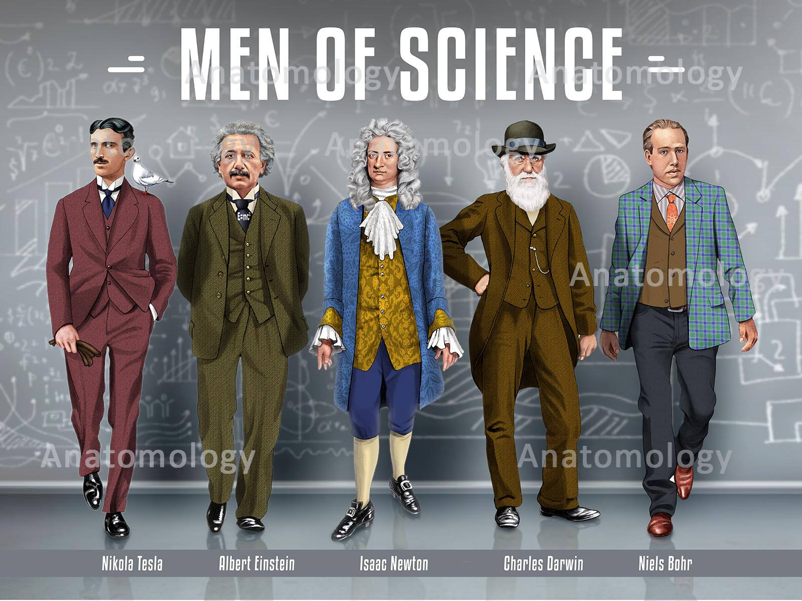
Men of Science Poster Example
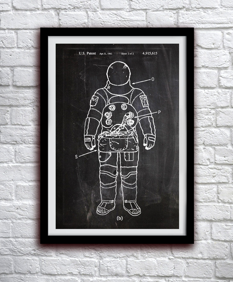
Astronaut Poster Example
Conclusion
Scientific posters are an effective and efficient medium, that, aside from careful planning and organizing, doesn’t take much from you. When used rightly, they can help you make people understand the technicalities of the subject you worked so hard on. Use all available elements to your advantage and help make the world see the glory in science. You may also see chalkboard poster designs and examples.


