7+ Signage Billboard Examples to Download
A lot of business entities nowadays are striving to make themselves known to the public. A good marketing strategy is what a company needs to survive and to flourish. Among the marketing strategies that are commonly utilized is the use of signages and billboards. Signages and billboards helps the business disseminate important information regarding their products and services and to catch people’s attention and lure them to their respective stores. They have been widely used since ages ago because they are proven effective to promote the entity and establish its brand in the industry.
In this article, examples of signages and billboards are presented. You can choose from the examples the most suitable for you and your business. Or, you may also check other designs and related discussions as well:
Digital Signage Template
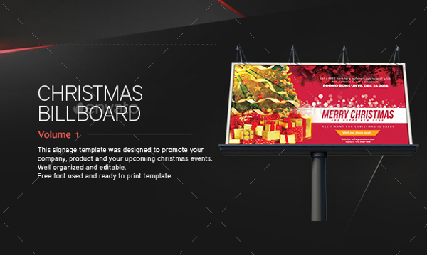
Realistic Billboard Mockup
Promotional Counter and Location Board
How to Design Your Signages and Billboards
In designing your signages and billboards. You must always keep in mind your goal which is to advertise your products and services. You must also know that things that you must consider in your design. You must also avoid the pitfalls in designing billboards as they can hinder your marketability. You want your billboard to get notice, so work hard on its design and layout since these are the basic things and are the core of your promotional material, the billboard. You may also see examples of advertisement design
Below are some important things that you need to consider and assess while making your own billboard. You may apply them as you make your own promotional material.
1. Short Number of Words
The shorter and the more concise the words placed in your billboards, the greater the impact to the viewers. As a rule of thumb, six words or less is ideal for your billboards and signage. This is different from flyers and menus where you can include details regarding the things you are promoting. In billboards, though you have the luxury of space for your advertisement, useless are the details since most of your target viewers are moving or just a passerby. Hence, you must make sure that in an instance, your information can be easily read and understood by onlookers. You may also like marketing flyer examples
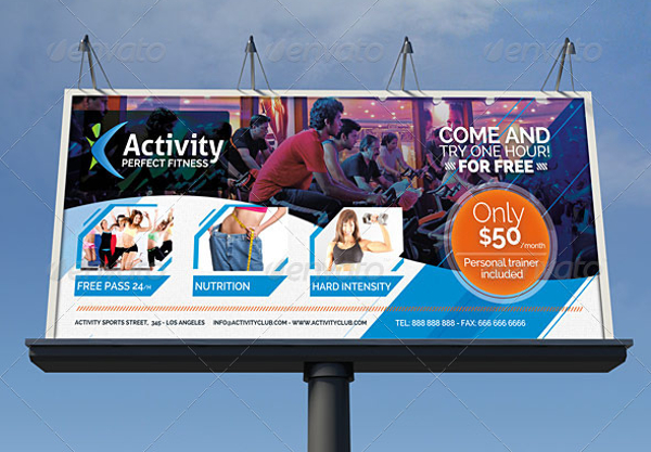
Fitness and Gym Business Signage Billboard
Urban Flyer Poster Billboard Mockup

2. Simple Layout
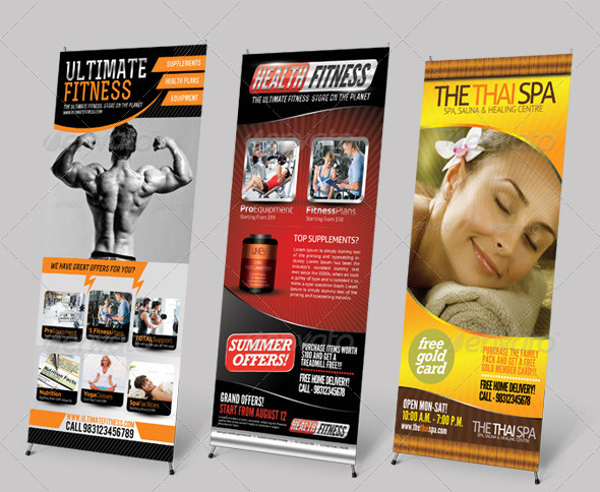
Avoid to much and complicated designs in your layout. You must be clear and brief in expressing your message. The most important thing is your main message which should be readable at first glance. Hence, designs are decorations are not an absolute must. For your font, choose something that is plain and simple. Cursive fonts may seem appropriate for invitation cards, but for billboards, this is not the same case. This may be hard to read or may consume the viewers time in trying to read your add. Hence, make your layout simple. The simpler the layout, the better. You may also check out vertical banner samples and templates
Printable Back to School Billboard

Pro Design Signage and Billboard Bundle
3. Don’t Be a Huge Distraction
There is a dilemma in designing a billboard: you want to get noticed yet you don’t want to be a cause of street accidents may it be minor or major. Take note that the main target of billboard advertisements are pedestrians, cyclists, bikers, and any drivers, the reason why you must make your ad a concise one since they will just have a quick flash on your advertisement. On the other hand, if you are working to enhance your billboard ad, people might get hooked on your billboard and become a cause of disaster. An example is the most iconic advert image of all time, the “Hello Boys” Wonderbra commercial, where onlookers get fascinated by the model’s cleavage that they end up crashing in poles, medians, and with other vehicles. Hence, you must achieve a balance in the design of your layout. You may also see examples of professional logo designs
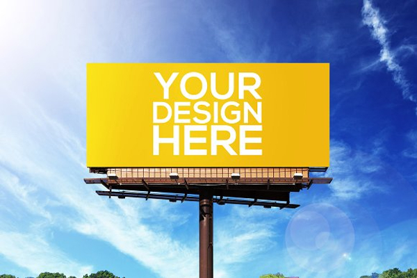
Realistic Billboard Mockups
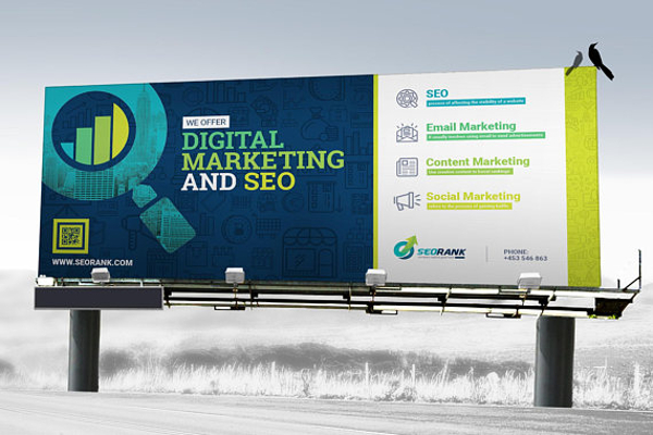
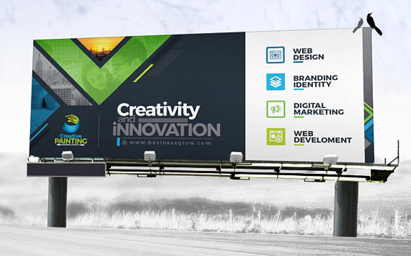
Signage Search Engine Optimization and Digital Marketing Agency Billboard
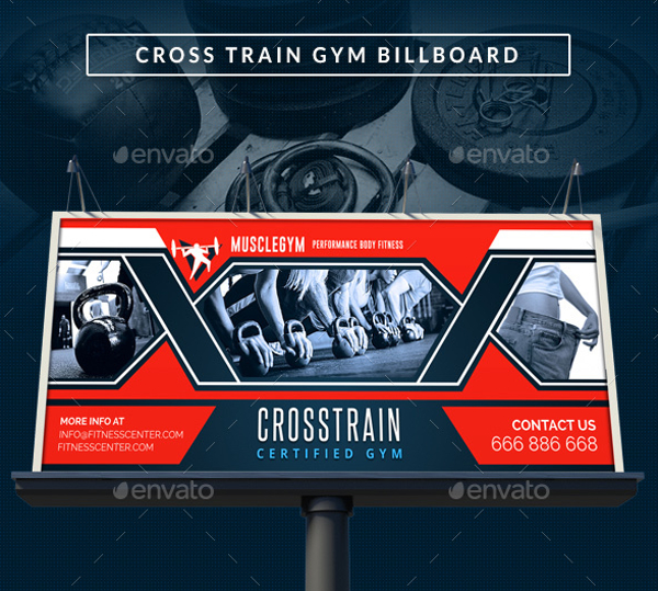
Cross Training Gym Signage Billboard
4. Be Smart
Surely, a smart billboard will catch people’s attention and will leave a lasting impression while a boring one while easily get ignored. However, a complex and too clever billboard will get lost on the audience. Hence, as a rule of thumb, do not include complex visual metaphors as these will only leave people scratching their heads, wondering what is going on. Though it is fulfilling for the viewers if they can solve the puzzle from a mind-boggling advertisement, there is no room for that in billboards. Billboards should be simpler and comprehensible. Be smart and fun, but never show off how clever you are through your billboards because those are for advertisements, not for hard puzzles and trivia. You may also like examples of vector design
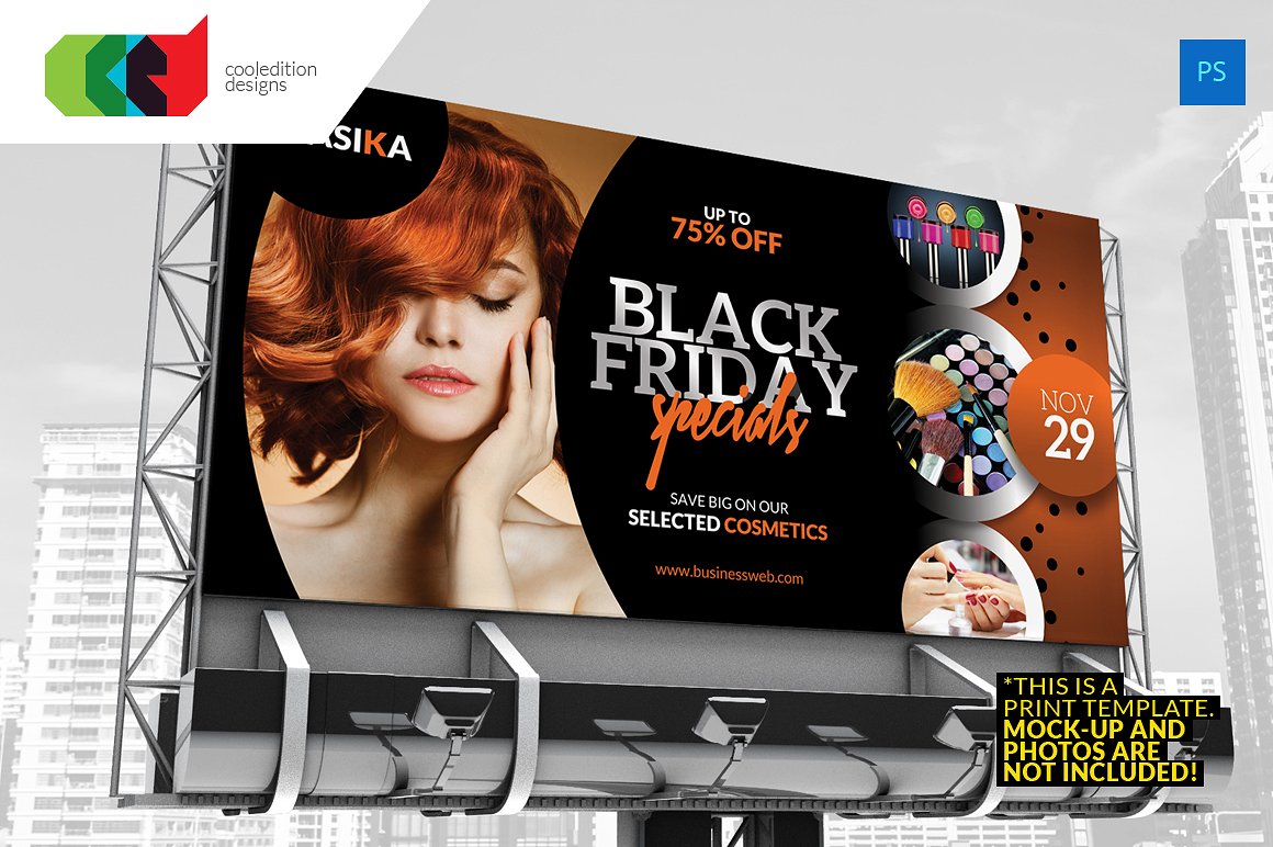
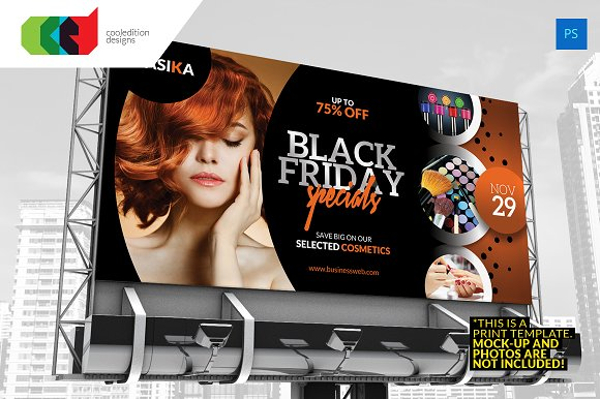
Black Friday Billboard
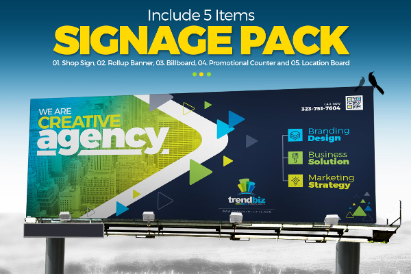
Signage Solution Pack-Billboard
5. Avoid Repetition
Be direct and concise and avoid repetition. You might have all the space you want for your advertisement and you might pay a great amount for your billboard ad but that does not give you credit to utilize all the spaces in your billboard by repeating words and explaining your advertisement. Avoid using a headline to explain your visual for you are only wasting your words. Avoid using a dull imagery and any graphics that does not do anything with your product; you are only wasting your chance in putting up your billboard advertisement. Hence, make use of the grand opportunity of having billboards and make use of the given space by being concise and without repeating your message over and over again. You may also check out creative brochure examples for designers
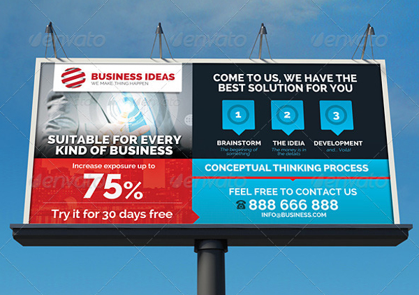
Multipurpose Corporate Business Signage Billboard
6. Note the Size of the Logo
In putting up an advertisement, you must not forget to include logos along with your products so people can easily distinguish the manufacturer or producer of the product that they are viewing. We often hear from marketers to make the logos in our advertisements bigger so it could be quickly seen even from afar. You are paying a lot from your billboard advertisement and you don’t want the viewers walking away without knowing the brand of the product on the billboard ad. It is a must that you include logos in your design. However, you must also keep it in size that do not distract the presentation of the main message. You should know how to balance the size of your logo and other designs because it is said that logos are a very much powerful piece of branding itself. You may also see examples of the best logo designs
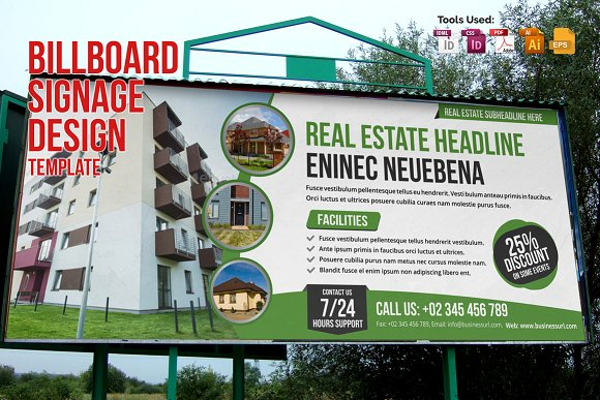
Billboard Signage Design
7. Arm’s Length Test
If you are not sure whether your billboard is readable from afar, do the arm’s length test. Print your design in a business card size and hold it out in an arm’s length. Is it still readable? Do you still get what you are expecting from the looks in your monitor? If the answer is no, you might consider revising and refining your billboard design until you accomplish your desired output. You may also like minimal logo designs for your inspiration
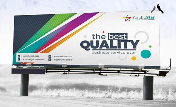
Digital Signage Template
8. Viewing Time
Note the viewing time of your billboard which is only 5 to 10 seconds. Remember that your audience is travelling usually at 65 miles per hour or more. On that very short period of time, you must capture the audience attention and make them understand what you are promoting or advertising.Thus, work hard on your billboard ad and make it understandable at one glance with a lasting impression. If it is only understandable but the viewer cannot have an impression over what you are presenting, your billboard is useless. They might know what you are advertising, but they will just let it pass since it is not interesting for them. You may also check out round logo design examples
In Sum…
Signages and billboards had already become a part of our society that we hardly notice them as a form of advertisement but just a form of design and built up. However, they played a very important part in a business organizations life since they are the ones who will communicate the company’s thoughts to the person, especially the target market. But you have to know that not all billboards are marketable. You need to work hard for it to gain people’s attention. In order to do so, you must know how to design your billboards and signages. They are as follows: your words must be concise, have a simple layout, don’t be a huge distraction, be smart, avoid repetition, note the size of your logo, do the arm’s length test, and lastly, take note of the audience’s viewing time. You may also see abstract logo designs
When you understand the above considerations, you will then how to make an attractive and marketable billboard that can serve its purpose well of informing people and advertising and promoting your products and services. For less hassle, why don’t you check out again the different examples and designs of signages and billboards presented above? You may also like hotel logo design examples


