10+ Studio Business Card Examples to Download
Photographers are, first and foremost, artists. The initial impression that people will have when they learn that you are a photographer is how you have an eye for things that most people don’t see. This is considered a similarity between you and painters, and aren’t both masters of such an admirable art? You may also see corporate business card designs and examples.
Since you are in this field of business, people will assume that you have a knack for creativity. Which means that this trait should be reflected in all that you do and in everything that you own. This high regard for your craft can also add to the pressure of having to design a business card since people will expect it to look..well.. unique. From the interior of your studio, to the littlest detail on your business card, you should project imagination and originality as if you just don’t know how else to do things.
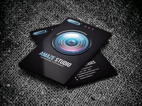
Classic Studio Business Card Example
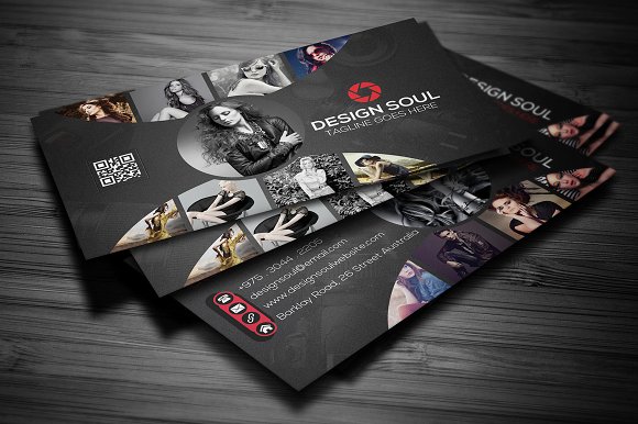
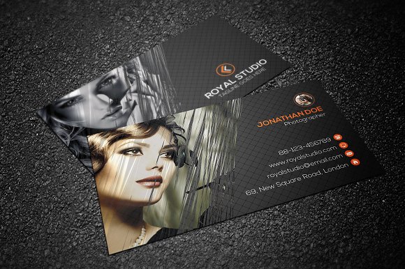
Studio Professional Photographer Business Card Example
Importance of Business Cards to Photographers
Here we are again with the argument that people, from whatever job position, do not need business cards anymore since everyone can get to know all necessary people through the Internet. But, contrary to popular belief, business cards are still the most effective, cheapest way of marketing which makes them as useful now as they are back then before the Internet dominated the world. Especially for small, start-up photographers, business cards are the best way to do business.
No matter how hard people emphasize the efficiency of online marketing and advertisement, none of what the virtual world can do for you can beat personal, physical interaction. The simple, underrated act of introducing your business face to face and handing out a business card to a potential client can make the exchange more memorable for your prospect. This is way better than posting marketing ads on social media that are just so easy to ignore.
A handshake, a smile, and the very act of giving out your business card, however, is much harder to disregard. This is why, as old school and primitive as it may seem to most people, business cards are still the most personal, most sincere way for you to attract notice for your business.
Also, your business card can be a reflection of your service. People will get a general impression of your business just by looking at your business card, and this is an effective way to catch their attention and to convince them to choose you over the handful other photography studios in the area. The overall aesthetic feel of your luxury business card will help future customers understand the brand you are trying to sell, without having to say a word. This, in itself, can already convince them of your studio’s trustworthy, quality work, and your authentic take on things.
In all the wonders of the Internet, these are just one of things it can’t help you with.
Pink Studio Modern Business Card Example
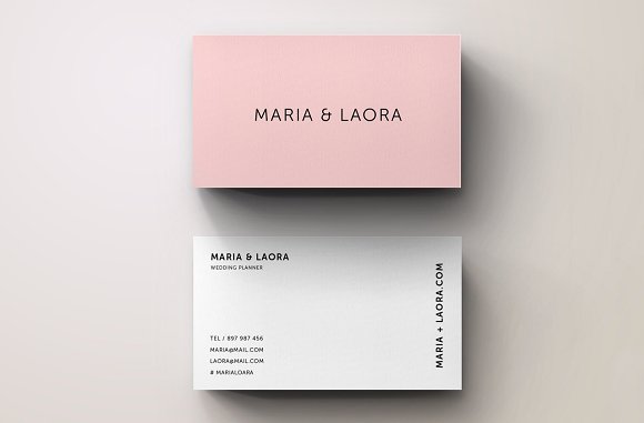
Wedding Photography Studio Business Card Example

Beautiful Studio Business Card Example
Important Elements In Designing Your Business Card
Yes, people still use business cards. Which means that you are not the only one using this marketing technique. Which also means that you need to up your game because, even in marketing, you have competitors. Now, a simple, basic, plain business card will do nothing to sell you or your business. You need to do something with the dominion given to you over that piece of paper. Here are a few tips to help you upgrade your business card:
1. Typography
This is an important element in the overall design of your best business card. A properly utilized font on your card can create your desired atmosphere. They can also make the difference between looking cluttered, and looking crisp and clean. (Hint, we want to achieve the latter.) Plus, business cards contain information that are supposed to be readable so choose a font that will make your details easy to read.
2. Logo and Color Scheme
This is also an important marketing tool since your customer is more likely to remember your business if he can attach a logo or a signature photo along with your brand. This duo will also make your business card more unique and more personal. Your color scheme can also help your clients identify your brand and distinguish it from all the other photography studios especially if you utilize the color schemes present in your studio’s products.
Put your modern logo on the center of your business card but leave space for minor graphics as well. Visual elements are also necessary to make your business card more pleasant to the eye. Since there are two sides of an empty business card to your disposal, you can utilize the other side for the logo and the other for your contact information.
Graphics are also a great way to make sure you don’t have too much empty space. (We don’t want people to think we have nothing important to say.) With the right play of colors and visuals, you can make your business card a little out of the ordinary.
Graphic Studio Business Card Example
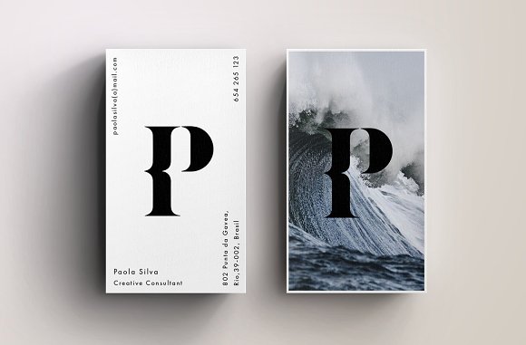
Professional Photography Studio Business Card Example
3. Material
One of the great things that our advanced technology can offer us is the ability to print out texts using different materials. Say adios to plain paper! Choosing the material for your business card is also an important aspect in creating the general appearance of your card.
This will also give your clients the impression that you give attention to the littlest details. Also, you don’t want to choose a type of paper that will easily bend or tear. Nothing too flimsy or too heavy, either. Choosing the right material can also really give your business card an added touch of spice.
Here are three of the most commonly used materials for business cards:
- Paper. Nothing beats this classic favorite. Needless to say that this is the most used material for printing out cards. Also, the special thing about paper is that it can come in many forms! It can differ in weight, in texture, and in color, and you can use these characteristics to compliment your graphics and visual content to really bring out your desired finished product. You may also see real estate business card designs & examples.
- Plastic. This material can make for an interesting and unique business card. Imagine having a transparent (frosted, or opaque) little piece of square holding all your information! It adds a little extra points to your creativity and ingenuity. Also, they don’t fold or tear like papers do. Unfortunately, plastics are quite expensive. Even the thickest type of paper costs less than a basic plastic for printing, and this is already reason enough for most to avoid using it. However, if you are willing to spend a little more for the sake of aesthetic beauty, this is the material for you.
- Stainless Steel. This is another tricky material to use for your creative business cards because, aside from being a little more expensive, it’s also quite difficult to find a printer that can print on this material. However, when used rightly, nothing will say elegant better than metal!
Aside from these three, there are also other materials you can use like fabric or wood. It is completely up to you and your desired outcome for your card. Also, the budget can be an issue. But then again, you don’t have to spend very much on your material. Just play your commodities right and you won’t have to.
4. Shape
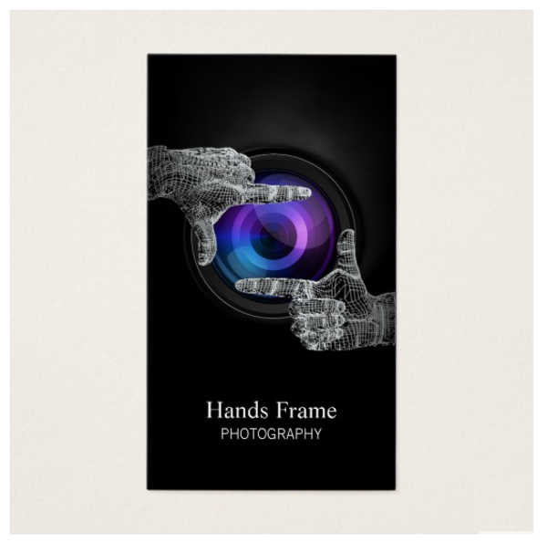
Business cards almost always come in tiny rectangles. BREAK AWAY FROM THAT MAINSTREAM by embracing different shapes for your card. Why not try a camera-shaped business card since you are in the photography business. Or even a square-cut card is already rebellion from the ubiquitous business card shape. You may also like examples of bakery business cards.
There are also printers that can cut paper into different shapes. Perhaps you can even try a circular card! This will make your card more interesting and more unique. It’s also effortlessly eye-catching since very few business cards have embraced unique shapes.
Take the image you want to represent with your simple card and choose a card shape that will help you achieve exactly that!
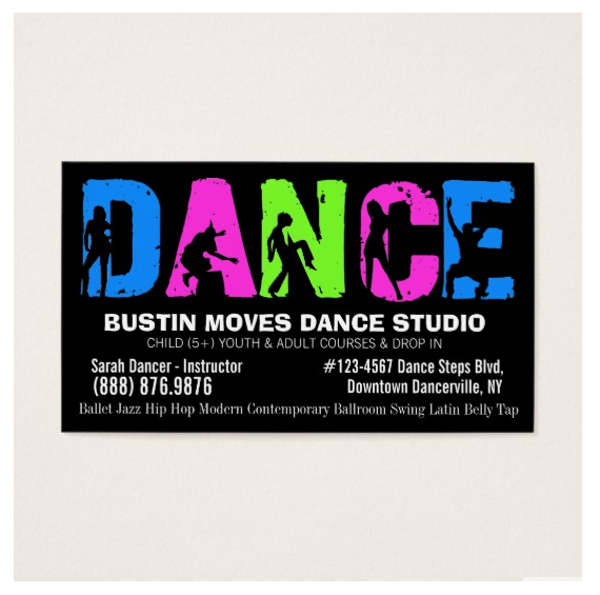
Dance Studio Business Card Example
Sophisticated Studio Business Card Example
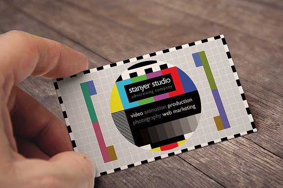
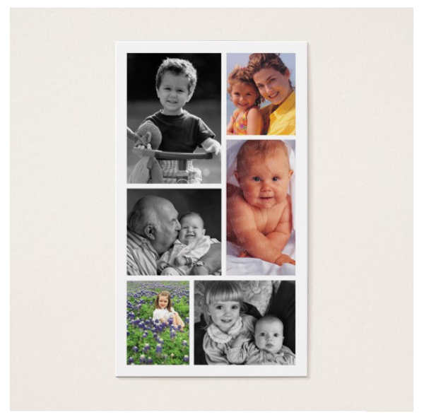
Cute Photography Studio Business Card Example
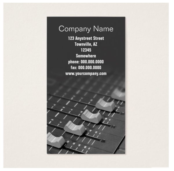
Studio Faders Business Card Example
5. Orientation and Content
The orientation is one of the first things that a client will notice in your minimal business card. In choosing one, put into consideration the overall look that you are trying to achieve with your card, and the way you would want your information to be laid out. There are two basic types of orientation:
- Landscape. This is the most common of the three. This is because, when placed in a card holder, the information on a modern business card written in landscape orientation can still be easily read. Also, every printer can print this format which will save you the hassle of having to look for a printer that can suit your need. However, its disadvantage is that it is too common. Since basically everybody is going for this format, it would take extra effort from your part to make your card stand out.
- Portrait. If you want to achieve a more elegant, more classy look, the portrait orientation is your best buddy. Every printer can also print this format so that’s an extra yay! The only downside to it is that, when placed inside card holders, the information on it can be quite difficult to read. (And by difficult, we mean your client will have to turn his card holder the other way.) But aside from that, this orientation will give your business card an effortless sophistication. You may also check out clean business card designs and examples.
Conclusion
As an artist, you have the responsibility of making sure you produce quality craft, even with your professional business card. But, as a businessman, you also have the important duty of making sure your business looks good in the eyes of prospected clients. Although it seems like a daunting job.


